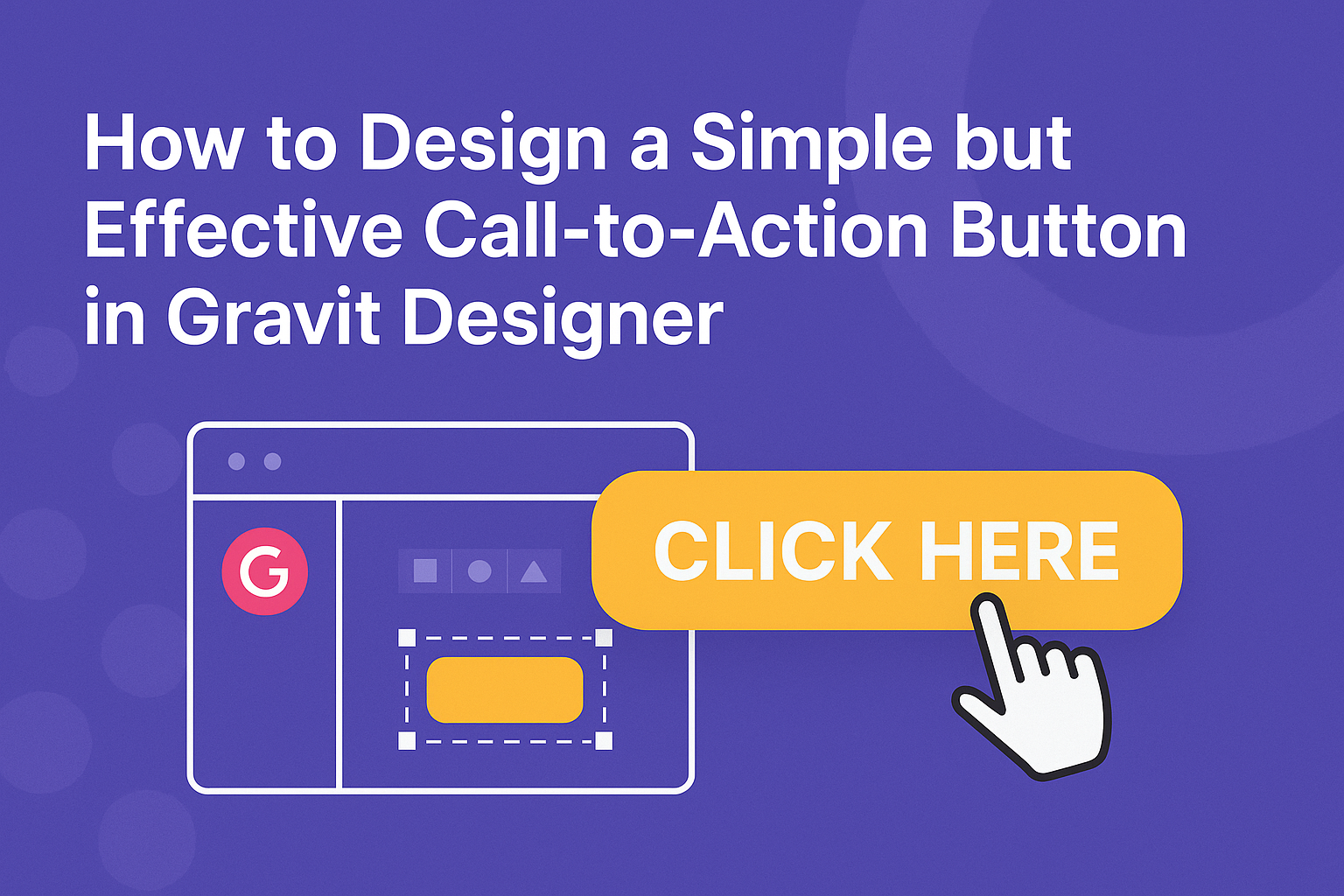
Designing a call-to-action button is a vital part of creating an engaging interface. A simple yet effective button can significantly boost website interaction and conversion rates.
This guide will share practical tips for achieving a standout design in Gravit Designer.
Using the right colors, shapes, and text is crucial for making a button eye-catching. It’s important to ensure that the call-to-action stands out against the background while still fitting well within the overall design.
Understanding the elements that drive engagement will help any designer create buttons that truly resonate with users.
Whether designing for a website, app, or social media, a solid call-to-action can lead to better user experiences. By following the right steps, anyone can create a button that not only looks great but also prompts action effectively.
Ready to get started on making your call-to-action buttons shine?
Getting Familiar with Gravit Designer
Gravit Designer is user-friendly and packed with features that make it great for designing. Understanding its interface, canvas setup, and essential tools helps set a solid foundation for any project.
Overview of the Interface
The Gravit Designer interface is clean and intuitive. Users will find a toolbar on the left, which houses drawing tools and shape options.
The top of the screen includes menus for actions and settings.
On the right side, the Inspector panel provides access to properties for selected elements, like colors and gradients. The canvas displays the design workspace where all the magic happens.
Navigating these areas is straightforward. Knowing where to find tools and settings can speed up the design process significantly.
Setting Up Your Canvas
To start designing, it’s important to set up the canvas correctly. Upon opening Gravit Designer, users can choose from predefined sizes or create a custom canvas.
To set the dimensions, go to the File menu and click on New Design. Here, they can specify width and height in pixels or other units.
Make sure to consider the purpose of the design when choosing the size. A well-set canvas will greatly assist in aligning elements and improving overall layout.
Essential Tools for Design
Gravit Designer offers a variety of tools to assist in creating eye-catching designs.
Key tools include the Pen Tool, which allows for precise vector drawing, and the Shape Tool for creating basic forms like rectangles and circles.
Users can also access text tools to add typography easily. Adjust properties like font size, style, and alignment through the Inspector panel for more control.
Additionally, the Color Picker and Gradient Tool help customize colors and effects. Familiarizing oneself with these tools will enhance efficiency in the design process.
Fundamentals of Call-to-Action Buttons
Designing effective call-to-action (CTA) buttons is essential for guiding users toward taking specific actions. This section discusses the importance of button design and breaks down the key elements that make up a successful CTA button.
Importance of Button Design
The design of a call-to-action button can significantly impact user engagement. A well-designed button attracts attention and encourages visitors to take the desired action, such as signing up or making a purchase.
Key elements include:
- Visibility: The button must stand out against the background. Using contrasting colors makes it eye-catching.
- Size: It should be large enough for easy clicking on both desktop and mobile devices.
- Text: Clear and actionable text creates urgency. Phrases like “Get Started” or “Shop Now” effectively guide users.
Incorporating these elements helps improve conversion rates and enhances user experience.
Anatomy of a Call-to-Action Button
Every call-to-action button consists of several critical components. Understanding these elements can aid in designing more effective buttons.
- Color: Different colors evoke different feelings. For example, red can create urgency, while blue conveys trust.
- Shape: Rounded corners can make a button feel more inviting. Square buttons may seem more formal.
- Text: The wording should be simple and action-oriented. Using strong verbs encourages immediate action.
- Iconography: Adding icons can enhance understanding. For instance, a shopping cart icon next to “Buy Now” makes the action clear.
By focusing on these parts, designers can create buttons that not only grab attention but also encourage users to interact with them effectively.
Designing Your Call-to-Action Button
Creating a call-to-action (CTA) button that stands out and captures attention is vital. It involves thoughtful decisions about color, typography, size, and even how to use icons or logos to enhance its effectiveness.
Choosing the Right Color
Color plays a key role in CTA design. Vibrant and contrasting colors can draw attention. Using colors that align with a brand’s palette while still standing out on a page is essential.
For example, if a website primarily uses blue and white, an orange button can create the desired contrast.
It’s also important to consider color psychology. Red may evoke urgency, while blue can convey trust.
Always test different colors to see which resonate best with the audience. A/B testing can provide valuable insights into what colors lead to better engagement and conversion rates.
Typography and Button Text
Typography should be clear and easy to read. Simple fonts like Arial or Helvetica work well, while decorative fonts may confuse users.
The text inside the button must be concise; phrases like “Get Started,” “Sign Up,” or “Learn More” are direct and effective.
The font size should ensure readability on all devices. A size of at least 16 pixels often works best. Using bold text can also help in making the button stand out.
Heeding these typography guidelines greatly enhances user interaction with the button.
Button Shape and Size
The shape of the button can influence user behavior. Rounded corners often make a button feel friendlier and more approachable, while sharp edges can give a more formal tone.
A standard size, such as 150×50 pixels, is commonly effective, but this can adjust based on design needs.
Ensuring that the button is large enough to click easily, especially on mobile devices, is key. A good rule of thumb is to keep buttons at least 44×44 pixels.
This size consideration helps to reduce user frustration and improves the overall user experience.
Incorporating Icons or Logos
Icons or logos can add visual interest to a CTA button. An arrow icon pointing right can suggest progression, making the action feel more dynamic. Adding a small logo can reinforce brand identity and make the button feel familiar.
When using icons, they should be relevant to the button’s action. For instance, a shopping cart icon is suitable for a “Buy Now” button.
Always ensure that the icons are not too large, as they should complement the text, not overpower it. Visual elements should enhance clarity and not confuse users about the action they will take.
Practical Tips and Tricks
Designing an effective call-to-action button involves several key elements. Paying attention to hover effects, accessibility, and testing will help ensure the button performs well and engages users.
Creating a Hover Effect
A hover effect adds an interactive touch to a button. This visual feedback can be simple, like changing the color or increasing the size slightly when users place their cursor over the button.
For instance, a button that shifts from blue to green upon hover can catch the user’s eye.
To create this effect in Gravit Designer, select the button and navigate to the “States” panel. Here, he or she can design variations for the hover state.
Utilizing opacity changes or subtle shadow effects can enhance the button’s appearance, making it more inviting.
Ensuring Accessibility
Accessibility is crucial in design. A button needs to be easily seen and understood by all users, including those with visual impairments.
Using high-contrast colors for the text and background helps improve visibility.
It’s also important to add descriptive text. Using phrases like “Click here to learn more” is more effective than just saying “Click here.”
This clarity assists screen readers in conveying information properly to users who rely on them.
Testing and Iterating Design
Testing different designs ensures the button meets user needs effectively.
He or she should try variations in color, size, and text in real user scenarios.
One effective method is A/B testing, where two designs are shown to different user groups to see which performs better.
Collecting feedback is essential.
Observing how real users interact with the button can provide valuable insights into what works and what doesn’t.
This ongoing process of testing and improving helps create a simple yet powerful call-to-action button that encourages users to engage.