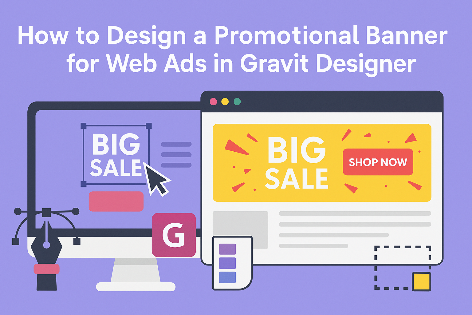
Creating a promotional banner for web ads can be a fun and rewarding project. Designing a banner with Gravit Designer allows anyone to create eye-catching ads that effectively grab attention and drive clicks.
With its user-friendly interface and versatile tools, Gravit Designer makes the process straightforward, even for beginners.
It’s essential to focus on simplicity and clarity in banner design. Using bold graphics and clear text helps convey the message quickly, as online viewers often make snap judgments.
By following best practices and utilizing the features of Gravit Designer, anyone can improve their chances of a successful ad campaign.
This blog post will guide readers through the steps of designing an engaging banner. From choosing the right dimensions to selecting colors that pop, this article aims to help creators produce attractive ads that stand out in a crowded digital space.
Getting Familiar with Gravit Designer
Gravit Designer offers a user-friendly environment that is easy to navigate. By understanding its layout and key tools, users can create appealing promotional banners effectively.
Understanding the Interface
When a user first opens Gravit Designer, they’ll notice a clean and organized interface.
The screen is divided into several sections:
- Toolbar: Located at the top, this contains the main tools needed for design, such as selection, shapes, and text.
- Canvas Area: This is where the design takes shape. It allows users to see their work in real-time.
- Layers Panel: On the right, this panel helps manage different design elements, offering control over layer order and visibility.
New users may find it useful to explore each part. Clicking on various tools will reveal additional options and shortcuts.
Familiarity with the interface enhances efficiency and creativity.
Essential Tools for Design
Gravit Designer comes equipped with several essential tools that empower users to design effectively. Here are some of the key tools to know:
- Shape Tools: These allow users to create basic shapes like rectangles, circles, and polygons, forming the backbone of most designs.
- Text Tool: This feature enables the addition of text to banners, with options to change font, size, and style easily.
- Export Options: Gravit Designer has various export settings that allow users to save designs in formats suitable for web ads.
Utilizing these tools improves design quality. Each tool plays a crucial role in crafting an engaging promotional banner that captures attention.
Planning Your Banner Design
When designing a promotional banner for web ads, careful planning is essential. This involves setting clear objectives, identifying the target audience, and deciding on the appropriate size and placement for the banner.
Setting Objectives
The first step in planning is to determine the main goals of the banner. Is it to promote a sale, increase brand awareness, or drive traffic to a website?
Setting specific, measurable objectives will help guide the design process.
Consider what action you want viewers to take after seeing the banner. For example, do you want them to click for more information or make a purchase?
Defining these objectives ensures that the design aligns with the intended outcome.
Identifying Target Audience
Next, identifying the target audience is crucial for effective design. Knowing who the banner is for will influence many design choices, including colors, fonts, and images.
Research the demographics and interests of the audience. Are they young and tech-savvy, or older and more traditional?
Tailoring the design to resonate with the audience’s preferences will increase engagement and effectiveness.
Deciding on Banner Size and Placement
Finally, the size and placement of the banner can significantly impact its visibility. Different platforms, such as websites and social media, have specific size requirements.
Choose a size that will stand out without overwhelming the surrounding content. It’s also important to consider where the banner will be placed.
High-traffic areas, such as the top of a webpage or alongside popular content, can drive more clicks.
Creating Your Banner
When designing a promotional banner using Gravit Designer, several important aspects come into play. The right color scheme, effective images, smart use of text, and strong branding elements all contribute to creating an eye-catching ad. Here’s how to ensure each part of the design works together seamlessly.
Choosing a Color Scheme
Selecting a cohesive color scheme is crucial for attracting attention. A good rule of thumb is to use a limited palette, typically 2-4 colors. This keeps the design clean and avoids overwhelming viewers.
Colors evoke emotions; for example, red can create excitement, while blue is often seen as trustworthy. Tools like Adobe Color can help find complementary colors.
When creating a banner, consider the context where it will appear. Bright colors may stand out in a social media feed, while softer tones might work better for a professional website.
Incorporating Images and Logos
Images and logos should be chosen with intention. High-quality visuals enhance the banner’s appeal and help convey the message quickly.
When selecting images, ensure they are relevant to the promotion.
Logos should be prominent but not overshadow the main message. It’s best to place the logo in a corner or at the top, maintaining balance in the design.
Using image editing tools within Gravit Designer, adjust size and placement to fit the banner’s dimensions. Aim for images that represent the brand’s identity and resonate with the target audience.
Adding Text and Typography
Text is essential for communicating the banner’s message. It should be clear and concise, as viewers will only glance at it.
Use large fonts for headlines and smaller fonts for additional details.
Choosing the right font style is key. Sans-serif fonts often look modern and clean, while serif fonts can convey tradition and reliability. Ensure that the typography aligns with the overall branding.
Limit the amount of text to avoid clutter. A catchy slogan or a direct call-to-action like “Shop Now” can be very effective. Proper spacing and alignment enhance readability.
Implementing Branding Elements
Incorporating branding elements helps create a consistent theme. This includes using brand colors, fonts, and imagery that reflect the business’s identity.
Consistent branding builds recognition and trust among consumers. It’s important to follow guidelines set by the brand to maintain integrity across all designs.
Subtle details, like including a tagline or a unique graphic element, can reinforce the brand. Keep in mind that these elements should complement rather than overwhelm the main message of the banner.
Finalizing and Exporting Your Design
Before finishing up a promotional banner design, it’s important to review the work thoroughly. This ensures everything looks perfect and functions well for web ads. Once satisfied, exporting the design in the right format is crucial for effective online use.
Reviewing Your Design
She should check for any design flaws. This includes ensuring the text is readable and the colors match the brand’s identity.
Key points to review:
- Text Clarity: Ensure all text is easy to read, using a suitable font size and style.
- Alignment: Check that all elements are properly aligned. Misalignment can look unprofessional.
- Visual Balance: Look for visual balance in the design. This helps the ad grab attention effectively.
It’s also wise to see how the banner looks at different sizes. Zooming out gives a better sense of how users will see it on various devices.
Exporting for Web
Once the design is polished, it’s time to export. They need to choose the right file format to ensure quality.
Common formats for web ads include:
- PNG: Great for images with transparency.
- JPEG: Good for photographic images and smaller file sizes.
When exporting, she should consider the resolution. For online use, 72 DPI is usually sufficient.
After selecting the format, test the file to ensure it appears as intended. Open it in a browser to see its display.
This final check is vital to confirm that everything looks sharp and professional.