Creating an eye-catching product label is essential for standing out on store shelves.
By using Gravit Designer, anyone can design professional-looking labels that effectively represent their brand and product. This guide will walk through the steps needed to create a stunning label ready for print.
Gravit Designer is a versatile tool that offers a variety of features perfect for label design. With its user-friendly interface, users can easily manipulate elements, choose colors, and add text in a way that highlights their unique branding.
Each step of the design process will be covered to help readers make the most of this powerful software.
Whether starting from scratch or using templates, learning to design a product label can be a fun and rewarding experience. This article is here to provide helpful tips and techniques to ensure the final product looks polished and professional.
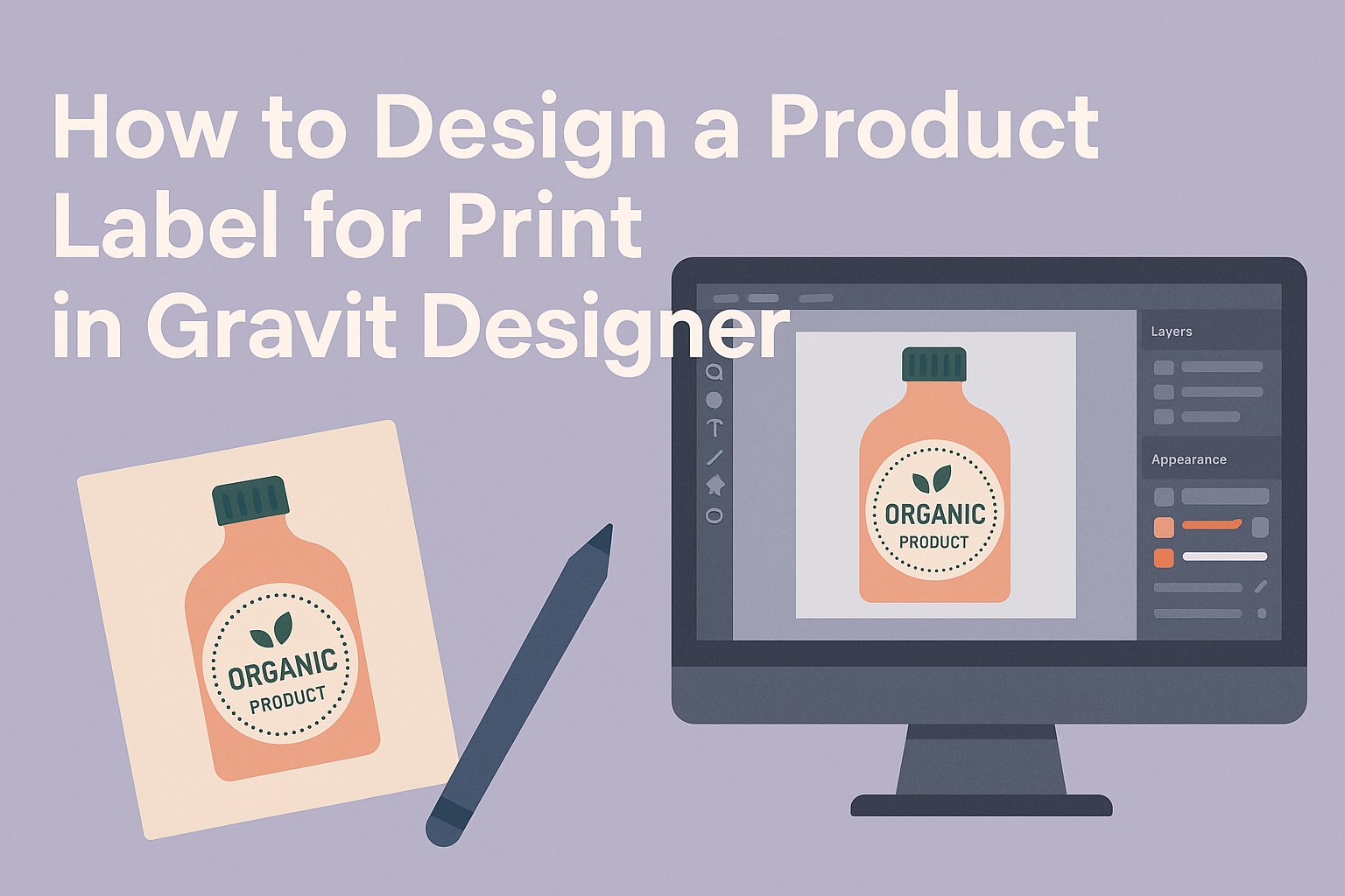
Understanding Gravit Designer Basics
Gravit Designer is a powerful tool that helps users create stunning designs for product labels and more. Understanding the basics of this software is essential for getting started.
Interface Overview
The interface of Gravit Designer is user-friendly and intuitive.
Users will find a main canvas in the center where designs come to life. On the left side, there is a toolbar with essential tools like shapes, text, and images.
The right panel displays properties that let users adjust settings for selected objects.
At the top, a menu bar offers options for file management, editing, and viewing. It’s also where users can find helpful features like layers and styles, which are crucial for organizing designs effectively.
Setting Up Your Workspace
Setting up the workspace is a key step.
Users can adjust the canvas size by going to the “File” menu and selecting “New.” Choosing custom dimensions will help match product label requirements.
Gravit Designer allows users to create multiple pages, which is helpful for brainstorming different designs. Users can also arrange their toolbox by dragging and dropping tools for easy access.
To enhance the workspace, it’s useful to enable “Snap to Grid” for precise alignment. This feature makes it easier to place elements accurately, ensuring everything looks professional.
Vector Tools and Techniques
Gravit Designer is known for its versatile vector tools.
The Pen Tool allows users to draw custom shapes with precision. It’s perfect for creating unique designs tailored to brand identity.
Users can also take advantage of the Shape Tool to create basic geometric figures. Combining these shapes through path operations, like Union or Difference, can create more complex designs.
Moreover, adjusting anchor points improves the shape’s details. Users can simply click on an object and manipulate these points for better curves and lines. Each of these vector techniques empowers users to produce stunning and original product labels.
Preparing the Canvas for Print Design
Creating a product label requires careful preparation of the canvas. It is essential to focus on the dimensions, colors, and structure so that the final design looks professional and appealing.
Setting the Correct Size and Resolution
First, it’s important to set the correct dimensions for the label. Typical sizes can vary, so knowing the specifications is key.
- Use standard measurements like 2″x4″ or 3″x5″.
- Always confirm the size with the printer.
Next, resolution is crucial for print quality. A DPI (dots per inch) of 300 or higher is ideal. This ensures crisp images and clear text.
When creating in Gravit Designer, set your canvas size to match the label dimensions. This helps avoid any scaling issues later.
Choosing Color Schemes for Print
Selecting the right colors can make a significant difference in print quality. Colors look different on screens than they do in print.
- Use CMYK color mode for printing. This stands for Cyan, Magenta, Yellow, and Key (Black) and helps achieve accurate colors.
- Keep in mind that some colors may not print exactly as expected, so always check a color reference guide.
It’s also a good practice to limit the color palette. This keeps the design cohesive and helps maintain brand identity. A palette of 3-5 colors usually works well.
Using Layers and Groups
Layers and groups are beneficial for organizing design elements. They allow for easier adjustments and better management of complex designs.
- Create separate layers for text, images, and backgrounds. This provides flexibility when editing.
- Use groups to combine related elements. For example, if there are multiple images or text boxes that belong together, grouping them helps keep everything organized.
Utilizing these features in Gravit Designer can streamline the design process. It simplifies editing and helps prevent accidental changes to other parts of the label.
Designing the Label Elements
Creating a product label involves carefully crafting its elements to convey brand identity and essential information. Key considerations include integrating brand elements, choosing the right fonts, and effectively incorporating images or icons.
Incorporating Brand Elements
Brand elements are crucial for a product label. These include the logo, color scheme, and any slogans or taglines. They help establish brand identity and recognition.
When integrating these elements, it’s important to maintain consistency with existing branding. Using the brand’s color palette will create a cohesive look. The logo should be prominent but not overpowering.
Position the logo at the top or center of the label for visibility. Ensure that the design reflects the brand’s personality, whether professional, casual, or playful. This consistency strengthens the consumer’s connection to the brand.
Fonts and Typography for Labels
Selecting the right fonts and typography is vital for readability and style. The font should match the brand’s tone, whether it’s modern, classic, or whimsical.
For the main product name, use a bold, clear font to attract attention. It’s best to limit font styles to two or three to avoid clutter. A sans-serif font is often easier to read at smaller sizes than a decorative font.
Hierarchy in typography helps guide the consumer’s eye. Use larger font sizes for headlines and smaller sizes for details. Always ensure that the text contrasts well with the background to enhance readability.
Adding Images and Icons
Images and icons can add visual interest and communicate the product’s purpose. Always choose high-quality images that are relevant to the product.
If using icons, they should be simple and easy to recognize. They can represent features like “organic,” “gluten-free,” or other selling points. Icons help break up text and make the label more visually appealing.
Position images strategically to complement other elements. Make sure they don’t overshadow the brand name or important information. Balancing images with text creates harmony on the label.
Exporting and Printing Tips
Getting the right export settings and performing a thorough pre-flight check are crucial steps in ensuring a high-quality product label. These tips help prevent common printing issues and ensure the design looks its best.
Export Settings for Print Quality
When exporting a label in Gravit Designer, it is essential to use the correct settings.
Designers should choose a file format suitable for printing, such as PDF, TIFF, or PNG.
- Resolution: Set the resolution to at least 300 DPI. This ensures crisp and clear images.
- Color Mode: Use CMYK color mode since printers require this for accurate color reproduction.
- Bleed: Include at least 0.125 inches of bleed to prevent white edges after trimming.
Following these settings ensures the final printed labels represent the design faithfully.
Pre-flight Check and Proofing
Before sending the label to print, conduct a thorough pre-flight check. This process identifies potential issues.
- Text Check: Ensure all text is outlined to avoid font problems.
- Image Links: Verify all images are linked correctly and included in the file.
- Colors: Confirm that all colors are set to CMYK for optimum printing results.
Proofing is also important. Review a printed proof to check colors and alignment before the final print run. This step can save time and costs down the line.