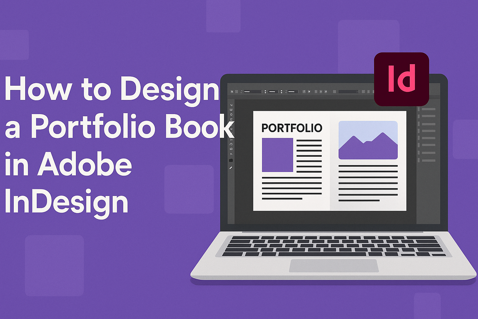
Creating a portfolio book in Adobe InDesign can be a fantastic way to showcase one’s work professionally. To design a standout portfolio, it is essential to focus on layout, consistency, and quality of the content. Ensuring that the design reflects the individual’s style and the type of work they do is key to making a strong impression.
InDesign offers numerous tools to help with this process. Users can start with pre-made templates for InDesign, which provide a foundation for designing a cohesive and visually appealing portfolio. For a more personalized touch, focusing on element placement and image sequencing can create a narrative flow that engages viewers.
Additionally, understanding how to manage and organize content is crucial. It’s worth exploring how to gather and organize photos and content for best results. By paying attention to these details, a portfolio book can effectively communicate a creative journey and captivate potential clients or employers.
Understanding Portfolio Books
Creating a portfolio book involves showcasing work or projects effectively. The sections below cover why a portfolio book is important and who it targets. This helps in crafting a book that meets specific goals.
The Purpose of a Portfolio Book
A portfolio book serves as a visual resume. It highlights the work and projects of an individual or company in a professional manner. These books are often used by creators, from photographers to designers, to show their skills and creativity.
A well-designed portfolio can create a strong first impression. It allows the viewer to understand the creator’s style and expertise quickly. Moreover, it is a tool for marketing and self-promotion. Printed or digital, it adds credibility and can differentiate a professional from others in their field.
Target Audience and Content Selection
Identifying the target audience is crucial to creating an effective portfolio book. The book might be aimed at potential clients, employers, or collaborators. Knowing who will view the portfolio helps in selecting the appropriate content and style.
Content selection is key. The book should feature the best work tailored to appeal to the intended audience. This may involve picking specific projects or artwork that best represent the creator’s abilities and style. Consistency in quality ensures that the portfolio leaves a lasting impression. Carefully curated content speaks directly to the viewer, highlighting relevant skills and achievements.
Getting Started with Adobe InDesign
Adobe InDesign is a powerful tool for creating professional documents like portfolio books. To harness its full potential, it’s essential to learn the interface, set up new documents, and understand workspaces and panels. These basics will lay a solid foundation for more complex designs.
Navigating the Interface
Adobe InDesign’s interface is user-friendly with a layout familiar to those who have used other Adobe products. It includes menus at the top and a toolbar on the left. The right side features a panel for managing layers, colors, and styles.
The central area is the workspace. Here, users can add text, images, and graphics. Essential tools are easily accessible, making it convenient to navigate and manipulate projects efficiently.
The user can customize the interface by adjusting the toolbar and panel arrangement to suit individual preferences. Keyboard shortcuts are also available to speed up tasks. Exploring these features helps users get comfortable and saves time in the long run.
Setting Up a New Document
Creating a new document is simple. Start by clicking “File” then “New Document.” A dialog box appears, allowing users to specify details like page size, margins, and orientation. These settings depend on the project requirements.
For a portfolio book, choosing the right page size is crucial. Standard sizes include A4 or Letter, but custom dimensions are also possible. Margins determine the text and image layout, helping to keep content organized.
Users should also pay attention to bleed and slug settings. Bleed ensures images extend to the edge after trimming, while slug can include notes for the printer. Adjusting these settings properly enhances the print quality of the final portfolio.
Understanding Workspaces and Panels
Workspaces and panels in Adobe InDesign offer tools for managing different aspects of design. Panels can be found on the right side of the interface. They include options for controlling text styles, colors, and layers.
Workspaces are presets of panel layouts tailored for different tasks, such as editing or designing. Users can switch between workspaces depending on their current needs, which streamlines the design process.
They can also create custom workspaces by dragging and dropping panels into desired positions. This customization allows for a more personalized and efficient working environment, enhancing productivity and focus during design projects.
Design Fundamentals
Designing a portfolio book in Adobe InDesign requires a focus on crucial elements such as typography, color schemes, and the efficient use of white space. Let’s explore these components to help create a standout portfolio.
Typography Choices
Typography is a core aspect of design, shaping how the audience perceives the content. It’s best to choose fonts that reflect the tone and purpose of the portfolio. For professional and clean looks, sans-serif fonts like Helvetica or Arial are often used. For more creative projects, serif fonts can add elegance.
Spacing and size of text are vital. Headers should be bold and larger to grab attention, while body text should remain readable. Using consistent font styles throughout the portfolio helps in maintaining a cohesive look.
Pairing fonts can also add visual interest. It’s advisable to limit font choices to two or three to avoid clutter. Experimenting with bold, italics, or different weights adds subtle emphasis without overwhelming the reader.
Color Schemes and Branding
Color choices convey messages and set the mood. It is important to select a color scheme that aligns with personal or professional branding. Neutral colors such as grays, whites, and blacks work well for a minimalist approach.
Incorporating brand colors helps in building recognition. Consistency in using color for headings, borders, or backgrounds ties the entire design together. Tools like Adobe Color can assist in choosing complementary colors.
Contrasting colors ensure that text stands out against backgrounds. For example, dark text on a light background improves readability. It’s essential, however, to avoid using too many bright colors that might distract from the content.
Utilizing White Space Effectively
White space, or negative space, enhances readability and makes the design look clean. It’s the empty space around elements on a page and helps in creating a balanced layout. Using white space wisely prevents the page from appearing cluttered.
When designing a portfolio in Adobe InDesign, spacing between text, images, and margins needs careful attention. Proper margins ensure content isn’t cramped and gives the design room to breathe. Applying white space in strategic places, such as around headlines or images, draws attention to key parts of the portfolio. This enhances focus and guides the viewer’s eye through the content smoothly.
Layout Techniques
Creating an appealing portfolio book in Adobe InDesign involves using tools like master pages, grid systems, and effective image placement. These techniques help maintain consistency, improve readability, and enhance visual appeal.
Master Pages and Templates
Master pages in InDesign provide a way to keep a consistent design throughout the portfolio. By using them, designers can easily apply uniform elements like headers, footers, and page numbers across different pages. This eliminates the need to manually add such details to every single page.
Templates can further simplify the process. They offer pre-designed layouts that are easy to customize. Designers can use these as a starting point, ensuring their portfolio maintains a structured and cohesive look. When designing from scratch, it’s beneficial to start with a basic template and modify it to match personal or brand aesthetics. Templates also save time and reduce errors.
Grid Systems and Alignment
Grid systems are essential for organizing content in a professional manner. They help align text, images, and other elements neatly. Using grids ensures uniform spacing between elements and helps provide a balance between visual elements and white space, giving the portfolio a clean look.
Aligning content according to a grid not only makes it visually appealing but also guides the reader’s eye. It’s crucial to maintain consistent alignment across pages to build a sense of harmony. Typically, grids can vary from simple two-column layouts to more complex multi-column setups, depending on the complexity and amount of content.
Image Placement and Text Wrapping
Images are a key part of any portfolio, so placing them effectively is important. One approach is to use the Rectangle Frame Tool to create frames for images. It ensures that images fit well within the layout without disrupting text flow.
Text wrapping, on the other hand, allows text to flow around images, making the page more dynamic. By selecting the text wrap option, text can seamlessly integrate with images, enhancing the overall aesthetic. Care should be taken to ensure that text remains legible and doesn’t get too close to the image edges.
Adding Content to Your Portfolio
When designing a portfolio book in Adobe InDesign, effectively adding content is key. This involves importing images, adding text, and utilizing interactive elements and layers to make the book engaging and well-organized.
Importing Images and Text
Adding images and text in InDesign involves using tools and techniques for precise layout. Users can import images by selecting File > Place and choosing desired photos or graphics. It’s important to use high-resolution images to ensure print quality.
Text can be added by utilizing the Type Tool. Create text boxes and type directly or place external text files. Adjust fonts, sizes, and styles to enhance readability and design. Aligning images and text properly ensures a professional look.
Creating Interactive Elements
Interactive elements add life to a portfolio. Using features like buttons and hyperlinks, designers can make their books engaging. Buttons can be created through the Button and Forms panel, which brings interactive functionality like navigating between pages or linking to external content.
Hyperlinks allow users to jump to relevant sections or online resources. They can be added by selecting text or objects and using the Hyperlinks panel to insert URLs.
Videos or animations can also be embedded for a dynamic portfolio. This helps in showcasing multimedia skills and holds the reader’s attention.
Organizing Projects with Layers
Layers help manage complex documents by organizing elements separately. This is crucial for maintaining a clean workspace. InDesign’s Layers panel allows users to create and rename layers to group related items like images, text, or interactive elements.
Different elements can be edited without affecting others by locking or hiding layers. This modular approach simplifies managing large projects with multiple components. Assigning layers to specific pages or sections helps in easily updating content and maintaining consistency across the portfolio.
Additionally, using layers ensures that printed and digital versions of a portfolio remain organized and professional.
Detailing Your Work
Detailing your work in a portfolio book is about presenting your projects clearly and effectively. This involves adding annotations to explain your work and crafting specific descriptions that highlight the essential aspects of each project.
Annotating Your Projects
Annotations are small notes or comments that provide extra information about your work. They should be informative yet concise.
It’s important to use annotations to highlight unique features or techniques used in each project. Consider pointing out any challenges you overcame or specific skills utilized. This can be done with direct notes next to images or in the margin.
Employing bullet points can make annotations easier to read. This way, viewers quickly grasp the key attributes of your work.
Annotations should not overwhelm the visuals but should instead complement them by adding valuable context.
Project Descriptions and Details
Each project should be accompanied by a brief description. This includes the project’s purpose, your role, and any tools or software used, such as Adobe InDesign.
Mentioning the goals and outcomes can give potential clients or employers a clear insight into your abilities. This can include any measurable results or feedback received.
Using bold text for important terms or outcomes can help draw attention to critical information. It’s also a good idea to keep sentences short and to the point.
Organizing information in a table can also be effective. For example, a column for each project detailing “Tools Used,” “Objective,” and “Outcome.” This format streamlines information and makes it easier to scan.
Refining and Finalizing
After creating the basic layout for a portfolio book in Adobe InDesign, focus on refining the details. This process involves careful proofreading, ensuring consistency, and choosing the right exporting options to make your project shine.
Proofreading and Editing
Before sending the portfolio book to print, proofreading is crucial. Errors in text can distract and undermine the book’s overall appeal. It’s a good idea to read the content aloud, as listening can help catch mistakes. Using spell check and grammar tools in InDesign also prevents small errors from slipping through.
Another useful method is to ask someone else to review the portfolio. Fresh eyes can spot issues you might miss. They can provide feedback on clarity and coherence. This step ensures that all text is polished and professional.
Consistency Checks
Consistency is key in a well-designed portfolio. Fonts, colors, and spacing should be uniform throughout the book. Ensure that headings, subheadings, and body text use the same styles and sizes unless variation is intentional. Check that image borders and alignments are the same across pages for a smooth look.
InDesign’s style features make this task easier. By setting and applying styles consistently, any changes needed can be uniformly applied with minimal effort. Using the Master Page feature helps maintain layout consistency on every page.
Exporting Options
Choosing the right export settings in InDesign is vital for the final output. When aiming for high-quality print, exporting as a PDF with high resolution ensures the images are crisp and clear. Check the PDF settings to match the print shop’s requirements, such as CMYK color mode.
For digital portfolios, using interactive elements like hyperlinks can enhance the user experience. Exporting an interactive PDF is a good choice for digital viewing. Other formats like ePub might be considered if the portfolio needs to be responsive on different devices. Make sure the final file meets the intended use, whether for print or digital display.
Printing and Presentation
For a polished portfolio book in Adobe InDesign, selecting appropriate paper and binding methods is crucial. Equally important are the correct printing settings, which ensure the final product looks professional and appealing.
Choosing the Right Paper and Binding
Selecting the right paper can make a significant difference in the look and feel of a portfolio. Paper type affects color and texture. Many designers prefer glossy paper for vibrant images and matte for a more subtle look. Weight is another consideration; heavier paper feels premium but can increase costs.
Binding options include saddle stitch, which is cost-effective for thin books, and perfect binding, ideal for thicker books. Hardcovers add durability and a premium feel, making them suitable for important presentations.
Printing Settings and Considerations
Before printing, adjusting the color settings is essential. Ensure colors are set to CMYK, which is standard for printing. This helps maintain color accuracy and consistency.
Be mindful of bleed and trim marks. Including a bleed ensures that images reach the edge of the page without white borders. Trim marks indicate where the paper should be cut, preventing important content from being clipped.
Resolution is crucial; images should be at least 300 DPI to avoid pixelation. Checking these settings in Adobe InDesign helps create a sharp and professional-looking portfolio book.