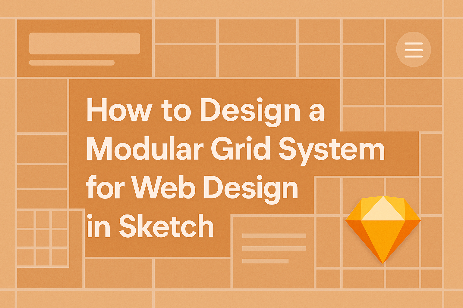
Designing a modular grid system can greatly enhance the layout of a website, making it visually appealing and easier to navigate.
By using Sketch, designers can create a flexible grid that adapts to different screen sizes while maintaining a clean and organized structure. This approach not only improves the user experience but also simplifies the design process.
Incorporating a modular grid allows for consistent spacing and alignment across various elements on the page. It provides a solid framework that can help streamline the design workflow.
With the right techniques, even beginners can master this fundamental skill in no time.
This blog post will guide readers through the steps needed to design a modular grid system in Sketch. They will learn practical tips and tools that make the process straightforward and enjoyable. By the end, they will have the confidence to implement their own grid systems effectively.
Understanding Modular Grids
Modular grids provide a structured way to design web layouts. They focus on arranging content in a clean and organized manner, making it easier to create visually appealing websites.
Defining Modular Grids
A modular grid is a layout system that divides a webpage into rows and columns. This creates a structure where elements can be placed in designated areas that fit within a grid. Each section acts like a module, creating a consistent pattern that enhances readability and usability.
In a modular grid, designers can create flexible layouts. This means various content pieces can easily align without creating clutter.
Designers often use guides in design tools like Sketch to visualize and implement these grids properly. The clear separation between elements ensures a balanced approach to web design.
Benefits of Using Modular Grids in Web Design
Utilizing modular grids in web design offers several benefits. First, they help maintain visual harmony. By aligning components within a set grid, the overall look remains consistent.
Another advantage is improved navigation. A well-structured layout leads users through the information more effortlessly. This can help keep visitors engaged with the site longer.
Additionally, modular grids reduce errors when adding or moving elements. With everything fitting neatly into the grid, designers can avoid mistakes that could disrupt the layout. This organized approach makes redesigns and updates more manageable, saving time and effort.
Setting Up Sketch for Modular Grid Design
To start designing a modular grid in Sketch, setting up the application properly is essential. This includes installing helpful plugins and configuring basic settings to streamline the design process.
Installing Plugins
Plugins enhance Sketch’s functionality, making it easier to create modular grids. One useful plugin is “Sketch Grids,” which helps in generating and managing grids efficiently.
To install a plugin:
- Open Sketch and go to the “Plugins” menu.
- Select “Manage Plugins,” then click on “Install Plugin.”
- You can find various plugins on the Sketch website or community forums.
With these tools, designers can quickly set up grids according to their project needs, improving organization and clarity in layouts.
Basic Configuration
Configuring Sketch for a modular grid begins with setting up the artboard.
- Create a new artboard using the Artboard tool.
- Adjust the dimensions to fit the intended design, like a web page or mobile interface.
Next, set up the grid:
- Go to the “Layout” section in the Inspector panel.
- Enable the grid by checking “Show Layout” and enter the desired number of columns.
- Set the gutter and margin sizes for proper spacing.
These simple steps foster a well-structured foundation for any design project, making it easier to align elements consistently throughout.
Creating a Modular Grid System
Creating a modular grid system involves careful planning and execution. Designers need to focus on determining the right dimensions, drawing the grid accurately, and using layouts and guides effectively.
Determining Grid Dimensions
The first step in creating a modular grid system is to determine the grid dimensions. This includes deciding the number of columns and the gutter width. Commonly, a 12-column grid is favored for flexibility.
Designers should consider the overall width of the design. For responsive layouts, using percentages instead of fixed pixel widths is ideal. This allows the design to adapt seamlessly to different screen sizes.
Choosing appropriate measurements helps maintain consistency. Keeping the gutters, margins, and padding uniform supports a clean design. A well-structured grid reduces clutter and guides the viewer’s eye.
Drawing the Grid
Once dimensions are set, it’s time to draw the grid in Sketch. Designers can start by creating a new artboard. Using the rectangle tool, they can define their grid area.
Next, create vertical lines using the line tool or by duplicating the rectangle for the columns. To ensure exact spacing, it’s essential to use the alignment features in Sketch. The smart guides will help snap lines into place.
After the vertical lines are set, add horizontal lines to form rows. Designers should adjust opacity or color for better visibility. Finally, grouping the shapes makes it easier to adjust later if needed.
Using Layouts and Guides
Utilizing layouts and guides is crucial in maintaining alignment. Sketch offers various options for creating and managing guides. Designers can set up custom guides to match their grid lines.
Using layout options in Sketch helps keep everything organized.
It’s advisable to use smart guides that automatically suggest alignment as elements are positioned. This saves time and enhances the grid’s functionality.
Designers should also consider using the “Layout” feature in Sketch. It allows for better control over spacing and alignment across different devices. This way, the modular grid remains consistent, whether viewed on a desktop or mobile device.
Best Practices for Designing with Modular Grids
Designing a modular grid system requires attention to detail and a clear understanding of how to balance various design elements. Key practices include ensuring content is well organized, considering responsive design, and integrating typography effectively.
Balancing Content
To create a balanced layout, designers should focus on visual weight and spacing. Each module in a grid should have equal importance to prevent one area from overpowering another. This can be achieved by aligning elements consistently and using white space wisely.
Using a grid enables the use of harmonious proportions. For example, splitting content into modules that follow a consistent size helps maintain an organized flow. Designers can experiment with varying sizes of modules while keeping a unified look.
Responsive Design Considerations
A modular grid must be flexible to adapt to different screen sizes. Designers can achieve this by using fluid grids that resize based on the viewport. To do this, they should set proportions in percentages rather than fixed pixel values.
It’s also essential to test layouts on multiple devices. Elements should stack or rearrange in a way that preserves readability and usability. Adjusting the number of columns in smaller viewports can significantly enhance user experience.
Typography and Modular Grids
Typography plays a crucial role in a modular grid’s design. Choosing the right font size and spacing can enhance content legibility.
Designers should follow a hierarchy for headings and body text, ensuring clear distinctions.
Moreover, consistent line lengths contribute to better readability. Keeping text within module boundaries supports a clean layout.
Designers should practice using different font styles to express the intended message without cluttering the design.