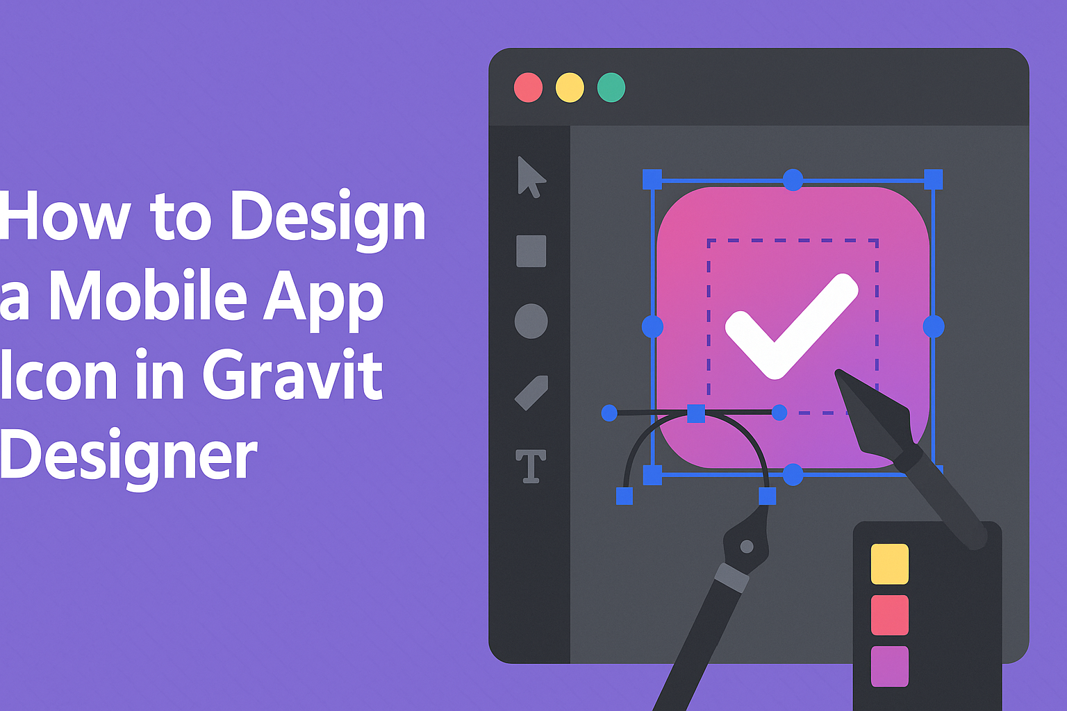
Creating a mobile app icon can greatly influence how users perceive an app. A well-designed icon serves as a visual summary of the app’s purpose and appeal.
Using Gravit Designer, users can easily craft eye-catching icons that stand out in app stores and make a memorable first impression.
In this guide, readers will learn practical steps to design a stylish and effective app icon. Gravit Designer offers a range of tools that make the design process intuitive, allowing anyone, regardless of skill level, to create professional-looking results.
By following the methods outlined in this article, users can enhance their app’s visibility and attract more downloads.
Getting Started with Gravit Designer
Gravit Designer is an accessible tool for creating stunning app icons. Understanding the interface and setting up the canvas are essential first steps.
Understanding the Interface
When first opening Gravit Designer, the user is greeted with a clean and intuitive workspace. The main areas consist of a toolbar, canvas, and layers panel.
- The toolbar at the top offers various tools for drawing, shaping, and editing.
- The canvas is the central area where designs come to life.
- The layers panel on the right helps manage different elements of the design
Previewing on Different Devices
Previewing the app icon on various devices helps ensure it appears as intended.
Each platform has specific guidelines for icon size and shape.
For instance, iOS icons should be 180 x 180 pixels, while Android typically uses 192 x 192 pixels.
Using device emulators or physical devices can help users visualize the icon within the app context.
Creating a mockup can also be a useful way to see how the icon looks on a home screen.
Adjusting the design based on these previews can help improve the icon’s effectiveness and appeal.

