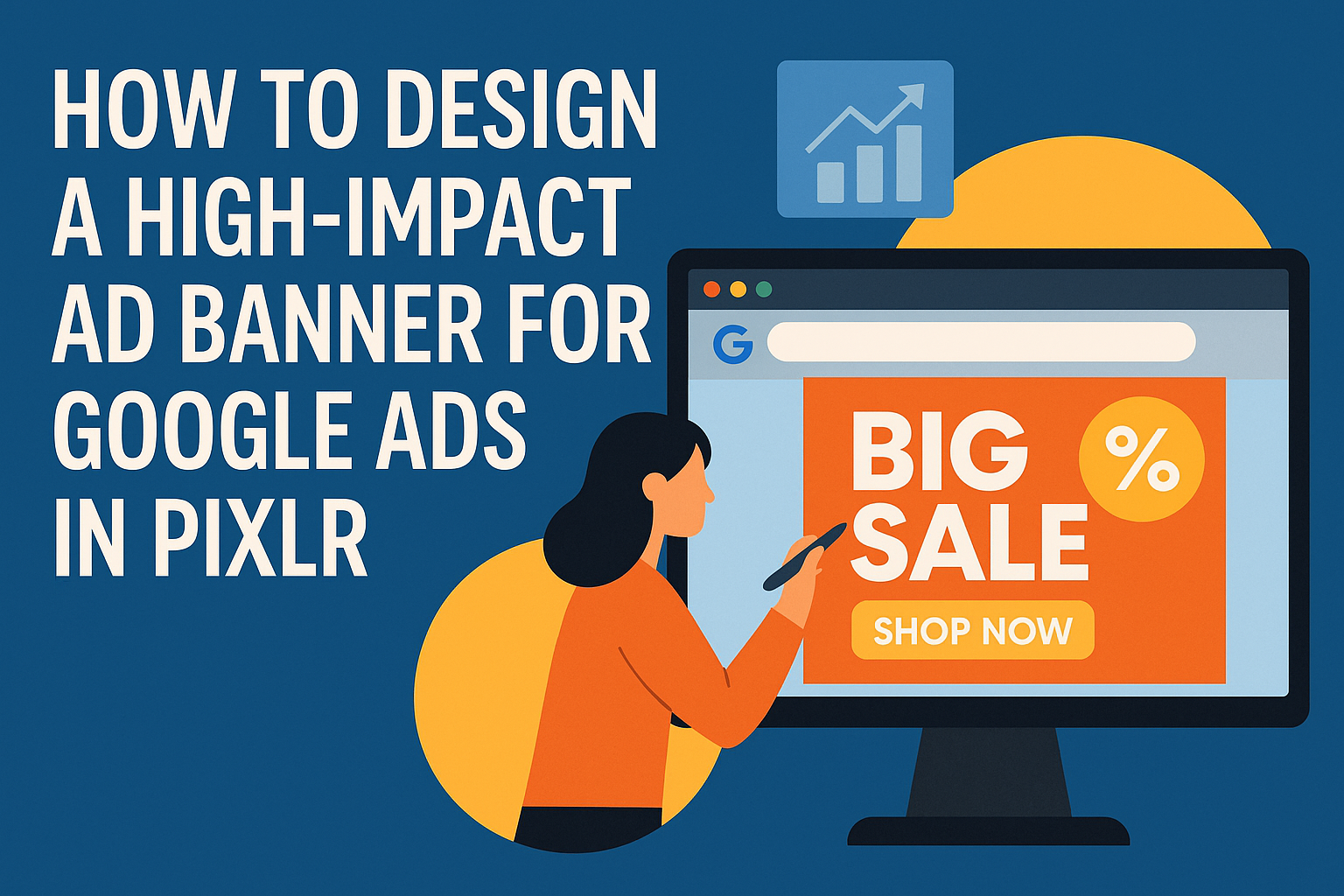
Creating an effective ad banner for Google Ads can seem challenging, but it doesn’t have to be.
Using Pixlr, anyone can design a high-impact ad banner that grabs attention and drives clicks. With the right tools and techniques, it’s possible to make visually striking banners that stand out from the competition.
In today’s digital landscape, a powerful ad can make all the difference in attracting potential customers. A well-designed banner is not just about aesthetics; it needs to convey the right message quickly and clearly.
Learning how to leverage features in Pixlr can elevate any design, making it not only visually appealing but also informative and engaging.
This blog post will guide readers through the essential steps in designing an impactful ad banner using Pixlr. By following these tips, they can create ads that not only look great but also perform incredibly well on the Google Ads platform.
Getting Started with Pixlr
Pixlr is a user-friendly graphic design tool that allows users to create stunning ad banners. Understanding the interface and setting up a canvas is essential for a smooth design experience.
Understanding the Pixlr Interface
When starting with Pixlr, the interface is intuitive and easy to navigate.
Users will find a toolbar on the left, which contains essential tools such as selection, brush, and text. Each tool has an icon that makes it easy to identify.
The options on the right allow users to adjust layers and apply filters. Layers are crucial when combining images and text without losing any original content. Users can rearrange layers as needed.
At the top, the menu bar provides access to features like file management and editing options. Familiarity with these sections will enable users to work efficiently.
Setting Up Your Canvas
Setting up the canvas is the first step in creating a banner ad.
Users can select the dimensions based on the ad type. Common sizes include 300×250, 728×90, and 160×600 pixels.
To start, click on “Create New” from the Pixlr homepage. The user can enter the desired width and height. It’s also helpful to choose a transparent background for flexibility.
After setting the dimensions, users should choose the resolution. A higher resolution ensures a crisp final product.
Once the canvas is ready, users can begin importing images and other elements to create their ad banner.
Design Basics for High-Impact Ads
Creating high-impact ad banners involves careful selection of colors, typography, and layout. Each element plays a critical role in drawing attention and communicating the message effectively.
Color Theory and Usage
Color can significantly affect emotions and perceptions. A well-thought-out color scheme can attract viewers and enhance brand recognition.
Primary Colors like red, blue, and yellow are typically vibrant and grab attention quickly.
Complementary Colors, such as blue and orange, can create a dynamic look that highlights key areas of the ad.
Using color psychology is essential; for instance, blue often conveys trust, while red can evoke excitement.
Considering the target audience when picking colors helps ensure the design resonates with them.
Typography and Readability
Typography greatly influences how the message is perceived. It’s vital to choose fonts that are clear and easily readable.
Sans-serif fonts such as Arial and Helvetica work well for online ads due to their modern look and legibility.
Using different font sizes can help emphasize important information, guiding the viewer’s eye where it needs to go.
Stick to two or three font styles to avoid a cluttered look.
Make sure that text contrasts well with the background. This enhances readability and attracts attention to the message.
Utilizing Visual Hierarchy
Visual hierarchy directs the viewer’s attention in a specific order. This is crucial for ensuring that they grasp the main message quickly.
Using size and placement effectively can help achieve this. The most important elements should be larger and positioned prominently.
Incorporating images or icons can also aid in conveying messages quickly—people often understand visuals faster than text.
For clarity, users should be able to scan the ad in a few seconds.
By strategically arranging these elements, a designer can create a more compelling and engaging ad that holds the viewer’s interest.
Creating Attention-Grabbing Elements
To design a standout ad banner, focusing on images, graphics, and clear calls to action is essential. These components can significantly influence how viewers engage with the ad and whether they take the desired action.
Incorporating Images and Graphics
Using striking images is a key element for attracting attention. The visual aspect of an ad can quickly communicate a message. It’s best to choose images that are relevant to the product or service. High-quality visuals help create a professional look.
Graphics can enhance the appeal as well. They can be used to highlight important features or create a cohesive theme. Consider using unique shapes or eye-catching colors to draw the viewer’s eye.
Tips for Using Images:
- Choose images that resonate with the target audience.
- Ensure images are not too cluttered.
- Use graphics to complement, not overwhelm, the message.
Adding Calls to Action (CTAs)
A strong call to action is critical for driving engagement. CTAs guide viewers on what to do next. Phrases like “Buy Now,” “Learn More,” or “Sign Up Today” can create urgency and encourage clicks.
Placement of the CTA is important. It should stand out within the design yet remain consistent with the overall aesthetic. Experiment with colors and fonts that contrast well.
Effective CTA Tips:
- Make CTAs prominent and clear.
- Utilize action-oriented language.
- Test different versions to see which performs best.
Optimization and Final Touches
When designing a high-impact ad banner, optimizing the file and ensuring it meets Google Ads requirements are crucial steps. The final touches can make the difference in how the ad performs.
Ensuring File Compatibility
Before exporting the banner, it is essential to check for file compatibility. Google Ads accepts several file formats, including JPG, PNG, and GIF.
Make sure the file size does not exceed 150 KB for better loading times. A quick loading banner improves user experience and increases engagement.
Additionally, maintain a resolution of at least 72 DPI to ensure clear images. Using the right dimensions will prevent any distortion in the final product.
Using tools within Pixlr, users can compress images without sacrificing quality. Checking these details helps ensure the banner looks professional and meets all advertising standards.
Previewing and Exporting Your Ad
Once the design is complete, it’s time to preview the ad. This step allows for spotting any errors or necessary adjustments before finalizing.
Using the preview feature in Pixlr, you can see how the ad will look on different devices. It’s crucial to ensure the text is readable and visuals appear sharp.
When ready to export, choose the appropriate file format based on the earlier assessment.
Select PNG for high-quality images or GIF for simple animations.
After exporting, double-check the file size and resolution once again. This final check ensures that the ad runs smoothly on Google Ads and effectively attracts viewers.