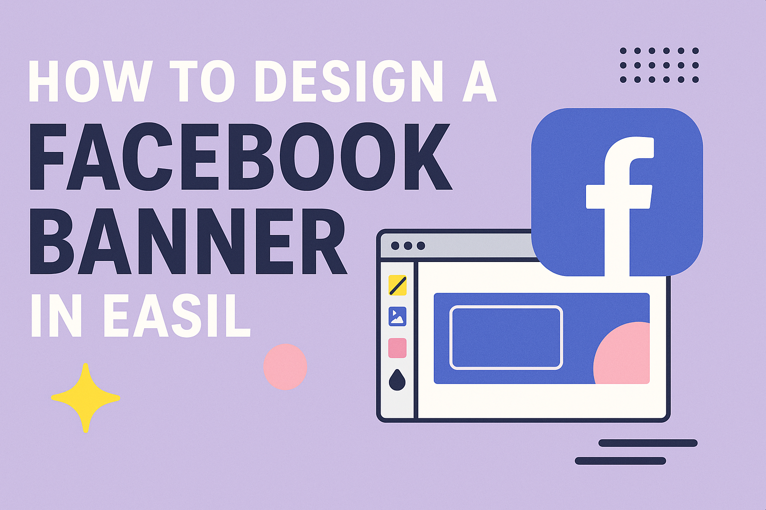
Designing a Facebook banner can seem overwhelming, but with the right tools, it becomes a fun task.
Using Easil makes the process simple and enjoyable, allowing anyone to create eye-catching banners in just a few clicks.
With its customizable templates and user-friendly interface, it provides an excellent platform for both personal and business needs.
Whether it’s sprucing up a personal profile or promoting a business, a well-designed Facebook banner grabs attention.
Easil offers a variety of options, from vibrant graphics to sleek layouts, which can fit any theme or occasion. This flexibility ensures that users can express their unique style and make a lasting impression on their audience.
Getting started is easy, and the results can enhance any Facebook page significantly.
By following some simple steps, anyone can transform their ideas into striking visuals that stand out in the crowded social media space.
With Easil, creating a professional-looking banner is not just possible; it’s also quite enjoyable.
Understanding Facebook Banner Dimensions
Getting the dimensions right for a Facebook banner is crucial for making a strong visual impact.
Different sizes cater to various uses, and knowing these can help create a more effective design.
Standard Banner Sizes
The standard size for a Facebook cover photo is 820 pixels wide by 312 pixels tall. This size is ideal for desktops and laptops.
For mobile users, the banner shows more like 640 pixels wide by 360 pixels tall.
When designing, keep in mind that these dimensions help ensure that important content stays visible across devices.
Designers should also consider using a resolution of at least 72 DPI for better image quality.
If a user wishes to incorporate video, 820 x 312 pixels is the recommended size with a maximum file size of 1.75 GB. This ensures the video looks sharp without being too large to upload.
Mobile vs. Desktop Considerations
Designing for both mobile and desktop is important. The experience can differ a lot because of size variations.
On mobile devices, users see a different portion of the banner. Therefore, placing key elements like text and logos in the center helps.
It’s wise to preview the design on both types of screens. This helps ensure that nothing is cut off or difficult to read.
Using bold colors and simple fonts can also improve visibility. Keeping text minimal allows users to quickly grasp the message, whether they’re on a desktop or a mobile device.
Choosing Your Design Elements
When designing a Facebook banner, selecting the right elements is key to making an impact. The design should connect with the audience clearly and effectively, focusing on images, colors, logos, and typography.
Selecting Attention-Grabbing Images
Images can make a big difference in attracting attention. They should relate to the message or theme of the banner. A clear, high-quality image will draw the viewer in.
Using Easil, he can easily browse through various graphics available in the library.
Consider using images of people, products, or landscapes that resonate with the target audience.
He might also think about the composition. A well-placed image can balance the design and guide the viewer’s eye. Remember, the image should enhance the message rather than overwhelm it.
Incorporating Brand Colors and Logos
Brand colors help create recognition and trust. When designing a banner, it’s important to stick to the brand’s color palette. This consistency strengthens the overall message.
Logos should be included but positioned thoughtfully. He can place the logo at a corner or center it according to the design flow. The size matters too; it should be visible but not overpowering.
Using shade variations can also create visual interest. He can use lighter or darker versions of primary colors to add depth without straying from the brand identity.
Utilizing Typography Effectively
Typography is an essential element in conveying information and mood. The right fonts help capture attention and ensure readability.
He should select fonts that match the brand’s voice—be it casual, formal, or playful.
It’s best to limit the number of fonts. Using one or two types creates a cohesive look. He can combine a bold font for headings with a simpler font for body text.
Size and contrast play crucial roles too. Text should be large enough to read easily on mobile devices. He should also use contrast—light text on dark backgrounds or vice versa—to enhance visibility.
Using Easil’s Design Tools
Easil provides a user-friendly platform for creating stunning Facebook banners. With its intuitive design tools, users can easily navigate the interface, customize templates, and add unique visual effects.
Navigating the Interface
When starting with Easil, getting familiar with the interface is key.
The dashboard displays all available templates, which are organized by categories like social media, events, and promotions. Users can access their projects through the “My Designs” section.
On the left side, design tools appear, including text options, layering tools, and elements.
Each tool is easy to understand, making it simple to select and modify components on the canvas.
To enhance the experience, Easil allows users to simply drag and drop elements, making design adjustments quick and efficient. This encourages creativity while minimizing frustration.
Customizing Templates
Easil offers a vast library of templates that are fully customizable.
After selecting a template, users can start editing right away. They can change background colors, fonts, and text sizes to match their brand.
Adding images is also straightforward. Users can upload their own or choose from Easil’s stock images.
Each template features editable text boxes, allowing users to write their own messages. They can also experiment with layout options to see what fits best. Modifying elements helps create a unique banner that stands out.
Adding Visual Effects
Easil’s design tools include options for visual effects that enhance a banner’s appeal.
Users can apply filters to images or add overlays for depth.
Simple effects, like shadows and highlights, can make text pop against the background.
Users can also adjust the transparency of elements, creating a layered look that grabs attention.
Easil provides features such as animations for dynamic designs. This can bring a banner to life, making it more engaging for viewers. Users can easily apply these effects to elevate their Facebook banners.
Optimizing for Engagement
To create an effective Facebook banner, it’s important to focus on engaging visitors. This can be achieved through strategic placement of calls-to-action and a proper balance of content and white space.
Call-to-Action Placement
The placement of a call-to-action (CTA) significantly influences user interaction.
It should be clear and easily visible. Placing the CTA in a spot where it naturally draws the eye—like the center or a corner—can make a big difference.
Using contrasting colors can help the CTA stand out against the background. Phrases like “Join Now” or “Learn More” are straightforward and effective.
Testing different placements can reveal what works best for the specific audience.
Balancing Content and White Space
White space is crucial in design as it creates breathing room for content. A cluttered banner might overwhelm viewers and lead to disengagement.
By mixing rich visuals with ample white space, the design appears modern and inviting.
Keep the message clear and focused. Highlight key points with bullet points or short phrases. This helps grab attention without overloading the viewer.
Striking a balance enhances the overall appeal.