Creating a custom landing page layout can greatly improve user experience and lead generation. A well-designed landing page in Affinity Designer can showcase products effectively, guide users smoothly, and boost conversion rates.
With the right tools and techniques, anyone can create a visually appealing and functional landing page that meets their specific needs.
In this article, readers will discover practical steps to design a landing page that stands out. From selecting the right templates to customizing elements, the process will be broken down for clarity.
By the end, they will feel empowered to craft their own unique designs that capture attention and drive results.
Getting Started with Affinity Designer
Affinity Designer is a powerful tool for creating stunning designs. To use it effectively, it’s important to understand the system requirements, get familiar with the interface, and know the difference between vector and raster environments.
System Requirements and Setup
Before starting with Affinity Designer, check the system requirements.
For Windows, a minimum of 4 GB of RAM is needed, while 8 GB or more is recommended for smoother performance.
For macOS, users need at least 2 GB of RAM, but 4 GB or more enhances the experience. It runs on macOS 10.9 or later and Windows 10 or newer, ensuring compatibility.
Users can download the software directly from the official Affinity website. Installation is straightforward.
After downloading, follow the prompts to install and activate the software. It’s a good idea to restart the computer after installation to ensure everything works smoothly.
Familiarizing Yourself with the Interface
The Affinity Designer interface is user-friendly and efficient.
On the left, you’ll find the Tools Panel, which contains essential tools for creating designs. This includes selection, pen, and shape tools.
At the top, the Menu Bar provides access to different features, including file management, editing, and adjustments.
The Context Toolbar changes according to the selected tool, offering relevant options. The Layers Panel on the right helps manage different elements in a design.
Spending time exploring these panels will make navigation much easier. Experimenting with each tool can also boost confidence when designing.
Understanding Vector and Raster Environments
Affinity Designer uses both vector and raster environments.
Vectors are made up of paths defined by mathematical equations, allowing for infinite scaling without losing quality. This is useful for logos and icons.
Rasters, on the other hand, are pixel-based. This means that resizing them can lead to blurriness or pixelation. Rasters are ideal for detailed images like photographs.
Understanding when to use each type is crucial in design projects. For example, using vectors for graphics and rasting for images in a layout ensures the best quality.
Knowing the strengths of each environment will help in making effective design choices.
Planning Your Landing Page Layout
A well-designed landing page starts with careful planning. The layout must align with the goals of the page, guiding visitors smoothly from one section to another. Key steps include defining the purpose, sketching a wireframe, and choosing a suitable color scheme and typography.
Defining the Purpose and Goals
Before creating the layout, it’s essential to understand the landing page’s purpose. Is it to collect leads, sell a product, or promote an event? Defining clear goals will help shape the design.
Each element on the page should support these goals. For example, a lead generation page might feature a prominent sign-up form.
Keeping the main objective in mind will ensure the design is focused and effective.
Sketching a Wireframe
Once the purpose is clear, sketching out a wireframe is the next step. A wireframe is a simple layout that shows where elements will be placed. This helps visualize the structure before diving into design.
The wireframe should include key components like headers, images, text blocks, and call-to-action buttons. This planning stage allows for quick adjustments and offers a roadmap to follow during the design process.
Choosing a Color Scheme and Typography
Colors and typography create the mood and impact of the landing page. Choosing a color scheme that aligns with the brand is crucial.
Colors should be visually appealing and should evoke the desired feelings from the audience.
Typography also plays a vital role. Selecting easy-to-read fonts ensures visitors can absorb the information quickly.
Combining a clear layout with thoughtful color and font choices leads to an inviting and effective landing page.
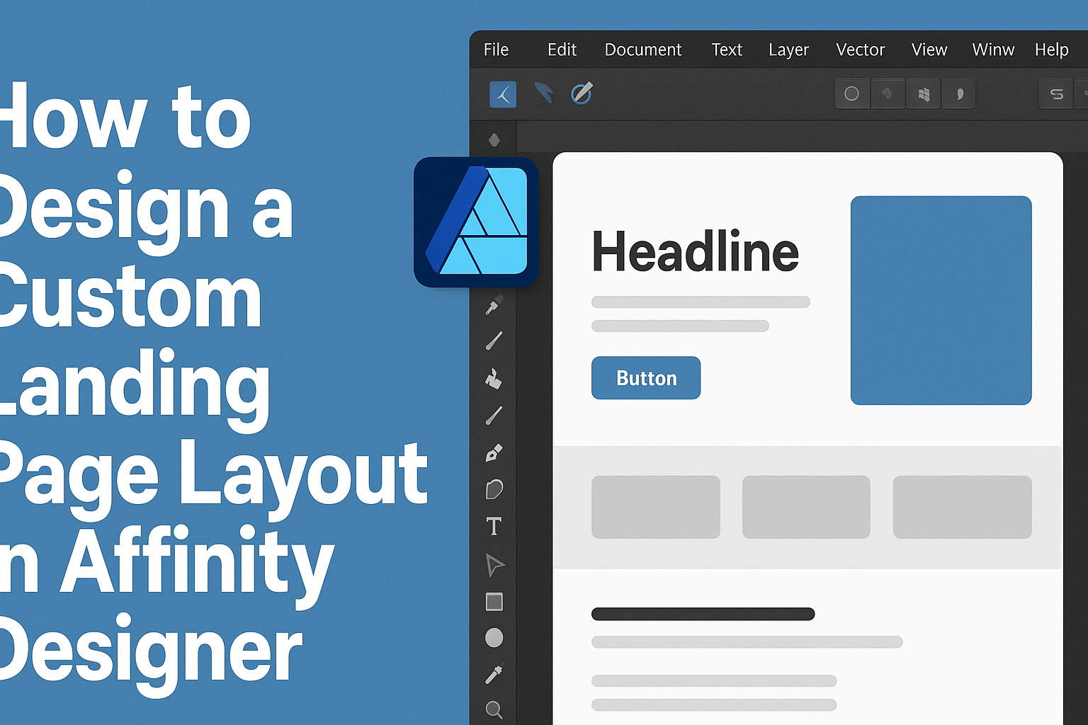
Creating the Layout in Affinity Designer
In this section, key steps for designing a landing page layout in Affinity Designer will be discussed. This includes setting up documents, designing headers, adding content, and more. Each part is essential for creating an effective and appealing landing page.
Setting Up Your Document
To start, create a new document in Affinity Designer. This can be done by selecting “File” and then “New.”
A common size for web pages is 1920×1080 pixels, but the size can be adjusted based on specific needs or preferences.
Next, it’s helpful to set the DPI to 72 for optimal screen display. Color mode should be RGB, as it’s ideal for digital design.
Lastly, organizing the layers from the start can make the design process smoother.
Designing the Header and Navigation
For the header, use a rectangle tool to create a space at the top of the page. It’s wise to keep the height around 80-100 pixels.
Adding a logo can enhance brand recognition. You can place it on the left side of the header.
Next, create a navigation menu with clear text links. Use a simple font for readability.
Font sizes around 16-20 points are common for menu items. Ensure the colors contrast well for visibility.
This area sets the tone for the whole page.
Adding Content Sections
When adding content sections, planning the layout is crucial. Divide sections using rectangles or guides to maintain consistency.
For text blocks, a common layout includes headlines, subheadings, and body text. Ensure that headlines are larger to grab attention.
Using bullet points can help organize information clearly.
Images can complement text and make sections more visually appealing. Maintain a consistent margin around these elements for a neat look.
Incorporating Visual Elements
Visual elements can greatly enhance the design. Icons, shapes, or images can make the landing page more engaging.
It’s best to stick to a consistent color scheme throughout the page. You can use color palettes to maintain harmony and brand identity.
Additionally, incorporating white space encourages readability. This helps direct focus to the most important parts of the layout.
Using shadows or gradients can add depth. These small details can make a big difference in visual appeal.
Finalizing the Footer
The footer is an important part of the layout. Allocate enough space for contact information, social media links, or additional navigation.
A simple design can work best here. You can use smaller font sizes, usually around 12-14 points, to differentiate it from the main content.
Including links to privacy policies or terms of service can be helpful.
Lastly, ensuring that the footer matches the overall design will create a cohesive look across the entire page.
Exporting and Testing the Design
When completing a landing page design in Affinity Designer, it’s essential to ensure it looks great across various devices and platforms. This section covers the best export options and how to check the design’s responsiveness along with cross-browser compatibility.
Export Options for Web
When exporting from Affinity Designer, the right format matters. Designers should consider using JPEG for images with many colors, while PNG is best for graphics that need transparency.
For web graphics, exporting assets as SVG can keep the design crisp at any size. Here’s a quick reference for export settings:
- JPEG: Good for photos
- PNG: Ideal for logos and graphics
- SVG: Perfect for scalable vector graphics
Ensure to check the quality settings for web formats. Use a resolution of 72 DPI, as it’s standard for online use. This will keep images lightweight and fast-loading.
Checking Responsiveness and Cross-Browser Compatibility
After exporting, it’s crucial to test how the landing page behaves on different devices and browsers.
The design should adapt smoothly from desktop to mobile.
Use tools like Google Chrome’s Developer Tools to view how the design looks in various screen sizes. Here are some steps to follow:
- Open the page in Chrome.
- Right-click and select “Inspect.”
- Click the device icon to toggle the device toolbar.
For browser compatibility, consider utilizing services like BrowserStack or CrossBrowserTesting.
These platforms help test how the landing page performs on different browsers, ensuring a consistent experience.