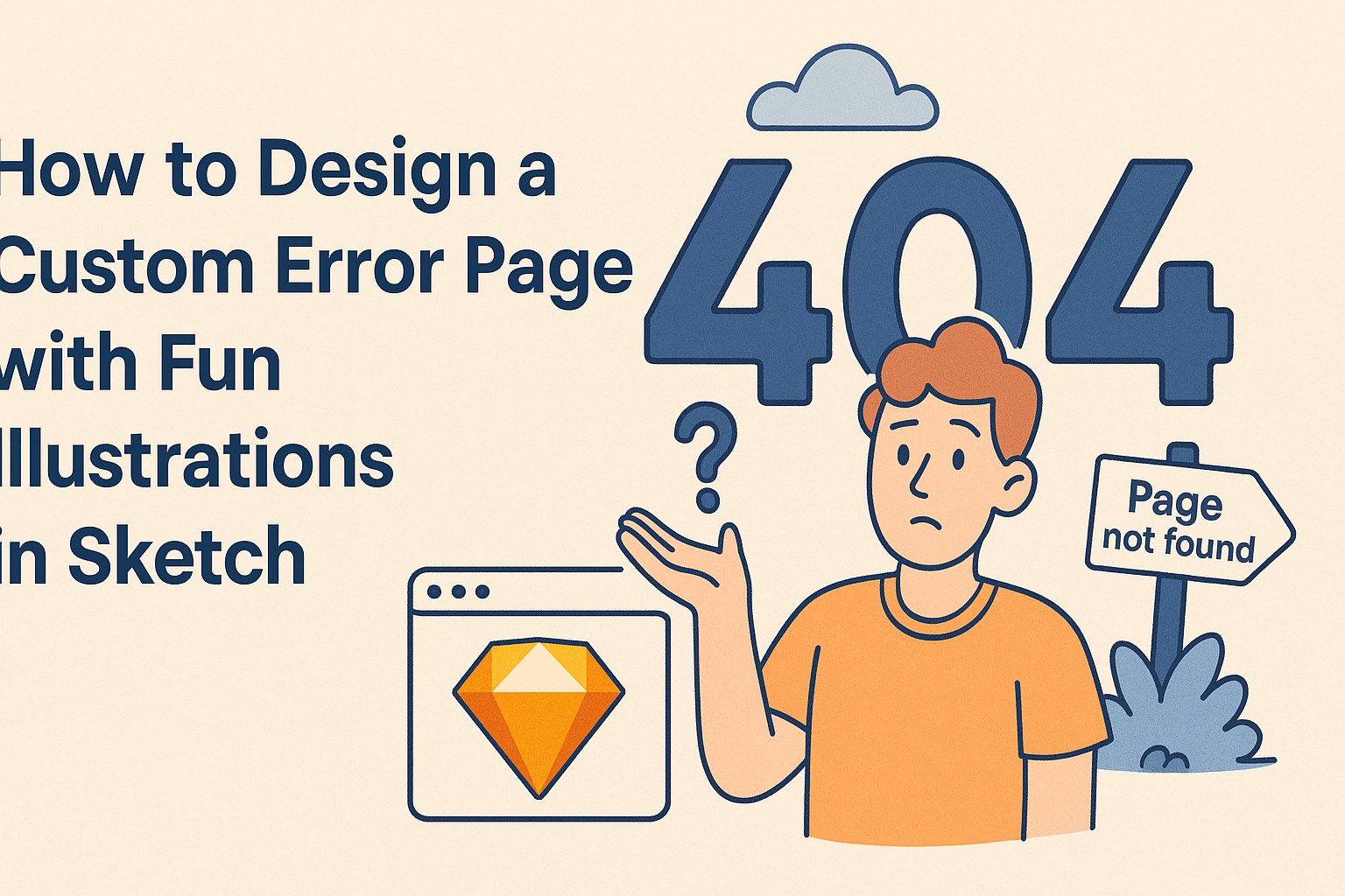
Creating a custom error page with fun illustrations can transform a frustrating experience into something enjoyable.
Designing a unique error page not only engages users but also reflects a brand’s creativity and personality.
With tools like Sketch, anyone can design illustrations that may bring a smile instead of disappointment when mistakes happen online.
This post will guide readers through the process of designing an eye-catching error page that stands out. Step-by-step, he or she will learn how to pair playful graphics with helpful messages, ensuring that users feel supported even when things go wrong.
The tips will cover choosing the right illustrations, crafting a friendly tone, and integrating brand elements seamlessly.
By the end of the article, anyone can design a custom error page that not only communicates effectively but also delights visitors. Fun, engaging error pages can make all the difference in a user’s experience, encouraging them to stay on the site.
Understanding Custom Error Pages
Custom error pages serve a vital role in website user experience. They can turn a frustrating moment into a more enjoyable and helpful interaction. Here’s a closer look at their purpose and some best practices.
The Purpose of a Custom Error Page
A custom error page, like a 404 page, informs users when they try to access a page that doesn’t exist. Instead of showing a generic error message, a creative page can soften the blow.
It can include fun illustrations and maintain the site’s branding.
The main goals are to guide users back to functioning parts of the site and reduce frustration. Providing options, such as links to the homepage or a search bar, keeps users engaged. A well-designed page can leave a positive impression, even amidst an error.
Common Error Page Best Practices
To create an effective custom error page, designers should follow a few best practices:
- Clear Messaging: Use friendly and straightforward text. Inform users clearly about the error and what they can do next.
- Brand Consistency: Keep the design consistent with the overall branding. This approach makes the page feel like a part of the site rather than a disjointed experience.
- Helpful Links: Include links to important pages, such as the homepage or popular content, to guide users.
- Visuals: Fun and relevant illustrations can lighten the mood and engage users. An image can make the experience more pleasant.
- Search Functionality: Adding a search bar allows users to find what they originally sought.
Implementing these practices can improve user experience, even during mistakes.
Setting Up Sketch for Illustration
Before diving into creative illustrations, it is essential to set up Sketch correctly. This ensures that everything runs smoothly and the design process is efficient.
Familiarity with the tools available and how to start a new project will help make the workflow easy and enjoyable.
Getting Started with Sketch
To begin using Sketch, the user should download and install the application on their computer. After launching it, they can create a new document by simply clicking on “File” and selecting “New.”
Setting the appropriate artboard size is crucial since this will define the canvas for their illustrations.
They can choose from various presets based on the type of project. For example, a standard web page might require a 1440×1024 artboard, while a mobile app may need a 375×667 size.
Once the artboard is set, it’s beneficial to organize layers and groups from the start. This organization makes it easier to access different components later.
Sketch Tools Overview
Sketch offers a variety of tools that assist in creating fun illustrations.
The Shape tool is excellent for drawing basic shapes like circles and rectangles. Users can easily adjust the size and color, allowing them to create visual elements quickly.
The Pen tool is crucial for more complex designs. It allows users to create custom shapes and paths, giving them the freedom to express creativity.
Additionally, the Text tool helps in adding any written content, which can be essential for error messages or descriptions.
Other helpful tools include effects like shadows and blurs, which can enhance illustrations. Users can also use Symbols to reuse design elements across multiple pages, saving time and maintaining consistency in the design.
Familiarizing oneself with these tools will significantly improve the user’s ability to create engaging error pages.
Designing Your Illustrations
Creating engaging illustrations for error pages involves careful planning and creativity. Focus on brainstorming ideas, mastering Sketch for illustration, and infusing personality into the designs to make them stand out.
Brainstorming and Sketching Concepts
To begin, it’s essential to brainstorm ideas that resonate with the user experience.
She can gather inspiration from various sources, such as popular culture, memes, or even company branding. Creating a mood board can help visualize concepts.
Encourage sketching rough ideas on paper or a digital tablet. This stage allows for experimentation with different styles and characters.
It’s important to consider the tone of the error page. Should it be humorous, quirky, or calming? This choice will affect the illustration style significantly.
A short list of potential themes could include animals, playful characters, or even objects like broken machinery. These concepts set the foundation for what will become delightful illustrations.
Creating Illustrations in Sketch
Once ideas are solidified, it’s time to create the illustrations in Sketch. This tool offers flexibility and precision, allowing for detailed designs.
Start by creating a new artboard that matches the dimensions needed for the error page.
Using vector shapes will make it easier to adjust sizes without losing quality. She should utilize Sketch’s built-in libraries for icons and other design elements. Combining these with custom illustrations can yield unique results.
Experimenting with colors is crucial. A vibrant palette can attract attention and convey emotion.
It’s advisable to stick to two or three primary colors for consistency, ensuring it aligns with the brand’s identity.
Adding Personality to Your Illustrations
Personality makes illustrations memorable. Adding distinctive features or expressions can create a connection with the user. Small details, like funny facial expressions or unique outfits, can enhance relatability.
Consider using elements that reflect the brand’s voice. For example, if a company has a playful image, whimsical characters would be appropriate.
She can also incorporate interactive elements, like animations, to engage users further.
Lastly, ensure that the illustrations fit within the overall design of the error page. Cohesion between text and images helps convey a clear message, making the error page feel less frustrating.
Integrating Illustrations with Your Error Page
Incorporating illustrations into an error page can enhance user experience significantly. This section covers important steps for exporting the designs from Sketch and implementing them on a website.
Exporting Assets from Sketch
To integrate illustrations effectively, the first step is exporting them from Sketch. This process ensures that the files are in the right format for web use.
- Select the Asset: Click on the illustration you want to export. Make sure it is fully prepared and doesn’t contain any unwanted layers.
- Export Settings: In the right sidebar, under the “Export” section, choose the desired format. Common formats include PNG and SVG, which are great for web graphics.
- Resolution: Consider setting the resolution for high-quality visuals. A standard size of 2x or 3x can ensure the illustration looks sharp on all devices.
- Export: Click the “Export” button. Save the files in a dedicated folder for easy access later.
This systematic approach helps create high-quality assets ready for web implementation.
Implementing on the Web
Once the illustrations are exported, the next step is placing them into the error page.
This requires a few key actions to ensure proper function and appearance.
- HTML Structure: Create a simple HTML structure for the error page.
Use semantic tags like <header>, <main>, and <footer> for better accessibility.
- Insert Assets: Use the
<img>tag to add the illustrations.
Ensure you link to your exported files correctly.
- Styling: Use CSS to position and style the illustrations.
Consider using flexbox or grid layout for better alignment. Add margins and paddings to ensure everything looks balanced.
- Testing: After implementing all elements, preview the page in different browsers.
Make adjustments to ensure the page displays correctly across devices.