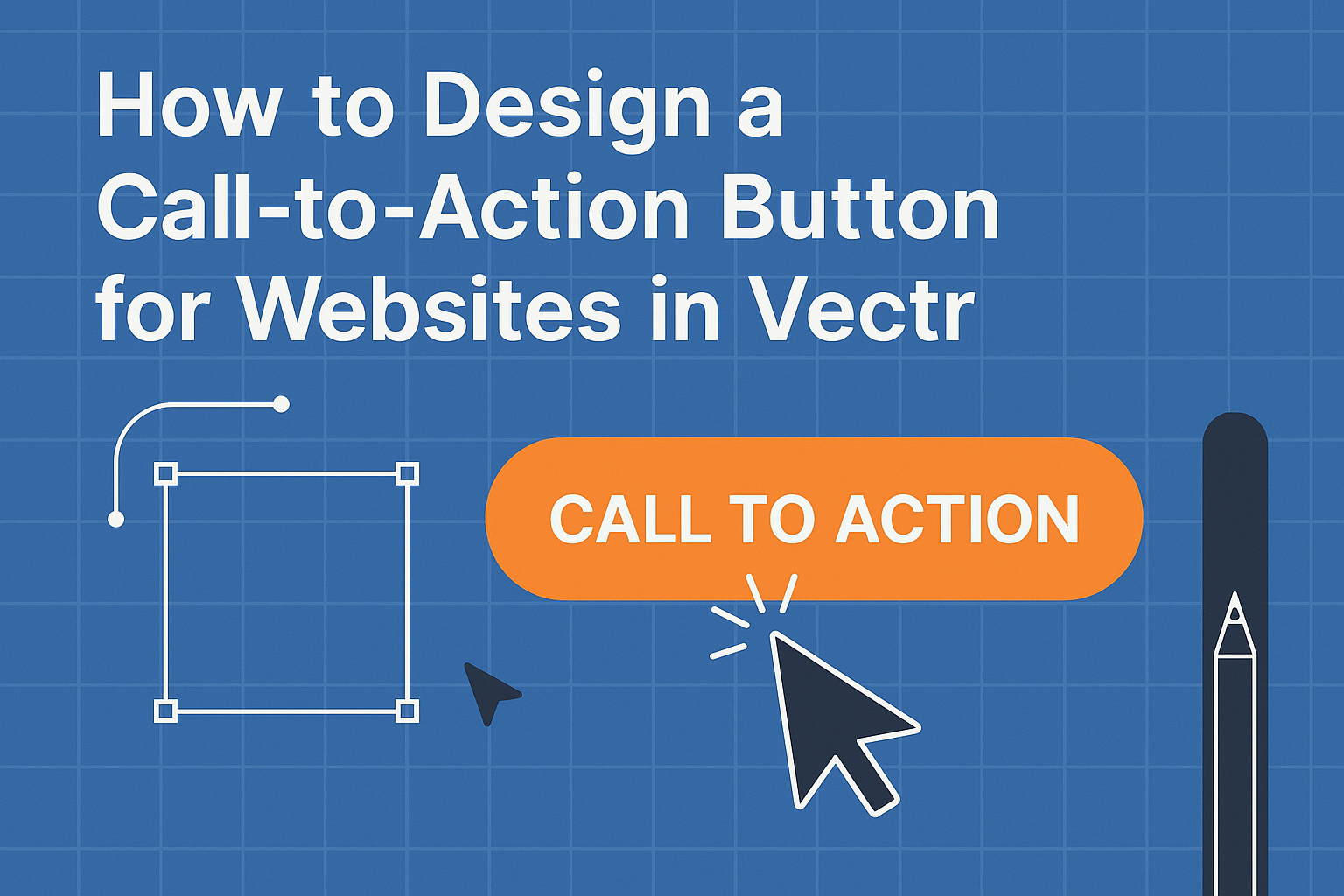
Creating an effective call-to-action button is essential for any website looking to boost engagement and conversions.
A well-designed CTA button can significantly increase click-through rates and drive user actions.
By using Vectr, a user-friendly design tool, anyone can craft eye-catching buttons that draw visitors in.
Understanding the elements that make a CTA button successful is key.
Factors like color, size, and placement all play a role in attracting attention and prompting action.
By following best practices and utilizing Vectr’s features, designers can create buttons that not only look great but also perform well.
With the right techniques and guidance, designing a compelling call-to-action button becomes a manageable and rewarding task.
This post will explore step-by-step advice on how to leverage Vectr for creating CTAs that truly engage users and enhance website effectiveness.
Understanding Call-to-Action Buttons
Call-to-action (CTA) buttons are vital for guiding users toward specific actions on a website. They encourage visitors to engage more, whether by signing up, making a purchase, or learning more about a service.
This section covers the psychology behind CTAs and essential components that make them effective.
The Psychology Behind CTAs
Understanding the psychology of CTAs helps in designing buttons that resonate with users.
Colors, shapes, and sizes play significant roles in how users perceive a button.
For instance, bright colors can grab attention, while softer shades may encourage calm and trust.
Using action-oriented language like “Get Started” or “Join Now” creates a sense of urgency. This prompts users to make quick decisions.
Additionally, placing CTAs in visible areas, such as above the fold or at the end of compelling content, leverages attention and fosters engagement.
Key Components of an Effective CTA
Effective CTAs consist of several key components that enhance user interaction.
Text is crucial; it must be clear, direct, and action-oriented. For example, phrases like “Try Our Free Trial” motivate users to act.
Design elements such as contrasting colors help CTAs stand out against the webpage background. The button’s size should also be adequate for visibility but not so large that it overwhelms other content.
Moreover, placement is critical. CTAs should be strategically located in areas where users are most likely to engage, like at the end of an article or in pop-ups.
Utilizing these components ensures that CTAs capture attention and drive user actions effectively.
Designing in Vectr
Vectr provides a user-friendly platform to create effective call-to-action buttons. Users can utilize its tools and features to design visually appealing buttons that can increase engagement on websites.
Getting Started with Vectr
To begin, users need to create an account or log into Vectr.
Once in, he or she can start a new project by selecting a blank canvas or using a template.
It’s essential to choose the right canvas size based on the website design.
The interface is straightforward, allowing users to easily navigate through different functions.
Users can adjust the dimensions, helping them visualize the button’s final size on their web pages.
Additionally, Vectr saves projects automatically, which means there’s no need to worry about losing work.
Users can share their designs instantly using a unique URL, making collaboration easy.
Exploring the interface at this stage will pay off later as it helps in speeding up the design process.
Vectr’s Tools and Features
Vectr is equipped with various tools that simplify the design process.
The shape tool helps create geometric forms like rectangles and circles, perfect for button designs.
Users can also apply colors and gradients to make the buttons stand out.
Another important feature is layers. With layers, users can arrange elements efficiently. It allows you to send a button to the back or bring it to the front easily.
The text tool is also vital for adding engaging words to the button. Choosing the right font style and size is crucial for readability.
Furthermore, export options allow users to download their designs in different file formats like PNG or SVG for use on websites.
Creating Your Button Shape
Designing a button shape in Vectr starts with selecting the appropriate base shape. For example, a rectangle is commonly used for buttons.
Users can easily adjust its dimensions by dragging the corners.
To create a rounded button, they can adjust the corner radius within the properties panel. This adds a modern touch to the design.
Applying a contrast color will ensure the button stands out against the background.
Adding a border can give the button a defined appearance as well.
Once the shape is done, it’s essential to group it with any text or icons. This keeps all elements aligned when moving or resizing the button.
Stretching creativity in this stage will lead to a unique and appealing design.
Styling Your CTA Button
Choosing the right style for a call-to-action (CTA) button is crucial for grabbing attention and encouraging clicks.
Key elements like color, typography, and the use of icons all contribute to how effective the button will be.
Color Theory and Contrast
Color is a powerful tool in design. It can evoke emotions and drive actions.
When styling a CTA button, it’s essential to pick a color that stands out against the background.
Consider using contrasting colors to make the button more visible. For instance, a bright yellow button on a dark blue background can attract attention.
Also, colors like red or green can signify urgency or safety, respectively.
It’s important to ensure the button color aligns with the brand’s identity. The use of a secondary color can complement the primary brand color, enhancing recognition while maintaining clarity.
Typography and Readability
Typography is another important factor in button design. The font should be easy to read at a glance.
Sans-serif fonts often work well for this purpose since they are clear and modern.
The font size should be large enough to ensure visibility, especially on mobile devices. A bold style can also make the button text stand out.
Ensuring good readability will help users quickly understand the action they are being asked to take.
Alignment and spacing also matter. Proper padding around the text makes the button feel more clickable. A well-spaced button can improve user experience and contribute to better conversion rates.
Incorporating Icons and Images
Using icons alongside text can enhance a CTA button’s appeal. An icon can clarify the action and make the button more engaging.
For example, a shopping cart symbol on a “Buy Now” button signals exactly what will happen.
It’s important to choose icons that are simple and intuitive. They should not clutter the design but rather complement the text.
The icon’s color should match or contrast with the button color to maintain harmony.
Images may also be used, but they should be relevant. Any image should not overpower the button’s message.
Keeping the design clean ensures that the main action remains clear and directs the user’s attention effectively.
Testing and Optimization
Testing and optimization are vital for ensuring a call-to-action (CTA) button performs effectively. By carefully evaluating the design and placement of the button, web designers can enhance its impact on user engagement.
Three key areas to focus on are previewing the design, conducting A/B testing, and using iterative design methods.
Previewing Your Design
Before launching a website, it’s essential to preview the CTA button design.
Vectr allows designers to visualize how the button will appear on different devices. They can adjust colors, sizes, and placements based on the target audience’s preferences.
This step helps identify potential visual issues that may affect user interaction.
Designers should check for clarity and legibility. If text is hard to read or if the color blends with the background, users may miss the button.
Always ensure that the CTA stands out enough to catch attention.
A/B Testing Your CTA
A/B testing is a powerful method for optimizing CTA buttons.
It involves creating two versions of the button, changing a specific element, such as color or text. Then, the designer can measure which version leads to more clicks and conversions.
For example, one button might use the phrase “Get Started” while another says “Join Now.”
Analyzing user behavior can clarify which wording resonates more. Tools like Google Optimize can assist with tracking results effectively.
Iterative Design for Better Performance
Iterative design involves continually refining the CTA button based on user feedback and performance data.
After A/B testing, designers should apply the insights gained to enhance the button’s appeal and effectiveness.
Using analytics tools, they can assess how users interact with the button over time. If the click-through rate decreases, it’s a signal to revisit the design.
Making small, data-driven adjustments consistently helps improve performance and user experience.
Emphasizing these testing and optimization strategies will ensure a CTA button captures users’ attention and drives desired actions effectively.