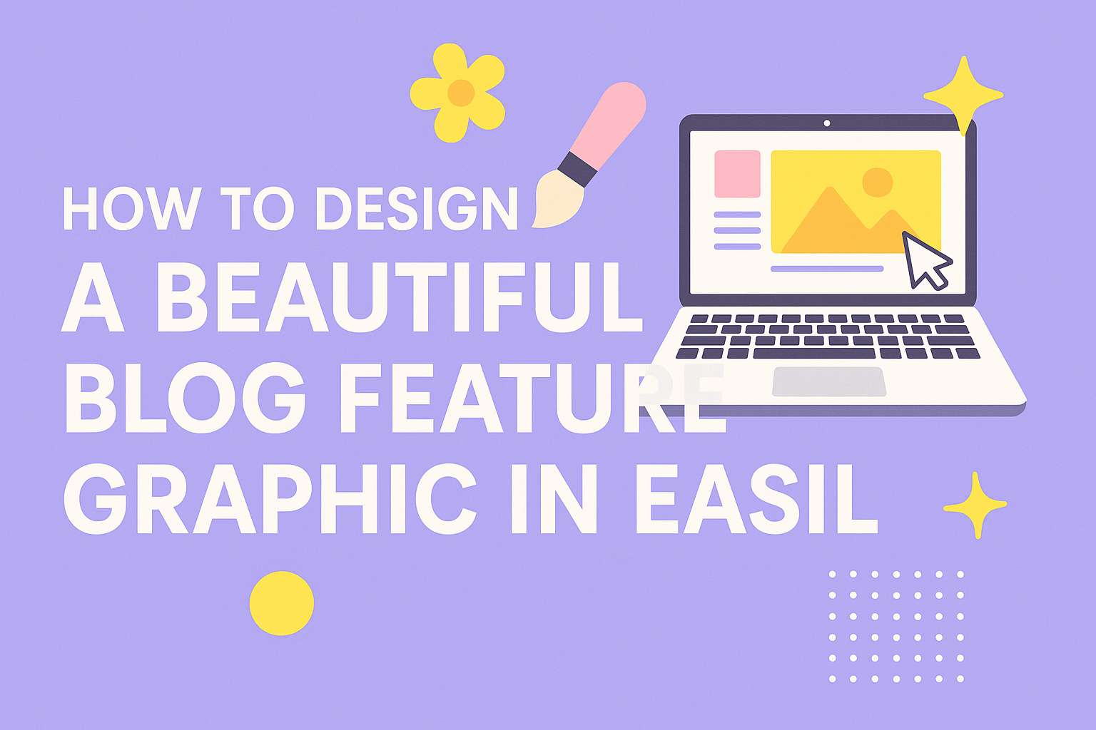
Creating a stunning feature graphic for a blog can greatly enhance its appeal and draw in readers.
To design a beautiful blog feature graphic in Easil, she can use eye-catching templates that are easy to customize. These templates make her visuals look professional without any design experience. With the right tools, she can transform her content and capture the attention of her audience.
Effective graphics not only add beauty but also convey information at a glance. By using Easil’s design features, they can easily integrate their brand colors, fonts, and images to create a cohesive look. This will help her blog stand out in crowded feeds and increase engagement.
Whether she is a beginner or has some design skills, Easil offers various tools that simplify the creative process.
With a little time and effort, designing an attractive blog graphic can be both enjoyable and rewarding.
Understanding the Importance of Blog Feature Graphics
Blog feature graphics play a crucial role in attracting readers and enhancing their experience. They not only catch the eye but also communicate key themes of the content. A well-designed graphic can encourage more shares and engagement from visitors.
The Role of Visuals in Blog Engagement
Visuals are essential for capturing attention in a crowded online space. Studies show that articles with images receive 94% more views than those without. This is because visuals help break up text, making it easier to digest.
When readers scroll through their feeds, a striking graphic can stop them in their tracks. It encourages them to click on the article. Monetized blogs especially benefit from this increased traffic, leading to more potential ad revenue or product sales.
Furthermore, visuals can evoke emotions and connect with the audience. Colors and shapes carry different meanings, which can influence how readers feel about the content. Thus, choosing the right visuals is key to enhancing blog engagement.
Key Elements of an Attractive Blog Graphic
An attractive blog graphic should have several key elements.
First, colors should align with the blog’s theme. Using a consistent color scheme can create a sense of harmony. This helps establish brand identity.
Second, fonts should be clear and easy to read. It’s recommended to stick to 2-3 fonts to maintain consistency across all graphics. Mixing too many styles can look chaotic.
Third, the composition should guide the viewer’s eye to important elements. Strategic placement of the title, images, and any icons can create a balanced look. Lastly, incorporating icons or illustrations can add personality and make the graphic more engaging.
By focusing on these elements, a non-designer can effectively create eye-catching visuals that enhance overall blog attractiveness and engagement.
Setting Up Your Workspace in Easil
Creating an effective workspace in Easil is essential for designing beautiful blog feature graphics. This process starts with understanding the user interface and selecting the right template to match the blog’s theme.
Navigating the Easil Interface
Once users log into Easil, they will find a clean and friendly interface. The main dashboard displays all their projects and templates. At the top, there is a toolbar for quick access to tools and features.
On the left side, the navigation menu allows users to switch between Workspaces and Templates easily. Clicking on “Workspace” helps keep graphics organized by project or team. Users can create folders to categorize designs, making it easier to find specific items later.
Having a clear workspace helps streamline the design process.
It’s important to familiarize oneself with all available options, such as editing tools, uploading images, and using templates.
Selecting the Right Template for Your Blog
Easil offers a wide range of templates to choose from. Users can browse categories based on themes, styles, or specific needs for their blog. This variety ensures that there is something suitable for everyone.
When selecting a template, consider the blog’s overall aesthetic and audience. A vibrant design may appeal to a creative blog, while a minimalist look suits a professional site.
Users can start with a pre-designed template or create one from scratch. Once a template is selected, it can be customized by changing colors, fonts, and images. This flexibility allows designers to create graphics that truly reflect their blog’s voice and message.
Crafting Your Design
Creating a stunning blog feature graphic requires careful consideration of color, typography, and imagery. Each element contributes to the overall effectiveness of the design, helping it attract and engage readers.
Choosing a Color Scheme
Selecting the right color scheme can set the mood of the graphic. He should start by identifying the emotions he wants to evoke. For example, warm colors like reds and yellows can energize, while cool colors like blues and greens create a calming effect.
Using tools like Adobe Color or Coolors can help find complementary colors. A rule to follow is the 60-30-10 rule: 60% of the dominant color, 30% of a secondary color, and 10% of an accent color. This balance can enhance visual appeal and cohesion.
Incorporating Fonts and Typography
Fonts play a vital role in communication. He should choose fonts that align with the blog’s tone; for instance, a playful font suits a lifestyle blog, while a clean serif font works for a professional site.
Combining one or two fonts can create a visually interesting design. He should use larger fonts for headlines and smaller ones for body text to guide readers’ eyes. Maintaining good readability is crucial, so ensuring enough contrast between the text and background color is essential.
Adding Images and Icons
Images and icons add depth to the graphic. He should select high-quality visuals that relate to the content. Using images can draw attention, while icons can simplify complex ideas.
When choosing images, he should consider their placement and how they interact with text. Icons can highlight key points and enhance understanding. It’s important to maintain a consistent style, whether realistic or illustrated, to create a unified look for the blog graphic.
Finalizing and Exporting Your Design
In this stage, the focus shifts to adding final details that will enhance the graphic. It’s essential to ensure that the design is polished and ready for display. Here’s how to make those final adjustments and export the graphic efficiently.
Applying Finishing Touches
To make a blog feature graphic stand out, adding finishing touches is crucial. Designers should check the alignment and spacing of all elements. This ensures a balanced look.
Consider these enhancements:
- Fonts: Ensure the font size and style are legible and match the blog’s theme.
- Colors: Use complementary colors to draw attention to key elements.
- Branding: Add a logo or a unique identifier to promote brand consistency.
Lastly, a quick review for typos and image quality will help catch any issues before moving on to export.
Exporting the Graphic for Web Use
Once the design is complete, exporting the graphic properly is key.
Easil provides options to save the graphic in different formats. The most common ones for web use are PNG and JPEG.
Export process includes:
- Select Format: Choose the desired file type based on quality needs. PNG is ideal for images with transparency.
- Adjust Settings: Set appropriate dimensions based on the platform requirements.
- Optimize: Make sure the final size of the graphic is not too large. This prevents slow loading times.
By following these steps, the graphic will be ready to engage viewers right away.