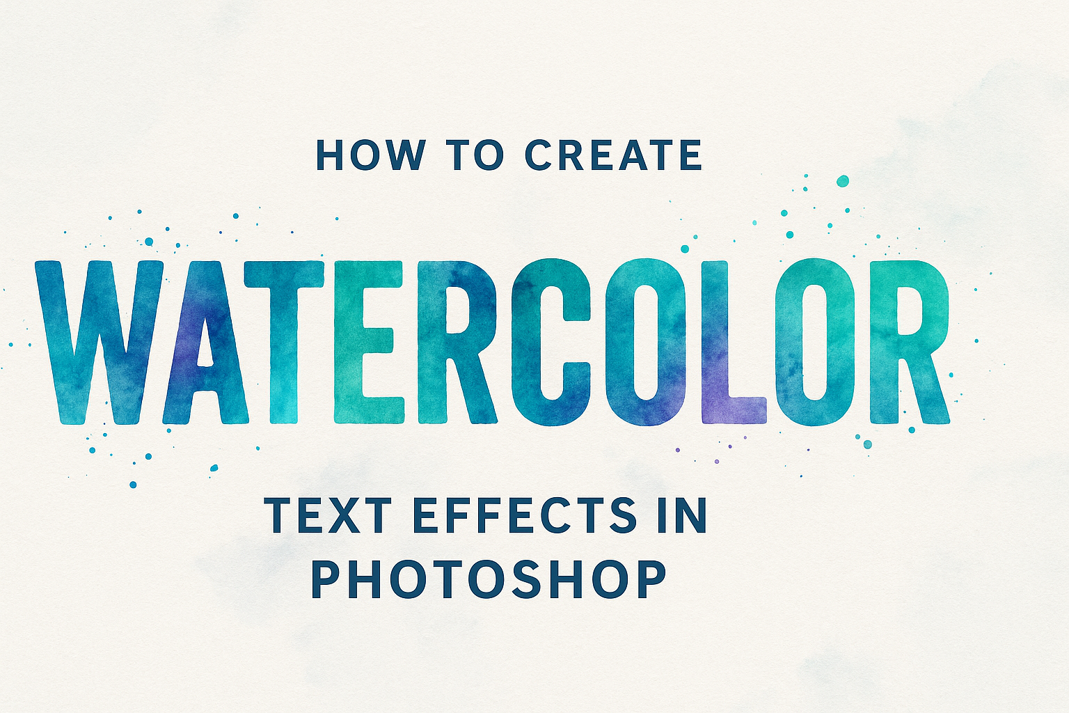
Creating watercolor text effects in Photoshop can add a vibrant and artistic touch to any project. With the right tools and techniques, anyone can transform plain text into beautiful watercolor art. This effect is perfect for creating eye-catching graphics for social media, invitations, and more.
In Photoshop, there are various methods to achieve a watercolor look. Users can explore different brushes and layer styles to mimic the appearance of watercolor paint. For example, utilizing blending modes and opacity adjustments can enhance the effect and make it appear more realistic.
By experimenting with colors and textures, creators can develop unique and personalized watercolor text effects. Online tutorials, such as those found on Envato Tuts+, offer step-by-step guidance to help designers achieve the best results.
Getting Started with Photoshop
To kick off your journey in creating watercolor text effects, it’s essential to become familiar with Photoshop’s interface and set up your document correctly. These steps will lay the foundation for success in your creative projects.
Understanding the Photoshop Interface
Photoshop’s interface is designed to give users easy access to a wide array of tools and features. On the left, you’ll find the Tools Panel with essential tools like the Brush Tool, Move Tool, and Text Tool. Each tool offers unique functions to aid your artwork.
At the top of the screen, the Options Bar changes based on which tool you select, allowing you to modify settings quickly. For example, when using the Brush Tool, you can change the size and hardness here.
The Layers Panel on the right is crucial for managing different elements of your project. It allows you to stack, hide, or show layers, giving you control over how elements interact. Understanding these panels will significantly enhance your ability to create complex designs.
Setting Up Your Document
To create a new document, launch Photoshop and click on File > New. A dialog box will appear where you can set your document’s dimensions, resolution, and color mode.
For most purposes, a resolution of 300 DPI ensures high-quality print results. Set the color mode to RGB for digital displays or CMYK for print. Depending on your project, adjust the size, but starting with an 8.5×11 inch canvas is common.
Once your document is set, save it immediately using File > Save As to avoid losing progress. Choose a format that suits your needs, such as PSD for future editing or JPEG for sharing finished work. This setup process ensures a smooth workflow as you dive into creating mesmerizing watercolor text effects.
Basic Watercolor Techniques
Creating watercolor text effects in Photoshop involves choosing the right tools and applying textures in a way that mimics traditional watercolor art. Attention to detail in both brush selection and texture application makes all the difference in achieving a realistic effect.
Choosing the Right Brushes
When creating watercolor effects, selecting the right brush is crucial. Photoshop offers various brush sets specifically designed for watercolor effects. Brushes with irregular, soft edges work well for mimicking the uneven color distribution found in real watercolor paintings.
Consider using sample brushes like “Sample brush 9” or “Sample brush 11.” These brushes allow for more natural strokes. Adjusting brush size and opacity can add depth and variation to the text. Try different brushes to find one that suits the desired effect. Experimentation is key in this step.
Using a tablet and stylus can provide additional control over brush pressure, which can enhance the watercolor look. This setup allows artists to apply more pressure for darker strokes and less pressure for lighter ones, closely resembling real-life watercolor techniques.
Applying Watercolor Textures
Applying watercolor textures can give text a genuine watercolor appearance. Start by using high-resolution paper textures as your background. This helps the text blend naturally with the paper, adding authenticity.
Next, explore different blending modes such as Linear Burn or Overlay to enhance watercolor effects. Adjusting layer opacity ensures that textures do not overpower the text but enhance it instead. Proper layering helps integrate the text with the background seamlessly.
Incorporating watercolor brushes alongside these textures can further blend the text into the background. This combination gives depth and a painterly effect. Remember to adjust colors to match the desired mood, using palettes such as soft pastels or vibrant hues.
Creating the Text Layer
To create an eye-catching watercolor text effect in Photoshop, first add your text to the canvas. Then, adjust the font and size to suit the desired aesthetic. This basic setup is crucial for building the final artistic effect.
Adding Text to Your Canvas
Start by opening your project in Photoshop and selecting the Type Tool from the toolbar. Click on the canvas where you want your text to appear. Type the words or letters you plan to use in your design. It’s important to choose the location wisely, considering how it will interact with other elements.
Use the Character panel to fine-tune your text’s appearance. Ensure the text is clear and easily readable. You may need to reposition it for the best visual balance. Remember that text is not set in stone and can be adjusted later as you develop the design further.
Save your progress regularly. Creating text layers early gives a solid foundation for adding creative effects. This step ensures that your text remains editable and flexible through further design stages.
Adjusting Font and Size
With your text layer in place, select a font that matches the watercolor style. Handwritten or brush fonts often complement this effect well. Try a few options until finding the most suitable one. Adjust the size as needed.
In the Character panel, tweak settings like kerning and tracking to improve the spacing between letters. This helps with the overall readability and aesthetics of the text. Larger or bolder text might require different spacing than delicate scripts.
Consider also changing text color. While this can be altered later, a light gray or subtle color may help visualize how the watercolor effect will look. Saving different versions can be useful for comparing styles as you progress.
Applying Watercolor Effects
Creating watercolor text effects in Photoshop involves different techniques. This guide covers using layer masks and blending modes to achieve a realistic watercolor look.
Using Layer Masks
Layer masks allow for flexible editing without permanently changing your text. To start, hide the text layer by clicking the eye icon next to it. Then, select the watercolor texture layer. Click the Add Layer Mask icon at the bottom of the Layers panel.
Layer masks let you blend textures into your text, creating the illusion of watercolor strokes. Using the Brush Tool, you can refine areas, controlling where the watercolor effect appears. This method provides control over the design and is reversible, making it suitable for detailed work.
Blending Modes for Watercolor
Blending modes modify how colors interact between layers, adding depth and realism to your text. By changing the Blend Mode of your texture layer, you can achieve a watercolor look. Common modes for this effect include Multiply and Linear Burn, which create rich, overlapping colors by enhancing darker areas.
Adjusting opacity in blending modes helps to fine-tune how pronounced the effect appears. Lowering opacity can create subtle, washed-out looks, while increasing it amplifies color saturation. Experimenting with these modes allows for creative flexibility, letting you tailor the watercolor effect to your desired style.
Customizing Your Watercolor Text
Customizing watercolor text effects allows for unique adjustments to colors and applications of different filters in Photoshop. This process enhances creativity and helps you achieve a personal touch to the text design.
Adjusting Text Colors
Adjusting colors can make your watercolor text pop. In Photoshop, start by selecting the text layer. Open the Color Picker to choose from a wide range of hues. It’s important to match the colors with the mood you want to convey. For a vivid look, select brighter colors like turquoise, magenta, or yellow.
You can use the Gradient Tool for a blend of multiple colors, adding richness and depth. Custom gradients provide smooth transitions that look natural, especially when combined with watercolor splashes.
Experimenting with Opacity settings also gives control over the transparency of colors. Lowering opacity can create a soft, watercolor blending effect. Combining these techniques can lead to visually arresting outcomes.
Applying Filters and Effects
Applying filters and effects in Photoshop enhances the richness of your watercolor text. Start by using the Watercolor Brushes available in Photoshop to add texture. These brushes mimic traditional watercolor strokes, contributing to a more authentic look.
Next, explore Layer Styles like Bevel and Emboss. These styles create faux depth without complex editing, making the text look slightly raised or indented. Pairing these effects with smart filters like Gaussian Blur can soften the edges, adding a splashy, watery appearance.
Incorporating Adjustment Layers such as Hue/Saturation lets you experiment with different tones. Try varying the saturation to find the most striking presentation. Creative combinations of these filters and effects can greatly transform your text into stunning artwork.
Refining Your Artwork
Enhancing your watercolor text effect in Photoshop involves careful adjustment of layers and the strategic use of shadows and highlights. These steps ensure your text is vibrant and more convincing as a watercolor creation.
Fine-Tuning Layers
In this stage, adjusting the layers is essential to ensure each part of the text stands out. Using the Layers panel, the user can experiment by changing the blend modes. Modes like Multiply or Overlay can offer different visual effects.
Masking is another technique to refine edges. By adding a layer mask, specific areas can be painted with a soft black brush to make parts of the watercolor less intense or blend seamlessly with the background. This technique helps create a natural look.
Opacity adjustments play a crucial role, allowing users to make certain areas faint or bold. By lowering the opacity, they can achieve a soft, washed-out appearance. Users should compare how different settings impact the overall look until they find a combination that fits.
Adding Shadows and Highlights
Shadows and highlights bring depth to the artwork. For shadows, the user creates a new layer and uses a soft brush in a darker shade than the primary color in the text. Placing this under the text layer and adjusting the opacity ensures a subtle effect that gives the illusion of paper texture.
To add highlights, a light-colored brush is applied on a new top layer. This technique simulates light falling on wet watercolor, making certain areas more reflective.
The user can enhance natural lighting effects by changing the layer blend mode to Screen or Lighten. By doing so, they emphasize the watercolor effect, giving the text a radiant finish. Adding these details can make a significant difference in making the artwork stand out.
Exporting Your Project
After creating a watercolor text effect in Photoshop, exporting the project correctly is essential. This ensures that the final output maintains the quality and looks great, whether you’re sharing it online or printing it out.
Saving in Different Formats
It’s important to choose the right format when saving your project. Photoshop offers several options like JPEG, PNG, and TIFF. Each has its own advantages.
JPEG is great for photographs and web use because it compresses the image, saving space. This format might reduce quality slightly due to compression. On the other hand, PNG is ideal for images requiring transparency, which is perfect for graphics without backgrounds. It preserves quality but may result in larger file sizes compared to JPEG. For high-quality prints, TIFFs are excellent because they keep all layers intact and don’t compress the image, preserving image quality at its best.
Always keep a copy of the project as a PSD file. This allows you to revisit and edit the project in the future if needed. Use Photoshop’s “Save As” option to choose the format that fits your needs best.
Optimizing for Web and Print
When preparing to share your project online, optimizing it for the web is key. This involves reducing file size without losing quality so that it loads quickly. Using Image Size and Resample Image options in Photoshop helps in scaling down dimensions appropriately. Export your project using the “Save for Web” option, which gives control over file type and quality settings.
For print, consider the resolution. Set the image at 300 DPI to ensure it prints sharply. This is the standard for high-quality prints. Additionally, use CMYK color mode for printing since it aligns with most printers, ensuring colors appear accurately. Adjusting these settings will help your project look professional, whether displayed on screens or printed on paper.