Creating interactive maps and diagrams in PowerPoint can be a game changer for presentations.
By using built-in tools like shapes and charts, anyone can design engaging visuals that capture attention and convey information effectively. This approach not only makes presentations more interesting but also helps in better understanding complex data.
Whether it’s for a school project, a business presentation, or a fun family event, interactive content keeps audiences engaged.
Learning to make these maps and diagrams opens up a world of possibilities for storytelling and information sharing.
From utilizing hot spots to link different sections to inserting detailed charts, the steps might seem tricky at first, but they are easier than many think.
Combining these elements enhances clarity and depth in presentations, making them memorable for viewers.
Understanding PowerPoint’s Capabilities
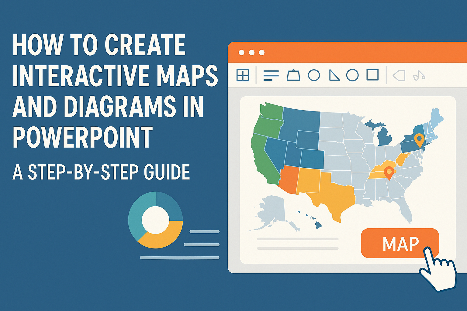
PowerPoint offers a variety of tools for creating interactive maps and diagrams. Users can insert maps directly into their presentations with just a few clicks.
Key Features:
-
Shapes and Icons: PowerPoint includes an extensive library of shapes. These can represent different areas or data points on a map.
-
Hot Spots: By creating clickable shapes, users can make interactive elements. This allows viewers to click on parts of the map for more information.
-
Charts and Graphs: PowerPoint allows the insertion of charts. These charts can illustrate data related to the map, enhancing understanding.
To create an interactive map, users should utilize the Insert Tab. This tab offers options for maps, shapes, and charts. It’s a central hub for enhancing presentations.
Quick Steps to Insert a Map:
- Open PowerPoint and choose the desired slide.
- Click on the Insert tab.
- Select Maps or Shapes from the menu.
With these tools, it’s easy to create attractive and informative presentations. PowerPoint’s features cater to various needs for visually engaging content.
Getting Started with PowerPoint
To begin using PowerPoint, the user must first launch the program. They can do this by clicking on the PowerPoint icon on their computer.
Once in PowerPoint, they will see several options. These include creating a new presentation or opening an existing one. To start fresh, selecting “Blank Presentation” is a great choice.
In the main window, users can find various tabs like “Home,” “Insert,” and “Design.” Each tab offers different tools to enhance their slides.
To create a map or diagram, they should click the Insert tab. This is where they can add shapes, images, and charts. Using simple shapes can help create interactive elements.
For example, users can create hotspots by inserting shapes. This can be done by going to the Shapes options and choosing their preferred shape.
Next, they can draw the shape on the slide. After drawing, users can format the shape using the Format tab. This includes changing color, size, and adding effects.
PowerPoint also provides templates for those who need a quick start. Users can explore these by clicking on File and then New.
With these basic steps, users are ready to craft engaging presentations. They can explore more advanced tools as they grow comfortable with the program.
Designing Your First Map
Creating an interactive map in PowerPoint can be fun and easy. Anyone can start by following these simple steps.
First, open PowerPoint and choose a blank slide. This gives plenty of space to work. Next, go to the Insert tab. Here, select the Shapes option to draw the layout of the map.
Once the basic shape is ready, use Text Boxes to label important areas. Keep the text clear and simple for better understanding. A good practice is to use colors that stand out.
Add icons or images to represent different points of interest. These elements can make the map more engaging. To make it interactive, use the Action settings. This feature allows users to click on specific areas for more information.
Tips for success:
- Keep it simple: Avoid clutter and keep the design clean.
- Use contrasting colors: This helps important features catch the eye.
- Test the interactivity: Run the presentation to ensure everything works smoothly.
After designing the map, save the presentation. This allows sharing with others easily. With practice, anyone can create impressive interactive maps that enhance their slides. For more detailed steps, visit this guide on interactive maps.
Incorporating Interactive Elements
Adding interactive elements to PowerPoint slides can engage viewers and enhance their understanding. These features allow the audience to explore content actively, making presentations more effective.
Using Action Buttons
Action buttons are shapes that perform specific tasks when clicked. They help navigate slides or trigger activities like starting a video or opening a document.
To insert an action button, go to the Insert tab, select Shapes, and choose an action button shape. After drawing it on the slide, a dialog box appears to set the action. Options include Hyperlink to another slide, Run macro, or even Play a sound. This feature is useful for creating an interactive quiz or directing users to different maps.
Leveraging Hyperlinks
Hyperlinks allow users to connect to websites, other slides, or documents. They provide an easy way to access additional information. To add a hyperlink, select a shape, text, or image, then right-click and choose Hyperlink.
In the dialog box, users can link to file paths, email addresses, or specific slide numbers. Hyperlinks can enhance presentations by directing the audience to relevant web resources or specific sections of the presentation. For example, linking to a detailed diagram or supporting data can improve the presentation’s interactivity and usefulness.
Animating Routes and Locations
Animating routes and locations on a map can make a presentation dynamic and engaging. This method lets viewers visually track paths or explore areas in detail.
To do this, select the map image, then head to the Animations tab. Choose an animation effect, like Fly In or Fade, to highlight specific locations. Adjust the timing and order of animations for clarity. For instance, animating a route on a world map can show the journey step-by-step, making information more digestible. This technique keeps the audience focused and involved.
Enhancing Maps with Visual Elements
Visual elements play a crucial role in making maps more engaging and informative. By incorporating icons, colors, and text, users can convey important information quickly and effectively.
Adding Icons and Shapes
Icons and shapes help express ideas in a clear and attractive way. They can represent different locations, actions, or themes on a map. To add icons, the user can go to the “Insert” tab and select “Icons.”
Choosing icons that fit the map’s theme is essential. For instance, using a leaf icon for environmental topics or a briefcase for business-related content enhances clarity. Shapes can also be customized to highlight areas of interest, such as using circles or arrows to indicate routes.
Utilizing Colors and Styles
Color can dramatically impact how a map is perceived. Choosing a color scheme that matches the presentation’s overall look enhances visual appeal. For instance, warm colors can draw attention, while cooler colors provide a calming effect.
It’s important to maintain consistency in color usage throughout the map. Using contrasting colors for different elements helps them stand out. Styles, such as solid fills or gradients, can give depth and dimension to the map, making it more dynamic.
Inserting Text and Labels
Text and labels are essential for providing context. They help viewers understand what they are seeing on the map. To add text, users can select the “Text Box” tool from the “Insert” tab and click where they want to add information.
Clear and concise labels are critical. They should not overwhelm the visual but provide necessary information effectively. Using different font sizes and styles can help highlight key points, guiding the audience’s attention.
Creating Interactive Diagrams
Interactive diagrams can enhance a PowerPoint presentation by making complex information easier to understand. They allow viewers to engage with content actively and retain information better. There are several types of diagrams one can create, each serving unique purposes.
Diagram Types and Uses
Different types of diagrams serve various functions in presentations. Common examples include flowcharts, mind maps, and organizational charts.
- Flowcharts illustrate processes step-by-step, helping to clarify complex workflows.
- Mind maps are great for brainstorming and organizing ideas visually.
- Organizational charts show the structure of a team or company, making relationships clear.
Each diagram type can be customized to fit particular needs, making them versatile tools in presentations.
Building a Process Diagram
To build a process diagram, start by defining the steps involved. Use simple shapes to represent each step, such as rectangles for tasks and diamonds for decisions. Connect these shapes with arrows to indicate the flow.
- Insert Shapes: Go to the ‘Insert’ tab, select ‘Shapes,’ and choose the desired shapes.
- Connect Shapes: Use arrows to link the shapes, ensuring a logical flow.
- Enhance Clarity: Add text inside the shapes to describe each step clearly.
This method allows the audience to follow the process easily and understand how each step connects.
Crafting an Organizational Chart
Creating an organizational chart helps to map the hierarchy of a team. Begin by deciding which levels to include in the chart.
- Choose a Template: PowerPoint offers pre-made templates under the ‘SmartArt’ feature for convenience.
- Input Details: Fill in the names and titles of individuals in each box.
- Design Considerations: Adjust colors and fonts for clarity and to match your presentation style.
By displaying the organization visually, it becomes easier for the audience to grasp roles and relationships within the team.
Using SmartArt for Advanced Diagrams
SmartArt in PowerPoint can enhance the presentation of information through visually appealing graphics. It allows users to create various types of diagrams that can help communicate complex data clearly.
Exploring SmartArt Graphics
SmartArt graphics come with many options for presenting information in a structured way. To start, users can access SmartArt by going to the Insert tab and selecting SmartArt. A dialog box will appear, showing different categories like List, Process, and Cycle.
Choosing a graphic type depends on what the user wants to show. For instance, a Process graphic works well for steps in a project, while a Cycle graphic illustrates ongoing processes. Users should double-click their chosen graphic to add text and data.
In addition to basic layouts, SmartArt offers picture options, allowing users to insert images directly into the diagrams, making them more engaging.
Customizing SmartArt Designs
Customizing SmartArt is crucial for making diagrams stand out. Once a graphic is inserted, users can modify it by clicking on it and exploring the Design and Format tabs that appear.
Different color schemes and styles can be applied to match the presentation’s theme. Users can also change shapes within the graphics by selecting them and choosing new ones from the Shape menu.
Adding effects like shadows, glows, or 3D styles can give the design a polished look. Keeping the layout clear and simple ensures the audience can easily understand the information presented.
Integrating Multimedia with Maps and Diagrams
Using multimedia can enhance maps and diagrams in PowerPoint, making them more engaging and informative. By embedding photos, videos, and audio narration, presenters can create a richer experience for their audience.
Embedding Photos and Videos
Integrating photos and videos into maps or diagrams can provide visual context and explain concepts better. To embed a photo, users can click on the Insert tab, then select Pictures. This allows them to choose images from their computer or online sources.
For videos, the process is similar. Going to Insert, then Video, lets users embed videos from their files or online platforms like YouTube. It’s important to ensure that videos are relevant and enhance the content, not distract from it. This method can make presentations more dynamic and memorable.
Adding Audio Narration
Audio narration can guide viewers through maps and diagrams. It personalizes the experience, providing additional details that may not be on screen. To add audio, users should go to the Insert tab and select Audio to record directly or choose a file.
When recording, clarity is crucial. Keeping the narration concise, directly relating to the visuals, helps maintain the audience’s interest. This feature allows for pauses, ensuring viewers can take in the information without feeling rushed. Integrating audio creates a more interactive presentation that can cater to various learning styles.
Checking for Consistency and Flow
Consistency in appearance helps the audience focus on the content.
Ensure that fonts, colors, and styles remain the same across all slides. For example, if a blue font is used for headings, stick with that shade throughout.
Flow is just as important. Each slide should logically follow the previous one.
Transitions should be seamless, guiding viewers naturally through the presentation. Consider arranging slides in a logical sequence, using a flowchart or outline to help visualize connections.
Check for alignment in visuals and text. Elements should be evenly spaced, avoiding cluttered layouts.
Remember, clear visuals enhance understanding and engagement.
Using Slide Master for Uniformity
To create a uniform look, the Slide Master feature is invaluable. This tool allows for changes to the overall presentation design, applying them to all slides instantly.
Begin by choosing a master layout that fits the content style. For example, use a title slide format for introductions and a different one for regular content slides.
You can also set a consistent background or logo, reinforcing brand identity.
Adjust font styles and sizes in the Slide Master to ensure readability. This saves time and helps maintain a professional appearance throughout the presentation.
Regularly review the Slide Master to make sure any recent additions align with previous settings, keeping everything cohesive as the project develops.