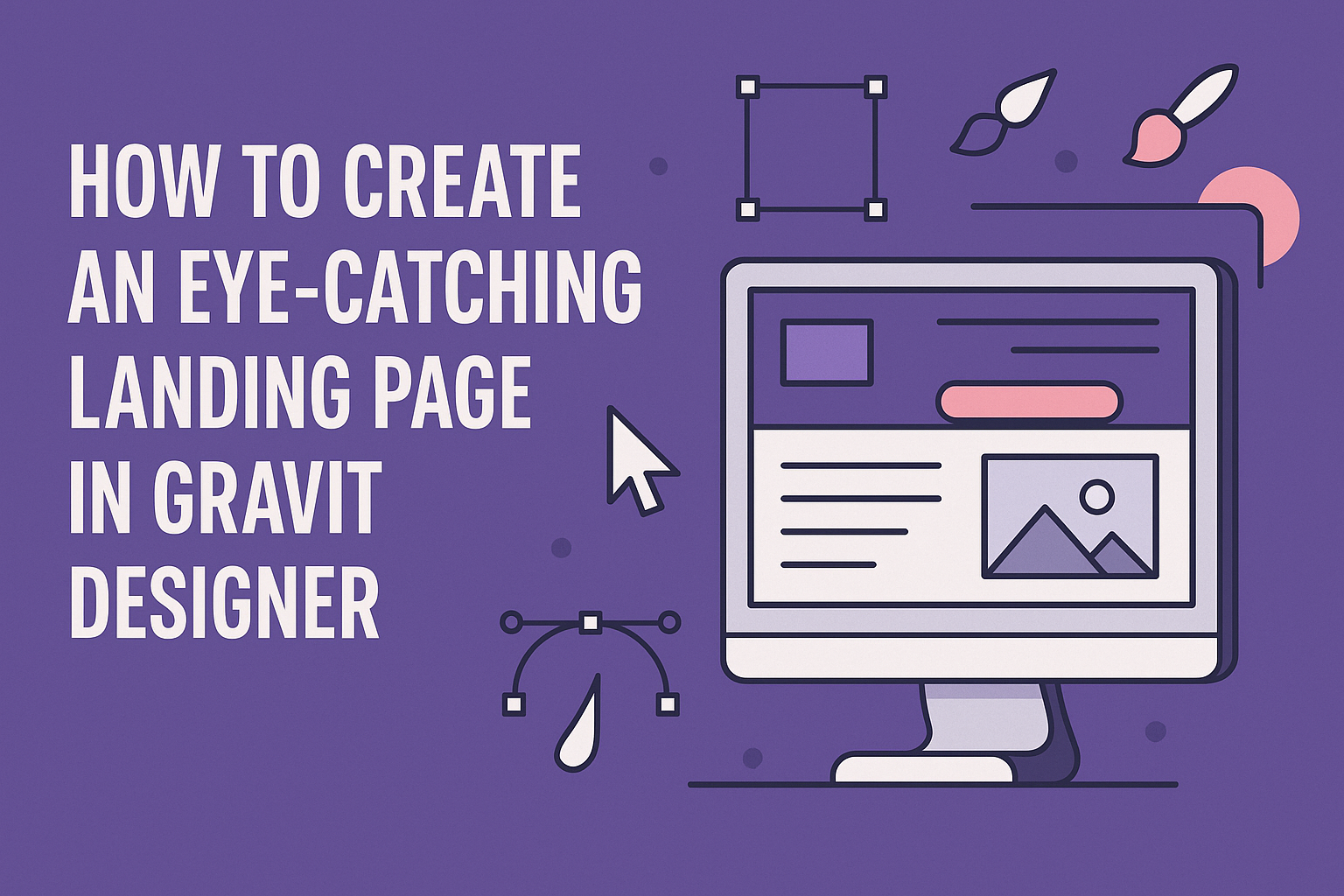
Creating an eye-catching landing page is essential for any online project. With Gravit Designer, users can easily craft stunning visuals that engage visitors and drive conversions.
By following some simple design principles and utilizing the right tools within Gravit Designer, anyone can design a memorable landing page that captures attention and encourages action.
Using a clean layout, effective use of color, and clear messaging can significantly enhance a landing page’s appeal. Gravit Designer provides a variety of features, such as shared styles and cloud saving, to streamline the design process.
These tools help ensure that the final product not only looks professional but also aligns with the overall branding of the project.
The journey to create a successful landing page may seem daunting, but with the right guidance and resources, it can be enjoyable and rewarding. Gravit Designer empowers designers at all levels to create high-quality graphics with ease.
With the right steps and creative approach, a standout landing page is just a few clicks away.
Understanding Gravit Designer Basics
Gravit Designer is a user-friendly design tool ideal for creating landing pages. Knowing the basics will help users efficiently navigate the software and utilize its features.
Getting Started with Gravit Designer
To begin using Gravit Designer, users can sign up for a free account on the Gravit website. The software is available on multiple platforms, including web, Windows, macOS, and Linux.
After signing in, users will find an option to start a new project.
Clicking on “New Document” opens a dialog box where they can choose the document size, orientation, and resolution. It’s helpful to pick a size that suits the design needs, ensuring everything fits nicely on the landing page.
Exploring the Interface
The interface of Gravit Designer is designed to be intuitive. The main area is the Canvas, where users can design and arrange elements.
On the left, there is a Toolbar with essential tools like selection, shape, and text.
To the right, the Properties Panel displays settings for the selected object. Users can adjust colors, sizes, and positions from here.
Familiarity with these sections enables smoother design processes, allowing users to focus on creativity.
Essential Tools for Design
Gravit Designer offers various tools that are crucial for creating stunning designs.
- Shape Tools: These include rectangles, circles, and polygons, allowing for basic layouts.
- Text Tool: Users can add text easily, customizing font styles, sizes, and colors.
- Pen Tool: Ideal for creating custom shapes, the pen tool provides flexibility for unique design elements.
Understanding these tools and their functionalities empowers users to craft visually appealing landing pages. Users should experiment with these features to enhance their skills and confidence in design.
Designing Your Landing Page
Creating a visually appealing landing page is essential for capturing attention. Focus on the structure, color scheme, graphics, and responsiveness to ensure a great user experience.
Setting the Layout Structure
A clear layout is key to guiding visitors through the landing page. First, divide the page into sections: header, main content, and footer. This helps organize information logically.
Using grids or columns can enhance the structure. Designers often apply a 12-column grid system to create a balanced and neat look. Plenty of white space around elements makes the page less cluttered and improves readability.
Place important information “above the fold,” meaning it is visible without scrolling. This keeps essential details front and center. Arranging elements in a logical flow encourages users to engage with the content seamlessly.
Choosing a Color Scheme
Color selection sets the tone and mood of the landing page. Designers should choose a color palette that reflects the brand’s identity. Using two or three main colors helps create a cohesive look.
Contrasting colors can enhance readability. For instance, dark text on a light background is easier to read. Color psychology also plays a role; blue can create a sense of trust, while red can evoke excitement.
Tools like Adobe Color can assist in picking complementary colors. When applying colors, it’s best to maintain consistency across the entire page to strengthen brand recognition.
Incorporating Engaging Graphics
Graphics enhance visual appeal and can convey messages quickly. High-quality images or videos are essential for keeping visitors interested. Choosing visuals relevant to the content enhances understanding.
Infographics are also a great option. They combine text and visuals to present complex information clearly. Including icons can break up text and make navigation easier.
Designers should ensure all graphics are optimized for fast loading. Heavy images can slow a page down, leading to frustration. Tools like TinyPNG can help compress images without losing quality.
Implementing Responsive Design
Responsive design ensures the landing page looks great on all devices. With so many users accessing sites via mobile, adapting layouts is crucial.
Designers can use flexible grids and layout patterns to achieve this.
Media queries in CSS adjust the design based on screen size. For instance, stacking columns on smaller screens improves usability. Touch-friendly buttons can also enhance the mobile experience.
Testing the landing page across devices is important. Tools like BrowserStack allow designers to see how their page performs on various platforms. A responsive design ultimately improves user experience and increases conversion rates.
Enhancing User Experience
Creating an eye-catching landing page involves prioritizing user experience. Key focus areas include smooth navigation, appealing typography, and effective call-to-action elements. These components work together to keep visitors engaged and guide them toward taking desired actions.
Optimizing Navigation
Navigation plays a crucial role in user experience. A clear and simple menu helps visitors find what they need quickly.
Designers should aim to keep the navigation bar at the top of the page for easy access.
Using descriptive labels makes it straightforward for users to understand what each section offers. It’s also helpful to limit the number of menu items to avoid overwhelming users.
Including a search bar can significantly enhance navigation, especially for content-rich sites. This allows visitors to find specific information without scrolling extensively.
Captivating with Typography
Typography greatly affects how content is perceived. Choosing a clean and modern font enhances readability. Consistency in font style can create a cohesive look across the landing page.
Using a combination of font sizes can emphasize important information. For example, larger headers can draw attention to key points while smaller text works for details.
Color contrasts between text and background also matter. Dark text on a light background tends to be easiest to read, which keeps visitors comfortable while browsing.
Adding Call-to-Action Elements
Effective call-to-action (CTA) elements can drive conversions. Buttons should be visually distinct and easy to spot. Bright colors like orange or green often encourage users to click.
Placement of CTAs is equally important. Positioning them above the fold and after key content makes it likely that visitors will engage.
CTAs should have clear and concise wording. Phrases like “Get Started” or “Learn More” provide direction and prompt users to take action.
Incorporating these elements effectively can create a user-friendly experience, enhancing the likelihood of conversions on the landing page.
Finalizing and Testing
Before launching a landing page, it’s crucial to ensure the design is polished and ready for audience engagement. This involves reviewing design principles and conducting thorough testing.
Reviewing Design Principles
During this phase, the designer should revisit essential design principles. Visual hierarchy is vital; important elements like headlines and call-to-action (CTA) buttons must stand out. Using contrast ensures these items catch the eye quickly.
Color and typography play a significant role too. The color scheme should align with the brand and evoke the desired emotions. Typography needs to be readable and consistent throughout the page.
It might help to create a quick checklist to confirm these elements are effective before proceeding.
Executing Pre-Launch Tests
The testing phase is where the page can shine. A/B testing is a powerful technique.
It involves creating two versions of the landing page to see which performs better.
Focus on one element at a time, such as a different CTA button or headline.
Monitoring user behavior will provide insight into what engages visitors most.
Analytics tools can track metrics like conversion rates, bounce rates, and time spent on the page.
User feedback is also invaluable.
Gathering input from potential users can identify weaknesses in design or usability.
Testing can help refine the page to ensure it meets audience expectations before the public launch.