Creating an ER diagram can seem daunting, but it doesn’t have to be. With the right tools, anyone can produce a clear and useful diagram that showcases relationships between data entities.
Canva offers a user-friendly platform that simplifies the process of making an ER diagram, allowing users to easily visualize complex data structures.
By using various templates and shapes available in Canva, anyone can design a professional-looking ER diagram in just a few steps.
This visual tool not only enhances understanding but also helps in effective communication of data systems.
Whether for a school project or a business presentation, learning how to create an ER diagram in Canva can be a valuable skill.
With this guide, individuals will discover how to efficiently build an ER diagram chart that suits their needs.
From selecting the right template to customizing it with entities and relationships, the process will become straightforward and enjoyable.
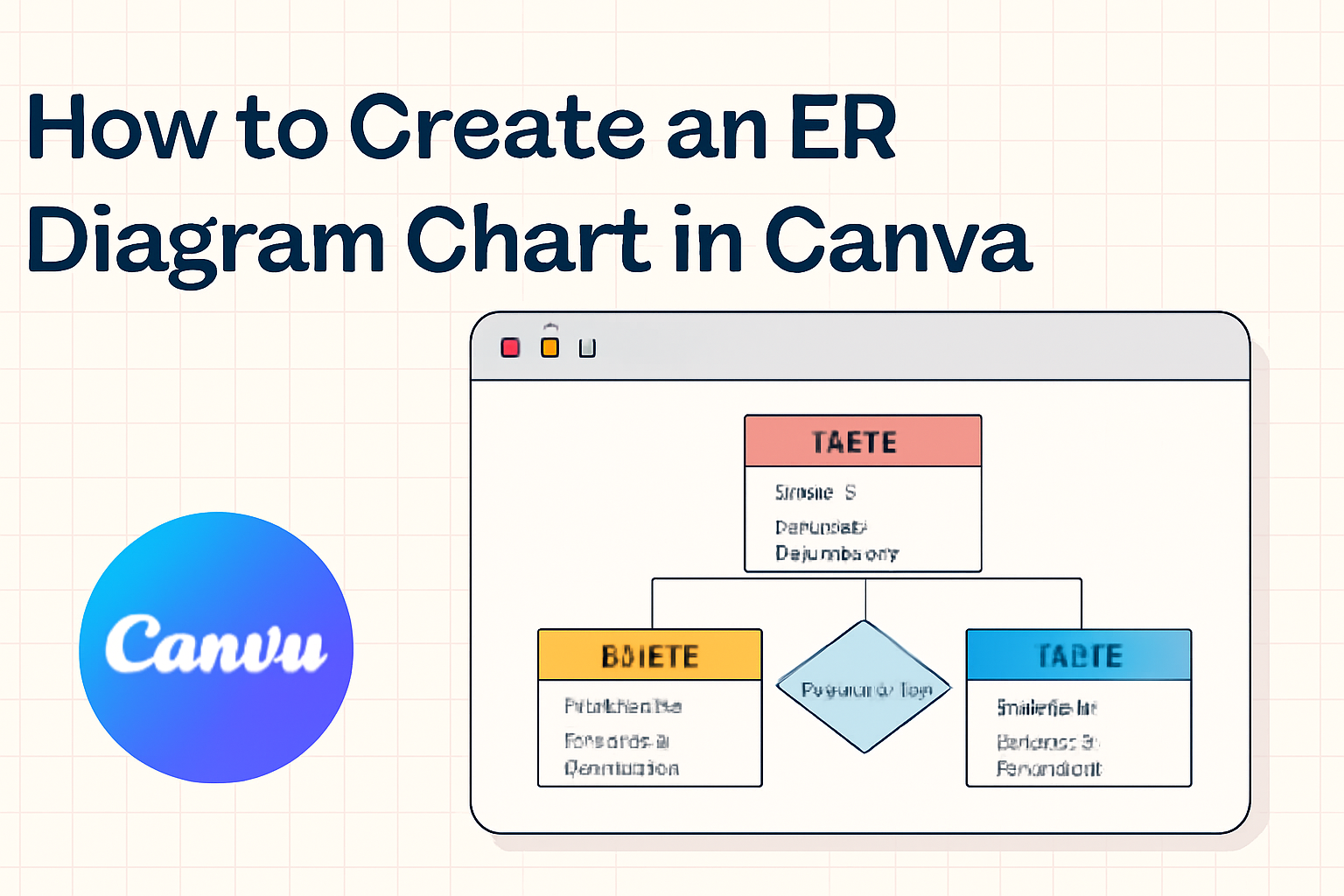
Understanding ER Diagrams
ER diagrams are essential tools for visualizing data relationships and structures in database design. They help simplify complex systems and clarify how various entities interact.
Definition and Purpose
An Entity-Relationship (ER) diagram is a visual representation of the entities within a system and their relationships. It helps in organizing and modeling data in a way that is easy to understand.
The main purpose of an ER diagram is to provide a clear picture of how different entities relate to each other. This aids in identifying the required information for database design.
ER diagrams are commonly used in software development and database administration to plan and communicate the structure of a database.
By outlining entities and their connections, these diagrams facilitate clearer communication among team members.
Components of ER Diagrams
ER diagrams consist of several key components. Each plays a vital role in depicting the data and relationships.
-
Entities: These are objects or things in the system, represented by rectangles. For example, “Customer” or “Order” can be entities.
-
Attributes: These describe the properties of entities, listed inside ovals connected to their respective entity. A “Customer” entity might have attributes like “Name,” “Email,” and “Phone Number.”
-
Relationships: These show how entities are connected and are represented by diamonds. For instance, a “Customer” places an “Order.”
-
Cardinality: This indicates the nature of the relationship, such as one-to-many or many-to-many, which helps clarify data interactions.
Understanding these components is crucial for designing effective databases.
Getting Started with Canva
Canva is a user-friendly design platform that helps create various visual content, including ER diagrams. To get going, users need to create an account and learn how to navigate the interface effectively.
Creating a Canva Account
To begin using Canva, a user must first create an account. This process is simple and quick.
- Visit the Canva website.
- Click on the “Sign up” button located at the top right corner.
- Users can choose to sign up with an email address, Google account, or Facebook account.
After providing the necessary information and agreeing to the terms, the account will be created.
Once registered, users can access templates and design tools. If a user prefers to try features before fully committing, Canva also offers a free version which includes many helpful tools.
Navigating the Canva Interface
Once logged in, users will see the Canva dashboard. This dashboard is organized and easy to navigate.
- Templates: Users can browse a variety of templates by clicking on “Templates” in the sidebar.
- Design Tools: On the left, there are options like “Elements,” “Text,” and “Uploads” to customize designs.
- Workspace: The main area is where users can create and edit their designs.
Utilizing the search bar at the top helps find specific designs quickly.
Familiarizing oneself with this setup allows for a smoother design process. Users can start immediately with the intuitive layout, enhancing their creativity with ease.
Designing Your ER Diagram
Creating an effective ER diagram involves carefully selecting templates, customizing shapes, and adding relevant text. These steps help in visually representing data structures clearly and effectively.
Selecting the Right Template
Choosing the right template is a crucial first step. Canva offers various ER diagram templates to suit different needs. Users can browse through the available options and select one that fits their project’s requirements.
It is important to consider the complexity of the data relationship. For simpler diagrams, a basic template might suffice. For more complex data, a detailed template with multiple entities might be needed.
By starting with a proper template, designers can save time and ensure a smooth layout from the beginning.
Customizing Shapes and Lines
Once a template is chosen, it’s time to customize shapes and lines.
Canva provides a variety of shapes that represent entities, attributes, and relationships. Users can select shapes from the “Shapes” tab to represent different data points.
Color is another important aspect. By using different colors for different types of entities, designers can enhance readability.
Lines connecting the shapes should also be clearly defined; using arrows to indicate the direction of relationships helps others understand the flow of data.
Proper alignment and spacing are essential to maintain a clean look.
Adding Text and Descriptions
Adding text to the shapes is the final touch in designing an ER diagram. Users should include meaningful names for each entity and attribute.
Clarity is key, so the text should be concise yet descriptive.
Canva allows easy text editing, where users can adjust the font, size, and color to make the text stand out. Descriptions can also be added, which provide further details about complex entities.
Organizing text in a clean way will help viewers quickly grasp the information presented.
Organizing Elements
When creating an ER diagram in Canva, organizing elements clearly is essential. This helps to make relationships between entities easily understood. Two important methods to achieve this are aligning objects and using color coding.
Aligning Objects for Clarity
Aligning objects ensures that the diagram looks neat and professional. It helps viewers follow the flow of information.
To do this in Canva, select the shapes you want to align. Then, use options like “Align Left”, “Align Right”, or “Center” from the top menu.
Using grids or guidelines can also aid alignment. When shapes are evenly spaced, it greatly enhances readability.
For example, aligning entities and relationships in a straight line guides the viewer’s eye naturally. A well-organized diagram prevents confusion and misinterpretation.
Using Color Coding
Color coding can make an ER diagram not only attractive but also functional.
Assign specific colors to different entities to represent various categories or types. For instance, use blue for customers, green for products, and orange for orders.
Consistent color usage helps viewers understand the relationships at a glance.
It is wise to create a legend that explains what each color means. This aids in quick reference.
By visually linking similar entities through color, the viewer can quickly analyze data and grasp complex structures.
Collaborating and Sharing
When creating an ER diagram in Canva, teamwork is essential. Collaborating features in Canva make it easy to work with others, share insights, and gather feedback efficiently.
Inviting Team Members
Inviting team members to collaborate on an ER diagram in Canva is a straightforward process.
First, open the diagram you want to share. Look for the “Share” button in the top right corner.
Click it, and enter the email addresses of the team members. You can choose whether they can view or edit the diagram.
Once invited, they will receive a link to access the diagram directly. This encourages active participation and allows for real-time collaboration, which is vital for effective teamwork.
Leaving Comments and Feedback
Canva allows users to leave comments on specific parts of the diagram. This feature is helpful for gathering feedback.
To use it, select the part of the diagram where feedback is needed and click on the comment icon.
Team members can type their thoughts and suggestions. Other users can reply to comments, creating a discussion around each point.
This streamlines communication and ensures that everyone’s voice is heard. It encourages participation and fosters a collaborative environment.
Exporting and Sharing Your Diagram
Once the ER diagram is complete, users can easily export and share it.
Canva provides multiple formats for export, such as PNG, JPG, and PDF. To export, click on the “Download” button in the top right corner.
Choose the desired format, then follow the prompts to save it to your device.
Users can also share the diagram directly through a link. This helps in sharing with those who may not have Canva accounts but need to view or present the diagram.
Tips and Best Practices
Creating an effective ER diagram in Canva requires attention to detail and thoughtful design choices. Below are some essential tips to enhance clarity and accuracy in diagrams.
Maintaining Readability
Readability is crucial for any diagram.
It is important to use clear fonts that are easy to read. Suggested fonts include Arial and Helvetica, which offer simplicity and clarity.
Choosing appropriate font sizes is also key. Headings should be larger, while annotations can be smaller but still legible.
Color contrasts help highlight different sections. Using a light background with dark text works well.
Additionally, adequate spacing between elements prevents clutter. Aim for a balanced layout where each entity can be quickly understood.
Ensuring Accurate Representation
Accuracy in representation is necessary for understanding relationships between entities. Each entity should have a clear title and description.
The use of appropriate symbols helps convey meaning. For example, diamonds can represent relationships while rectangles denote entities.
It is also essential to maintain consistency throughout the diagram. Using the same shapes for similar entities helps users grasp information quickly.
Double-checking the connections between entities ensures clarity. Arrows should clearly indicate the direction of relationships.
Keeping the Design Simple
Simplicity is an important aspect of effective diagram design. Avoid overloading the diagram with excessive details.
Focus on key entities and their relationships.
Less is often more, making it easier for viewers to grasp the main idea.
Using templates available on Canva can streamline the design process. Templates provide a good starting point and help maintain a professional appearance.
Incorporating a limited color palette also contributes to a streamlined look.
Selecting two to three colors can enhance visual appeal without overwhelming the viewer.
Lastly, always ask for feedback. A fresh set of eyes can help identify areas for improvement and ensure clarity.