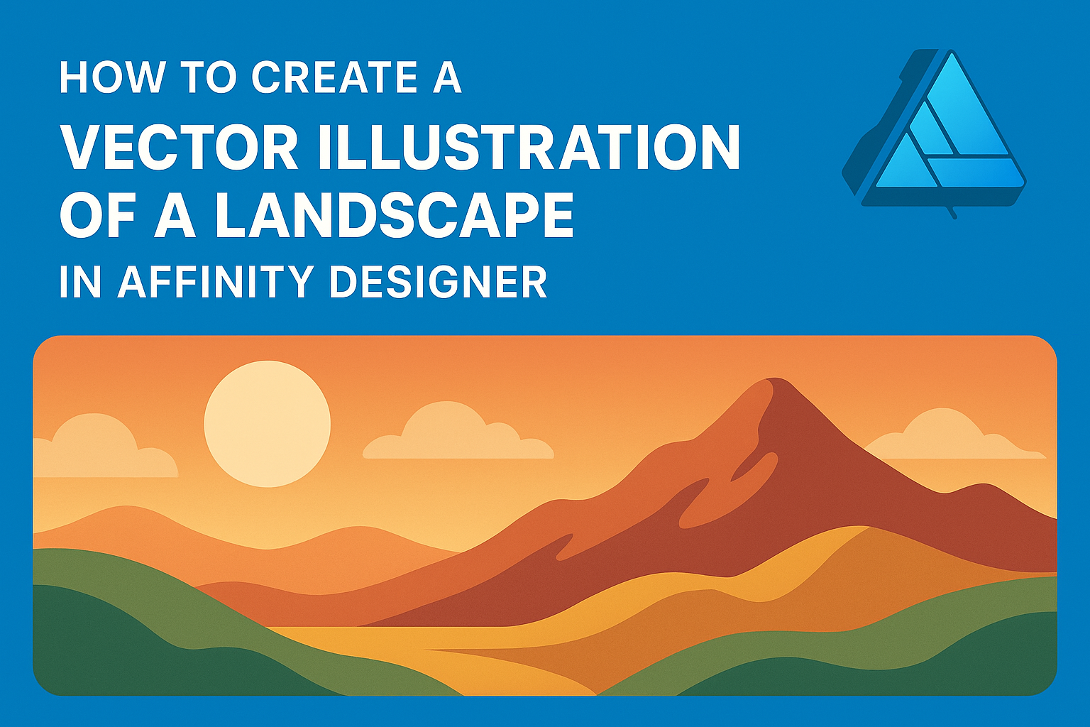
Creating a stunning landscape vector illustration in Affinity Designer is an enjoyable process that sparks creativity.
By using basic shapes and colors, artists can capture the beauty of nature in a modern digital format.
This guide will provide easy steps and tips to help anyone, whether a beginner or experienced designer, create their own unique landscape artwork.
Artists often use tools like the Pen Tool and various fill options to bring their visions to life. With some practice, users can learn to create depth and interest in their designs.
The beauty of Affinity Designer lies in its ability to combine vector graphics with textures, making illustrations more dynamic.
As they explore different techniques, readers will discover how to add personal touches to their work. This blog post will walk through the key steps needed to produce an eye-catching landscape illustration that stands out.
Getting Started with Affinity Designer
To create a stunning vector illustration, it’s important to understand how to navigate and set up Affinity Designer. This section provides essential advice on the workspace, document setup, and tools available for artists.
Understanding the Workspace
Affinity Designer’s workspace is designed for creativity. When you open the program, the default layout includes several panels.
These panels contain tools for drawing, colors, and layers.
On the left, the Tools Panel lets users access drawing tools easily. The Color Panel, usually on the right, helps in selecting and adjusting colors quickly.
At the top, the Menu Bar includes file options and other features. Customizing the workspace is easy. Users can drag panels to rearrange them based on personal preference.
A clear workspace helps maintain focus and efficiency.
Setting Up Your Document
Before starting any project, setting up the document is crucial.
To create a new document, click on File and then New. Users can choose the size of their canvas based on the desired outcome.
For landscape illustrations, a larger canvas usually works best. A common size is 3000 x 2000 pixels at 300 DPI for high-quality prints.
Make sure to select the right color mode too; RGB is good for digital work, while CMYK suits print.
Knowing the document settings ensures a smooth workflow as the project develops.
It’s also helpful to name the document early to keep organized.
Familiarizing with Tools and Panels
Familiarity with the tools and panels is key for smooth operation.
The Pen Tool is essential for creating precise vector paths. The Brush Tool offers a variety of brushes to add texture and details.
Moreover, the Layers Panel is vital for managing different parts of the illustration. This feature allows users to keep elements separate, making edits easier.
Taking time to explore these tools can enhance creativity. Tutorials and practice projects can further boost confidence. Affinity Designer has a range of tutorials online to help users master different techniques.
Designing the Landscape
Creating a vector landscape involves careful attention to the elements that shape the scene. This includes the skyline, mountains, trees, and various textures. Each part contributes to a cohesive and inviting illustration.
Creating the Skyline
The skyline serves as the foundation of the landscape. Begin by using the Rectangle Tool to create a horizontal shape at the top of the canvas. This will represent the horizon.
He or she can then use the Pen Tool to add swooping curves or peaks to give the skyline character.
Next, fill this shape with a gradient to mimic a natural sky. Soft blues or warm sunset hues can add depth.
Finally, adding clouds enhances the visual interest. Use soft, rounded brush strokes or the Ellipse Tool to form fluffy clouds that make the skyline more dynamic.
Drawing Mountains and Hills
Mountains and hills give the illustration a sense of depth and perspective.
Start by sketching simple triangular shapes for mountains. The Pen Tool will help create jagged edges that mimic the ruggedness of mountain tops.
To add dimension, use gradient fills or varying shades of green and brown. A lighter color can be used for peaks kissed by sunlight, while darker shades work well for shadowed areas.
For hills, softer curves can be created by adjusting anchors with the Pen Tool. They should appear gentle and inviting, contrasting with the sharp peaks of mountains.
Adding Trees and Vegetation
Trees and vegetation bring life to the landscape. The shapes can vary significantly, from tall pine trees to broad-leaved oaks.
Use the Pen Tool to draw the trunk and branches, and then create the foliage with a mix of shapes.
To make trees realistic, combine different shades of green for the leaves. Consider layering shapes for depth and texture.
Adding small bushes or grass at the base can ground the trees in the scene. These elements work together to create a richer, more engaging environment.
Detailing with Textures and Elements
Adding textures and small details makes the landscape more visually appealing.
Textures can be applied using brushes or patterns. For instance, a subtle grain pattern can enhance the ground or create a rough rocky surface.
Incorporate elements like birds or clouds to lend a sense of movement. These small additions can transform a simple landscape into a lively scene.
Clusters of wildflowers can also add pops of color. Ensure these details balance the composition without overwhelming other elements, creating a harmonious landscape.
Applying Colors and Effects
Colors and effects are key to bringing a vector landscape to life. Using the right palettes, gradients, and effects can enhance depth, dimension, and overall appeal.
Working with Color Palettes
Creating a color palette is an essential part of designing a vector landscape.
He or she can start by choosing colors that convey the desired mood, such as vibrant tones for a sunny scene or muted shades for a calm atmosphere.
Using tools like Adobe Color can help in selecting complementary colors. It’s helpful to limit the palette to around five colors to maintain harmony.
Organizing colors in layers or using swatches in Affinity Designer can streamline the design process.
Using Gradients and Shading
Gradients can add depth to the landscape. They are useful for transitioning between colors smoothly, giving a more realistic appearance.
She can apply a gradient fill in Affinity Designer by selecting the shape, then choosing the gradient tool in the toolbar.
Shading is equally important for creating dimension. Using darker shades on one side of objects can suggest shadows, while lighter shades can be added where light hits.
Layering different opacity levels helps enhance the visual interest.
Applying Effects for Realism
Effects can transform a simple illustration into something striking.
Affinity Designer offers various effects like shadows, glows, and blurs. She can use the shadow effect to create a sense of depth around trees or hills, making them appear three-dimensional.
Adding a slight blur to distant objects can mimic atmospheric perspective. Adjusting the layer effects, such as opacity and blending modes, allows for unique looks.
Simple adjustments can greatly enhance realism, helping the landscape feel alive and inviting.
Final Touches
In this section, important steps will help enhance the final illustration. By adjusting the composition, refining details, and exporting correctly, the artwork will stand out beautifully.
Adjusting Composition and Layout
To achieve a balanced composition, consider the placement of each element.
He should evaluate the overall layout to ensure it draws the eye naturally across the scene. Using guides and grids can help align elements more precisely.
Scaling objects can also affect how the landscape feels. If an object appears too large or small, resizing it may improve the overall look.
White space around elements is important too, as it gives the design room to breathe.
Lastly, experimenting with layers can add depth. By rearranging layers, one can create a more dynamic scene that feels three-dimensional and engaging.
Refining Details and Contrast
Taking time to refine details can make a big difference.
She can zoom in to enhance features like leaves or textures on mountains. Adding small elements, such as birds or clouds, enriches the scene.
Adjusting contrast is crucial for making colors pop. One can use adjustment layers for this purpose.
Increasing contrast can make shadows deeper and highlights brighter, creating a more vibrant illustration.
It’s also helpful to apply textures. Subtle textures can give the landscape a more natural feel. Combining smooth areas with rough textures draws attention and adds interest.
Exporting Your Final Illustration
Before exporting, it’s wise to check the color profile. A RGB color profile is great for online use, while CMYK is better for printing.
He should ensure the colors remain consistent across different devices and prints.
When ready, exporting in various file formats is beneficial. PNG is excellent for clean images, while SVG allows for scalability.
Naming the files properly also aids in organization. Adding relevant keywords to the file names can make searching easy later.
Finally, using the appropriate resolution is key. Standard resolutions are often 72 DPI for web and 300 DPI for print to ensure clear visuals.