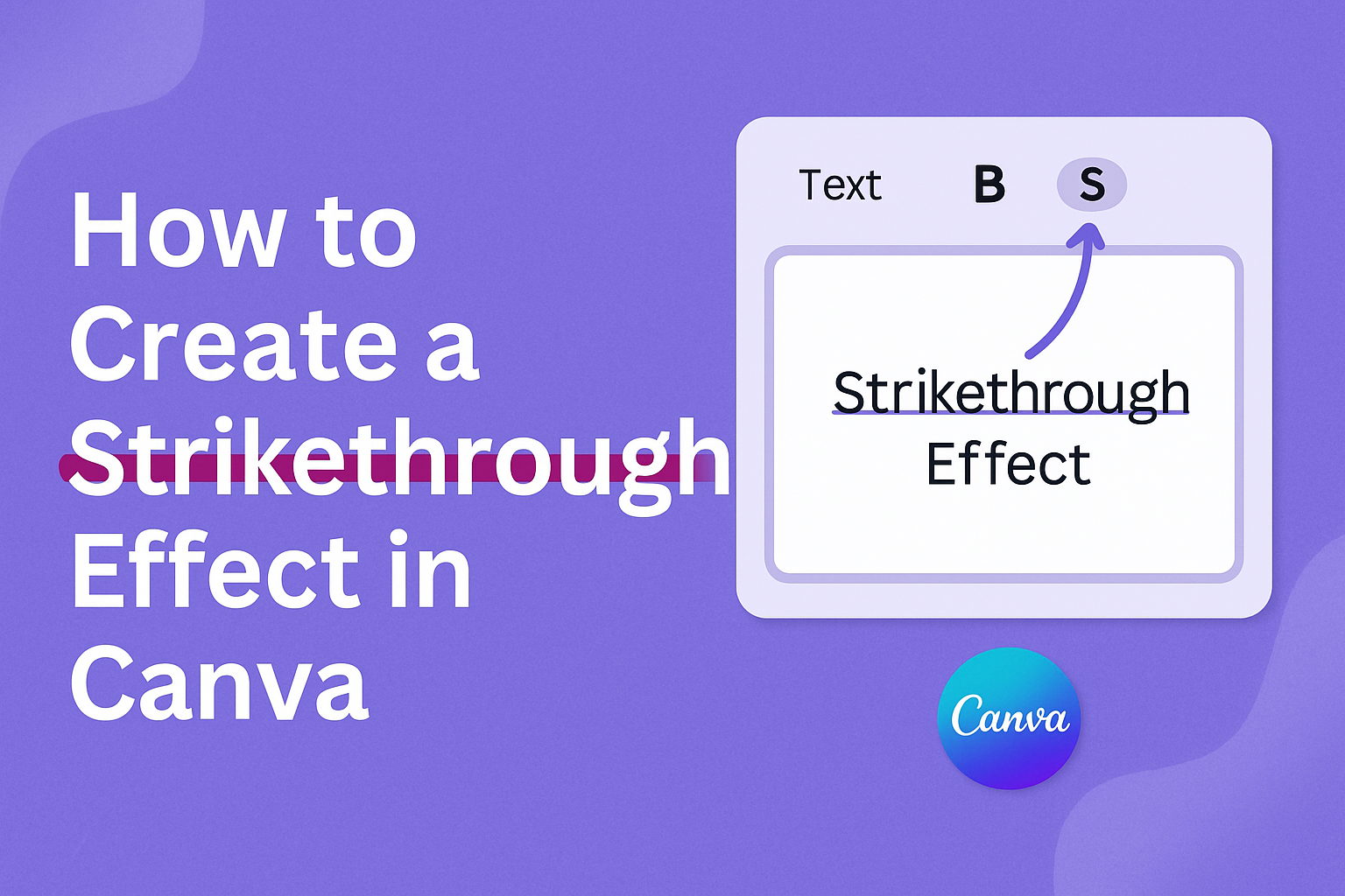
Creating a strikethrough effect in Canva is a handy trick for designers looking to add flair to their text elements.
Whether you’re updating old promotional materials or emphasizing parts of a new design, using this text effect can make your work stand out.
To apply the strikethrough effect, select your text, go to the “Text Effects” button in the toolbar, and choose “Strikethrough” from the options.
This effect is especially useful for those looking to show edits, highlight discounts, or even add a playful touch to holiday cards. Canva makes it easy for all skill levels to incorporate this style into their projects.
Readers can explore different options such as adjusting the line’s thickness and color to match their design needs with ease.
Getting Started with Canva
Creating a strikethrough effect in Canva starts with setting up a Canva account and understanding the dashboard.
These steps ensure you are ready to use Canva’s design tools effectively.
Signing Up for a Canva Account
Signing up for Canva is simple. First, head to the Canva website.
Next, look for the “Sign Up” button on the homepage.
Users have options to sign up using their email, Google account, or Facebook profile. Each method is straightforward, and it’s just a matter of choosing the one that suits you best.
Once the initial sign-up is complete, Canva may ask for basic information like name and purpose of use. This helps tailor the experience to user needs.
Here, they can choose if they are using it for personal, business, or educational purposes.
Lastly, Canva offers both free and premium plans. The free plan provides a range of design templates, while the premium offers additional features like more templates, fonts, and design elements. Users can start with the free plan and consider upgrading later if needed.
Navigating the Canva Dashboard
After signing up, users are greeted with the Canva dashboard. This is the central hub for all design projects.
On the homepage, recent projects and design suggestions are displayed prominently.
A sidebar on the left helps users find templates, elements, or even create a new design from scratch. Each section is clearly labeled to aid navigation.
This makes it easier to find tools and resources quickly.
On the top bar, users can access saved designs, shared projects, and the Canva app directory. This streamlined layout ensures that users can access all necessary tools without clutter or confusion.
Each feature is accessible with just a couple of clicks, making the design process smooth and enjoyable.
Understanding Canva’s Text Features
Canva offers various text features that allow users to add and customize text in their designs. These features enable users to select text styles, alignments, and effects such as strikethrough.
Learning how to efficiently use text tools can enhance the visual appeal of a design.
Adding Text to Your Design
Adding text in Canva is straightforward. Users start by selecting the “Text” tool from the sidebar.
Canva provides three main text options: Heading, Subheading, and Body text, allowing users to choose the level of emphasis they want for their text.
After choosing a text type, click on the design canvas to place and type the desired content.
Users can click and drag the text box to position it where wanted. Canva’s text tool also provides the alignment features, such as left, center, or right align, which help in arranging text neatly.
To make text stand out against design elements, contrast is key. Consider using background colors or lines behind text. This approach helps text remain legible and visually compelling in different design contexts.
Customizing Font Styles
In Canva, customizing font styles allows for creativity and personalization.
Users can choose from a wide range of fonts to match the theme of their project.
Fonts can be changed by clicking on the text and then selecting a font from the dropdown menu.
Text size adjustments make sure content fits well within the design. Users can do this by entering specific font sizes or dragging the size slider.
Text color is another customizable feature, allowing users to select from a palette of colors or create custom shades.
Canva also allows users to create effects like bold, italics, and underline for added emphasis.
By using these formatting options, designers can highlight important information and convey messages effectively.
For those wishing to add a special touch, Canva’s tools enable strikethrough effects by inserting a line element manually or using select text effects. This feature is particularly useful for showing edits or changes to text, making it a dynamic and useful tool in design work.
Creating a Strikethrough Effect
Creating a strikethrough effect in Canva is a simple task. This guide will help you use line elements effectively and adjust their thickness for the desired look.
Using Line Elements for Strikethrough
To start, open Canva and choose your design project. After selecting or creating a text box, the next step is adding a line.
You can find line elements by searching in the “Elements” tab on the side menu.
Drag the chosen line over the text where you want the strikethrough. Make sure to resize the line as needed.
Aligning the line with the text is crucial for a clean look. If the line isn’t placed well, it may not give the effect you’re aiming for.
Adding multiple lines can help achieve different styles, like double strikethroughs. Experimenting with color can also make your strikethrough more visually appealing.
Remember, lines come in different styles, such as dashed or solid, which can add unique flair to your design.
Adjusting Line Thickness and Position
After placing the line, adjusting its thickness is key to achieving the right strikethrough style.
Use the “Line Style” option from the top toolbar to modify the line. Here, you’ll see a slider for line weight. Sliding it to the right will increase the thickness.
Make sure the line is properly positioned over your text. You can drag it up or down as needed.
Precise placement ensures the strikethrough looks professional and clean.
Using the layering feature can help if the line needs to be behind or in front of other elements.
Proper adjustments to thickness and position are important to make the strikethrough effective and visually appealing. If done right, it can enhance the overall readability and aesthetics of your design.
Enhancing Designs with Strikethrough
Strikethrough effects in Canva can add unique touches to any design. They can highlight or de-emphasize parts of the text and offer exciting opportunities to play with colors and textures.
Strikethrough for Visual Emphasis
Using strikethrough in design can draw attention in a creative way.
When a designer wants to show a change in thought or indicate what has been removed without deleting it, strikethrough becomes a valuable tool.
Imagine making a promotional banner. Striking through outdated prices or descriptions can highlight new offerings or discounts.
This approach keeps the design clean and straightforward while effectively pointing out what’s important. Utilizing this feature helps balance visual interest with clarity in communication.
Combining Colors and Textures
Combining colors and textures with strikethrough effects can enhance the design’s appeal.
Experimenting with different strikethrough colors against contrasting backgrounds can make text stand out even more.
Textures add another layer of creativity. By integrating patterned or textured lines instead of plain ones, a design gains depth and sophistication.
For instance, using a dashed or dotted line could convey a playful tone, while a solid, bold line might feel more formal. These choices can help reflect the overall message and mood of the design, making it more engaging.
Troubleshooting Common Issues
Creating a strikethrough effect in Canva can sometimes be tricky. Common problems include misaligned strikethrough lines and difficulty resizing both text and lines simultaneously. The following subsections will help address these issues with practical solutions.
Aligning Strikethrough with Text
One common issue is getting the strikethrough line perfectly aligned with the text. If it’s too low or too high, it looks messy.
To fix this, it’s best to zoom in on your project. This gives a closer view, making it easier to adjust the alignment.
Using arrow keys to nudge the line can help. This allows for fine-tuning without moving too far.
Make sure to check the thickness of the line. Sometimes a slightly thicker line aligns better visually.
Keep adjusting until the line is centered over the text, creating a neat effect.
Resizing Text and Strikethrough Together
Resizing text and a strikethrough line together can be difficult. If they’re resized separately, the design might look off.
To fix this, group the text and the line before resizing.
First, click on the text and the line while holding the Shift key. This selects both elements.
Then, use the group option to lock them together.
Once grouped, the text and line can be resized together. This keeps the proportions the same and maintains a cohesive look.
To ungroup later, just click on the group and choose the ungroup option.