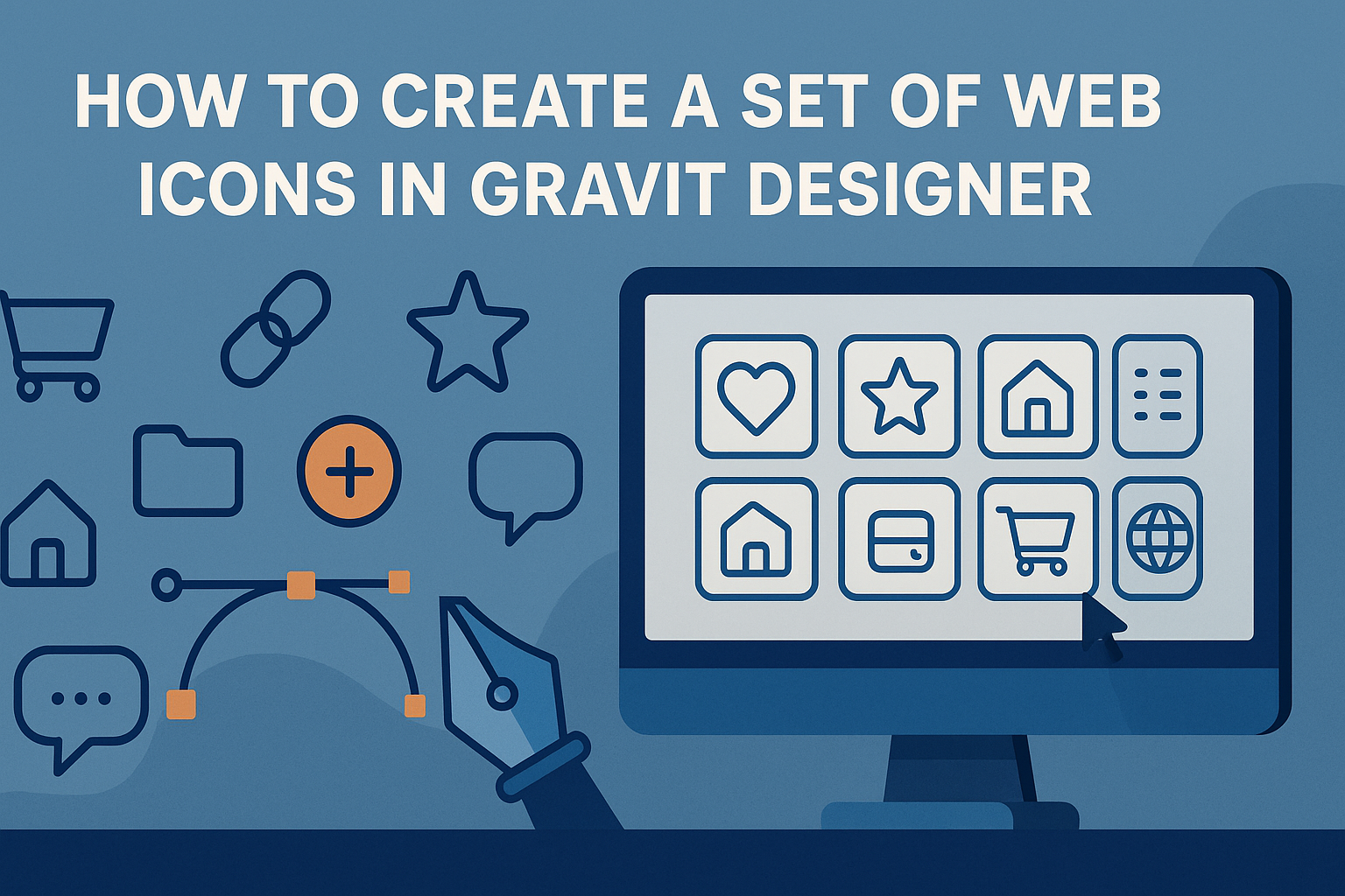
Creating a cohesive set of web icons can enhance any digital project.
To craft a set of web icons in Gravit Designer, one must utilize the right tools and techniques to achieve a unified look. This design software provides an intuitive platform for artists and developers alike, making the icon design process both effective and enjoyable.
Many designers appreciate Gravit Designer for its user-friendly interface and flexibility.
By following straightforward steps, anyone can learn to create stylish icons that fit their website’s theme. This guide will explore essential tips and tricks to help designers get started on their icon design journey.
Whether starting a new project or refreshing an existing one, mastering icon design can elevate the user experience significantly. With the right guidance, icon creation can become a fun and rewarding process that yields professional results.
Now, let’s dive into the world of web icon design in Gravit Designer.
Getting Started with Gravit Designer
Getting started with Gravit Designer involves a few simple steps. The user needs to download and install the software, understand its interface, and set up a document for their design work. These steps are crucial for a smooth design experience.
Downloading and Installing
To begin, he should visit the Gravit Designer website to download the software. It is available for Windows, macOS, and Linux, ensuring accessibility for many users. The download process is straightforward; simply click the download button for the appropriate operating system.
Once the download is complete, he can install the application by following the on-screen instructions. After installation, he can launch Gravit Designer to start creating. It’s that easy!
Exploring the User Interface
Upon opening Gravit Designer, it’s important to familiarize oneself with the user interface. The layout is intuitive, with key tools organized in a toolbar on the left side.
Common tools include:
- Selection Tool: For selecting and moving objects.
- Shape Tools: For adding rectangles, circles, and polygons.
- Text Tool: For inserting text into designs.
He can also find the properties panel on the right side, which provides options to edit selected shapes, including size, color, and effects. The center of the screen serves as the canvas where designs come to life.
Setting Up Your Document
To set up a new document, he should click on “File” and choose “New Design.” A dialog box will appear, allowing the user to select document size and orientation.
For web icons, it’s often best to choose a smaller canvas size, such as 512×512 pixels. He can also set the DPI (dots per inch) to 72 for web use.
Once the settings are adjusted, clicking “Create” will bring the new document to life. This setup provides the foundation for creating eye-catching web icons in Gravit Designer.
Designing Your First Icon
Creating your first icon can be exciting and a bit challenging. He or she can focus on understanding the aesthetics, leveraging basic shapes and tools, and applying colors effectively.
Understanding Icon Aesthetics
Before starting the design, it’s important to grasp the essence of icon aesthetics. Icons should be simple yet recognizable. A successful icon generally balances form and function.
Key elements include:
- Simplicity: Avoid clutter to make the icon easily identifiable.
- Consistency: Use similar styles throughout the icon set to create unity.
- Scalability: Ensure icons remain clear at various sizes, especially small displays.
He or she can visualize the intended purpose of the icon, as that will guide the design choices throughout the process.
Using Basic Shapes and Tools
Gravit Designer provides various tools for creating icons using basic shapes. Starting with shapes like circles, squares, and triangles simplifies the process.
Steps to get started:
- Select the shape tool and choose a basic shape.
- Draw the shape on the canvas, adjusting the size as needed.
- Combine shapes to form more complex designs by overlapping or grouping them.
These simple shapes are the building blocks of any icon. Using them effectively can help create a strong design foundation.
Applying Colors and Gradients
Color can breathe life into an icon. Choosing the right colors can convey meaning and enhance the design’s visual appeal.
Tips for applying color:
- Limit the color palette to 2-3 main colors for a cleaner look.
- Use gradients to add depth, but ensure they remain simple.
He or she should experiment with color combinations to find what works best for the icon’s intent. Consider how colors will appear on different backgrounds, ensuring they remain effective in various contexts.
Advanced Techniques
Creating web icons can be enhanced with some advanced techniques. These methods allow designers to experiment with shapes, manage layers, and apply effects to add depth to their icons.
Creating Complex Shapes
To design intricate web icons, combining basic shapes can create complex forms. Gravit Designer offers tools like the Pen Tool that allows for drawing freeform shapes. Designers can combine circles, rectangles, and polygons to make unique designs.
Using the Boolean operations feature can simplify shape merging. These operations include Union, Subtraction, Intersection, and Exclusion. For example, using Union merges selected shapes into one. This helps in creating icons that are not only attractive but also functional.
Working with Layers and Groups
Managing layers effectively is crucial. In Gravit Designer, layers help control visibility and arrangement of different components of an icon. Designers should name their layers clearly for easy navigation.
Grouping related layers can streamline the design process. To group, select the layers and use the shortcut Ctrl + G. This action helps in moving multiple elements together without altering their individual settings.
It’s also important to lock layers that are not being edited. This prevents accidental changes and keeps the workspace organized.
Adding Effects and Textures
Adding effects can make icons stand out. Gravit Designer provides various styles like shadows, glows, and gradients. For instance, a subtle shadow can create depth and make an icon feel more three-dimensional.
Designers can also apply textures to add character. Using a texture overlay can bring a unique feel to the icons. To do this, select the icon and apply an image fill or pattern filling.
Experimenting with opacity can blend textures nicely. Adjusting the opacity level allows the texture to enhance rather than overpower the base icon.
Exporting and Usage Tips
When creating web icons in Gravit Designer, it’s essential to consider the best file formats and optimization strategies. Proper export settings can significantly affect load times and overall performance.
Choosing the Right File Formats
Selecting the correct file format is crucial for web icons. Common formats include SVG, PNG, and JPEG.
- SVG: Best for scalability. Icons remain sharp at any size.
- PNG: Ideal for images with transparency. It suits detailed designs.
- JPEG: Useful for complex images but doesn’t support transparency.
For most web icons, SVG is the go-to choice because of its lightweight nature and versatility. It’s perfect for responsive designs as it maintains quality across different screen sizes. Before exporting, ensure that the chosen format aligns with the design’s needs and the website’s overall style.
Optimizing for Web Performance
To keep websites fast and user-friendly, optimizing icons is vital.
Compressing files can reduce their size without losing quality.
- Tools: Use online compressors like TinyPNG or SVGOMG for SVG files.
- Sizing: Make sure icons are the correct size for their usage. Larger files can slow down loading times.
Additionally, implementing lazy loading can enhance performance.
This technique loads icons only when they appear in the user’s viewport.