Creating an eye-catching newsletter layout in InDesign can be a fun and rewarding task. With the right steps, anyone can design a professional-looking newsletter that effectively communicates their message.
This guide will help readers understand the key elements needed to build a great layout from start to finish.
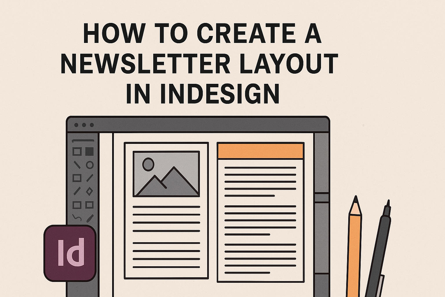
InDesign offers powerful tools that make layout design easier. By exploring features like text boxes, image placement, and grids, they can create a visually appealing and organized newsletter.
Anyone looking to boost their newsletter’s appeal and clarity will find valuable tips and techniques here.
Readers can transform blank pages into vibrant newsletters that engage their audience. Following the steps outlined in this article will empower them to unleash their creativity while maintaining a clean and inviting layout.
Whether they are beginners or more experienced users, learning these principles will elevate their design skills.
Getting Started with InDesign
To create a successful newsletter, it’s essential to understand the tools at your disposal in InDesign.
By getting familiar with the interface, setting up your document correctly, and utilizing master pages, anyone can start designing efficiently.
Understanding InDesign’s Interface
InDesign has a user-friendly interface that might seem overwhelming at first, but it is designed for efficiency. The main components include the Control Panel, Tools Panel, and Panels for Layers and Pages.
- Control Panel: Located at the top, it offers quick access to settings like font size and alignment.
- Tools Panel: On the left side, it contains tools for text, shapes, and editing.
- Panels: Found on the right, they help organize elements in the document, such as layers and styles.
Getting acquainted with these areas will enhance their workflow.
Setting Up Your Document
Before diving into design, setting up the document correctly is crucial. To start, open InDesign and create a new file.
- Define Document Size: Click on File > New > Document. Choose the size, like A4 or Letter, depending on your newsletter’s needs.
- Margins and Bleeds: Set appropriate margins for readability. Bleeds are essential if your design goes to the edge of the page.
- Page Count: Decide on the number of pages as it may affect layout planning.
These steps create a solid foundation for any newsletter project.
Working with Master Pages
Master Pages allow designers to create consistent layouts across multiple pages. By applying elements like headers, footers, and page numbers on a master page, they save time and ensure uniformity.
- Creating a Master Page: Go to the Pages Panel and double-click on the master page. This opens it for editing.
- Adding Elements: Place text or graphic placeholders that appear on every page. For instance, a footer with page numbers works great here.
Using master pages streamlines the design process, making updates easier across the entire document.
Designing Your Newsletter
Creating an appealing newsletter layout involves several key elements. Color schemes, fonts, images, and text styles work together to engage readers and convey the right message. Each component should be carefully chosen for best results.
Choosing a Color Scheme
A well-thought-out color scheme sets the mood for the newsletter. Start by selecting 2 to 4 colors that complement each other.
Use a primary color for headings and important elements, while secondary colors can highlight sections or create contrast.
Tips for Choosing Colors:
- Consider Brand Identity: Align colors with existing branding.
- Use Color Theory: Understand how colors interact. For example, blue offers a calming effect, while red can create excitement.
- Check Accessibility: Ensure sufficient contrast for readability.
Tools like Adobe Color can help in picking harmonious color palettes.
Selecting Fonts and Typography
Fonts significantly impact how readers perceive the message. Choose between serif and sans-serif fonts based on the newsletter’s tone.
- Headers: Use a bold font for headings to grab attention.
- Body Text: Stick to simple fonts for easier reading.
A common combination is a modern sans-serif for headers and a classic serif for the body.
Important Notes:
- Limit Font Variations: Use a maximum of two or three different fonts.
- Maintain Consistency: Keep font sizes consistent for a polished look.
Check tools like Google Fonts for a variety of options.
Adding Images and Graphics
Images and graphics enhance visual interest and support the content. They break up text and create a balance on the page.
When selecting images:
- Use High-Quality Photos: Choose crisp images that align with the topic.
- Include Infographics: Summarize complex information visually.
- Maintain Relevance: Ensure every image relates directly to the content.
Position images strategically to keep the flow of the newsletter intact. Use captions to provide context or encourage engagement.
Incorporating Text and Styles
Clear text layout improves readability and keeps readers engaged. Start with a hierarchy in mind: headlines, subheadings, and body text should have clear differentiation.
Text Layout Tips:
- Use Bullet Points: Break up large chunks of text to enhance skimming.
- Adjust Line Spacing: Space can help readability. Standard spacing is 1.15 to 1.5 for body text.
- Highlight Key Points: Use bold or italic styles to emphasize important information.
This approach ensures that readers can quickly find what interests them while enjoying the overall design.
Streamlining the Layout Process
Efficiency is key when creating a newsletter layout. By using grids, styles, and libraries, one can simplify the design process and ensure a polished look.
Using Grids and Guides
Grids and guides help organize content on a page. They create consistent spacing and alignment, making it easier to arrange elements in a newsletter.
InDesign allows users to set up a custom grid that fits their layout needs.
One effective way to use grids is by establishing a six-column grid. This setup can provide flexibility in layout design. Each column can hold different types of content, permitting variations in design while maintaining a unified look.
Guides can be adjusted to align text and images. Simply dragging them into position creates visual order.
It’s also helpful to snap objects to guides for quick alignment. This makes the layout process faster and highlights any necessary adjustments.
Creating and Applying Styles
Styles in InDesign save time and maintain consistency. By creating text and object styles, users can apply these formats with just a click.
For example, a paragraph style can include font, size, and spacing settings, ensuring uniformity across the newsletter.
InDesign users can also create character styles for special text formatting. This makes it easy to emphasize headlines or quotes without manually adjusting settings each time.
Applying these styles across the document not only speeds up the process but helps avoid mistakes.
Changes can be made to a style, instantly updating all text using that style. This keeps the layout looking professional with minimal effort.
Leveraging InDesign Libraries
Using InDesign Libraries can significantly enhance the workflow.
Libraries allow users to store and easily access frequently used elements, like logos, images, and text blocks.
To create a library, users simply go to the Window menu, select Libraries, and add items to it.
This makes it easy to drag and drop these elements into any project quickly.
InDesign Libraries not only save time but also ensure design consistency. When the same elements are reused, the newsletter maintains a cohesive look. This method reduces redundancy and streamlines the overall layout process.
Finalizing Your Newsletter
Before wrapping up the newsletter, it’s crucial to ensure everything is polished and ready for distribution. Proofreading and editing will help catch any errors, while exporting in the right formats ensures it looks great, whether in print or online.
Proofreading and Editing
The first step in finalizing a newsletter is thorough proofreading. This includes checking for spelling and grammatical errors, ensuring consistency in font styles and sizes, and confirming that images are placed correctly.
A checklist can be helpful. Consider items like:
- Spelling mistakes
- Consistent formatting
- Image alignment
After the initial read, it’s beneficial to have someone else review it. Fresh eyes can catch mistakes that might have been overlooked.
Lastly, read the text aloud to check the flow and make sure everything sounds just right.
Exporting for Print and Digital Formats
Once editing is complete, the next step is to export the newsletter. InDesign allows users to choose the right format for their needs.
For print, export as a high-resolution PDF. This ensures that text and images look sharp.
For digital distribution, a lower resolution PDF or an interactive PDF version can be useful.
Use the “Export” function and select:
- PDF (Print)
- PDF (Interactive)
Ensure all links work properly in the digital format.
Review the settings in the export dialog to maintain the layout and colors.
Proper exporting will make the newsletter look professional in every format.