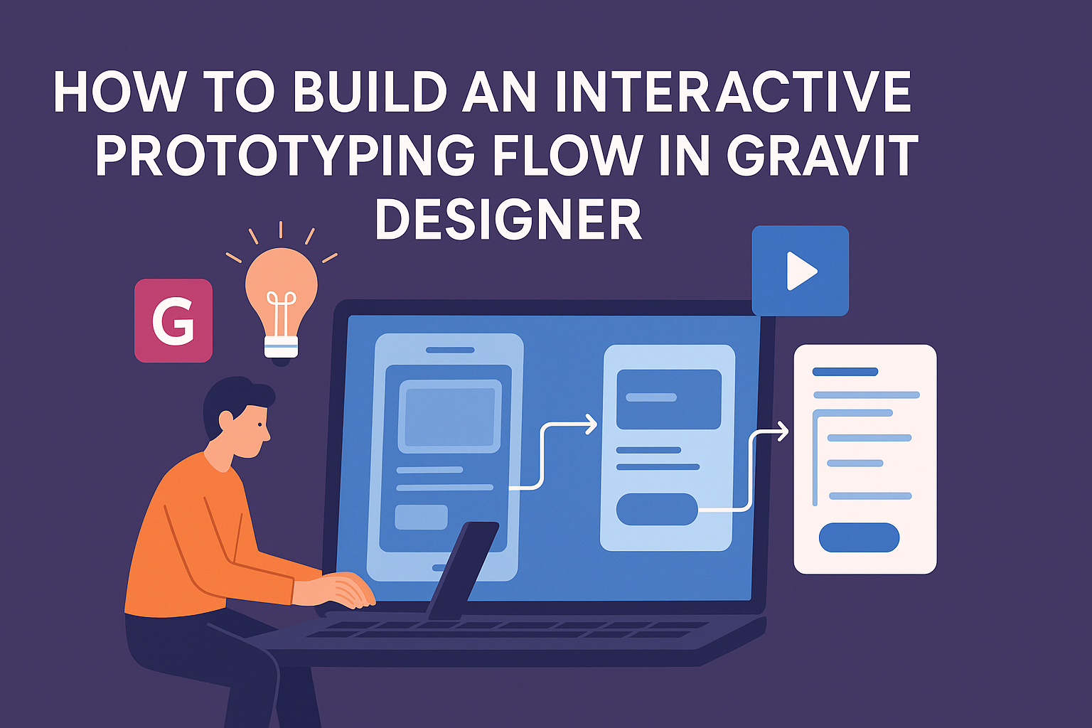
Building an interactive prototype in Gravit Designer can make a big difference for designers aiming to visualize their ideas.
A well-structured prototyping flow not only helps in refining design concepts but also engages stakeholders with realistic user experiences. This process allows designers to test functionality and gather feedback early on.
As designers work through the steps in Gravit Designer, they will find tools that simplify animation and interactivity. This makes it easier to create a prototype that feels like the final product, enhancing the overall design process.
Engaging with an interactive flow leads to better design decisions and a smoother development stage.
By following the right techniques, anyone can master the art of interactive prototyping in Gravit Designer. With practice, they can elevate their design projects and bring innovative ideas to life. Exploring these methods can inspire creativity and efficiency in any design endeavor.
Getting to Know Gravit Designer
Gravit Designer is a versatile tool that offers a clean interface and powerful features. Understanding how to navigate its layout and utilize its capabilities can enhance the design process.
Interface Overview
The interface in Gravit Designer is user-friendly, emphasizing ease of use.
At the top, users will find the menu bar with options for file management, editing, and view settings.
To the left, the tool panel gives access to functions like selection, shape tools, and text tools. The right side hosts the inspector, where users can adjust properties like fill, stroke, and effects.
The canvas area in the center is where designs come to life. Overall, the layout is intuitive, making it easy for both beginners and experienced designers to find their way around.
Setting Up Your Workspace
Customizing the workspace in Gravit Designer can enhance productivity. Users can set their preferred workspace by rearranging panels to suit their workflow.
To start, drag and drop panels to create a layout that feels comfortable. Users can also save these configurations for future projects.
Another important aspect is using shortcuts. Gravit Designer supports a variety of keyboard shortcuts that can speed up the design process. Learning these will help users navigate the tool more effectively.
Exploring Key Features
Gravit Designer is packed with features that streamline the design process. Users can create vector illustrations, design for print, and even make presentations.
Notable features include symbols for reusable components, making designs consistent and efficient. The export options are also extensive, allowing designs to be saved in various formats like SVG, PDF, and PNG.
Another key aspect is the collaboration tools. Users can share their projects with others, enabling teamwork and feedback in real time. These features make Gravit Designer a robust choice for interactive prototyping.
Creating the Foundation
Building an effective interactive prototype starts with creating a solid foundation. This involves carefully designing initial screens, selecting the right shapes, and choosing appropriate text styles. Each element plays a crucial role in ensuring the prototype communicates the intended message clearly.
Building Your First Screen
To create the first screen in Gravit Designer, one should start with a blank canvas. Selecting the appropriate canvas size is important. Common dimensions for web prototypes include 1920×1080 pixels.
Once the size is set, it’s time to add a background color or image. Choosing a neutral background can help other elements stand out.
He or she can then begin adding shapes and containers to design the layout.
Using grids and alignment tools will ensure elements are positioned neatly. This approach maintains the flow of the design and enhances visual appeal. After that, it’s helpful to name the layers for easy navigation as the project grows.
Working with Vectors and Shapes
Gravit Designer offers various vector tools to create custom shapes. Using the Pen Tool, one can draw unique paths that fit specific design needs. Precision is key, so zooming in helps make more detailed shapes.
For standard UI elements, basic shapes like rectangles and circles can be dragged onto the canvas. These shapes can be modified by adjusting their size, corners, and colors. She or he can also use Boolean operations to combine shapes into more complex forms easily.
Applying fill and stroke options adds personality to each element. Adjusting opacity can help create a sense of depth. This layer management keeps the design organized and easily tweakable.
Adding Text and Typography
Once the visual elements are in place, the next step is adding text. Choosing the right font is essential for readability and style. Gravit Designer has a variety of fonts, but sticking to a couple for consistency is best.
When adding text, consider the hierarchy. Headers should be bold and larger, while body text can be smaller and lighter. A clear visual hierarchy guides users through the information structure.
Adjusting line spacing and letter spacing can enhance legibility. It’s beneficial to align text properly within its containers. Previewing the design ensures that everything looks good in context and is user-friendly.
Linking the Elements
Linking the elements is crucial for creating a smooth and interactive experience in Gravit Designer. This involves using layers, adding interactions, and including transitions to enhance the prototype’s flow.
Using Layers and Symbols
Layers help organize different components in a design. Each element, like buttons or images, can be placed on separate layers. This makes selecting and modifying them easier.
Symbols are reusable components in Gravit Designer. For example, if there is a common button style, it can be saved as a symbol. This way, any changes made to the symbol will apply to all instances throughout the design. This approach saves time and ensures consistency.
To use layers effectively:
- Organize layers by grouping related items together.
- Name the layers clearly for easy reference.
- Use symbols for recurring elements to streamline design updates.
Creating Interactions
Creating interactions adds functionality to the prototype. Gravit Designer allows users to set click and hover actions on elements. This engagement makes the prototype feel more alive.
To create an interaction:
- Select the element where the interaction should happen.
- Navigate to the interactions panel.
- Choose the type of interaction, such as “On Click” or “On Hover.”
- Define what happens next, like navigating to another page or changing element styles.
Including interactions keeps users engaged and helps them understand how the final product will work.
Adding Transitions and Animations
Transitions and animations enhance the visual appeal of the prototype. They help create a smoother flow between different screens or elements.
Gravit Designer offers various animation options. Designers can set duration and easing types for each transition. For instance, a simple fade can signal that a new screen is loading.
To add transitions:
- Select the element for which the transition applies.
- Choose a transition effect like “Slide In” or “Fade Out.”
- Set up the timing for the transition to control how quickly it occurs.
By incorporating these aspects, the designer can make the prototype more dynamic and enjoyable for users.
Testing and Sharing
Testing and sharing the prototype is crucial for gathering valuable feedback. This process helps designers refine their work and ensure the design meets user needs. Effective techniques include previewing the prototype, sharing it for feedback, and exporting the design for various uses.
Previewing the Prototype
Before sharing a design, it’s important to preview it. This allows the designer to interact with the prototype and check if all elements function correctly. They can look for any design flaws or broken links.
In Gravit Designer, the preview option lets the designer see the prototype as users would. This live view helps identify any issues early. Designers can also make tweaks directly within the program based on this preview. Taking the time to refine during the preview stage enhances the quality of the final product.
Sharing for Feedback
Once the prototype is ready, sharing it for feedback is the next step. Gathering input from peers and users is essential for understanding different perspectives.
Designers can use tools like links or shared files. For example, they can upload the prototype to a platform that allows commenting. The feedback can be structured to focus on usability, aesthetics, and functionality, which can be crucial for improvement. Encouraging specific feedback ensures that the most important aspects are reviewed properly.
Exporting the Design
Exporting the design is the final step before launch.
Gravit Designer allows users to export their prototypes in various formats, such as PNG, SVG, or PDF. This flexibility supports different needs, from sharing with team members to presenting to stakeholders.
When exporting, designers should choose the format that best fits their audience’s needs.
For instance, PDF files work well for documents, while PNGs are great for images. By ensuring the right format is selected, they can facilitate smoother communication and presentation of their design.