Creating an eye-catching flyer for a conference or trade show can make a big difference in attracting attendees.
With Easil, anyone can design a professional-looking flyer in just a few simple steps. This tool offers a range of templates and design options that cater to various events, ensuring each flyer stands out.
Using Easil not only simplifies the design process but also empowers users to express their unique brand.
They can easily customize colors, fonts, and images, making it possible to capture the essence of their event. By learning how to navigate this platform, they can enhance their promotional efforts significantly.
Whether it’s the first event or a recurring conference, the right flyer can create buzz and excitement. By following an easy guide, they will discover how to build a flyer that communicates the event’s key details and engages potential attendees effectively.
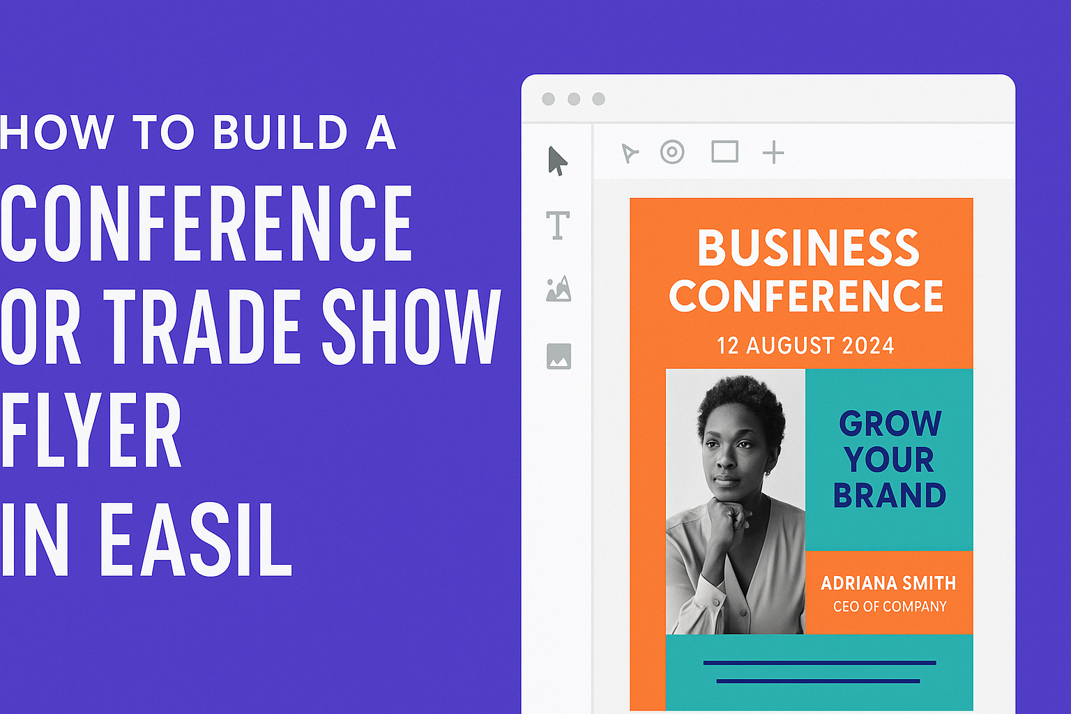
Getting Started with Your Design
When starting to design a conference or trade show flyer, it’s important to select the right template and understand the dynamics of the event.
Choosing the right visual foundation will help convey the event’s purpose effectively. Knowing how conferences and trade shows function will also guide the design choices.
Choosing the Right Template
Selecting a suitable template is crucial for setting the correct tone. Easil offers a range of templates tailored for events, ensuring designs fit various themes.
Considerations for template selection:
- Event Type: Pick a template that reflects the type of event, such as tech, education, or healthcare.
- Layout: Choose a layout that supports all key information, like date, time, and location.
- Customization: Make sure the template allows for easy changes in color, fonts, and images.
Using these tips, a user can find a template that best suits their event’s needs.
Understanding Conference or Trade Show Dynamics
Designing a flyer requires grasping how conferences and trade shows operate. These events often feature multiple sessions, speakers, and networking opportunities.
Key dynamics to remember:
- Target Audience: Know who will attend and tailor the message accordingly. Specific interests help in making the flyer relatable.
- Value Proposition: Clearly communicate what attendees will gain, such as learning opportunities, networking, or special sessions.
- Visual Hierarchy: Organize information so that the most important details stand out. Use bold fonts for titles and concise descriptions for the events.
Understanding these factors will help in crafting a flyer that attracts and informs the audience effectively.
Design Elements and Principles
When creating a conference or trade show flyer, it’s essential to focus on key design elements and principles. This includes incorporating branding, mastering layout and composition, and using color and fonts wisely. These aspects greatly impact how the flyer communicates its message and attracts attention.
Incorporating Branding and Theming
Branding is crucial for any flyer. It helps create a connection with the audience. Incorporating the brand’s logo, colors, and slogans reinforces the identity.
Consistent theming across all promotional materials strengthens the visual impact. Flyers should reflect the event’s purpose and tone.
For example, an industry conference might use professional colors and fonts, while a creative trade show could allow for more vibrant designs. Keeping branding elements visible ensures that the flyer resonates with the intended audience.
Layout and Composition Basics
The layout of a flyer significantly influences readability and engagement. A clear structure is essential. Breaking text into sections with headers helps guide the reader’s eye.
Using bullet points or short paragraphs makes information digestible. It’s vital to avoid clutter. White space can enhance overall visual appeal by giving the design room to breathe.
Positioning key elements strategically, like titles and call-to-action areas, is also important. They should stand out but not overwhelm the design.
Using Color and Fonts Effectively
Color choices play a major role in conveying emotion and setting the mood. Using a limited color palette keeps the design looking professional.
Contrasting colors for text and background enhance readability. It helps important information to pop out.
Font selection is just as vital. It’s best to stick to two main fonts: one for headlines and another for body text. Ensure they complement each other and align with the branding.
Using bold or italic styles can emphasize important points without causing distraction. Together, thoughtful color and font choices create a cohesive and inviting flyer design.
Content Essentials
Creating a conference or trade show flyer requires thoughtful content that captures attention. Each element plays a crucial role in ensuring the flyer conveys the right message and engages the audience.
Crafting Compelling Headlines
A strong headline grabs attention and sets the tone for the flyer. It should be clear and concise while highlighting the event’s purpose. Using action verbs can make headlines more engaging. For example, instead of saying “Annual Conference,” a headline like “Join Us for the Annual Conference: Innovate and Inspire!” draws interest.
In addition, the font choice and size matter. Bold, large fonts can enhance visibility. Including relevant keywords can improve searchability, which is essential if the flyer will be shared online.
Key Information to Include
Essential information must feature prominently on the flyer. This includes the event name, date, time, and location. Clearly presenting these details helps the reader quickly understand what the event is about.
Additionally, include any speakers or special guests, as their names can attract attendees. A brief agenda or list of topics could be beneficial, providing insight into what participants can expect.
In any case, consider using bullet points to organize this information. This layout makes it easier to read and absorb quickly.
Adding Calls to Action
Calls to action (CTAs) guide readers on what to do next. They encourage immediate engagement and can significantly impact attendance.
Phrases like “Register Now,” “Get Your Tickets Today,” or “Learn More” are effective CTAs.
Position CTAs prominently on the flyer. Using contrasting colors or bold text can make them stand out.
Providing a clear link or QR code for registration offers convenience, making it easy for readers to take action.
Remember, CTAs should create a sense of urgency or importance, prompting the reader to act swiftly.