When creating designs in Canva, understanding how to use colors effectively is key to making an impact.
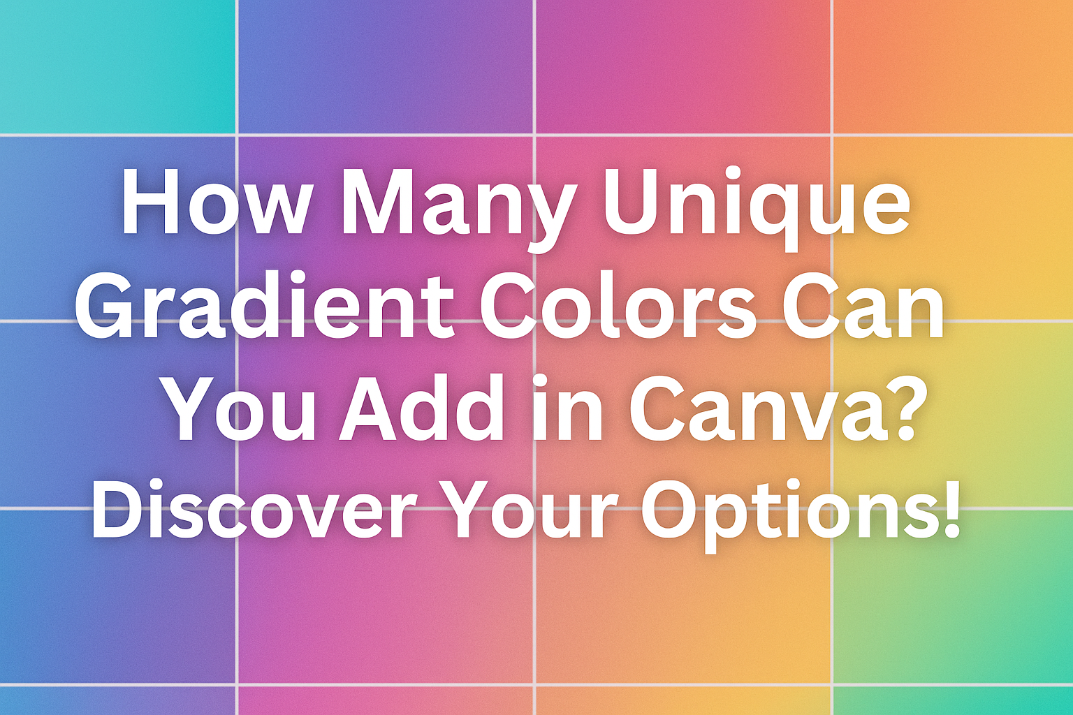
Users can add up to 10 unique gradient colors to a single design element, allowing for rich and diverse color combinations. This feature opens the door to endless creativity and helps designers achieve the perfect look for their projects.
With the ability to blend multiple colors smoothly, gradients can enhance everything from backgrounds to shapes.
They can create depth and visual interest that draws viewers in.
This blog post will explore how to make the most of gradients in Canva, including tips and tricks for designing eye-catching visuals.
For those eager to elevate their design skills, knowing how to master gradients can be a game changer. This article will provide insights not only on adding colors but also on creating stunning effects that can transform any design.
Understanding Gradient Colors in Canva
Gradient colors are a powerful design tool in Canva that can transform simple designs into eye-catching visuals. They blend different shades harmoniously, adding depth and style to any project. Here’s a closer look at what gradient colors are and how Canva implements them.
What Are Gradient Colors?
Gradient colors are created by blending two or more shades to create a smooth transition. They can move from one color to another or shift through multiple colors. This effect is often used in backgrounds, text, and shapes to add visual interest.
There are several types of gradients, including linear, radial, and angular.
Linear gradients transition along a straight line, while radial gradients blend colors outward from a central point. Angular gradients move around a focal point, creating a sense of movement. Each type can convey different emotions and styles.
How Canva Handles Color Gradients
In Canva, users can easily create and customize gradients. When adding gradient colors, they can choose up to 10 unique colors within a single gradient. This flexibility allows users to match their designs with specific themes or branding.
To create a gradient, users simply select the element and click on the color tile. They can then access the gradient options and pick their desired colors.
Canva’s intuitive color picker makes it easy to adjust the hue and positioning of color stops. This feature ensures that gradient colors enhance the overall look of the design while remaining user-friendly.
Creating Custom Gradients
Creating custom gradients in Canva allows users to enhance their designs with vivid colors and depth. By choosing the right colors and adjusting the gradient direction, one can achieve unique looks that stand out.
Choosing the Right Colors
Selecting the perfect colors for a gradient is crucial.
Users can start by considering colors that complement each other. A simple color wheel can help with this. Colors that are adjacent on the wheel often blend nicely, while contrasting colors can create a striking effect.
In Canva, users can pick colors from the color palette or enter specific hex codes to get exact shades.
It’s also beneficial to try out different combinations. Experimenting with light and dark shades can add dimension to the design.
Here’s a tip: Three-color gradients can often yield more interesting results. One can select a dominant color and two accent colors for balance.
Adjusting Gradient Direction and Type
Once the colors are chosen, adjusting the direction and type of the gradient is the next step.
Canva offers various options for how the gradient can flow, such as linear or radial gradients. Each type creates a different visual effect.
For linear gradients, users can decide if the gradient flows from top to bottom, left to right, or diagonally. Radial gradients start from a central point and spread outward. This can create a lovely burst effect.
To adjust these properties, users can click and drag on the gradient or use the settings in the toolbar. Fine-tuning the angle or spread can help achieve the desired look. Remember, practice makes perfect when creating gradients!
Tips for Beautiful Gradient Designs
Creating beautiful gradient designs involves understanding color harmony and effectively using gradients within layouts. These tips will guide you to enhance your designs using unique gradients in Canva.
Color Harmony and Contrast
When choosing colors for gradients, it’s important to consider color harmony. This means selecting colors that work well together. For example, complementary colors (those opposite on the color wheel) can create striking effects.
Color Schemes to Consider:
- Analogous Colors: Colors next to each other (like blue and green) create a calm look.
- Complementary Colors: Opposite colors (like orange and blue) add energy and vibrancy.
Contrast is also vital; it helps ensure that the gradient is visible and impactful.
Using a mix of light and dark shades can enhance depth, making the design more dynamic. Testing different combinations in Canva allows designers to find the perfect balance.
Using Gradients in Layouts
Gradients can enhance overall layout designs by adding interest and depth. They can serve as backgrounds, overlays, or even within elements.
Effective Gradient Uses:
- Backgrounds: A subtle gradient can make text stand out. Light gradients behind dark text improve readability.
- Overlay Effects: Applying a gradient overlay on images can create a unique look and draw attention.
When incorporating gradients, consistency is key. Using similar gradients across different elements in a design creates a cohesive look. Canva allows easy adjustments, so experimentation is encouraged.
Limitations and Best Practices
When using gradients in Canva, there are important factors to consider. Understanding these limitations and best practices can help users create more effective designs.
Potential Limitations in Canva
One limitation is the number of unique gradient colors that can be added. Canva allows a maximum of 10 colors within a single gradient. This can be restrictive for users aiming for more complex designs.
Another issue is that not all design elements support gradients. For example, while text can have gradients applied, some shapes might not allow this feature. This can lead to unexpected results.
Performance can also be affected. Using too many colors or layers in a gradient may slow down the design process. Users might need to find a balance between creativity and functionality.
Best Practices for Gradient Usage
To get the best results with gradients, users should keep a few key practices in mind.
1. Limit Color Choices:
Stick to 2-4 colors for a cleaner look. Too many colors can make the design chaotic.
2. Use Contrast:
Ensure there is enough contrast between colors for better visibility. This helps important elements stand out.
3. Test on Different Backgrounds:
Always check how the gradient looks on various backgrounds. Some colors may not display well against lighter or darker settings.
4. Gradients in Text:
When applying gradients to text, choose colors that complement each other. This enhances readability.