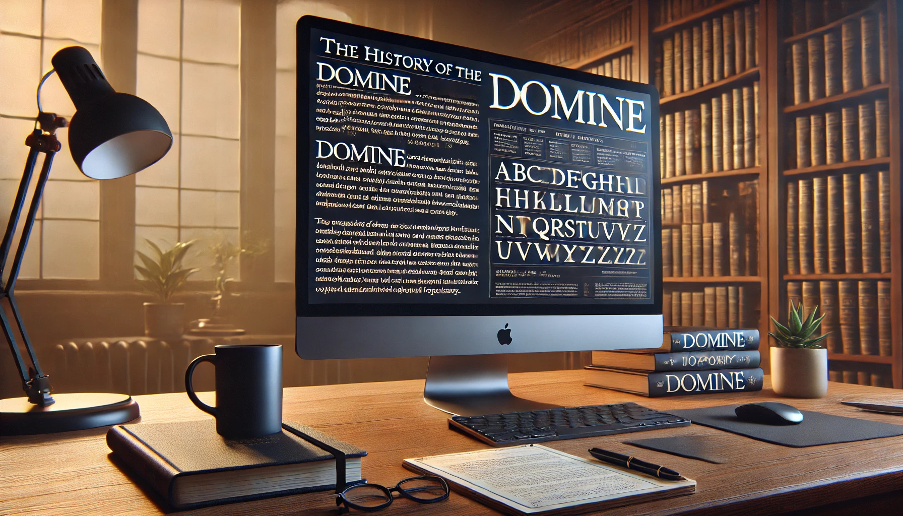
Domine is a typeface that captures the elegance of classic serifs while blending modern readability. Created by Pablo Impallari, it was specifically designed to work well on digital screens, making it ideal for online content. Domine is perfect for sites where reading is the main activity, like newspaper or magazine websites.
The font shines at sizes like 14 and 16 pixels but remains readable even at 11 pixels, showcasing its versatility. Its design ties together the smooth curves from fonts like Clearface with the sharper features of Clarendon, giving it a unique blend of style and structure. Those who appreciate a classic look with a contemporary flair find Domine appealing.
Domine’s charm lies in these design choices, making it not only aesthetically pleasing but also practical. Google Fonts highlights its use for web body text, ensuring it fits seamlessly into various digital platforms. Whether used for long articles or brief posts, Domine provides a reliable and stylish option for any web page.
Origins of Domine
The Domine font is a modern serif typeface that combines classic design with touches ideal for digital media. It is known for its readability and elegant appearance, making it a popular choice in web design.
Conceptualization
Domine was created by Pablo Impallari with the goal of enhancing readability for digital text. From the outset, it was intended for use as body text on websites. Impallari focused on creating a typeface that was comfortable for reading, even in smaller sizes like 11 or 12 pixels. This focus on web readability set Domine apart from more traditional serif typefaces, which might not perform as well on screens.
The font was crafted to look good on both newspaper and magazine websites. These platforms often require a typeface that maintains clarity across different devices and resolutions. The decision to prioritize legibility and comfort was a key aspect of Domine’s conceptual beginnings.
Design Influences
Impallari drew from several historical typefaces to shape Domine’s unique style. The font blends elements of Clearface and Clarendon, resulting in a harmonious mix of softness and structure. Clearface, known for its organic appearance, provides playful curves. Clarendon’s more rigid style contributes defined serifs and squarish counters.
This combination gives Domine a classic feel with modern adaptability. The font’s readability at sizes like 14 and 16 pixels makes it versatile for various digital applications. Domine’s design takes these historic influences and adapts them for present-day digital use, creating a typeface that fulfills both aesthetic and functional needs.
Development of Domine
Domine is a serif typeface known for its readability and classic design. This section delves into its creation, focusing on how its initial design process laid the foundation and the refinements that fine-tuned it for digital readability.
Initial Design Process
The creation of Domine began with the need for an effective digital font suitable for extended reading on screens. Designed by Pablo Impallari, Domine aimed to offer a comfortable reading experience. The focus was on body text, testing various sizes to ensure a balance of legibility and aesthetics. Domine is particularly effective at 14 and 16 pixels, but it remains clear even at smaller sizes such as 11 or 12 pixels.
Inspired by historical fonts, Domine mixes styles, such as the lively Clearface design from 1907 and the stricter Clarendon style from 1845. These influences resulted in a typeface that combines modern looks with traditional roots. This choice emphasizes its versatility for newspapers and magazines where the clarity of text is vital.
Refinements and Revisions
Throughout its development, Domine underwent several adjustments to perfect its appearance and functionality. Each revision focused on enhancing its digital readability, especially given the different screen types and resolutions available today. The designers emphasized refining curves and serifs to optimize clarity.
These refinements ensured the font remained visually appealing without causing eye strain during long reading sessions. Improvements also addressed kerning and spacing, ensuring consistency across various platforms and devices. This dedication to detail makes Domine a reliable choice for digital publishing.
Characteristics of Domine
Domine is a serif typeface with a blend of classic and modern features. It is designed for comfortable reading on digital screens, offering unique details that enhance its legibility and appeal.
Serif Features
Domine is characterized by its serif design, which combines elements of two iconic typefaces. It blends the softness of Clearface with the strictness of Clarendon. The serifs are strong and pronounced, which provides stability to the text.
Ball serifs feature prominently, adding a playful touch to certain letters. This combination of styles gives Domine a distinctive look that is both traditional and contemporary. These features contribute to the typeface’s aesthetic and help maintain clarity in various text sizes.
Readability Factors
Domine is optimized for web use, making it highly readable on screens. It performs well at typical body text sizes like 14 to 16 pixels and can even be legible at 11 pixels.
The design focuses on minimizing strain on the eyes during long reads, which makes it suitable for digital media such as newspapers and magazines. The consistent stroke width and smooth curves further enhance readability, creating a comfortable reading experience for the audience.
Unique Glyphs and Characters
One of the standout features of Domine is its unique glyphs. Certain letters, like ‘a’ and ‘m’, feature playful curves that add character to the typeface. The design incorporates teardrop terminals, delivering a refined touch.
Despite its charm, Domine does not include italics, which may limit its use to display purposes or straightforward text composition. This makes it an ideal choice for headings and simple content where elegance and readability are key.
Typography and Usage
Domine, a serif typeface, is appreciated for its readability and versatility. It suits both print and digital environments, with specific styles for diverse applications. It pairs well with other fonts to create harmonious designs.
Print Versus Digital
Domine is a modern serif typeface primarily created for digital use. Its design ensures that text remains legible on screens of various sizes. With features like rounded letters and short serifs, it provides a smooth reading experience, making it ideal for long-form text online.
In print, Domine maintains its clarity but is less common compared to digital. Its structure and spacing can make it a good choice for printed texts requiring clear readability, but it shines brightest on digital platforms.
Popular Applications
The Domine font appears widely in online publications, blogs, and websites due to its clear and classic style. Designers favor it for digital content where long passages of text are involved, like articles or e-books. It offers a professional yet approachable look.
Since it is freely available on Google Fonts, it’s easily accessible for web designers. Its open-source nature allows users to incorporate it into various projects without licensing restrictions.
Pairing with Other Fonts
Pairing Domine with other fonts can enhance its appeal. It works well with sans-serif fonts, creating a balanced contrast that is visually appealing. For example, combining Domine with fonts like Open Sans or Lato can provide a modern touch to any design.
When paired with other serif fonts, it’s important to choose those with complementary styles. Fonts like Merriweather can complement it due to similar proportions and styles. This pairing ensures a seamless and cohesive design without overwhelming the reader.
Technical Details
Domine is a serif typeface known for its readability on digital screens. It is commonly used for websites featuring body text, such as newspapers and magazines. Both the format and the licensing of Domine are important considerations for designers and developers.
Font Formats and Files
Domine is available in multiple font formats to ensure compatibility with various platforms. The most common formats are TrueType (TTF) and Web Open Font Format (WOFF). TTF is widely used in desktop publishing and design software.
WOFF is favored for web use, as it allows for faster loading times and browser compatibility. Another version, WOFF2, offers improved compression over WOFF, making it even more efficient for modern web usage. These formats help ensure Domine renders well across different devices and operating systems.
Licensing and Permissions
Domine is available under an open license, allowing for flexible use in various projects. Designers can use Domine for both personal and commercial purposes without paying license fees. It is essential for users to check the specific terms of usage and any restrictions it might have. Licenses usually allow modification of the font, which can be a significant advantage for tailoring fonts to specific design needs.
For more information, Domine is accessible through Google Fonts, where users can see the full licensing details and download options. Understanding these permissions is key to utilizing Domine effectively in any design projects.
Reception and Critique
Domine has become a popular choice among designers for its clear readability and classic style. While it has been praised for certain attributes, it also faces some criticism, particularly concerning its lack of italics.
Adoption by Designers
Many designers appreciate Domine for its focus on readability within digital formats. It is often used in online publications like newspapers and magazines where long-form text is key. This typeface provides a classic feel with a modern twist, making it versatile for various projects. For those working on digital media, Domine is a favorite. Its teardrop terminals and sleek appearance make it distinct among serif fonts. The fact that it is open-source also allows designers to use it freely.
Critical Reception
While Domine is praised for its readability in digital text, some critiques aim at its limitations. The lack of italic style is noted by some users, making it less versatile for projects requiring diverse typography. Despite this, many still consider it reliable for digital text settings. Its design elements, such as a mix between Clarendon and ITC Clearface, are often mentioned positively. However, the call for more variations in style remains, reflecting ongoing debates in typography. Designers appreciate its durability for body text, but those desiring more stylistic choices might look elsewhere.
Notable Implementations
Domine is a popular choice for websites where readability is key. It works wonderfully on newspaper and magazine sites, as its elegant design helps text appear clear and easy to read. The typeface shines in sizes like 14 and 16 pixels, offering comfort to the eyes during long reading sessions.
Many digital platforms utilize Domine for its clean and classic appearance. Its use on screen-based media makes it a fitting option for blogs and online publications that feature extended articles. The font’s design ensures that text remains visually appealing while maintaining clarity.
Some online tools and websites use Domine because it is optimized for web use. This serif typeface is frequently chosen for its modern touches blended with traditional elements, making it both timeless and fresh. Its distinctive style lends a professional look to written content.
Future of Domine
Domine is poised to make a significant impact in the digital world. As more people read long-form content online, its clear design becomes even more valuable. The font’s open-source nature allows designers and developers to adapt it for various digital media applications, ensuring its continued relevance.
Updates and enhancements are anticipated for Domine, especially in providing italics. This addition could make the font even more versatile for different text formats. By expanding its features, Domine may appeal to a broader range of digital content creators.
Collaboration with the design community could lead to innovative uses of Domine. Since it is freely available on Google Fonts, aspiring and established designers have easy access to it. This may encourage further experimentation and creative applications across various platforms.