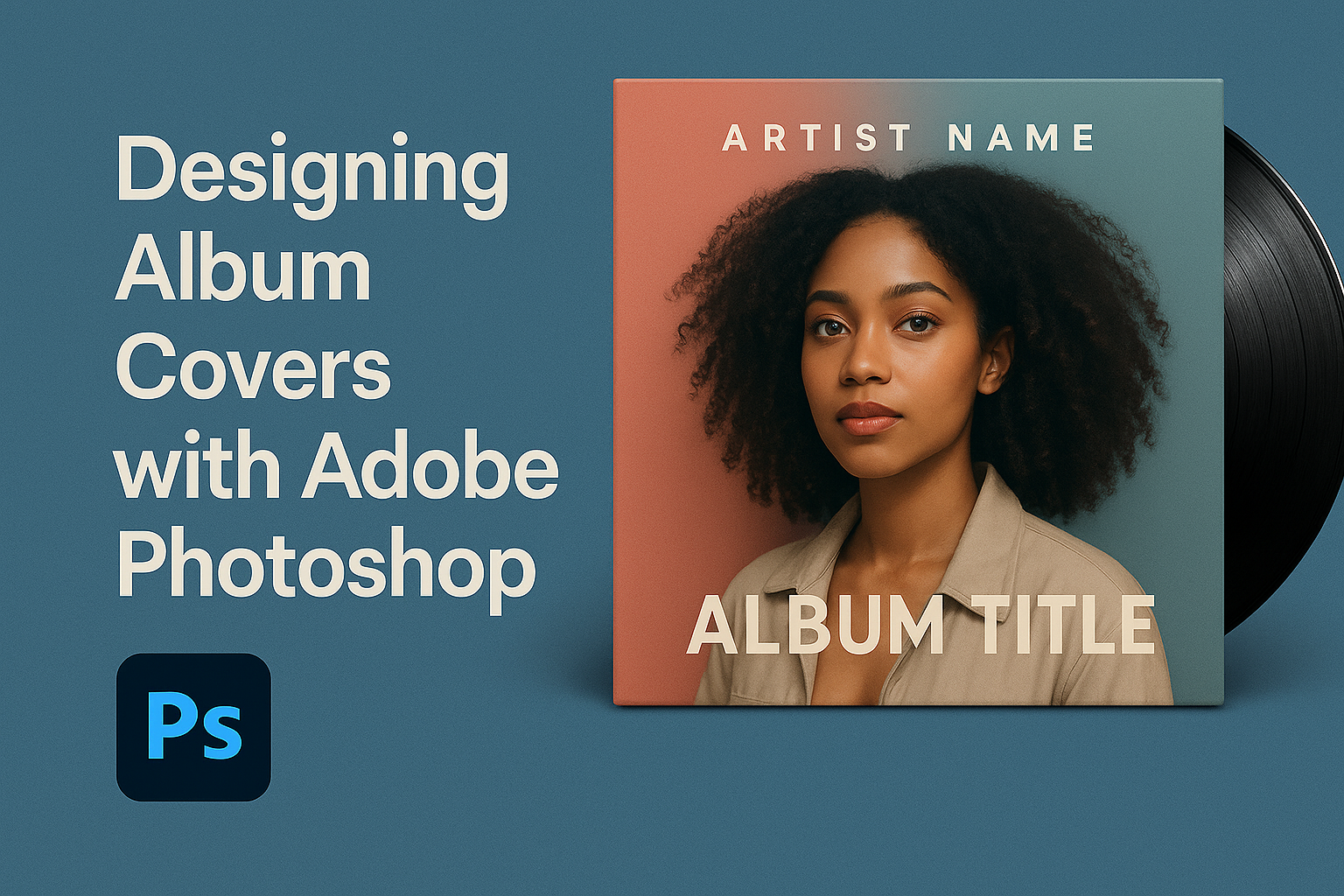
Creating an eye-catching album cover is essential for artists looking to leave a lasting impression. With Adobe Photoshop, the possibilities for design are endless, allowing artists to bring their vision to life. Mastering Photoshop tools can transform a basic image into a striking album cover that captures attention.
From layering images to applying special effects, Adobe Photoshop provides designers with the capabilities they need to craft unique and memorable album covers. Utilizing techniques such as mask selections and color adjustments, designers can produce professional-grade covers that stand out in any digital or physical format.
For those exploring the artistic side of music promotion, experimenting with Adobe Photoshop opens up opportunities to innovate and create visually captivating album art. By understanding the software’s features, artists and designers can showcase their creativity in ways that resonate with listeners and fans alike.
Getting Started with Adobe Photoshop
Jumping into Adobe Photoshop can feel a bit overwhelming at first because of its wide range of features and tools. Fortunately, this guide will help simplify the initial steps.
Understanding the Workspace
Photoshop’s workspace is where all the magic happens. On the left, there’s the Tools Panel, home to all basic editing tools like the brush, eraser, and selection tools. The Options Bar at the top changes based on the tool selected, offering more control.
On the right are panels for layers, adjustments, and more. Layers help keep designs organized. Users can think of it as a digital stack of images. Getting comfortable with these elements is key to efficient editing.
Menus along the top, like “File” and “Edit,” offer many functions such as importing, editing, and saving projects. Adjusting these panels to suit individual needs can boost productivity.
Setting Up Your Document
Starting a new project in Photoshop means first setting up the document correctly. To do this, click on File > New to open the setup window. Here, users can choose the document size, resolution, and color mode.
For album covers, a common size is 3000×3000 pixels at a resolution of 300 DPI. This ensures good quality for both print and digital use.
Choosing RGB color mode is best for online use, while CMYK is better for print. Making these decisions early helps prevent issues later.
Basic Tools Overview
The Basic Tools in Photoshop are essential for any project. The Move Tool (V) allows users to move items around on the canvas. The Brush Tool (B) is perfect for painting on images, allowing for creativity in designs.
The Selection Tools like the Magic Wand (W) help in choosing specific parts of an image to edit. The Text Tool (T) is essential for adding any text or typography to the album covers.
Experimenting with each tool can help users become familiar with their capabilities, leading to better and faster design processes. Practicing these tools will make designing album covers smooth and enjoyable.
Planning Your Album Cover Design
Creating an engaging album cover requires careful planning. It involves gathering inspiration, forming a solid concept, and sketching out ideas. These steps ensure the design effectively represents the music and draws in potential listeners.
Research and Inspiration
Research is the starting point for any album cover design. He or she should explore a wide range of designs to understand current trends and gather inspiration. Look at album covers from various genres and note what makes them stand out. This helps in understanding visual elements that engage audiences.
A designer could also seek inspiration from unrelated fields, like fine art or fashion, to bring fresh ideas. Exploring resources like art galleries or online portfolios can spark creativity. Collecting a range of images and ideas enhances creative thinking and helps produce a unique and captivating design.
Concept Development
Developing a clear concept is crucial for an album cover. The designer should begin by understanding the album’s theme, style, and intended message. This involves communication with the artist or band to align on the desired look and feel.
Brainstorming sessions can be beneficial, encouraging a free flow of ideas. Mapping out possible concepts with simple sketches or notes helps to visualize and refine ideas. A strong concept shows cohesion between the music and visuals, making the album cover memorable and meaningful.
Sketching Your Ideas
Sketching is an essential part of the design process. It allows the designer to experiment with layout, typography, and imagery without constraints. Starting with rough, quick sketches can aid in exploring different compositions and elements.
Refining these sketches into more detailed drawings helps in finalizing the visual plan. Using tools like pencil and paper or digital drawing apps can make the process flexible and straightforward. This phase is about capturing the ideal look before moving to digital design, ensuring a well-considered and effective album cover.
Working with Images
When designing album covers in Adobe Photoshop, managing images involves several steps. This includes importing and sorting files, touching up images for the best look, and using creative compositing techniques to combine elements seamlessly.
Importing and Organizing
An essential first step in album cover design is importing and organizing the images. Users can begin by creating a new document based on typical album cover dimensions, often 12×12 inches. It’s a good practice to use a grid to ensure everything aligns well.
Photoshop lets users easily import images by dragging them from folders into the program.
Organizing layers is vital for efficiency. Naming each layer and grouping them logically simplifies working with complex projects. Users can quickly access this Photoshop feature to maintain clarity in their design.
Editing and Retouching
Once images are organized, the next step is editing and retouching. This includes adjusting brightness, contrast, and colors to match the project’s theme. Photoshop tools like the Levels, Curves, and Color Balance play an essential role in achieving the desired look.
For portraits, using the healing brush or clone stamp can help remove blemishes or distractions. A soft approach avoids making photos appear unrealistic. Using layer masks allows for precise adjustments without damaging the original image.
Tools from the masks’ Properties panel can further refine selections for delicate edits, ensuring a polished final image.
Compositing Techniques
Compositing brings multiple image elements together in a cohesive design. It often involves blending images and textures to create an engaging scene. Using clipping masks is effective for confining textures to specific areas such as text or shapes, creating eye-catching effects.
Adjusting layer opacity and applying blending modes like Overlay or Multiply can seamlessly combine various image elements. Users should ensure each element looks naturally integrated with techniques such as adding shadows or highlights to create depth.
By mastering these compositing techniques, designers can enhance their album covers, making them more visually appealing and dynamic.
Typography in Design
Typography is a crucial element in designing album covers. It sets the mood and supports the overall theme of the artwork. By choosing the right fonts, fine-tuning text elements, and applying creative text effects, designers can create visually appealing covers that grab attention.
Choosing Fonts
When selecting fonts for an album cover, the style and genre of the music should guide the choices. A rock album might benefit from bold, edgy fonts, while a jazz album could use elegant, smooth typefaces.
Contrast can make text stand out. Pairing a decorative font with a simple one adds visual interest and hierarchy. Designers should consider readability, especially for smaller text. Test different fonts to see how they align with the album’s theme and the target audience.
Fine-Tuning Typography
Fine-tuning typography involves adjusting spacing and alignment. Kerning, or the space between letters, plays a key role in making text look balanced and professional. Proper kerning improves readability and aesthetics.
Line spacing, or leading, must also be optimized to avoid crowded or overly spaced text. Text alignment, whether centered, left, or right, should be consistent with the design’s flow. Consistency in typographic style helps maintain a cohesive look across the album cover.
Text Effects and Styles
Text effects can add depth and flair to an album cover. Shadow effects make text pop against busy backgrounds, while gradient fills add color variations. Embossing and beveling create a 3D appearance, adding more layers to the design.
Textures can be applied to text to give it a unique appearance that complements the cover’s theme. Tools like Photoshop offer various styles and effects, enabling designers to experiment with creativity. Ensure effects align with the theme and do not distract from the main visual focus.
Color Theory and Application
Color plays a big role in album cover design. It sets the mood and can influence how people feel about the music before they even listen. This section will explore different color schemes, how to apply them effectively, and ways to adjust colors to enhance the overall design.
Color Schemes
Choosing the right color scheme can make or break an album cover. There are various color schemes to consider, like complementary, analogous, and monochromatic.
- Complementary schemes use colors opposite each other on the color wheel, like blue and orange. This creates a vibrant look.
- Analogous schemes involve colors next to each other on the wheel, such as red, orange, and yellow.
- Monochromatic schemes use variations of a single color, providing a clean and cohesive appearance.
Each scheme brings out a different emotion or feeling, so it’s essential to pick one that matches the album’s theme.
Applying Colors to Your Design
Once the color scheme is selected, applying it correctly is key. Start by using a base color that sets the tone for the design. This color often covers large areas or backgrounds.
Next, use darker and lighter shades of the base color to create depth. This technique helps to highlight and shadow elements, making the design more dynamic.
Adding accent colors can draw attention to specific design elements. This technique can guide the viewer’s eye to important parts of the album cover, like the band name or album title.
Color Adjustments
Colors often need tweaks to look their best. Photoshop offers various tools to adjust colors without altering the design too much.
The Hue/Saturation tool is great for changing colors and enhancing specific tones. This can intensify or mute colors to better fit the mood of the album.
The Curves adjustment can help refine color balance and contrast, ensuring the design looks balanced. Small changes can make a big impact on the cover’s appeal.
Finally, consider using the Color Balance tool to adjust the overall color tone. This can help in aligning the mood of the cover with the music it represents.
Utilizing Layers and Masks
Layers and masks in Adobe Photoshop are key to creating complex and visually striking album covers. They allow designers to add depth, manage different elements, and create seamless compositions.
Layer Basics
Layers are the building blocks of any Photoshop project. Each layer can hold a different part of an image, such as text, photos, or graphics. This separation allows easy editing without affecting other parts of the design. For album covers, this means artists can adjust the background, logo, or main image independently.
Using layers, designers can experiment by hiding or showing different parts of their design. This is done by clicking the eye icon next to the layer in the Layers panel. Naming layers can help keep them organized, especially in complex projects. Grouping layers is another useful feature, allowing related elements to be moved or hidden together.
Advanced Layer Techniques
Advanced techniques unlock further creative possibilities. One such technique is the use of clipping masks which allow a texture or color to apply only to a specific layer, such as text.
Adjustment layers can change colors, brightness, and contrast without altering the original image. This is especially useful for album cover designs as it allows designers to test different moods and styles. Another powerful feature is layer blending modes, which can create effects like light overlays or double exposures, making designs more dynamic and engaging.
Masking for Designers
Masks add versatility to design work by allowing for non-destructive editing, meaning changes can be undone easily. Masks let designers show or hide parts of a layer. By painting on a mask with a soft brush, designers can create smooth transitions and blends between images. This technique enhances album cover designs by creating depth and natural integrations of different elements.
Layer masks are useful for enhancing shadows and highlights. Adjusting a mask can make elements pop by increasing the contrast or blending them into the background more smoothly. Using masks gives designers the flexibility to fine-tune their artwork without worrying about permanent changes to the original images.
Adding Final Touches
Adding final touches can make a big difference in album cover designs. This step might involve enhancing colors, adjusting brightness, or adding textures. Using tools like Adobe Photoshop’s filters and layers can help achieve a polished look.
In some designs, adding small details such as highlights or shadows can add depth and interest. It’s also common to tweak the typography at this stage, ensuring that it stands out and complements the overall design. Consistency is important here; elements should work together to create a cohesive design.
Artists often step back and view their work from different distances or angles to see how these final touches hold up. This perspective helps in spotting minor details that could be improved.
Preparing for Print and Digital
After the design looks perfect, it’s essential to prepare it for print and digital formats. Each format has different requirements. For print, saving the file in a high-resolution format like TIFF or a high-quality JPEG is important. The standard resolution for printing is usually 300 DPI (dots per inch).
For digital, file formats like JPEG or PNG are preferred for their versatility and compression. It’s also important to check that the image remains sharp and clear when resized for smaller displays, such as on music streaming platforms.
Ensuring color accuracy is also vital. Colors might appear differently when printed, so doing a test print can help verify that the colors are as expected. For digital use, ensuring compatibility across devices by testing on phones, tablets, and computers can affirm that the album cover looks great everywhere.
Exporting Your Design
Exporting your album cover design in Adobe Photoshop ensures that it’s ready for various uses, whether online or in print. It’s important to choose the right file format and adjust export settings for the best quality.
File Formats and Usage
Choosing the right file format is crucial for how an album cover will be viewed and shared. JPEG is commonly used for online sharing due to its balance of quality and size. For print, TIFF or a high-resolution PDF is often preferred. These formats retain detail and color accuracy.
For digital use, consider PNG for graphics with transparency. It keeps a crisp quality. Musicians and designers should understand differences in formats to ensure the cover looks professional across all platforms.
Export Settings
When exporting in Photoshop, several settings affect the final look and usability of the cover design. Resolution is key; 300 DPI (dots per inch) is standard for print, ensuring sharpness. For web use, 72 DPI is enough, as screens require less detail.
Color settings also matter. For printing, use CMYK, which aligns with printing ink colors. For screens, use RGB.
Adjust settings in the export dialog box to finalize the design’s readiness for its intended platform.
Quality settings influence file size and download speed. Higher quality means larger files, so striking a balance is important depending on usage. Familiarizing with these options can help ensure the album cover meets the desired standards.