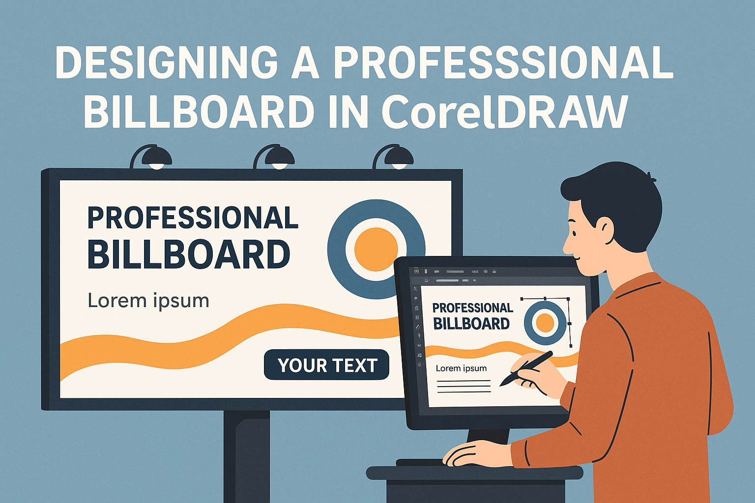
Designing a professional billboard in CorelDRAW combines creativity with clear communication. The key is to create a simple, eye-catching design that effectively conveys the intended message. Billboard designs should be simple enough for passing viewers to grasp within seconds.
Color choice and text size are crucial when working on a billboard. The bold use of colors can grab attention, while concise text ensures the message is understood quickly. Designers often find that using three to seven words works best to engage viewers, as noted by the Ultimate Guide to Billboard Design.
With the right techniques and tools, CorelDRAW can transform a basic idea into a striking billboard. Design skills are honed over time, but using step-by-step tutorials and exploring the software’s capabilities can help anyone get started. Learning how to design through easy tutorials, like those available on YouTube, makes the process more accessible.
Understanding Billboard Design
Creating an effective billboard involves more than just placing images and text. Key elements include visual hierarchy to guide the viewer’s eye, employing advertising principles to engage the audience, and utilizing CorelDRAW’s capabilities to bring designs to life.
Importance of Visual Hierarchy
Visual hierarchy in billboard design helps in directing the viewer’s attention to the most important elements. The design should ensure that headlines are bold and easy to read from a distance. Colors and fonts should create contrast, making the message stand out.
Placement of elements is crucial; the main message or call-to-action should be at the top where it’s easily seen. Graphics should support the message, not overwhelm it. Understanding the flow from headline to graphic can enhance quick readability, essential for moving traffic.
Principles of Effective Advertising
Effective billboard advertising grabs attention within seconds. Using simple, clear messages often works best. Billboards are often viewed by drivers or pedestrians moving quickly, so the content must be concise. Seven words or less is a common guideline.
Images can be powerful, especially when they evoke emotions or convey the brand’s personality immediately. The call-to-action should be prominent and memorable, whether it directs viewers to a website or phone number. Unique selling points can also differentiate one message from another.
CorelDRAW’s Role in Design
CorelDRAW plays a significant role in billboard creation by offering precision and flexibility. The software allows designers to create vector graphics that are scalable, which is important for large formats like billboards. Tools for layering help in organizing elements according to the visual hierarchy.
CorelDRAW also has various templates and design elements that can speed up the creation process. Designers can use its color management system to ensure that the colors are vibrant and consistent across different viewing distances. This software can be a valuable tool for those looking to produce professional-looking billboards efficiently.
Getting Started with CorelDRAW
CorelDRAW is a versatile tool for creating professional billboard designs. By mastering its interface, setting up your document, selecting an appropriate color palette, and understanding vector basics, anyone can create stunning and effective billboards.
Navigating the Interface
The CorelDRAW interface is user-friendly once you become familiar with the layout. The toolbox on the left provides access to drawing tools, shapes, and text. Users can customize their workspace to suit their preferences. At the top, the property bar changes according to the tool selected, offering quick access to tool options.
Panels like Object Manager and Layers make organization simpler. On the right, the Color Palette allows easy color selection. Regular practice with these elements enables efficient design creation.
Setting Up Your Document
When starting a new project, setting up the document correctly is crucial. Begin by selecting File > New. A dialog box will appear where you can specify dimensions. For billboards, larger dimensions ensure quality printing; most designs use dimensions matching the final print size.
Adjust resolution to match industry standards, typically 300 dpi for high-quality output. It’s wise to set up margins and guidelines to keep important content within safe areas. Bleeds are essential for designs that reach the edge of the material.
Choosing the Right Color Palette
Color plays an important role in billboard design. CorelDRAW offers several options to create and select color palettes. The right palette ensures visibility and legibility at a distance. RGB and CMYK are common modes; CMYK is ideal for print.
Experiment with contrasting colors to capture attention, but keep the overall palette limited to avoid clutter. CorelDRAW’s Color Styles feature helps maintain consistency across designs. Using predefined palettes or creating a custom one ensures that your billboard stands out effectively.
Vector Basics for Billboard Design
Vectors are vital in billboard design due to scalability without loss of quality. CorelDRAW’s tools make it easy to create and manipulate vector graphics. Begin with simple shapes found in the toolbox, like rectangles or ellipses.
The Bezier tool allows more complex paths and curves, giving creative freedom. By converting objects to curves, designers can refine them using nodes and handles. Understanding vector paths and editing anchors ensures crisp, clean graphics that are easily adjustable, perfect for large-scale printing.
Crafting Your Message
Creating a compelling message for a billboard involves balancing engaging content, effective typography, and strong branding. These components work together to catch the eye and convey the intended message quickly and clearly.
Writing Engaging Content
Engaging content is key to a successful billboard. It’s important to keep the message short and direct. Long messages can be difficult to read quickly, so focusing on a single, clear idea is essential.
To make the content stand out, using active language and a call to action can prompt interest and engagement. A simple question or statement that directly addresses the viewer helps grab attention.
Including memorable phrases or slogans can also make a billboard more effective. These elements stick in the viewer’s mind, enhancing recall and reinforcing the message.
Typography Techniques
Typography plays a crucial role in ensuring the content is easy to read and visually appealing. Suitable fonts are readable from a distance. Options like Arial Black or Impact are often effective choices due to their legibility and boldness. Find more about best fonts in this guide on Billboard Boldness.
Font size matters, too. Bigger fonts help ensure the message reaches the viewer, even from afar. It may also help to use contrasting colors for text and background to enhance readability.
Aligning text strategically directs the viewer’s eye easily. Horizontally centered text is popular as it maintains balance and symmetry, making the message easy to follow.
Incorporating Branding
Branding helps ensure that the audience associates the message with the company or product. Using consistent colors, logos, and design elements helps reinforce brand recognition.
The brand logo should be prominent yet not overpower the main message. Placing the logo in a corner can work well, keeping the focus on the message while making sure the brand is visible.
Using elements that reflect the overall brand style ensures cohesion across advertising platforms. This consistency helps the brand stand out and builds trust with the audience.
Visual Elements in Focus
In designing a professional billboard, the visual elements are crucial. This includes carefully choosing images, creating unique illustrations, and maintaining consistent themes.
Selecting Images and Graphics
Choosing the right images and graphics is vital for an effective billboard. Each element should be easy to understand from a distance. High-resolution images work best as they remain clear and sharp. Images should also be relevant to the message, complementing the text instead of distracting from it.
It’s important to consider how colors work together. Bright and contrasting colors catch attention, while too many colors can be overwhelming. Keeping the design simple allows viewers to quickly grasp the message.
For additional tips on image selection, visit CorelDRAW’s Billboard Design Guide.
Creating Custom Illustrations
Custom illustrations add a personalized touch to a billboard. Using CorelDRAW, designers can create unique vector graphics tailored to the brand’s identity. Vectors are scalable without losing quality, making them ideal for large formats like billboards.
Illustrations should align with the brand’s voice and convey the intended message. Simple, bold designs are more effective for quick recognition. It’s also wise to maintain a balance between illustration and text, ensuring neither overshadows the other.
Tools in CorelDRAW allow for the integration of original sketches, providing a distinctive visual experience.
Using Consistent Styles and Themes
Consistency in style and theme unifies the visual elements on a billboard. This includes using a cohesive color palette, fonts, and graphic styles throughout the design. Consistent themes help in reinforcing branding and ensuring the message is easily identifiable.
CorelDRAW offers various tools to maintain design consistency. Designers can save custom color palettes and font selections, making it easier to apply them across different elements.
Keeping the theme consistent not only aids recognition but also builds trust with the audience. For more on creating a stylish yet simple billboard, check out this YouTube video.
Layout and Composition Strategies
Designing a professional billboard in CorelDRAW requires thoughtful use of layout and composition. Key strategies include balancing elements for impact, using space effectively, and paying attention to margins and borders. These aspects ensure the billboard catches the viewer’s eye and delivers the message clearly.
Balancing Elements for Impact
Balance is essential in billboard design to create a cohesive look. Designers should consider both symmetrical and asymmetrical layouts. Symmetrical balance provides a clean and orderly appearance, making it easy for viewers to process information quickly. Asymmetrical balance, on the other hand, adds interest and can guide the viewer’s eye through different parts of the design.
Text and images need to be balanced to avoid overwhelming the viewer. Large images with minimal text work well since viewers have only seconds to grasp the message. It’s also important to keep in mind the weight of each element. Bold elements can attract more attention and should be used strategically to highlight important information.
Effective Use of Space
Effective use of space is crucial in billboard design. A cluttered billboard can confuse viewers, so it’s important to keep the design simple. Negative space, or the area around and between elements, should not be underestimated. It can help guide the viewer’s gaze and emphasize the focal points of the design.
Text spacing is key. Letters should not be too close as this can make words hard to read from a distance. Also, giving images room to breathe enhances visual appeal. Use layout tools in CorelDRAW to ensure elements are evenly spaced and appropriately sized relative to each other.
Attention to Margins and Borders
Margins and borders frame the content on a billboard and can help enhance readability. Proper margins ensure that important details remain visible and not cut off or obscured. When designing, it’s essential to keep content well within the edges of the display area.
Borders can add to the visual impact of a design. They can create a boundary that separates the billboard from its surroundings, drawing attention to the content. It’s important to choose border styles that complement the overall design and do not distract from the main message.
Optimizing for Large-Format Printing
When creating designs for large formats like billboards, it’s crucial to ensure clarity and accuracy. Resolution, color proofing, and correct file formats play key roles in achieving a professional result. These elements will help maintain the integrity of the design when printed on a large scale.
Understanding Resolution and Scale
A key aspect of large-format printing is maintaining image clarity. Using images with a minimum of 150 DPI (dots per inch) ensures sharpness in the printed product. Higher resolutions make the final print more detailed and clear. Designers should avoid enlarging low-resolution images since they can become pixelated when printed Tips for Exceptional Large Format Digital Printing.
Scaling the design is also important. If the design exceeds the software’s maximum dimensions, it should be created at a fraction of the actual size, such as 50% or 25%. This helps manage large projects within software limitations without sacrificing quality Setting Up Design Files for Large Format Printing.
Color Proofing for Accuracy
Color is crucial for grabbing attention. Different screens can display colors differently, so it’s important to use color proofing to ensure the printed colors match the designer’s vision. This includes checking the colors in various light settings and using pantone colors for consistency.
Software used for design often has proofing presets that simulate printing outcomes. Designers should adjust color settings and proof the design multiple times before finalizing it. This avoids unwanted surprises when the design is printed, maintaining its visual impact.
File Preparation and Formats
Correct file preparation ensures that designs print correctly. Formats like PDF, AI, and EPS are typically preferred because they support high resolutions. Including bleed in the design file is also necessary to avoid white edges appearing in the final print Designing for Large Format Printing.
It’s essential to check all image and text elements for alignment and legibility before submitting the file for printing. Vector formats can be beneficial as they don’t lose quality when scaled. Proper preparation saves time and keeps the integrity of the design throughout the printing process.
Review and Revisions
When designing a billboard in CorelDRAW, it’s key to include a review and revision process to refine and perfect the design. This involves conducting critiques, adopting an iterative approach, and ensuring the design is ready for production.
Conducting Design Critiques
Getting feedback is important for improving a billboard design. Involving team members or peers in a critique can provide fresh insights. They can spot issues that the designer might overlook. Feedback sessions should focus on clarity, message effectiveness, and visual appeal.
CorelDRAW makes it easy to share designs online. By using CorelDRAW.app’s review features, designers can get comments directly on the digital design. These critiques should be constructive, focusing on how to enhance the design rather than just pointing out flaws.
Iterative Design Approach
Design improvements are often made through an iterative approach. This means revisiting the design multiple times and making adjustments. Each round of changes should bring the design closer to its intended impact and clarity. Using layers in CorelDRAW allows designers to test different elements separately.
This process encourages creative solutions and fine-tunes each aspect until the design is both visually stunning and easy to read. Iterating might involve color tweaks, font adjustments, or repositioning elements to achieve a harmonious layout.
Finalizing the Design for Production
Once revisions are complete, it’s time to finalize the design. Final checks should include ensuring that the text is legible and that colors are correctly represented. At this stage, CorelDRAW’s features can verify that the billboard is ready for printing, by checking resolution and color profiles.
Exporting the design in the right format is also crucial. The file should be suitable for the printer’s requirements, ensuring a smooth transition from digital to physical display. A thorough review at this stage ensures that the final product communicates the intended message effectively.
Preparing for Display and Installation
When preparing a billboard for installation, it’s important to ensure the design looks great from various distances. Consider visual clarity. Text should be large, bold, and easy to read from afar. Use bright, contrasting colors to make the message stand out.
Think about the placement of the billboard. It should be visible to both drivers and pedestrians. A location that blocks part of the design can ruin the impact. Designers must plan for any obstacles like trees or other structures.
The materials for the billboard also matter. Ensure that materials are durable and weather-resistant. This helps the billboard last longer outdoors, through different weather conditions. Strong materials keep the design looking fresh and professional.
Installation day needs careful planning. Crews should be ready with the right tools and equipment. Safety is crucial, so everyone on the team should follow safety procedures. This keeps both the installation crew and the public safe.
Using checklists during installation can ensure that everything is in place. It’s a good way to track the progress and catch any missed steps. Checklists help prevent mistakes and ensure a smooth installation process.
Finally, checking the final appearance of the installed billboard is key. Viewing it from different angles ensures it meets the expectations and that nothing was missed. This final inspection helps ensure the billboard has the intended impact on its audience.