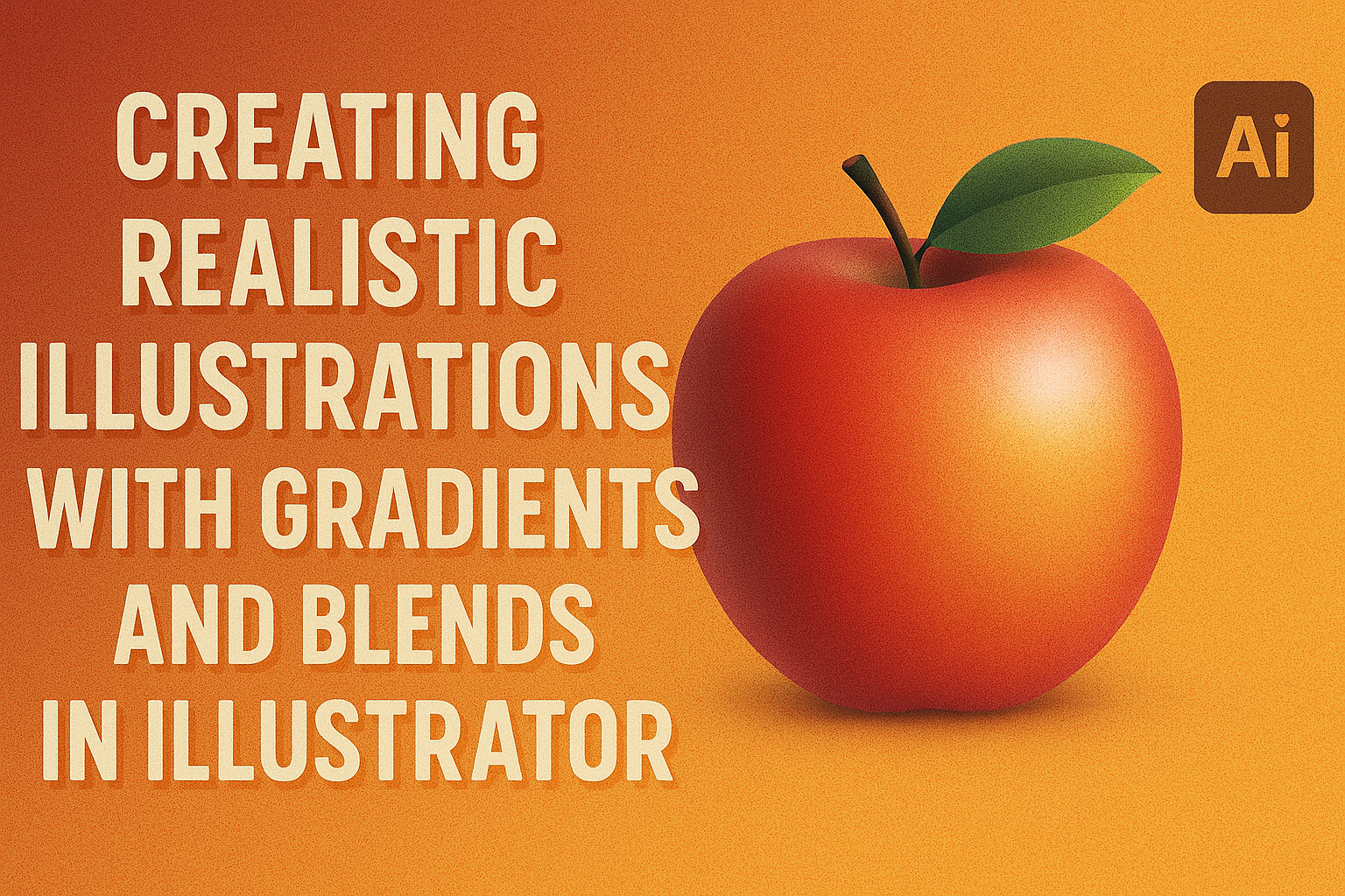
Creating realistic illustrations can be an exciting challenge for both beginners and experienced designers. Using gradients and blends in Adobe Illustrator allows artists to add depth and dimension to their vector art, making illustrations more lifelike. With the right techniques, anyone can transform a flat design into a captivating masterpiece that stands out.
Adobe Illustrator offers powerful tools like the Gradient Tool and the Blend Tool, which play a crucial role in achieving realistic effects. Techniques such as using Gradient Mesh and Blend Tool applications can create intricate details and smooth transitions in colors. This approach is essential for crafting images that grab the attention of viewers.
By understanding how to manipulate these tools, artists can push their creative boundaries. Those looking to improve their skills will find the process rewarding, giving them the ability to create illustrations that not only meet their needs but also enhance their portfolios. Whether it’s creating a striking illustration of a military style cap or bringing a simple object to life, using gradients and blends can take your artwork to the next level.
Understanding Color and Light
When creating realistic illustrations, understanding color and light is essential. It involves knowing how colors interact on the wheel, how light affects an image, and using contrast to enhance depth and realism.
The Color Wheel Basics
The color wheel is a tool that helps artists understand the relationships between colors. It is divided into primary, secondary, and tertiary colors. Primary colors are red, blue, and yellow. Mixing these creates secondary colors: green, orange, and purple. Tertiary colors come from mixing primary and secondary colors, like red-orange or blue-green.
Complementary colors, which are opposite each other on the wheel, enhance contrast and make elements stand out. Analogous colors, which sit next to each other, create harmony. Using the wheel helps artists choose color schemes that match their illustration’s mood. Whether it’s a warm atmosphere using reds and oranges or a cool setting with blues, the wheel guides choices that make the artwork visually appealing.
Lighting and Shading Fundamentals
Lighting affects how viewers perceive an illustration. It defines the texture and form of objects and sets the mood of the scene. Artists often use a light source (like a lamp or sunlight) to guide their shading techniques. Highlight is where light directly hits and is the brightest area. Midtones show normal light levels on surfaces, and shadows are where the light is blocked.
Effective shading involves blending these tones smoothly to make surfaces appear three-dimensional. Artists use techniques like cross-hatching or gradient shading to create different effects. Understanding how light interacts with objects helps in adding realism. For instance, softer lighting creates a calm feeling, while harsh lighting can add drama or focus to specific details.
The Role of Contrast in Realism
Contrast is crucial for realism in illustrations. It creates depth and draws attention to focal points. High contrast between light and dark areas adds dimension and makes elements pop. Artists use contrast to lead the viewer’s eye to important parts of the image.
Techniques include using complementary colors or varying line thickness to emphasize certain areas. Soft contrast, achieved through gentle transitions between shades, brings a more subtle, life-like quality.
Employing contrast strategically can change the mood and impact of the artwork. For example, stark contrast can add drama, while mild contrast can keep the composition balanced.
Getting Started with Adobe Illustrator
Adobe Illustrator is a powerful tool for creating detailed vector illustrations, and learning its basics can immensely improve design skills. Key aspects include preparing the workspace, understanding tools, and knowing the differences between vector and bitmap graphics.
Setting Up Your Workspace
Setting up the workspace in Adobe Illustrator is crucial for efficiency. Users can customize the panel layout to fit their needs. By going to Window > Workspace, they can choose from presets like Essentials or create a custom setup.
Adjusting the Artboard to suit project requirements helps keep designs organized. Users can resize the Artboard by selecting the Artboard tool. Creating gradients can enhance illustrations and should be a skill prioritized in setup.
An Overview of Illustrator Tools
Illustrator offers a wide range of tools to help bring ideas to life. The Selection Tool is often used to position items, while the Pen Tool allows for intricate path creation, essential for vector work.
Another essential is the Gradient Tool, which adds depth to designs through color transitions. Users can find more information on using the Gradient Tool at Adobe’s guide. The Type Tool helps incorporate text into art, making it important for posters or branding.
Vector VS Bitmap: What You Need to Know
Understanding the difference between vector and bitmap graphics is key when working in Illustrator. Vector graphics are made from paths, which means they’re scalable without losing quality and great for logos and illustrations.
In contrast, bitmap graphics are composed of pixels and can become pixelated when resized. Illustrator’s focus is on vector art, which allows for precise and adjustable designs. This distinction is vital when starting digital art to ensure the right tool is chosen for each project.
Mastering Gradients
Using gradients in Adobe Illustrator can transform simple designs into visually appealing artworks. This involves understanding how to create basic gradients, utilize advanced techniques, and apply them to complex shapes.
Creating Basic Gradients
Basic gradients in Adobe Illustrator involve blending two or more colors smoothly. Users can access the Gradient tool, which is often found in the Tools panel. By selecting an object and dragging the Gradient tool across it, a simple gradient is applied.
There are three main types of gradients: linear, radial, and freeform. Linear gradients change color along a straight line, while radial gradients spread out from a central point. Freeform gradients allow for more flexibility and creativity, letting users place color points manually within the shape.
Learning to adjust the direction and angle of gradients is crucial. Users can modify these settings in the Gradient panel, which fine-tunes the blend to meet their design needs. Changing these settings can create striking effects and enhance the depth of an image.
Advanced Gradient Techniques
Advanced techniques include options like the Gradient Mesh Tool, which allows for more detailed and realistic graphics. This tool lets users create complex patterns by manipulating individual mesh points, each with its own color.
Another technique is using gradient transparency. Users can adjust the opacity sliders for different gradient stops, providing a smooth fade effect. This adds layers and can make the artwork appear more dynamic and textured.
Blends add to the versatility of gradients by transitioning between two shapes smoothly. This technique is perfect for creating unique effects such as smooth color transitions or stylish designs that grab attention. It’s essential to experiment with these methods to extend the range of creative possibilities.
Applying Gradients to Complex Shapes
Applying gradients to complex shapes involves strategic use of blending modes and gradient adjustment. When dealing with intricate logos or illustrations, gradients can add depth and dimension, highlighting curves or creating visual focus.
The Gradient Mesh Tool works well for complex shapes, allowing for precise control over the gradient, even in multi-faceted designs. Mastering this tool results in more realistic and lifelike images.
Incorporating gradients into complex objects also includes using clipping masks. This technique ensures gradients do not spill over the edges, maintaining clean and professional designs. Experimenting with different combinations and settings helps refine skills, enhancing the final look of any creative project.
Working with Blends
Blending in Illustrator is a powerful technique that helps in creating smooth transitions and adding depth to illustrations. This section explores essential aspects of using the Blend Tool, perfecting color transitions, and enhancing illustrations through blending techniques.
Understanding the Blend Tool
The Blend Tool in Illustrator offers artists the ability to combine two or more objects into a seamless transition. To start, select the objects you want to blend. Then, choose Object > Blend > Make. This simple step forms the basis of blending by calculating the steps needed for a smooth transition. Adjustments can be made for step count or spacing, allowing artists more control over the blending process.
Note: Mastery of blending can make images appear more lifelike and dynamic. Artists should explore different styles and settings to achieve their desired effect. Understanding this tool fully can help in producing more cohesive and visually appealing artworks.
Creating Smooth Color Transitions
Creating smooth color transitions is vital to maintain the illusion of depth and realism. The basic principle involves blending colors in such a way that they appear to merge seamlessly. In Illustrator, this is often accomplished by manipulating the gradient and blend settings.
Artists can refine the transitions by adjusting colors, gradients, and the number of blend steps. This can be done using the blending options in Illustrator. Different combinations can create unique results, providing flexibility and creativity in designs. Aim for smooth, gradual shifts from one color to another to maintain cohesion in illustrations.
Crafting Depth with Blending
Achieving depth in illustrations often requires careful blending of shapes and colors. By using gradients and shades effectively, artists can make elements appear to pop or recede. This can be especially useful in crafting 3D-like effects or focusing attention on a particular area.
For enhanced depth, consider combining blending with shadows or highlights. Creating Gradient-Filled Objects in Illustrator further complements this by adding realistic elements. Experimentation with different techniques, such as overlaying blends and adjusting opacities, will allow artists to achieve more detailed and captivating compositions.
Understanding how to shape illustrations through blending opens up creative possibilities, making artwork more dynamic and visually impressive.
Techniques for Achieving Realism
Creating realistic illustrations in Adobe Illustrator involves several key techniques. These methods focus on adding textures, creating effective shadows and highlights, and using the gradient mesh for detailed work.
Using Textures for Added Realism
Textures can greatly enhance the believability of an illustration. By incorporating subtle textures, artists can simulate real-world surfaces like wood, metal, or fabric. Using textures effectively involves layering them over vector shapes and adjusting transparency. Patterns and image overlays can be added to enhance detail.
Importing high-resolution textures and using the Opacity Mask feature in Illustrator helps blend them seamlessly into the artwork. Tools like the Texture Panel allow creators to adjust the scale and rotation, fine-tuning the texture appearance to match the scene. Incorporating textures adds depth and interest, making illustrations feel more lifelike.
Realistic Shadow and Highlight Methods
Shadows and highlights add dimension and realism to illustrations. In Illustrator, these can be created using gradients and transparency settings. For shadows, darker gradients with a subtle blur can suggest depth, while highlights use lighter hues to draw attention to illuminated areas.
Object blends are a technique where multiple objects are used to transition smoothly from shadow to highlight. This helps in achieving smooth tonal changes. Using the Blend Tool, artists can create soft transitions that mimic natural lighting. Shadows can be offset slightly for a more realistic look, providing the desired three-dimensional effect.
Gradient Mesh for Detailed Illustrations
Gradient mesh is a powerful tool for creating detailed and realistic images. This method allows artists to control how colors blend across a complex shape. By manipulating mesh points, users can create intricate color variations.
Starting with a simple shape, the Gradient Mesh Tool in Illustrator allows fine-tuning of each point’s color and position, which helps depict light and shadow accurately. It’s especially useful for mimicking complex surfaces like skin or fabric folds. This technique is advanced but rewarding, providing exceptional control over shading and fine details, bringing illustrations closer to realism.
Applying Realism to Different Illustration Styles
Creating realistic illustrations involves using gradients, blends, and other techniques. These methods can bring a new level of depth and authenticity across various styles of art. From cartoons to photorealistic art, each style offers its unique challenges and opportunities for incorporating realism.
Realism in Cartoon Illustrations
Cartoon illustrations rely heavily on exaggerated features and simplified forms, but adding realism can enhance their appeal. By using gradient mesh techniques, artists can create more lifelike textures. Simple shadows and highlights make these illustrations pop.
Incorporating some realistic elements, like light and shadow play, can make characters more engaging. Textures and details, such as skin tones or clothing folds, can be subtly applied using vector brushes. This approach keeps the playful essence while adding visual interest.
The use of clipping masks also enables the layering of textures, enhancing the depth of flat images. These techniques combined ensure that the cartoon retains its character while gaining a realistic touch.
Photorealistic Illustration Techniques
Photorealism demands precision and attention to detail. Tools like the gradient mesh in Adobe Illustrator are essential. They allow artists to mimic natural phenomena, like light reflection and texture, effectively.
Careful observation is key in this style. Capturing nuances like the soft gradients on glass or the intricacies of the human face can transform an image. Artists often work with real-life references and use gradients to achieve smooth transitions between tones.
Techniques such as using the pen tool to draw paths precisely help in maintaining control over the image. Layering these effects with transparency settings can create stunning, lifelike artwork.
Applying Gradients to Abstract Art
Abstract art often relies on bold shapes and colors, but gradients can add complexity and elegance. By smoothly blending colors, artists create depth and movement within the geometric or organic forms.
Using gradient tools, artists can transform flat shapes into dynamic pieces that suggest shape and form. Adding layers of gradient colors can simulate light effects that evoke emotions.
The subtle differences in hues, along with transparency, can create ethereal or dramatic effects. These applications demonstrate how abstract art can benefit from realistic techniques to engage viewers on a more profound level.
Workflow Tips and Tricks
In creating realistic illustrations with gradients and blends in Illustrator, efficient layer handling, careful color choices, and keyboard shortcuts can greatly enhance productivity and design quality.
Efficient Layer Management
Proper layer management helps keep designs organized, especially when working with complex illustrations. Using layers allows artists to separate different elements, making it easy to modify specific parts without affecting the whole design. For instance, keeping gradients on separate layers from line art can prevent accidental changes.
Grouping related objects and labeling layers clearly adds another layer of clarity. This approach speeds up the workflow when switching between tasks. Locking and hiding layers also help in focusing on the active layers, reducing distractions and preventing mistakes.
Color Palette Selection Tips
Choosing the right colors is crucial for achieving realism in vector illustrations. Colors should be selected to create a harmonious look. It’s beneficial to use a palette of analogous colors, which are located next to each other on the color wheel. This method helps create smooth transitions and realistic shading effects.
Artists can explore digital tools to generate palettes or pick colors from real-life references for accuracy. Saving and reusing color palettes within Illustrator can also ensure consistency across different projects or parts of a design.
Shortcut Keys for Faster Design
Using shortcut keys speeds up the design process significantly. Illustrator offers many useful shortcuts that can save a lot of time. For instance, pressing “Ctrl/Cmd + D” repeats the last action, which is handy for duplicating gradient adjustments across similar objects.
Other useful shortcuts include “Ctrl/Cmd + G” to group items and “Ctrl/Cmd + Shift + G” to ungroup them. These shortcuts streamline workflow and help maintain focus on creativity rather than frequent trips to the menu bar.
Finalizing and Exporting Your Artwork
Ensuring your digital artwork reaches its full potential involves both preparation for print and digital export. Choosing the right settings is crucial to maintain quality and detail.
Preparing Illustrations for Print
Getting illustrations ready for print requires attention to color management and file format. First, artists should switch their color mode to CMYK. It ensures colors look the same on paper as they do on screen. Next, checking the resolution is key. A minimum of 300 DPI is essential for print clarity.
Bleed settings are also important. Adding a bleed of about 0.125 inches can prevent unwanted white edges. Save the file in a print-friendly format like PDF or TIFF. These maintain high quality and support CMYK colors.
Export Settings for Digital Use
For digital illustrations, RGB color mode is preferred. It supports a wider range of colors suited for screens. Choosing the right resolution is also crucial. A resolution of 72 DPI is often sufficient for screen display, but higher may be needed for more detailed images.
Exported files should be compressed without losing quality. Formats like JPEG or PNG are suitable for most digital uses. PNG is particularly useful for images with transparency. Don’t forget to adjust the image dimensions to the desired size before exporting.
Final Touches Before Publication
Before publishing, artists might add finishing touches to make the artwork stand out. Adjusting the brightness or contrast can enhance visibility. Ensuring alignment and removing any unwanted elements are also advised steps.
Proofreading text within the illustration is another important task. Even small typos can affect professionalism. Lastly, artists may wish to use a digital watermark to protect their work.