Mastering a realistic watercolor effect in CorelDRAW brings digital designs to life. Artists and designers can transform their projects by simulating the soft, flowing look of traditional watercolor paintings. CorelDRAW’s tools allow users to experiment with brush sizes, granulation levels, and color intensity for perfect results every time.
Exploring different techniques adds depth and uniqueness to your artwork. Techniques like using the Freehand Tool to trace watercolor lines or applying the built-in Watercolor effect can be effective methods. These strategies make it possible for artists to achieve stunning realism.
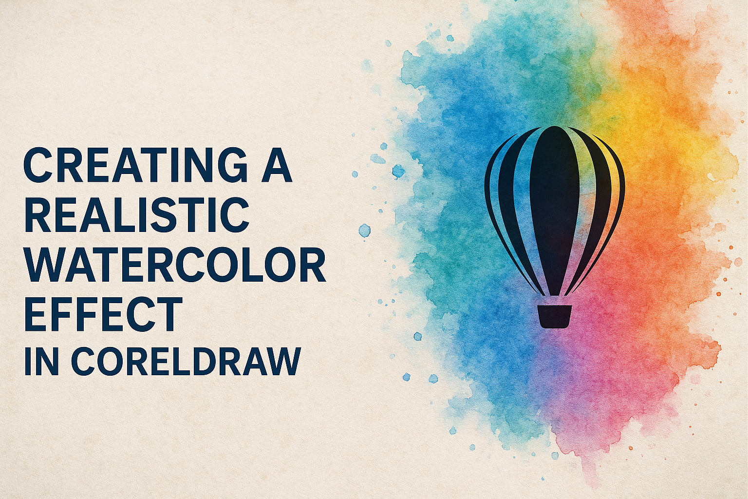
Learning how to incorporate these effects can set your designs apart. Resources such as the tutorial on creating watercolor effects in CorelDRAW provide valuable guidance for beginners and advanced users alike. With practice, anyone can enhance their skills and achieve professional-quality effects.
Understanding Watercolor Techniques
Creating realistic watercolor effects involves mastering various techniques. These include controlling brush strokes, using washes and layers effectively, and mixing colors for the desired impact. Each aspect plays a crucial role in producing lifelike textures and enhancing the depth of the artwork.
Brushwork Basics
Brushwork is essential for achieving a realistic watercolor effect. Artists often start with larger brushes for broad areas and switch to smaller ones for details. The pressure applied to the brush can vary to create different stroke qualities. Light pressure results in softer strokes, while firm pressure offers more defined lines.
Experimentation with different brush types and sizes allows artists to discover unique textures. Flat brushes can produce sharp lines and broad strokes, while round brushes are versatile for both thick and thin lines. Sable hair brushes are a popular choice due to their ability to hold water well, making transitions smoother and colors more vibrant.
Washes and Layers
Washes and layers are techniques that add depth and richness to watercolor paintings. A wash is a thin layer of color applied to the paper. There are different types of washes, including flat washes and graded washes. In flat washes, a single color is spread evenly. Graded washes create a gradual change in tone.
Layers build complexity. Each layer should be allowed to dry before applying the next. Artists often start with light layers and progressively add darker tones to achieve depth without making the painting look muddy. Glazing, a technique where thin layers of paint are added one above another, adds to the richness and intensity of the colors.
Color Mixing and Application
Color mixing in watercolor requires careful planning. Unlike oils or acrylics, watercolors can lose vibrancy if mixed excessively. Primary colors are mixed on a palette to create secondary colors. Artists often use a limited palette to maintain harmony in the artwork.
Colors can be applied using various techniques. Wet-on-wet involves applying paint onto a wet surface, creating soft edges and gradients. Wet-on-dry, where paint is applied to dry paper, results in sharper lines and more control. Combining both methods allows for dynamic effects. Artists also pay close attention to color transparency, using this quality to enhance the overall composition.
Getting Started with CorelDRAW
Getting started with CorelDRAW involves setting up your workspace, understanding the use of vectors and rasters, and navigating the interface. Mastering these basics will help users create stunning digital art efficiently.
Setting Up Your Workspace
To begin with CorelDRAW, it’s important to customize the workspace according to your needs. Adjust the tools and toolbars for quick access to frequently used features. Use the Options menu to change preferences like color schemes and default file paths.
Having the right layout enhances productivity. Arrange the workspace to maximize your screen space. Utilize Dockers to keep essential tools within easy reach. Organizing palettes, color swatches, and toolbars can help in smoother workflow management.
Consider saving your workspace layout. This allows you to return to your preferred setup anytime. It’s a good way to ensure consistency when switching between projects.
Working with Vectors and Rasters
In CorelDRAW, understanding the difference between vector and raster images is crucial. Vectors are made of paths and points, and they’re scalable without losing quality. This makes them ideal for logos and illustrations.
Rasters, or bitmap images, consist of pixels and are best for photos with intricate color details. CorelDRAW allows users to work with both types by importing and converting these images as needed. Familiarize yourself with the tools to create, edit, and combine these image formats.
Adopting the right techniques for each type helps achieve the desired graphic effects. Effects like blending and masking can enhance vector artwork, while filters and adjustments improve raster images.
Navigating the Interface
Navigating the CorelDRAW interface efficiently is key to a smooth creative process. Start by familiarizing yourself with the Property Bar, which provides context-specific options depending on the tool selected. This helps make quick adjustments to objects or elements.
The Toolbox contains tools for drawing and modifying shapes, text, and colors. Understand how to switch between tools using shortcuts to speed up your process.
Lastly, work with Menus and Dockers to access additional features. Dockers allow for multitasking by showing different panels simultaneously. Adjusting these elements will help tailor the interface to suit your workflow, making it easier to focus on your designs.
Creating Your Watercolor Palette
To achieve a realistic watercolor effect in CorelDRAW, it is essential to choose the right colors and customize brushes to mimic traditional watercolor techniques. This section explores how to select colors effectively and utilize custom brushes and textures to enhance your digital artwork.
Choosing Colors
Selecting colors for your digital watercolor palette is crucial in painting. It’s beneficial to organize colors similar to a traditional palette. Many artists use a color wheel setup, starting with yellows and moving through reds and blues.
Warm colors like red and orange should be grouped on one side, while cooler tones like blue and green stay on the opposite. This method helps in balancing the painting’s color temperature effectively.
CorelDRAW offers access to various color options, allowing artists to experiment with blending. Make sure to have primary colors like warm and cool yellows, reds, and blues to mix diverse shades. This approach helps in crafting vibrant artworks with depth and realism.
Custom Brushes and Textures
CorelDRAW provides versatile tools to create custom watercolor brushes and textures. These tools are essential for mimicking the fluidity of natural watercolors. Artists can adjust brush settings to control opacity, flow, and blending modes, which helps in adding varied textures.
By experimenting with different brushes and settings, one can replicate the look of traditional watercolor paints on textured paper. Effects like soft edges and gradient washes can be achieved by layering semi-transparent strokes. This technique allows for a sophisticated level of detail.
Adding textures is just as important. Use texture overlays to simulate the appearance of watercolor paper. Creating unique brush patterns and custom textures aids in enhancing the authenticity of the artwork, giving it a rich, tactile feel.
Layering Techniques in CorelDRAW
Layering in CorelDRAW enhances the design process by organizing elements efficiently. Knowing how layers and objects interact is crucial for creating structured artwork. Blending and transparency further refine visuals, adding depth and realism to designs.
Understanding Layers and Objects
In CorelDRAW, layers are like transparent sheets stacked on top of each other, allowing designers to control the arrangement and visibility of objects. Each drawing starts with a default layer named “Layer 1.” Users can add more layers to organize their artwork effectively.
To use a layer, it must be active. In the Object manager docker, clicking a layer name highlights it, indicating its active status. CorelDRAW also offers master layers for elements repeated across pages. This is useful for consistent backgrounds or watermarks.
Creating multiple layers can prevent clutter and make editing easier. By placing objects on separate layers, designers can hide or lock specific parts without affecting other elements. This enhances control during the design process, especially in complex projects involving numerous elements.
Blending and Transparency
Blending and transparency are essential for achieving a watercolor effect in CorelDRAW. They allow the combination of colors and textures, creating soft transitions between elements. CorelDRAW provides tools such as Transparency and Mesh Fill to manipulate these properties.
Applying the Transparency tool to objects lets designers adjust how much of the layer below is visible. This can make objects appear lighter and blend smoothly into the background. The Mesh Fill tool offers more detailed control over color gradients, perfect for adding depth to designs.
When blending, pay attention to layer order. Layers on top can affect how colors and transparency are perceived. Experimenting with different layer combinations can lead to unique and visually appealing effects, enhancing the overall design’s realism.
Watercolor Effects with CorelDRAW Tools
Creating a watercolor effect in CorelDRAW can be achieved using various tools like the Artistic Media Tool, Mesh Fill Tool, and Interactive Blend Tool. Each tool offers unique features that enhance your design, making it look like a true watercolor painting.
Artistic Media Tool
The Artistic Media Tool in CorelDRAW allows users to create brushstroke-like effects. This tool includes a variety of preset brush styles resembling watercolor strokes. Users can adjust the thickness and opacity of the strokes to mimic the uneven and fluid look of real watercolor. By combining different presets and adjusting their settings, they can achieve a variety of watercolor textures.
Another feature is its customization option. Users can design their custom brushstrokes by modifying existing styles or creating new ones from scratch. This flexibility allows for a personalized touch in designs. The ability to tweak brush settings is useful for achieving different watercolor effects, from subtle washes to bold strokes.
Mesh Fill Tool
The Mesh Fill Tool is powerful for creating subtle transitions in color, similar to watercolor blending. It works by generating a grid over an object, letting users apply different colors to each node. This feature creates smooth color gradients, capturing the gentle blending seen in watercolor paintings.
Adjusting the grid allows for more detailed control of the color flow. Users can manipulate individual nodes to adjust the hues and saturation. This control is particularly beneficial for imitating natural watercolor effects, where colors smoothly transition and overlap.
Interactive Blend Tool
The Interactive Blend Tool helps combine multiple objects with a gradual mix of colors. It’s effective for simulating the gradual color shifts seen in watercolor art. Users can blend between two colors, creating a soft, painted effect across their design.
With the tool, users have control over the number of steps in the blend, influencing how smooth or defined the transition appears. This can help mimic the diffusion of colors often found in watercolor. The tool also allows for blending between different shapes, adding variety and complexity to designs.
Fine-Tuning Your Artwork
Enhancing a realistic watercolor effect in CorelDRAW involves adjusting colors, adding details, and using masks and paths. These steps help make the artwork more vibrant and realistic, bringing out the beauty of watercolor nuances.
Adjusting Colors and Tones
Adjusting colors is essential for achieving a convincing watercolor look. Artists can experiment with hue, saturation, and brightness to refine the color palette. Using tools like the Color Balance can help in achieving the desired warm or cool tones.
Blending colors smoothly can mimic the natural flow of watercolor. Gradual adjustments allow the colors to transition naturally, enhancing the realism. It’s also helpful to explore watercolor presets to find the best fit.
Adding Details and Highlights
Adding details and highlights makes the artwork stand out. Fine brushes can be used to emphasize specific areas, adding depth and texture. Highlighting techniques create contrast, which brings certain elements to the foreground.
Layering subtle details helps depict light and shadow effectively. Tools for layering and transparency adjust the prominence of various features, enabling depth. This approach results in a dynamic and engaging composition.
Using Masks and Clipping Paths
Masks are important for controlling which parts of the artwork are affected by changes. By utilizing masks, artists can protect certain areas from being altered while enhancing others. This technique ensures clarity and precision.
Clipping paths are also useful, as they shape how textures and colors are applied. This allows for the retention of certain watercolor patterns while manipulating others. Using masks and paths effectively maintains a seamless appearance.
Exporting and Sharing Your Creation
After crafting a realistic watercolor effect in CorelDRAW, exporting the project in the right format and resolution is key to ensuring it looks fantastic on different platforms. Understanding the best online platforms for sharing can help maximize your creation’s reach and impact.
File Formats and Resolution
Picking the right file format is crucial for maintaining the quality of your watercolor effect. JPEG is a common choice for online sharing due to its compression efficiency, but it may compromise quality compared to other formats. For better quality, PNG is preferred since it supports transparency and provides a sharper image.
To preserve details, ensure you export with a high resolution. A minimum of 300 DPI (dots per inch) is recommended for print to maintain clarity and vivid colors.
If your focus is digital display, a resolution of 72 DPI is usually sufficient. However, careful consideration is necessary to fit the specific requirements, especially for social media platforms. Adjusting the resolution based on where the image will appear can greatly enhance its visual appeal.
Online Platforms for Showcase
Choosing the right platforms for showcasing your artwork is essential. Instagram is highly popular for visual content and provides great tools for engagement with its wide art-loving community. Visual consistency and frequent posts can help enhance visibility.
For more professional interaction, Behance is ideal. Artists often use Behance to connect with industry professionals, enabling showcasing of their portfolios in a creative environment.
For those targeting hobbyists or artistic communities, DeviantArt remains a leading platform. It allows sharing with fellow artists and engaging in art-focused discussions, fostering creative growth and network expansion. Identifying your audience will guide which platform best suits your watercolor art.