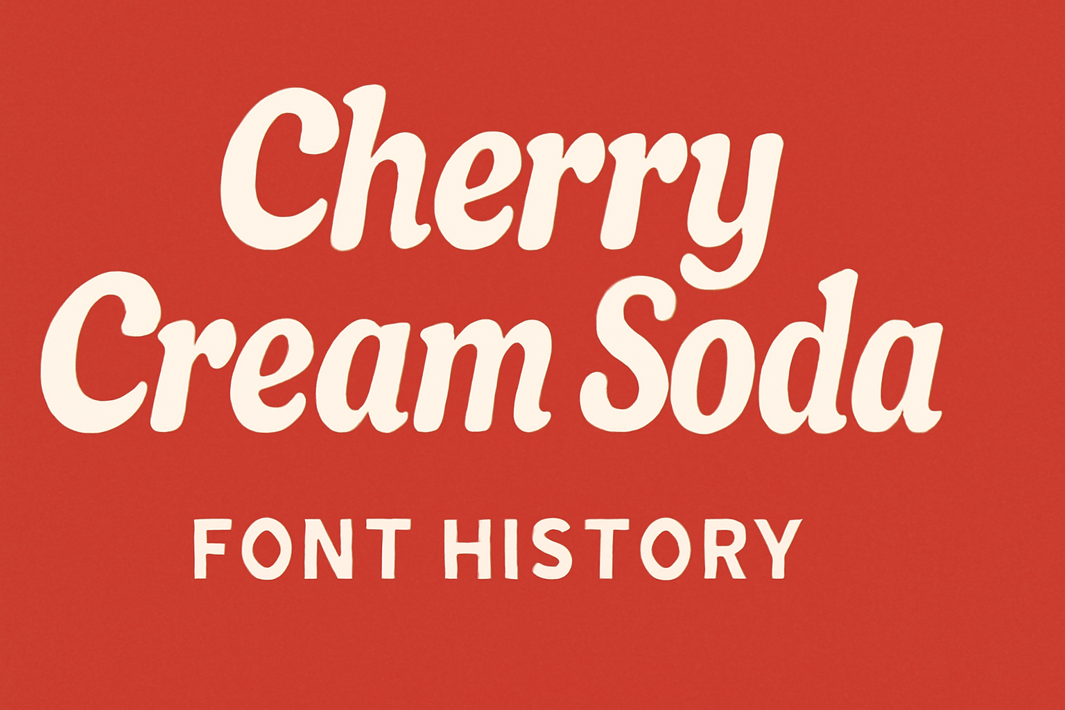
Cherry Cream Soda is a font that captures the lively essence of the 1950s. This extra wide sans-serif font feels like stepping into a retro diner, brimming with the bubbly enthusiasm of the era. With its playful design, it adds a vintage touch to any project, making it perfect for posters and branding.
Cherry Cream Soda embodies a blend of nostalgia and fun, transporting users to the optimistic world of mid-20th century America. It’s more than just a font; it’s an experience that evokes the exuberance of soda fountains and jukeboxes. Retro-themed designs benefit greatly from its nostalgic charm.
The popularity of Cherry Cream Soda has grown, with many downloading and using it for various creative projects. Its vintage appeal and unique style make it a sought-after choice for designers looking to bring a bit of the past into the present. To explore its design and uses further, see the guide on this cheerful font.
Origins of Cherry Cream Soda
Cherry Cream Soda is a font that captures the lively spirit of the 1950s. Known for its wide sans-serif style, it was created with a focus on bubbly enthusiasm and nostalgic charm. This section explores the typography era it belongs to and the inspirations behind its design.
Typography Era
Cherry Cream Soda reflects the style of the 1950s, a time when bold and playful fonts were in vogue. Post-World War II, there was a surge in advertisements and signages that featured large and friendly typefaces. These fonts aimed to convey optimism and energy, aligning well with the societal mood of recovery and growth.
During this era, typography was not just about readability; it stood for something bigger. Fonts like Cherry Cream Soda brought a vibrant and carefree feel to various media, similar to the retro themes used in soda fountain advertisements and posters. This period allowed designers to experiment with styles that combined both function and fun.
Designer Inspirations
The inspiration for Cherry Cream Soda comes primarily from the iconic American diners of the 1950s. Designers were drawn to the colorful and lively atmosphere of these diners, mirroring their vibrant culture in the font’s bold lettering. The typeface aimed to evoke nostalgia, capturing memories of jukeboxes, checkerboard floors, and neon signs.
By embodying the youthful joy of that period, Cherry Cream Soda’s design elements were influenced by the spirit of teenage culture and rock ‘n’ roll aesthetics. This connection to music, lifestyle, and visual art from the era played a significant role in how the typeface was crafted, making it not just a font, but a story in itself.
Design Elements
Cherry Cream Soda is a unique typeface that draws inspiration from the vibrant 1950s era. Featuring a bold and wide sans-serif style, this font exudes a playful yet vintage charm, making it ideal for retro designs.
Characteristics of the Typeface
Cherry Cream Soda stands out with its extra-wide, sans-serif design. The font captures the lively and carefree vibe of the 1950s. This typeface is perfect for projects that need a touch of nostalgia and exuberance. It conveys an upbeat and youthful energy, making it popular for posters and graphic elements intended to evoke a retro feel. The style maintains readability while offering a sense of fun.
The font’s design is flexible, making it suitable for various uses such as branding, headlines, and social media graphics. It retains its youthful character without overshadowing readability. Its single weight variation ensures consistent performance across platforms, providing both digital and print designers with a reliable option. The balance between its boldness and legibility is one of the key reasons it draws attention.
Distinctive Letterforms
This typeface features unique letterforms that are characterized by their rounded edges and open shapes. Its letters are wide and inviting, embodying the spirit of a classic soda fountain ambiance. The typeface combines modern aesthetics with classic styles, offering a fresh perspective on vintage design. This uniqueness makes its letterforms highly recognizable.
The tall x-height and generous spacing contribute to its distinct look. Its retro appeal comes from detailed attention to proportions and subtleties in the curves. These features add to the playful nature of the font while enhancing its visual accessibility. Such characteristics make Cherry Cream Soda a favored choice for projects looking to capture the fun and flair of a bygone era.
Usage
Cherry Cream Soda is an extra-wide sans-serif font well-suited for designs that want to capture a retro vibe. It works great for posters, branding materials, and more, each benefiting from its upbeat 1950s style.
Popular Implementations
This font is often seen in projects that want a nostalgic or playful feel. Its 1950s-inspired design makes it ideal for retro-themed posters and advertisements. Cherry Cream Soda adds a lively touch to branding for diners or events that echo mid-20th-century culture.
Designers frequently choose this font for children’s products or interactive media. Its wide, bubbly letters can attract young audiences. The font is also popular in digital media platforms that focus on fun and creativity.
Industry Recognition
Cherry Cream Soda has gained a reputation for its unique style among designers. It is recognized for its versatile use in retro designs, making it a favorite among graphic artists. Industry professionals also appreciate it for its readability and ability to stand out in crowded designs.
Various resources offer Cherry Cream Soda for free, enhancing its accessibility among designers. Websites like Google Fonts and Fontsource provide easy access, further cementing its popularity in both print and digital design.
Technical Details
The Cherry Cream Soda font is a fun and nostalgic typeface. Key aspects include its different font variations and its licensing terms.
Font Variations
Cherry Cream Soda is mainly recognized for its display style, making it a great choice for headlines or titles. It offers a single weight of 400, which is considered regular. This ensures consistency in visual appearance and keeps the focus on its playful design.
Its wide and friendly look captures the feel of mid-20th-century American diner culture. The design features rounded edges and an extra-wide appearance, evoking a sense of warmth and approachability. It’s perfect for projects that aim to convey whimsy and nostalgia.
Licensing and Usage Rights
Cherry Cream Soda is available under the Open Font License. This means it can be used both personally and commercially without charge. Users can freely share, modify, and distribute the font.
While the font can be employed on many platforms such as websites and print media, alterations to the design should comply with license terms. The Open Font License promotes open collaboration, encouraging designers to experiment while respecting predefined guidelines. This makes Cherry Cream Soda an excellent choice for creative projects.
Evolution of Cherry Cream Soda
Cherry Cream Soda has undergone various changes and updates since its inception. This section highlights the version releases that marked significant milestones and the specific updates and alterations that have shaped its modern form.
Version Releases
Cherry Cream Soda made its debut as a vibrant and lively typeface, bringing the spirit of the 1950s to modern design. The first release introduced it as a sans-serif font with a wide stance and playful curves. Designers quickly embraced it for its retro charm and bold style.
As the font gained popularity, it became part of many design projects ranging from posters to branding materials. The decision to make Cherry Cream Soda available in different formats helped increase its adoption. Its ease of use and unique look remained consistent across different versions, making it a dependable choice for designers wanting a nostalgic flair.
Updates and Changes
Throughout its lifecycle, Cherry Cream Soda has seen updates to improve versatility and performance. One key change was optimizing the font for digital platforms. This made it easier to use in web design, allowing for quicker loading times and better rendering on various devices.
The updates also expanded language support, which made Cherry Cream Soda accessible to a wider audience. Additionally, enhancements in font weight and spacing improved readability without losing its characteristic bubbly style. Some of these changes ensured that the font stayed relevant in an ever-evolving digital landscape while maintaining its original charm.
Cultural Impact
Cherry Cream Soda has made a notable impression in both the design world and among niche fan groups. Its retro style gives it a unique place in design trends and special interest communities.
Influence on Design Trends
Cherry Cream Soda has become a favorite for designers aiming to capture a vintage look. The font’s retro feel is linked to mid-century American diner culture, bringing nostalgia into modern projects. Designers use it in branding for restaurants, cafés, and products that want a playful and classic vibe.
Websites often feature Cherry Cream Soda to create a fun, engaging atmosphere. Its use in banner ads or social media graphics makes it stand out with its bold, wide letters. This font helps projects feel friendly and lively, appealing to a broad audience.
Niche Communities and Fans
Cherry Cream Soda has attracted a dedicated following among specific niche communities. Vintage and retro design enthusiasts particularly appreciate its nod to the past. The font is used by communities that focus on creating artwork with a nostalgic touch, connecting the past and present through design.
Fans often share their creations online, showcasing the font in various projects. This sharing culture helps spread its popularity and inspires others to embrace its unique style. Online forums and social media groups discuss the best ways to utilize Cherry Cream Soda in diverse projects.
Criticism and Reviews
Cherry Cream Soda is known for its wide, bubbly design that captures the spirit of the 1950s. Professional designers and everyday users share their thoughts on its strengths and potential drawbacks.
Professional Opinions
Design experts often appreciate Cherry Cream Soda for its retro vibe and unique style. The font’s wide sans-serif look is praised for being eye-catching, making it a popular choice for posters and branding.
Some professionals note that its energetic design doesn’t fit all contexts. Due to its noticeable style, it might not suit more formal layouts. This font is frequently recommended for creative projects, where its distinctive quality can truly shine. Designers also comment on its limited weight options, which might restrict versatility in some design projects.
User Feedback
Users of Cherry Cream Soda admire its playful and fun appearance. Many find it a great addition to retro-themed designs, helping to evoke nostalgia. It’s often highlighted for its readability, even at smaller sizes.
Some users, however, mention that its unique style may not work for every project. For formal documents or minimalist designs, this font can seem too bold or distracting. The single font weight is a limitation, leading some users to seek other fonts for a more varied look. Despite these points, the font maintains a loyal fan base for specific creative purposes.
Future of Cherry Cream Soda
The Cherry Cream Soda font is set to continue its journey, with developers and designers considering updates and embracing new styling trends. Its influence in retro and modern designs remains strong.
Planned Development
Cherry Cream Soda could see enhancements in its current design. This could include new weights and styles to increase versatility. Designers might also explore introducing italics or bold variants to broaden usage scenarios.
Collaborations with type foundries might occur to ensure high-quality releases. There is potential for this font to adapt for improved readability on digital platforms, addressing users’ growing needs for responsive typography. As interest in vintage styles persists, Cherry Cream Soda could cement its place in both nostalgic and innovative spaces, aligning with design updates.
Predicted Trends
As design trends evolve, Cherry Cream Soda’s wide and classic appearance might position it as a favorite in retro and pop culture design. Expect to see it in marketing campaigns aiming to evoke nostalgia.
The font might gain traction in the digital world, finding a place in web design, apps, and digital media. Designers are likely to integrate it into projects needing a bold, fun statement piece. Its adaptability may lead to higher demand, marking it as a key player in bridging classic and modern aesthetics. The trend towards personalization and distinct visual identities supports its continued relevance.