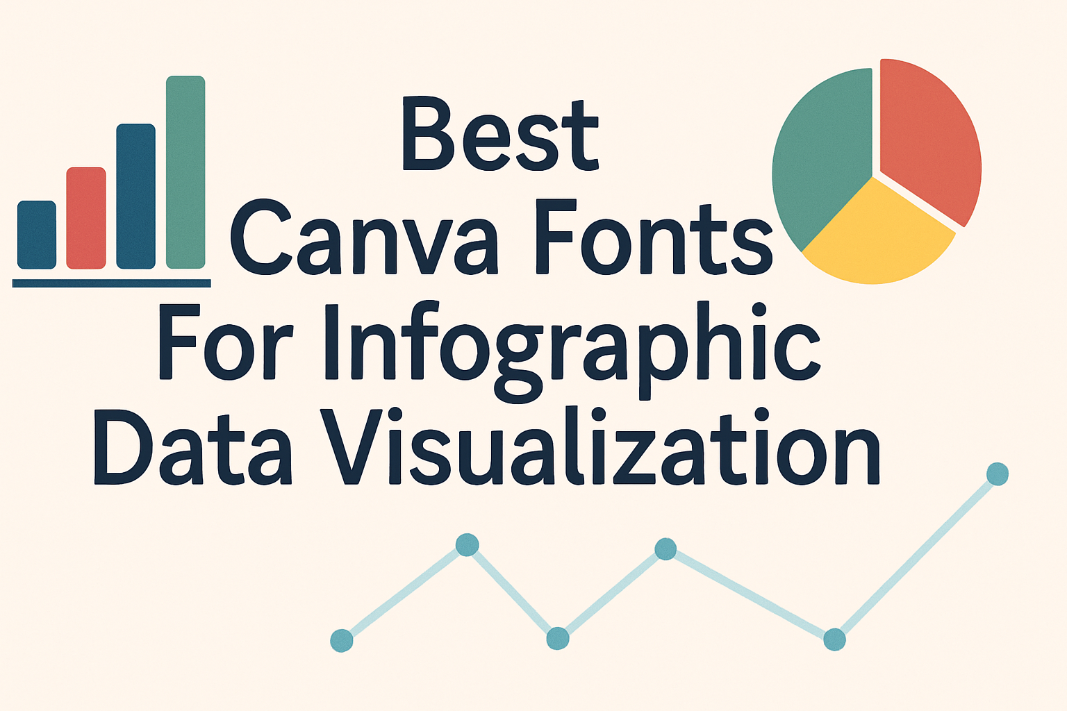
Choosing the right fonts in Canva can make a big difference when creating infographics for data visualization. The best Canva fonts for infographics are clear, easy to read, and help highlight the important information without distracting the viewer. These fonts make data look clean and professional while keeping the message simple. People often struggle to …
Font Tutorials
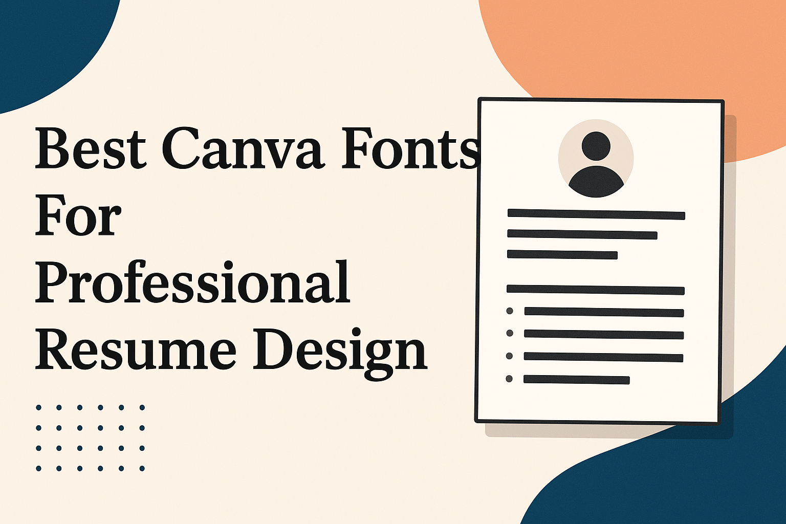
Choosing the right font for a resume can make a big difference in how professional and easy to read it looks. The best Canva fonts for a professional resume combine clarity with style, helping your resume stand out without being distracting. Using the right font ensures that a hiring manager can quickly scan your experience …
Choosing the right font for digital ads and banner campaigns is key to grabbing attention and making messages clear. Fonts like Montserrat, Open Sans, and Impact are popular because they are easy to read and stand out on screens of all sizes. The right choice can help an ad connect with viewers quickly and encourage …
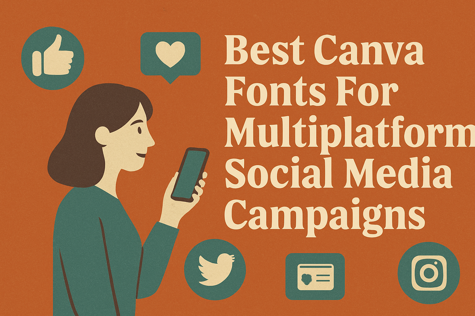
Choosing the right Canva fonts for multiplatform social media campaigns is key to making your graphics clear and engaging across all channels. The best fonts combine readability with style, like clean sans-serifs or elegant script options, to grab attention without overwhelming viewers. Using fonts that work well together helps create a consistent brand look whether …
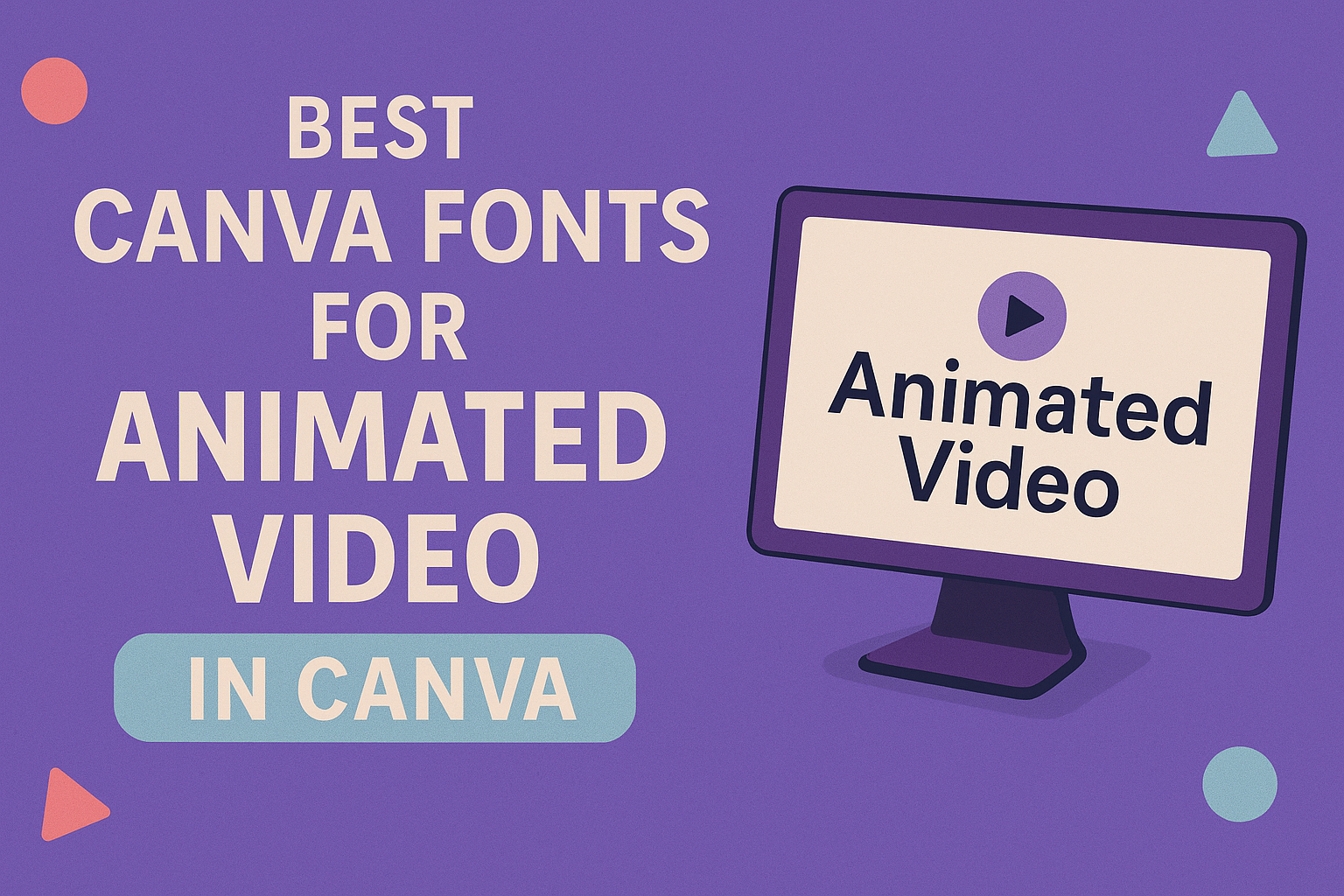
Choosing the best fonts for animated video text in Canva can make a big difference in how a message grabs attention. Fonts like Montserrat, Bebas Neue, and Poppins work very well because they are clear, bold, and easy to read even when moving on screen. These fonts help viewers focus on the words without distraction. …
Creating designs with a retro gaming or pixel art vibe needs the right fonts to capture that classic, nostalgic feel. The best Canva fonts for these themes are pixelated, blocky, and bold, perfectly matching the look of old-school video games and digital art. These fonts work great for titles, logos, and short text bursts where …
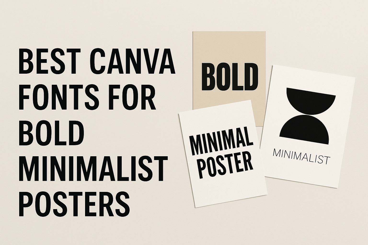
Creating bold minimalist posters in Canva is all about choosing the right fonts that catch attention without overcrowding the design. The best fonts for this style are clean, simple, and strong—like Lato Bold, Mont Bold, and Lot—which make your message clear and impactful. These fonts work well because they combine thick strokes with minimal details …
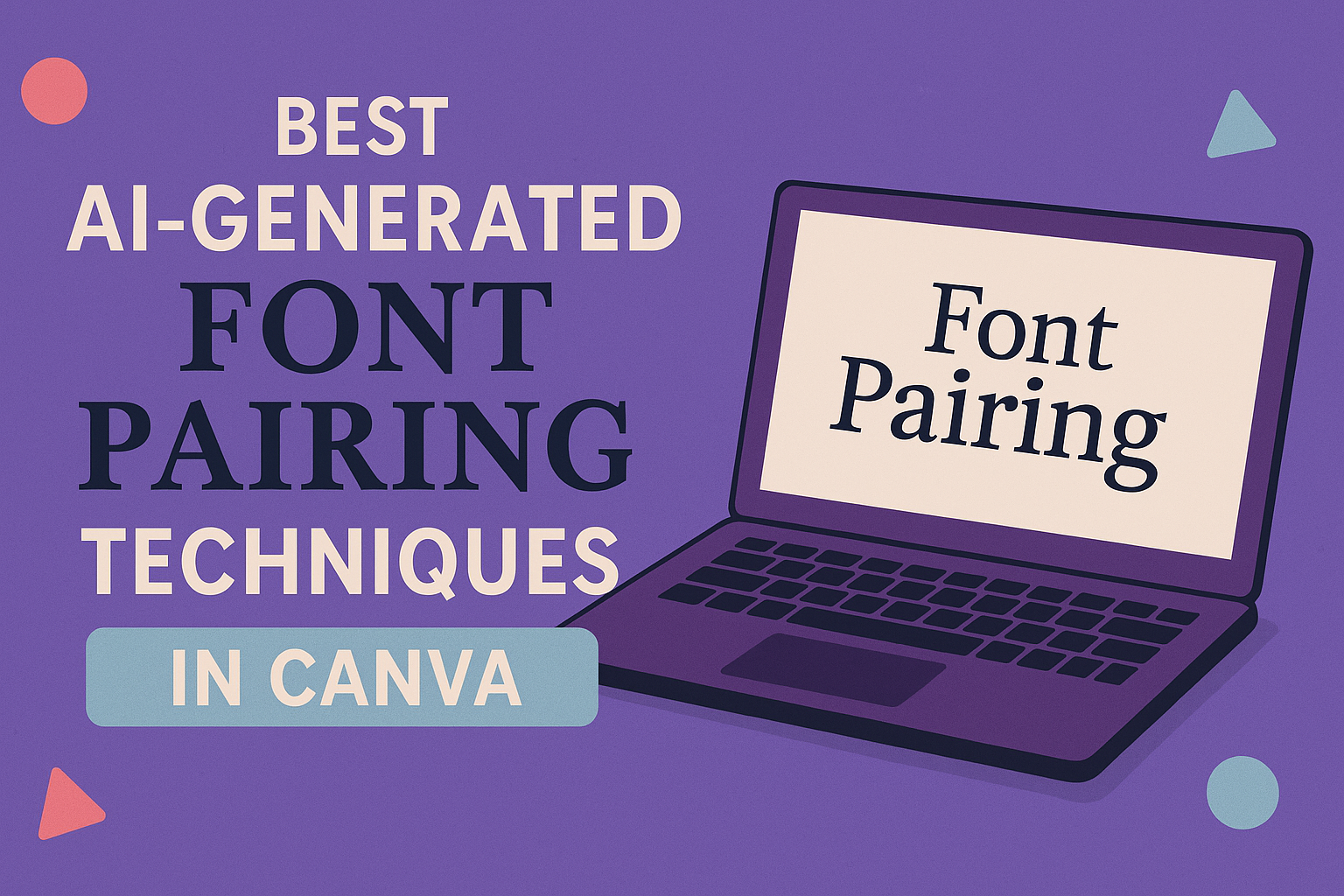
Using AI to find the best font pairings in Canva makes design simpler and more effective. AI tools analyze your choices and suggest font combinations that look balanced and professional without the guesswork. This helps users create appealing visuals quickly, whether for social media, presentations, or branding. With Canva’s AI-powered font pairing feature, anyone can …
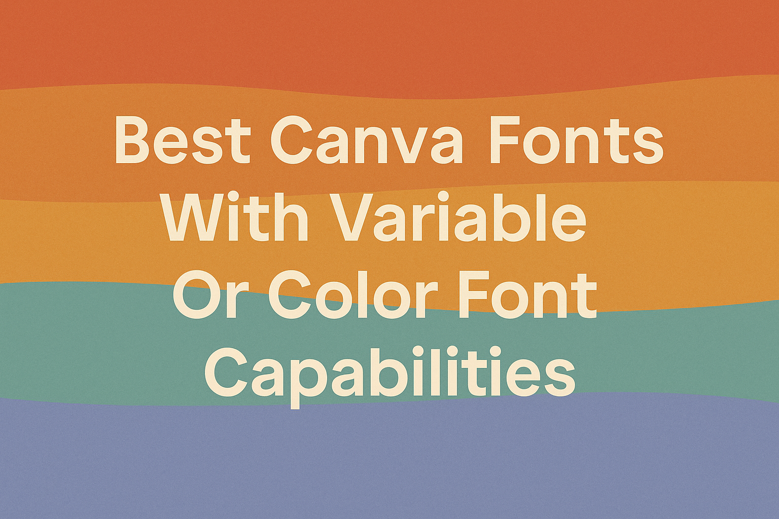
Designers who want more control over their text will find variable and color fonts in Canva a game changer. Variable fonts let users adjust thickness, width, and style with easy sliders, while color fonts add vibrant, multi-colored effects to any design. These font types open new creative possibilities beyond traditional static options. Using these advanced …
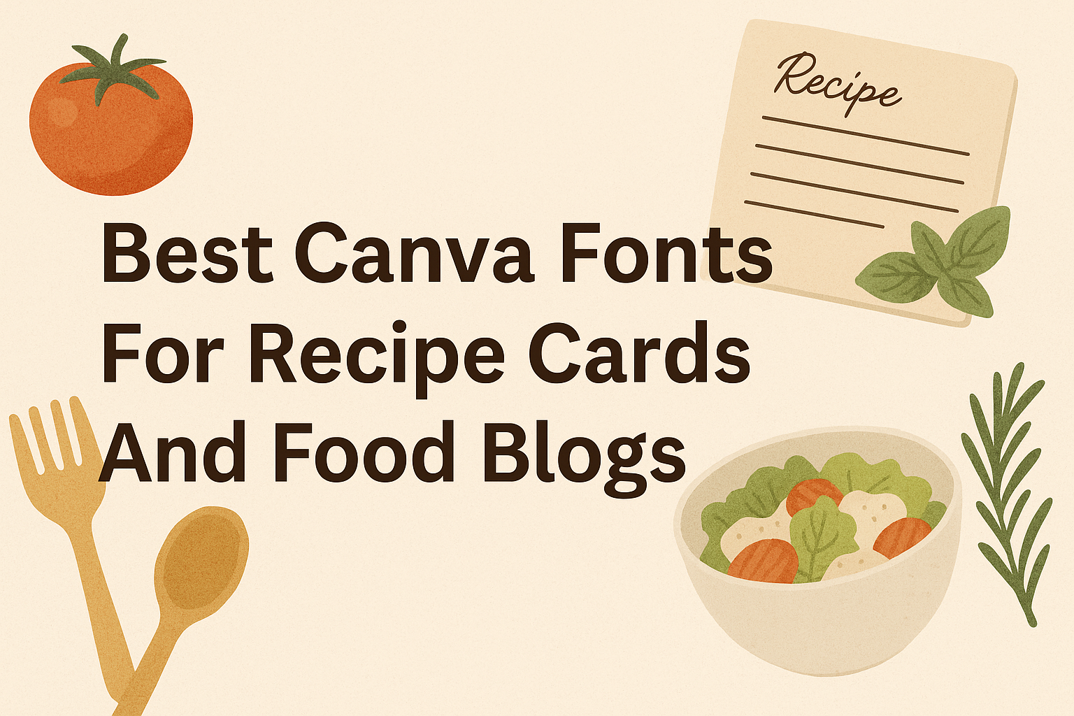
Choosing the right font can make recipe cards and food blogs look tasty and inviting. The best fonts are easy to read but also match the style of the food, whether it’s a cozy home-cooked meal or a fancy dessert. Fonts like Atkinson Hyperlegible and Poppins are great choices because they keep the text clear, …