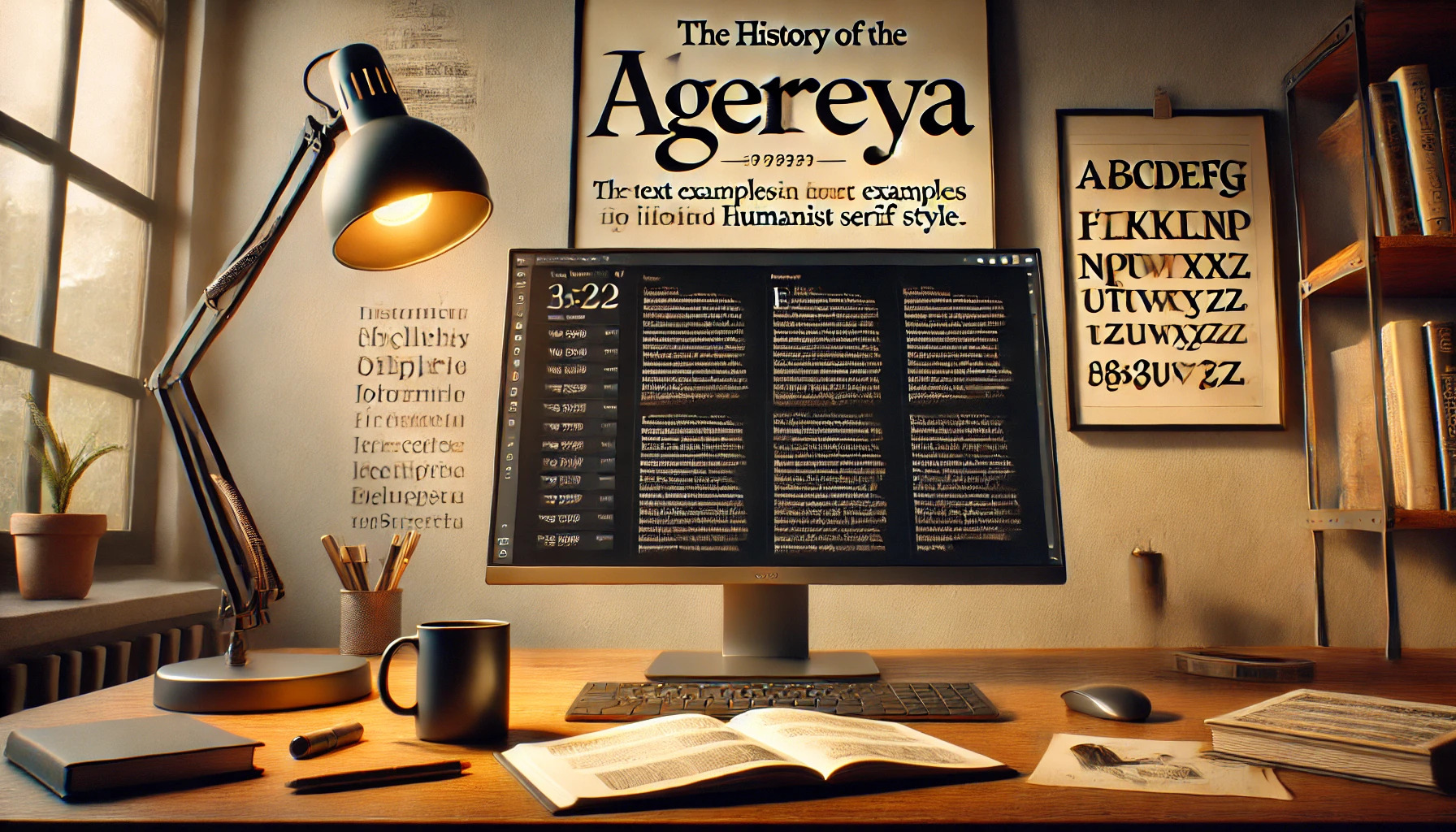
Alegreya is a font that has captured the attention of both designers and readers alike. Created by Juan Pablo del Peral, it was originally designed for literature. Its dynamic and varied rhythm makes it perfect for lengthy texts, offering readers a smooth reading experience. Alegreya has a unique charm, striking a balance between classical and …
Font Tutorials
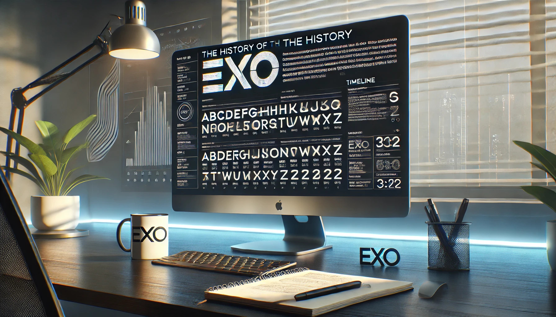
Exo has made its mark as a versatile and modern geometric sans serif font, offering an impressive array of 9 weights each with true italic versions. This remarkable range makes it suitable for both display and text use, catering to a variety of design needs. Exo was first launched on Kickstarter in 2011 and later …

The Bodoni Moda typeface offers a modern twist on a classic design. It is a no-compromises Bodoni family that fits perfectly into the digital age, combining elegance with functionality. With its variety of weights and styles, Bodoni Moda caters to diverse design needs, making it a popular choice for both print and digital media. Originating …
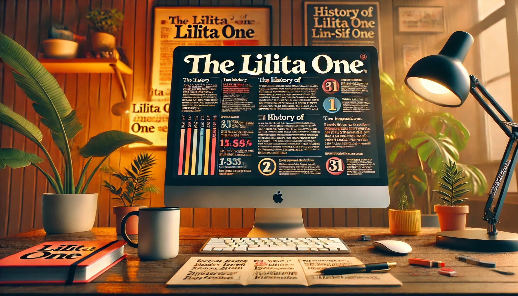
Lilita One is a font that grabs attention with its bold, adventurous look. Originally crafted by Alan835, it stands out due to its thick lines and slightly condensed style. This makes it perfect for headlines and short text snippets. The font’s design combines a rugged feel with some unique details, giving it a soft yet …
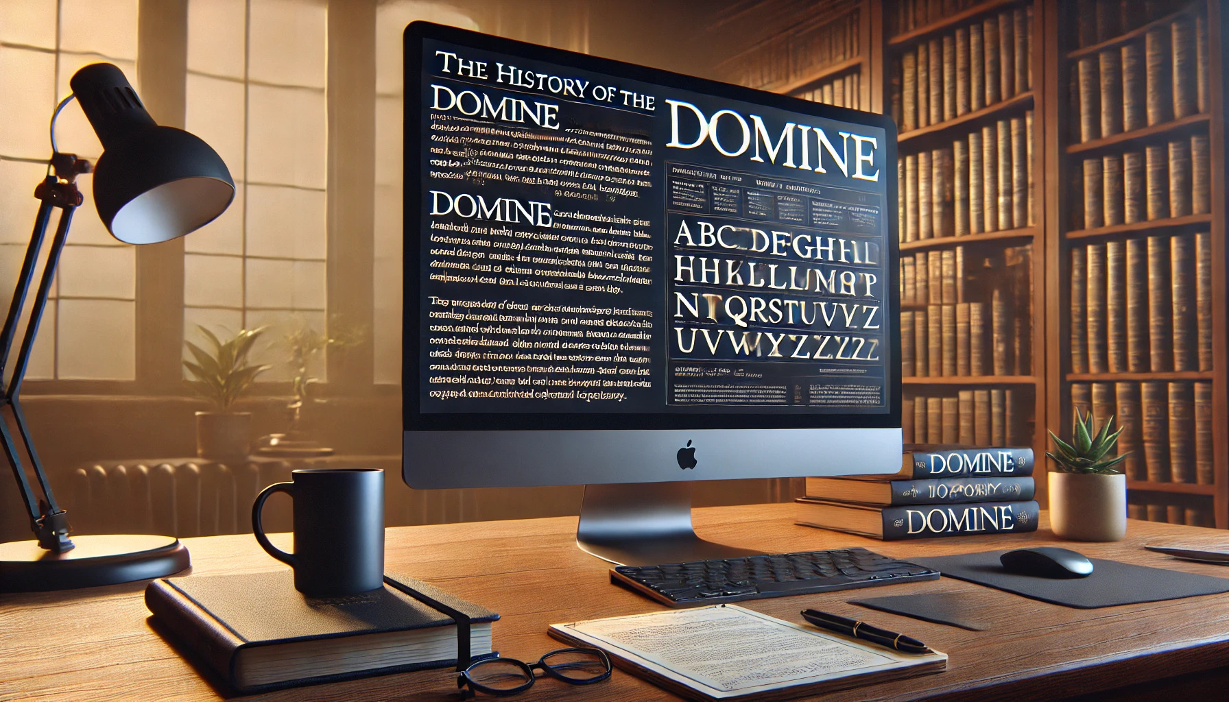
Domine is a typeface that captures the elegance of classic serifs while blending modern readability. Created by Pablo Impallari, it was specifically designed to work well on digital screens, making it ideal for online content. Domine is perfect for sites where reading is the main activity, like newspaper or magazine websites. The font shines at …

Nanum Gothic is a popular sans-serif font designed with a modern touch. It was created by Sandoll Communications and is part of the Nanum font family. This font is especially designed for the Korean language script “Hangeul” and also supports Latin characters, making it versatile for different uses. The design of Nanum Gothic focuses on …
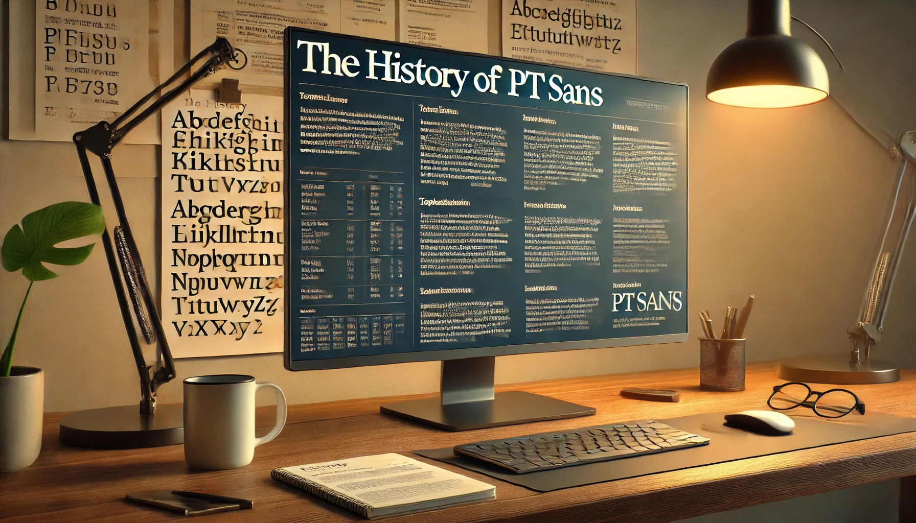
PT Sans is not just a typeface; it’s a blend of history and modern design. Born out of a project to celebrate Peter the Great’s orthography reform, PT Sans offers a unique connection between past and present typography. This font family includes styles that cater to diverse uses, from standard documents to captions for small …
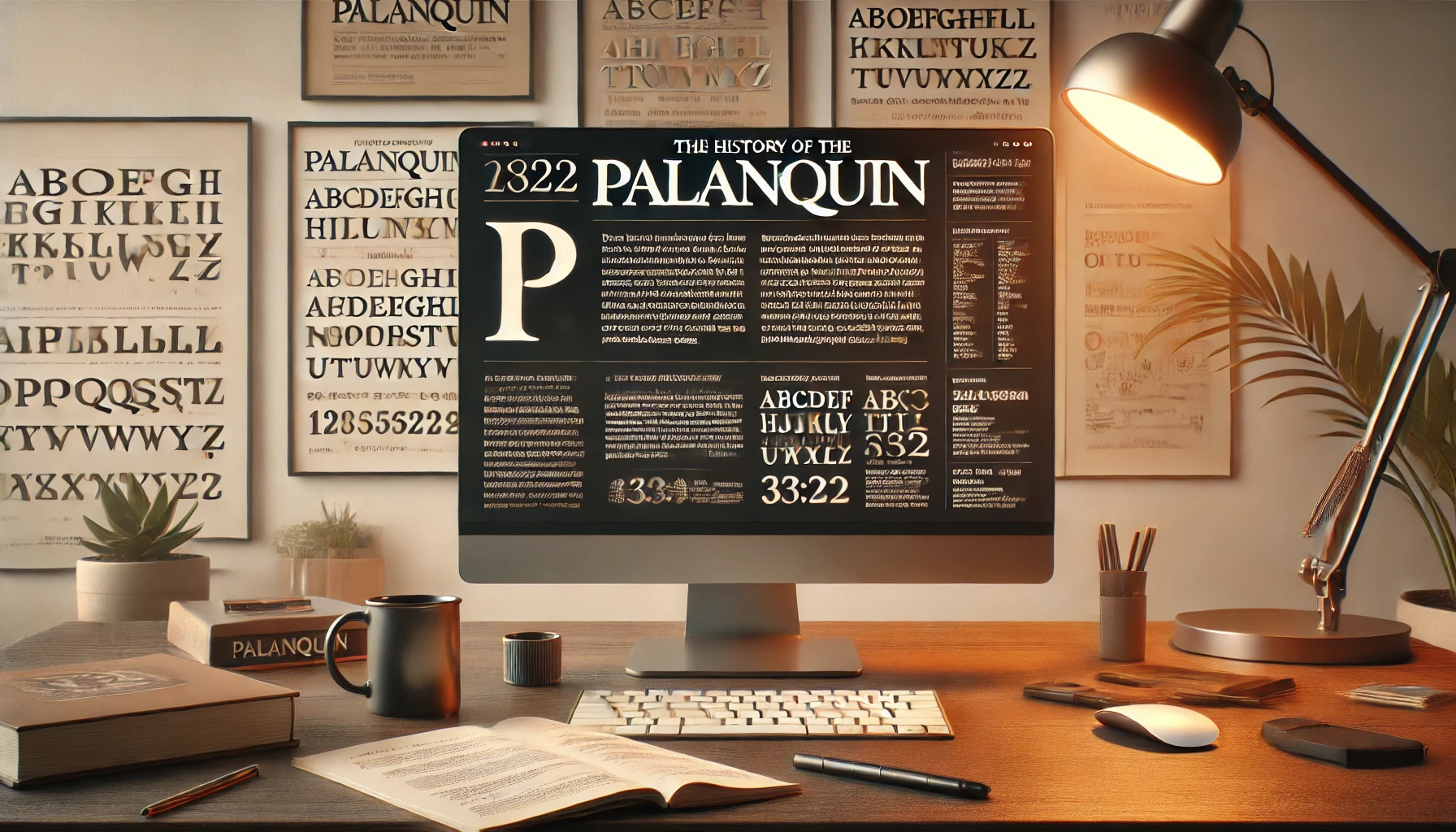
Palanquin is a uniquely crafted text type family that integrates both Latin and Devanagari scripts. It’s designed by Pria Ravichandran to fit the digital age, with a style that suits a variety of modern uses. This makes it a favorite for those who appreciate clean and versatile design. The typeface offers seven text weights and …

Libre Baskerville is a font that draws inspiration from the classic Baskerville typeface, which was designed in the mid-18th century by John Baskerville. This modern adaptation is optimized for on-screen reading, offering a taller x-height and wider counters. Beyond its on-screen appeal, Libre Baskerville carries the legacy of its historical predecessor. The original Baskerville typeface …

Garamond is a name that resonates with elegance and history in the world of typography. Born out of the craftsmanship of sixteenth-century Parisian engraver Claude Garamond, this timeless serif typeface has left a lasting impact on book printing and design. Garamond’s typefaces have been celebrated for their readability and classic style, making them a favorite …