
The Raleway font has become a popular choice for many designers due to its elegant and modern appearance. Originally designed by Matt McInerney in 2010, Raleway began as a single thin weight and has since evolved into a versatile sans-serif typeface with multiple weights and styles. This evolution has made it suitable for a wide …

Montserrat is a vibrant typeface that tells the story of its origins through its design. Inspired by the urban typography of Buenos Aires, it was created by Julieta Ulanovsky. Montserrat captures the spirit of the early twentieth century with its geometric shapes and clean lines. This font is more than just letters; it is a …

The Ubuntu Font Family is a modern, humanist-style typeface that brings elegance and readability to the digital world. This font family was developed by Dalton Maag with funding from Canonical Ltd. It has become an integral part of Ubuntu’s brand identity. Created for the wider Free Software community, it was initially released in 2010. Its …

Libre Baskerville is a font that draws inspiration from the classic Baskerville typeface, which was designed in the mid-18th century by John Baskerville. This modern adaptation is optimized for on-screen reading, offering a taller x-height and wider counters. Beyond its on-screen appeal, Libre Baskerville carries the legacy of its historical predecessor. The original Baskerville typeface …

Nanum Gothic is a popular sans-serif font designed with a modern touch. It was created by Sandoll Communications and is part of the Nanum font family. This font is especially designed for the Korean language script “Hangeul” and also supports Latin characters, making it versatile for different uses. The design of Nanum Gothic focuses on …

The Bodoni Moda typeface offers a modern twist on a classic design. It is a no-compromises Bodoni family that fits perfectly into the digital age, combining elegance with functionality. With its variety of weights and styles, Bodoni Moda caters to diverse design needs, making it a popular choice for both print and digital media. Originating …
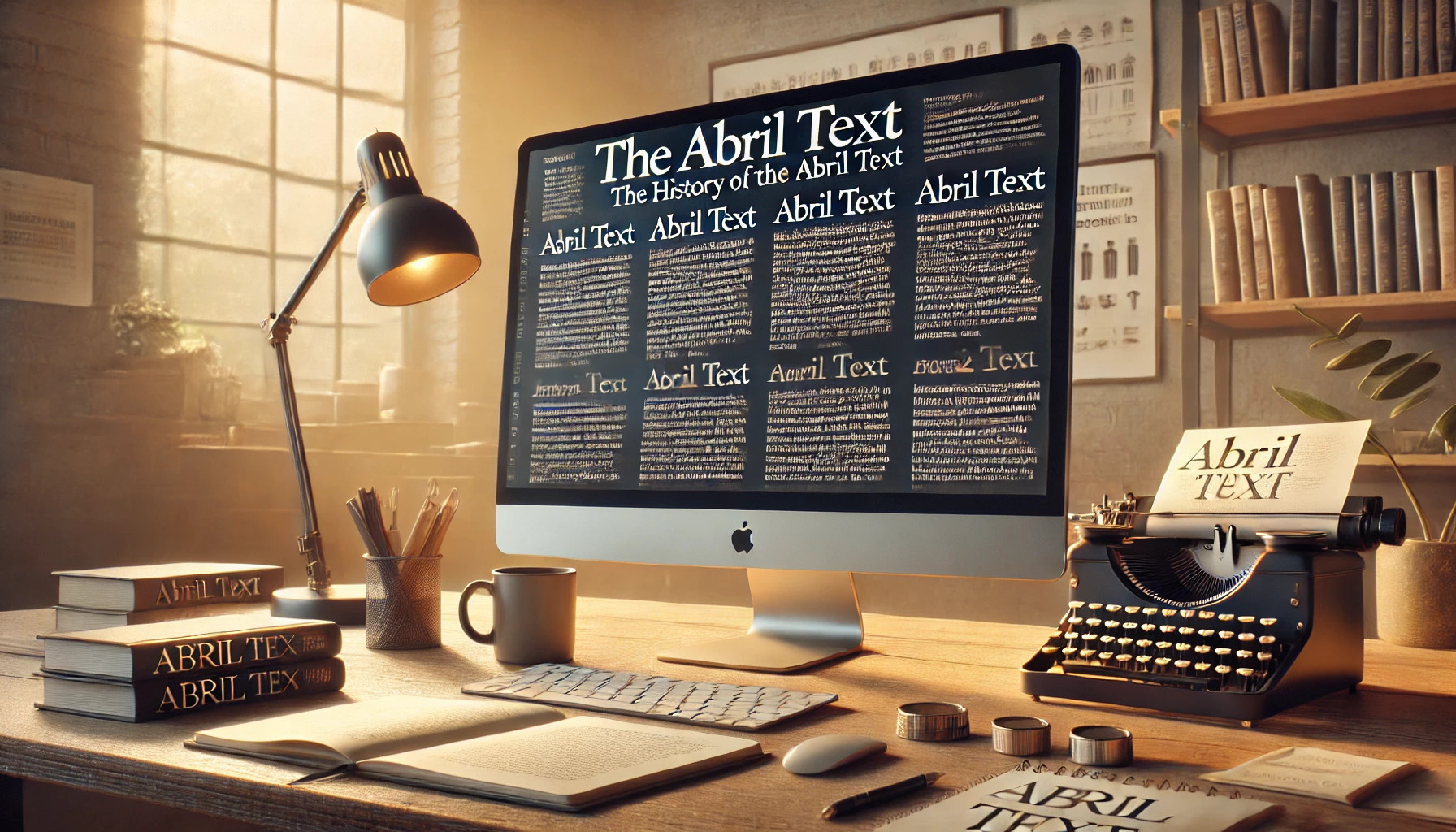
Abril Text is an intriguing typeface with a rich history that draws from a blend of 19th-century influences. Designed by Veronika Burian and José Scaglione, this font is part of the broader Abril family, known for its versatility across various design applications. Abril Text offers a darker and more robust style compared to its sibling, …
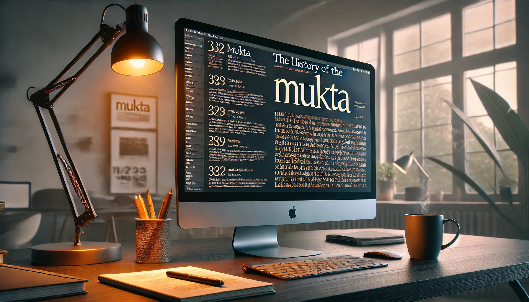
Mukta is more than just a common font; it is a testament to the fusion of traditional and contemporary design. Emerging as a flexible and versatile typeface, it serves multiple scripts like Devanagari, Gujarati, Tamil, and Latin. Its clean, humanist style makes it ideal for various digital and print uses. Mukta’s name, meaning “free” or …
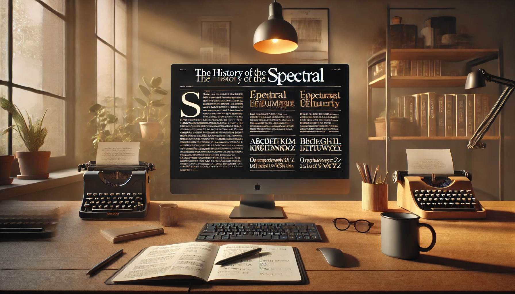
Spectral is a fascinating typeface that has made a significant impact in the world of digital typography. Created by Production Type and commissioned by Google Fonts, it offers a clean and versatile serif design. Spectral is designed for reading on screens, providing an efficient and visually appealing experience. This typeface is available in seven weights …
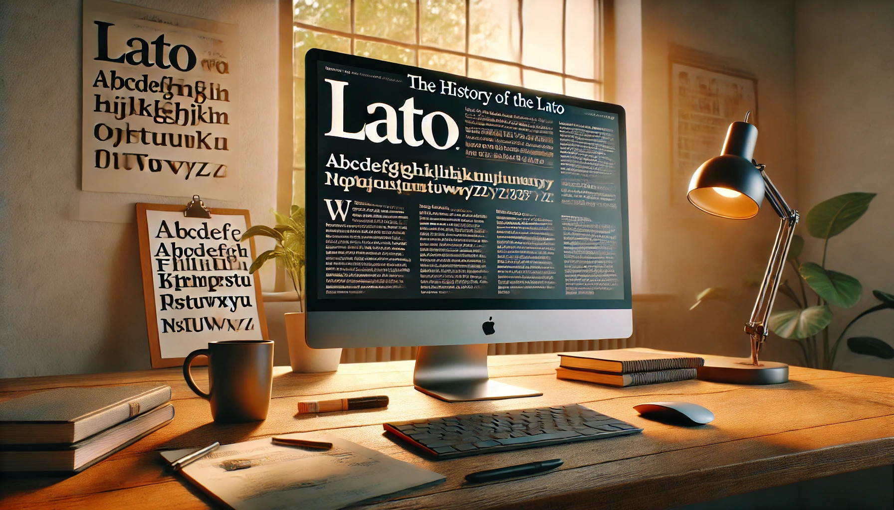
Lato is a typeface that seamlessly blends modern design with readability, making it a favorite among designers and web developers. Created in 2010 by Polish designer Łukasz Dziedzic, Lato initially served as a corporate identity project for a bank. When the bank changed its vision, Dziedzic decided to release the font publicly, and it quickly …