Bold and modern design often begins with the right choice of font.
Striped fonts in Canva offer a unique blend of style and creativity that can elevate any project, from logos to headlines.
For those looking to make their designs stand out, selecting the best striped fonts in Canva can make a significant difference.
Readers will find that these fonts range from vintage to modern styles, each bringing its own charm and personality.
Some of the top choices include Squartiqua Stripes and Neultica Scratched, known for their distinct textures and bold appearances. These fonts are not just visually captivating, but also versatile enough to suit a variety of creative needs.
Whether you’re a seasoned designer or just starting out, exploring the rich variety of striped fonts in Canva can be both exciting and rewarding.
By experimenting with these fonts, anyone can bring a fresh and dynamic look to their designs, ensuring each project is both memorable and impressive.
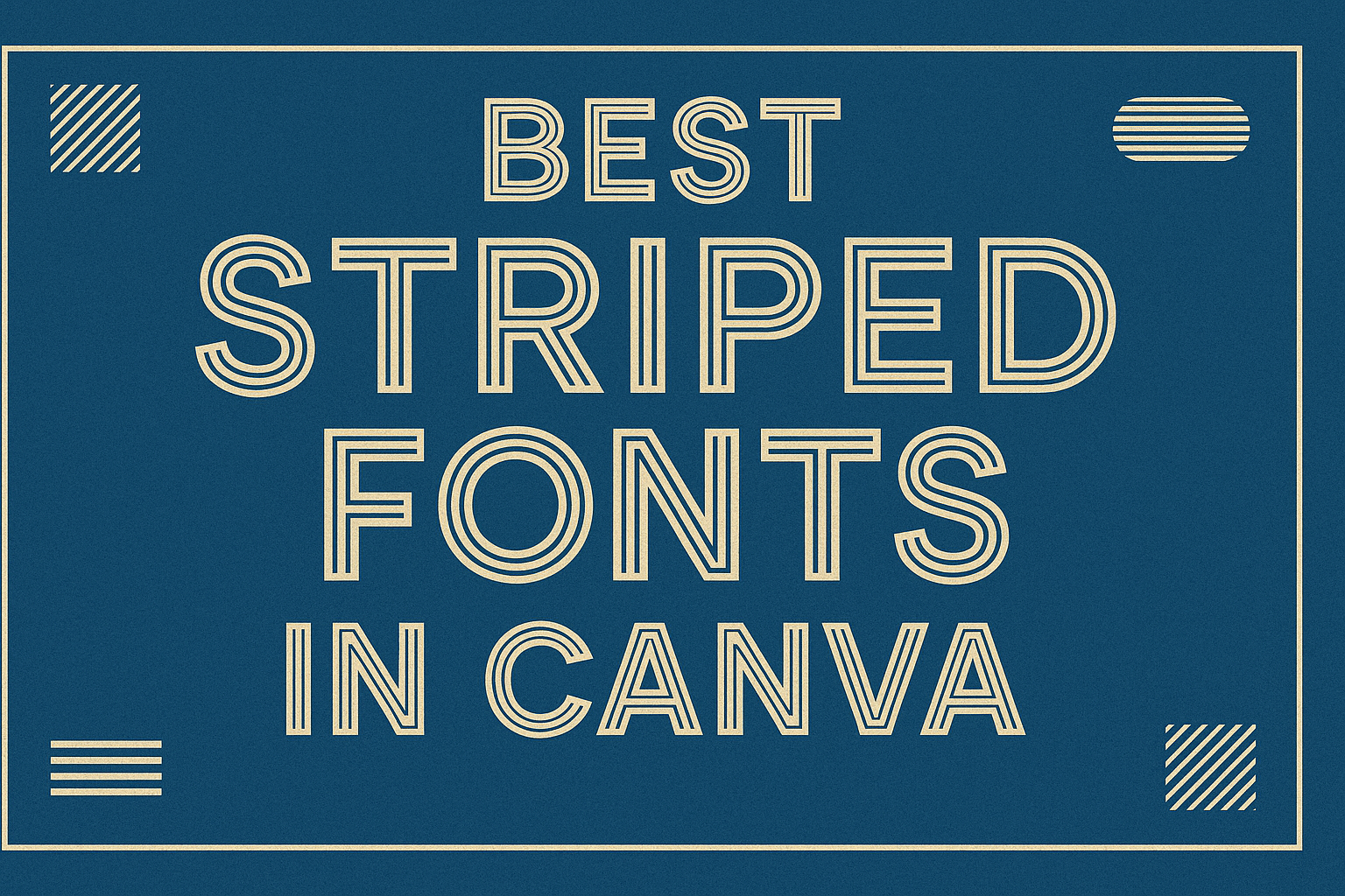
Exploring Striped Fonts in Canva
Striped fonts are gaining popularity for their unique look and versatility.
Designers are increasingly using these fonts to make their projects stand out with bold and dynamic style.
What Are Striped Fonts?
Striped fonts feature lines or patterns running through the letters, creating a textured or layered effect. This design choice can give text a bold, eye-catching look, making it popular for branding, logos, and headlines.
Striped fonts can vary greatly in style, from minimalist to intricate. In Canva, options like Squartiqua Stripes and Neultica Scratched offer different aesthetics ranging from modern to vintage-inspired designs.
By adding visual interest, striped fonts can transform ordinary text into a creative statement.
The Rise of Striped Fonts in Design
Over recent years, striped fonts have become more common in design projects. Their popularity is linked to the demand for unique and engaging typography that stands out in both digital and print media.
With platforms like Canva, accessing diverse and stylish striped fonts has become easier. Designers and hobbyists alike are embracing these fonts for everything from social media posts to event invitations.
This trend reflects a broader movement towards more personalized and distinctive visual communication in the design world.
How to Use Striped Fonts Effectively
Striped fonts can add a unique and stylish touch to any design. Knowing how to pair them with images, choose the right colors, and create a clear visual hierarchy can help your design stand out.
These tips aim to make your text eye-catching yet readable.
Pairing Striped Fonts with Images
Striped fonts can become the focal point of a design when paired thoughtfully with images.
It’s important to balance the complexity of the font with the simplicity of the background. For instance, a busy image may clash with a striped font. Instead, opting for a simple background helps the text stand out.
Choosing images with complementary colors is key. If the stripes in the font are bold and bright, selecting an image with softer, muted tones can enhance readability. This ensures the text doesn’t get lost in the design.
Also, keeping some white space around the text can prevent the design from feeling cluttered. This makes the striped font pop and draws attention to your message without being overwhelming.
Color Choices for Striped Fonts
Selecting the right colors for striped fonts is crucial.
Contrast plays an important role—using contrasting colors for the font and background can make your text more readable. For instance, a dark striped font on a light background is easier to read than a dark-on-dark combination.
It’s also wise to limit your palette to a few colors. Too many different hues can make the design look chaotic. Instead, sticking to two or three colors that align with your brand can keep the design cohesive.
Bold colors can add emphasis, while italic or lighter hues can provide subtlety. Experimenting with different color combinations and pairing them with your design elements can create an eye-catching look.
Creating Visual Hierarchy with Striped Fonts
Visual hierarchy helps guide the viewer’s eye to the most important elements first.
Using striped fonts selectively for headings or important text can make these elements stand out. For body text, consider using simpler fonts to maintain readability.
Varying the size of striped fonts can also establish hierarchy. Larger sizes naturally draw more attention, making them perfect for titles or key points. Meanwhile, smaller sizes can be used for less critical information.
Aligning text consistently contributes to a clean look. Centering vital text and aligning secondary information to the left or right can direct attention where needed and strengthen the visual structure of the design.
Best Practices for Striped Fonts
Using striped fonts in your designs can add flair and creativity. It’s essential to balance this style with readability and the overall design’s flow. Below are some key aspects to focus on when using striped fonts.
Contrast and Legibility
When choosing striped fonts, it’s vital to ensure they stand out from the background.
High contrast between the font and background color enhances readability. If the stripes make the font hard to read, consider using bolder stripes or a lighter background.
Another tip is to pair striped fonts with simpler typefaces. This combination allows the striped fonts to serve as an eye-catching element without overwhelming the viewer. This approach works well for headlines or short text.
Spacing and Sizing
Proper spacing is crucial to maintaining clarity in striped fonts.
Adjusting letter spacing can make the text easier to read. If letters appear too cramped, increasing the spacing can give the font room to breathe and stand out on the page.
Font size also plays a significant role. Larger sizes often improve readability by making the stripes clearer. For smaller text or intricate patterns, opt for a simpler, non-striped font to maintain balance in the content.
Avoiding Overuse
While striped fonts can enhance a design, overusing them can lead to the opposite effect.
It’s best to apply them selectively, such as in logos or titles, to draw attention to specific parts of your work.
Mixing striped fonts with too many other decorative fonts can make a design look chaotic. Instead, use striped fonts sparingly as accents to deepen the visual interest without creating a busy appearance.
Top Striped Fonts in Canva
Striped fonts in Canva offer unique styles, enhancing designs with eye-catching effects. Each type of striped font brings something special, whether it’s elegance, boldness, or playfulness. Explore these top picks to add personality and flair to your projects.
Elegant Striped Fonts
Elegant striped fonts in Canva elevate designs with their refined and sophisticated look.
Squartiqua Stripes is a standout choice, featuring both uppercase and lowercase letters with a stylish texture. It brings a touch of class to logos, invitations, and branding, promising to catch anyone’s eye.
Neultica Scratched offers a slightly edgier take while retaining elegance. Its subtle stripe detail enhances readability, making it perfect for headings and creative projects.
Another option is Brim Narrow Combined, which combines narrow letterforms with striped elements for a sleek appearance. This font works well for digital and print media, offering versatility with a touch of charm.
Bold Striped Fonts
For those who want their designs to stand out, bold striped fonts are the way to go.
Bungee Shade delivers a vibrant look with its thick letters and prominent stripes. Available in Canva, it’s excellent for highlighting key messages, especially in posters and advertisements.
The Vast Shadow Font provides a dramatic effect, featuring large, bold letters with lines running through them. This font suits titles and headings, ensuring your text captures attention in an instant.
Quad Line is another bold choice, with its structured design and clear lines creating a strong presence. Use it for projects that require impact, like banners or promotional material, where the message needs to make an impression.
Playful Striped Fonts
For designs that need a fun and lively touch, playful striped fonts are ideal.
KG Primary Dots Lined is child-friendly, with dotted stripes that add a whimsical feel. It’s perfect for projects aimed at kids, like educational materials or playful invitations.
Kare Gradient brings a unique colorful vibe, blending gradient effects with stripes. This font can add an energetic and cheerful tone to social media graphics or event flyers.
Vintage Modern mixes classic and modern styles with its playful stripe patterns. It’s a versatile choice that fits both casual and nostalgic themes, making it ideal for various creative applications.
Incorporating Striped Fonts in Various Designs
Striped fonts in Canva offer a distinctive style that can enhance logos, social media graphics, and print media. These fonts bring a modern edge and can capture attention with their unique patterns. Read on to discover how these fonts can be used effectively in different design settings.
Striped Fonts in Logo Design
In logo design, striped fonts can make a brand stand out. They add a creative twist, making logos more memorable.
When creating a logo, it’s important that the font complements the brand’s identity. A bold, striped typeface can convey innovation and energy, making it ideal for businesses in creative industries.
When selecting a striped font for a logo, readability is crucial. Avoid overly intricate fonts that can become hard to read, especially at smaller sizes.
Mixing striped fonts with solid ones might balance the design, providing both style and clarity. It’s also helpful to experiment with color combinations, as the stripes can interact with colors in exciting ways.
Striped Fonts in Social Media Graphics
Social media graphics must grab attention quickly. Striped fonts are perfect for this task, instantly drawing the eye.
They can be used for text overlays on images, creating a dynamic look that stands out in a crowded feed.
Using striped fonts in social media does not mean compromising readability. For impactful graphics, designers often use striped fonts for headlines or short phrases. These fonts can highlight key messages while using simpler fonts for body text.
Animated posts can also benefit from striped fonts, as they add movement and depth. The textures created by stripes can make graphics appear more lively and engaging.
Striped Fonts in Print Media
In print media, striped fonts bring a touch of modern flair to traditional formats. Whether it’s a magazine cover, a flyer, or a brochure, these fonts can make headlines pop. Their unique designs draw in readers by offering something visually different.
Careful consideration is needed when using striped fonts for print to ensure clarity.
It’s best to reserve them for headlines or significant statements, avoiding long passages of text.
In print, colors can play a vital role. Select combinations that maintain legibility and enhance the striped effect. The use of bright or contrasting colors can amplify the visual impact of the stripes.
Customizing Striped Fonts in Canva
Customizing striped fonts in Canva can add a unique touch to any design. Whether it’s for a logo, poster, or social media graphic, there’s plenty of room for creativity.
Choosing the Right Font
Users can start by selecting from a variety of striped fonts, like Squartiqua Stripes or Vintage Modern. These fonts offer distinct styles that can fit different projects. For a bold look, Squartiqua Stripes is a solid choice.
Adjusting Font Size and Color
Once a font is chosen, users can adjust its size to better fit their layout. Changing the color of the stripes can also enhance the visual appeal. Canva allows users to play with various shades to match the font with the overall design theme.
Using Effects
Canva provides effects that can further customize fonts. Adding shadows, glows, or changing the transparency can make the text stand out. It’s a simple way to add depth to the design.
Combining with Other Elements
Incorporating other design elements like shapes or illustrations can complement striped fonts. By layering different elements, users can create a cohesive and professional look. Canva’s design tools make this process easy and intuitive.
For tutorials on creating striped text, users can explore resources like this video guide. Following step-by-step instructions can help users maximize their design potential.
Technical Considerations for Striped Fonts
When using striped fonts in Canva, it’s essential to consider the file types you use and how they interact with different systems. Another key factor is how these fonts affect loading times and overall performance in your design projects.
File Types and Compatibility
Choosing the right file type is crucial for ensuring your striped fonts display correctly.
Common file types include OTF (OpenType Format) and TTF (TrueType Format). OpenType offers more features, like advanced styling options, which can be useful for more complex projects.
Compatibility is important, too. Some font styles may not work across all browsers or devices, which can cause your design to look different than intended.
Earlier versions of some software might not support certain font features, making it vital to test these fonts on multiple platforms.
Adobe Illustrator and Photoshop might support some advanced features better than simpler design tools. Knowing the strengths and limitations of each tool will help you choose the most compatible fonts for your project.
Before finalizing your design, checking how your chosen font appears on different devices can avoid unexpected issues.
Loading Times and Performance
Striped fonts can add depth to your designs but might affect how quickly your project loads.
Complex fonts with many details can take longer to load, especially if used extensively throughout a project. This could lead to slower performance on websites or presentations.
Optimizing your design by using striped fonts sparingly can help maintain quick loading times.
It’s also possible to preload fonts to improve performance. Using caching techniques and serving fonts from reliable servers can ensure smoother experiences.
Be mindful of how users will experience your designs on different devices and internet speeds.
Testing your project in various scenarios will help balance aesthetic appeal with functionality. This approach ensures that stylish fonts don’t come at the expense of usability.
Updating and Maintaining Your Font Library
Keeping a font library up-to-date is important for any design project. Regular updates ensure access to the latest trends and capabilities.
It’s a way to keep designs fresh and engaging.
Checklist for Your Font Library:
- Add New Fonts: Regularly explore platforms like Canva for fresh options.
For example, striped fonts in Canva have unique styles that can make texts stand out.
- Organize Efficiently: Use categories or tags to sort fonts by style, such as bold, italic, or striped. This makes it simple to find the right font quickly.
Regular review of the font collection helps eliminate those no longer useful. Clearing unused fonts can also improve software performance and make it easier to navigate the library.
Benefits of a Well-Maintained Font Library:
- Easier access to a variety of fonts when needed.
- Encourages creative experimentation with new fonts.
- Saves time when working on multiple projects.
Consistency in updating and maintaining a font library contributes to smoother design processes. Staying on top of font management enhances creativity and maintains a professional standard for any design project.