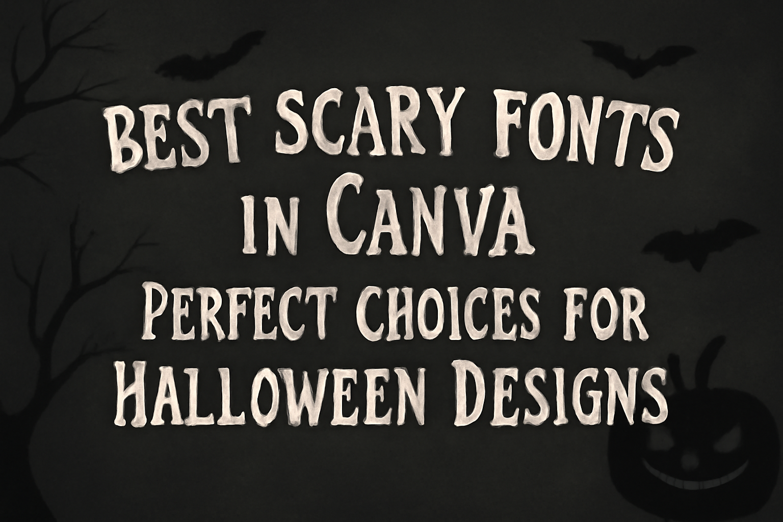
When designing for Halloween, choosing the right font can make a huge difference. The best scary fonts in Canva can elevate any spooky design, making it more engaging and fun.
From eerie drips to bold edges, these fonts set the perfect mood for invitations, decorations, or social media posts.
For anyone looking to capture the essence of Halloween, Canva offers a variety of fonts that add character and creativity to any project.
Whether it’s a classic font like Jeepers or more unique options like Charu Chandan Blood Drip, there’s something for every Halloween theme.
Designers can easily find fonts that resonate with the spooky vibe they aim to create.
Exploring Canva’s Font Library
Canva offers a vast font library that allows users to find the perfect typeface for any design project.
With a wide range of styles, accessing and navigating these fonts is straightforward.
How to Access Fonts in Canva
To access fonts in Canva, users can log in to their account and create a new design.
Once in the design editor, they can click on the text tool located in the sidebar. By selecting the “Add a text box,” users will see a dropdown menu with a variety of font options.
For a more targeted search, it’s possible to type keywords like “scary” or “horror” into the search bar. This will filter the fonts, making it easier to find specific styles.
Users can also filter by popularity or newest additions.
Categories of Fonts
Canva categorizes its fonts to help users find the right style quickly. The main categories include serif, sans-serif, script, and display fonts.
- Serif fonts have small lines at the ends of the letters, giving a classic look.
- Sans-serif fonts are clean and modern with no lines, perfect for a minimalist design.
- Script fonts mimic handwriting and are often used for invitations or artistic projects.
- Display fonts are bold and eye-catching, ideal for headlines or promotional materials.
By browsing these categories, users can discover fonts that align closely with their project’s theme.
Top Scary Fonts for Your Designs
When creating spooky designs in Canva, choosing the right font can make a big difference. Here are three top fonts that will help set the perfect eerie mood for any Halloween project.
Creepster: Perfect for Halloween
Creepster is a fun and spooky font that captures the spirit of Halloween. Its jagged edges and playful style make it suitable for party invitations, posters, and social media posts.
This font has a whimsical feel, perfect for children’s Halloween events. The letters appear as if they are crawling, adding an engaging touch to any design. Using Creepster can draw attention and create excitement.
Ideal for any Halloween-themed project, Creepster is easily readable yet has a creepy charm. It adds just the right flair to bring your designs to life.
Butcherman: A Bloody Typeface
Butcherman is another great font that stands out when looking for something more intense. This typeface features sharp angles and a bold design that can give any project a fearsome look.
It works well for horror-themed movie posters, haunted house flyers, and any design that seeks a chilling vibe. The dramatic style evokes images of classic horror, making it ideal for themed events.
The letters appear to be stained, adding a touch of blood-soaked terror. Butcherman can instantly elevate the fear factor in any creation, making it a must-try font for Halloween designs.
Nosifer: Gothic Charms
Nosifer brings a gothic and eerie aesthetic to any design. The font’s unique letters seem to drip, giving it a haunting appearance. This quality makes it perfect for more serious horror projects like thrillers or Halloween-themed art.
Nosifer works well for book covers, websites, and advertisements centered around spooky themes. Its gothic style captures attention while still remaining legible.
This font creates a mysterious atmosphere, drawing viewers in with its charm. Using Nosifer can enhance the overall feel of a design, making it an excellent choice for dark themes.
Design Tips for Using Scary Fonts
Using scary fonts can elevate designs, creating a fun and spooky atmosphere. It’s important to balance the elements of design and select appropriate colors to ensure the text stands out effectively.
Balancing Fonts and Visuals
Choosing the right font is just the beginning. It’s vital to pair spooky fonts with visuals that complement them. A chaotic or busy background can make text hard to read.
To achieve balance:
- Limit Text: Use scary fonts for headers or key phrases only. Too much text can overwhelm the viewer.
- Consistent Style: Match the font style with visual elements. For instance, medieval fonts pair well with castles or graveyard imagery.
- Hierarchy: Use different font sizes and weights. This helps guide the viewer’s eye and emphasizes important information.
Selecting the right visuals ensures that the font adds to the design rather than detracts from it.
Color Contrasts and Backdrops
Effective use of color is crucial when working with scary fonts. High contrast between the text and background enhances readability.
Consider these tips:
- Dark Backgrounds: Dark colors like black or deep purple work well with bright text like white or neon shades.
- Accent Colors: Incorporate colors like red or orange to convey a sense of urgency or fright. These colors can draw attention to key areas.
- Simple Backdrops: Use solid colors or subtle textures. Busy patterns can clash with fonts, making the text hard to read.
By focusing on contrasting colors and simple backgrounds, the scary fonts can shine and set the desired mood.
Best Practices for Font Pairing
Choosing the right fonts in Canva can greatly enhance the design. Pairing fonts effectively involves balancing spooky styles with neutral options while ensuring they remain easy to read.
Pairing with Neutral Fonts
When selecting spooky fonts, it’s wise to pair them with neutral fonts. Neutral fonts, such as sans-serif options, help ground the design. This contrast ensures that the main message is clear while adding a touch of flair.
For example, using a bold horror font for headlines alongside a simple sans-serif font for body text can create a nice balance. Fonts like Arial or Helvetica work well here. They don’t compete with the more decorative fonts, allowing them to stand out while maintaining readability.
Another effective technique is to limit decorative fonts to titles or headings. Keeping the body text clean and simple helps the viewer focus on the content, making the overall design more effective.
Considering Readability
Readability is critical when pairing fonts.
Spooky fonts can sometimes be intricate and difficult to read. It’s essential to consider how these fonts will look across different backgrounds.
When using a scary font, testing it at various sizes is important.
If the text appears cluttered or hard to decipher, it may be best to switch to a more straightforward option.
Contrast plays a key role in readability.
Dark fonts on light backgrounds, or vice versa, enhance legibility.
When in doubt, a bold font paired with lighter styles can improve clarity while keeping the spooky vibe alive.