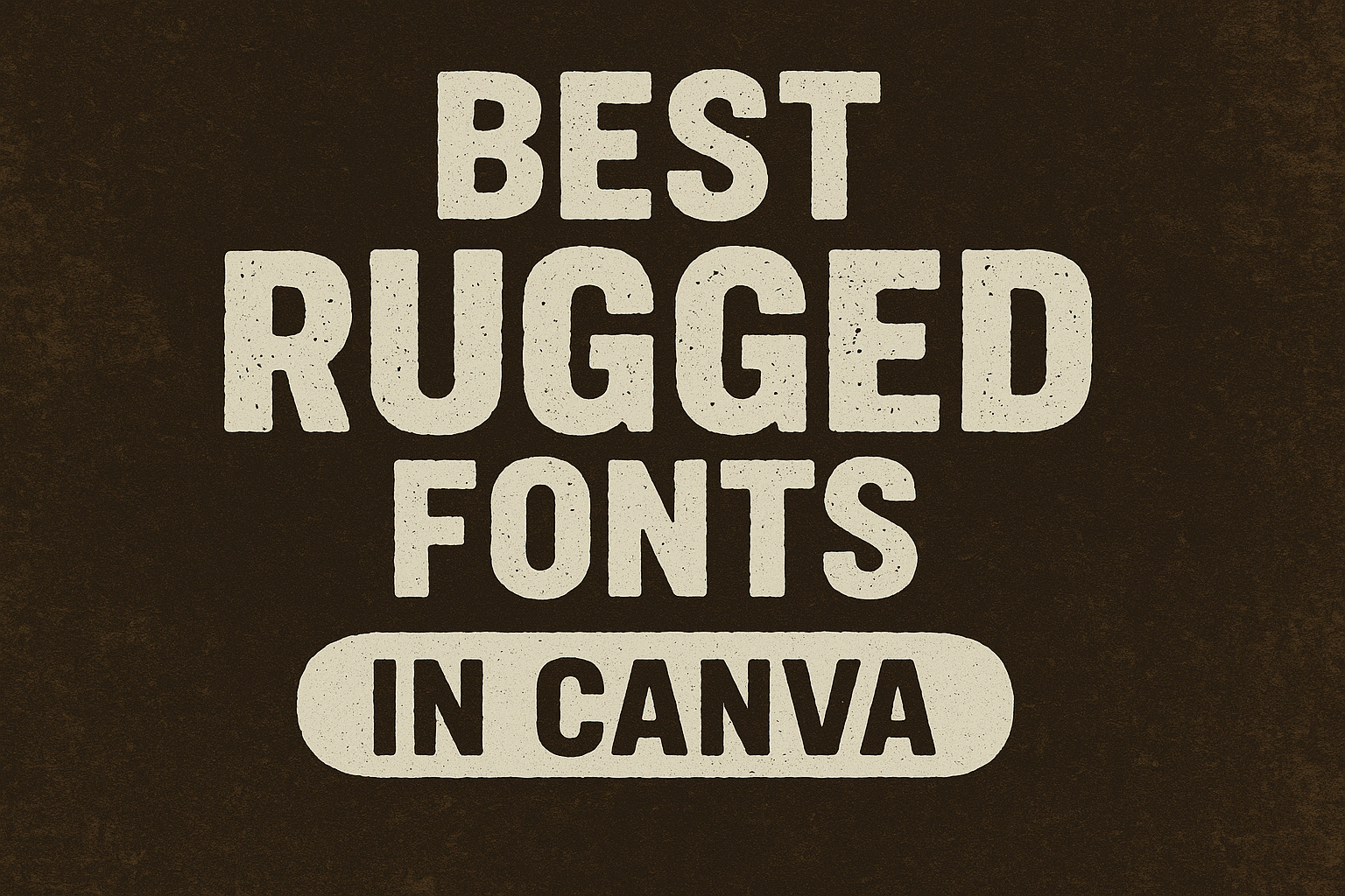
Looking to add some personality and character to your designs? Rugged fonts in Canva might just be the solution you’re seeking.
These fonts bring a unique texture and style to any project, making them perfect for creating eye-catching graphics. Rugged fonts offer a rustic and distressed look, ideal for designs that need both boldness and charm.
With so many font options available, it can be challenging to find the right one for your design needs.
Whether you’re working on a logo, a flyer, or packaging, rugged fonts bring an edge that can make your project stand out. From the bold and eye-catching Zuume Rough Bold to the elegant yet tough Rye, each font has something special to offer.
For those who enjoy exploring fonts with a natural and rustic vibe, there’s a wide variety to choose from on Canva. Fonts like Rustic Printed Stamp and Vescona give your designs a vintage and handmade feel. These options are not only versatile but also provide a unique touch that can elevate your creative work.
What Makes a Font Rugged?
Rugged fonts bring a feeling of strength and durability to any design. They are often used in projects that need a bold, tough appearance, like branding for outdoor gear or extreme sports.
Characteristics of Rugged Fonts
Rugged fonts often have certain features that make them stand out. Boldness is a key trait. These fonts usually have thick lines that give them a sturdy look.
Many rugged fonts have irregular edges that mimic natural textures, adding to their robust feel. The shapes in rugged fonts can be blocky or rough, which helps maintain visibility even at smaller sizes. This makes them perfect for titles or logos. Rugged fonts can often adjust easily to different design needs because of their adaptable nature.
The Impact of Texture and Weight
Texture plays a crucial role in the appearance of rugged fonts. Some fonts have a distressed or worn look, like they were stamped or painted with rough strokes. This can make the text feel more authentic and imbue it with a sense of history or use.
Weight is another important factor. Many rugged fonts are heavier, emphasizing their solid presence.
A font like Comodo Stamp has a textured look that adds a dynamic element while maintaining readability. Weight variations within the same font family can offer flexibility for different design purposes, making them even more versatile for designers.
Top Rugged Fonts in Canva
Rugged fonts in Canva are perfect for projects that need a bold, rustic, or industrial feel. This selection includes a mix of strong and visually distinct fonts that can enhance any design with a touch of adventure or nostalgia.
Strong and Bold Picks
The Zuume Rough Bold font offers a robust and edgy style. It’s great for making text stand out with its rough, bold appearance. This font is perfect for posters, signage, or any design that requires a tough look.
ART Nuva is another option that combines readability with a rugged style. Its clean yet distressed lines make it versatile for adding some grit to any project.
These fonts work well in creating impactful headers and can set the tone for the entire design.
Rustic Charm Favorites
The Rustic Printed Stamp is ideal for designs that feature a handcrafted look. With its distressed texture and irregular lines, it brings a warm, vintage feel. It’s useful for branding related to crafts, handmade goods, or anything that needs a nostalgic touch.
For those aiming for a more classic rustic vibe, the Old Printing Press style mimic fonts are a great fit. These fonts have an artisanal aesthetic, making them perfect for invitations or menus that want to capture a touch of history.
Industrial-Inspired Selections
Strong Steel is a rugged font that’s inspired by industrial elements. Its robust and straightforward design makes it effective for conveying strength and durability. This is suitable for projects related to construction, machinery, or urban themes.
The Concrete Block font offers a more textured look, reminiscent of urban landscapes. It’s great for adding depth and character to designs that want to emphasize toughness.
Both these fonts are effective in creating an industrial atmosphere, making them a go-to choice for designs that need an edge.
How to Access Rugged Fonts on Canva
Users can easily access rugged fonts on Canva by exploring its font library and using helpful strategies to find the perfect font for their project. This section provides a step-by-step guide for navigating Canva’s extensive font library and discovering the best rugged fonts for unique designs.
Navigating Canva’s Font Library
Canva makes browsing for fonts straightforward. Once users open their design, they simply click on the text element they want to edit. This action reveals a menu with a dropdown list of fonts.
From here, the search bar allows users to type font names or keywords like “rugged” to filter relevant options. Rugged fonts like Fibre and Zuume Rough Bold are examples easily accessible in this library.
Clicking on a font name applies it directly to the selected text, allowing users to see changes instantly. This user-friendly interface helps designers experiment with different styles efficiently.
Tips for Finding the Right Font
Choosing the right font involves considering the project’s needs and the emotions it should evoke.
A font with a bold, distressed look might suit a more dynamic design, while a textured serif could convey elegance and strength. Users can explore related fonts by entering specific terms such as “grunge” or “stamp.”
Trying different keywords often surfaces a variety of styles that might otherwise go unnoticed. Before settling on a font, designers should think about how it aligns with their project’s tone and purpose, ensuring it complements the message they wish to convey.
Pairing Fonts for Maximum Impact
When designing with rugged fonts in Canva, pairing them with the right counterparts can enhance your design. Using script fonts for elegance or sans serif fonts for a modern look can bring balance and focus to designs. Below are tips on how to make compelling choices for both styles.
Pairing with Script Fonts
Rugged fonts, with their textured and bold styles, pair well with script fonts that add a touch of elegance and fluidity.
For instance, a rugged font like Fibre can be complemented by a smooth, flowing script like Pacifico. This combination softens the roughness of the rugged font, creating a contrast that stands out.
In invitations or posters, this pairing can draw attention to key elements while maintaining a friendly tone. When choosing a script font, consider its readability and how well it complements the rugged font. The goal is to create a harmonious balance that appeals to viewers without overwhelming them.
Complementary Sans Serif Pairings
Rugged fonts can also work well with clean, sans serif fonts to achieve a balanced look. A classic pairing might be using a bold, textured option with something like Montserrat, a clean sans-serif font.
This combination can bring a modern and robust touch to presentations or digital media. In branding, a rugged font adds character and uniqueness, while the sans serif font ensures clarity and professionalism.
Choose sans serif fonts that contrast yet complement the rugged font without competing for attention. This creates an impactful visual hierarchy, making key messages stand out in the design.
Using Rugged Fonts in Design
Rugged fonts add a bold and impactful look to any design project. They are ideal for projects involving a strong or rustic theme. With their unique texture, they help elevate designs, whether you’re working on logos, posters, or packaging.
Logo Creation
In logo creation, rugged fonts give an identity a sense of strength and authenticity. They are especially useful for brands that want to portray toughness or a connection to nature.
A rugged font can make the name of a company stand out, providing visual weight and memorability. For outdoor or adventure-themed brands, using a rugged font in the logo enhances the brand message.
The font’s texture and boldness also help capture the attention of potential customers, making the logo easily recognizable. By using these fonts, brands communicate their core values effectively and establish a strong brand presence.
Poster and Flyer Design
Posters and flyers benefit significantly from the use of rugged fonts. These fonts grab attention and convey a message with clarity and assertiveness.
For events like concerts and sports games, a rugged font adds an energetic vibe to the design. The distressed look of rugged fonts can create a vintage or handmade feel, which is appealing in artistic or indie event posters.
They establish a mood that matches the theme of the event, giving the design a cohesive look. With the right color choices, these fonts make posters visually striking and memorable, ensuring the event information is noticed and retained.
Branding and Packaging
Rugged fonts in branding and packaging communicate durability and quality. When used on packaging, they suggest that the product is reliable and well-made.
This is particularly effective for products in sectors like outdoor gear, artisanal foods, or handmade goods. The distinctive appearance of these fonts can make packaging attractive and help it stand out on the shelves.
By engaging consumers visually, rugged fonts encourage closer inspection and interest in the product. For brands, this advantage can translate into increased consumer trust and higher sales, as the font choice aligns with the brand’s ethos and enhances its story.
Customizing Fonts in Canva
Customizing fonts in Canva allows users to make their text stand out by adjusting various elements. By playing with size, spacing, and emphasizing text effects, users can create visually appealing and unique designs.
Adjusting Size and Spacing
In Canva, font size and spacing are crucial elements that can completely change the look of a design. Users can click on the text box and then use the size option in the toolbar to change how big or small the text appears.
Adjusting spacing between letters and lines is also simple. Look for the spacing option in the toolbar, where users can increase or decrease letter and line spacing to fit the design’s needs.
Spacing helps make the text more readable and visually pleasing. For designs that need more emphasis on particular words, increasing the size dramatically can create a strong focal point. Proper spacing ensures that text doesn’t look cluttered, maintaining the balance across the design.
Adding Text Effects
Canva provides plenty of text effects that can transform ordinary text into exciting designs. Users can access these effects by selecting their text box and choosing the “Effects” option.
Whether it’s adding a shadow, neon glow, or background to the text, these effects help the text pop. Using effects like curve creates interest by making the text follow different shapes.
Shadows can give depth, while outlines make the text stand out against busy backgrounds. It’s a fun way to enhance a design without needing advanced graphic design skills, allowing each user to add a personal touch to their creations.
Best Practices for Typography
Typography in design is crucial to convey the message effectively. Two key considerations include ensuring text is easy to read and establishing visual hierarchy for clear emphasis.
Readability and Legibility
Readability and legibility are essential for effective communication. Readability refers to how easily text can be read and understood.
Ensuring sufficient contrast between text and background helps improve readability. Sans-serif fonts are often recommended for digital content because of their clean lines.
Legibility means how easily individual characters can be identified. Choosing the right font size and line spacing can dramatically impact legibility.
Text should not be too crowded or stretched, and variety in text style (bold, italic) can be used to highlight important points without losing clarity.
Hierarchy and Emphasis
Hierarchy guides readers through the content by emphasizing important parts.
Utilizing different font sizes and weights makes key information stand out.
Headlines should be significantly larger or bolder than body text to draw attention.
Visual hierarchy can be achieved by using color or spacing.
For instance, brighter colors can be used to make certain text stand out.
Spacing, such as indentation or line breaks, also helps separate different sections, making reading smoother.
Typography should be consistent throughout a design, using a limited number of font styles to maintain a cohesive and professional look.
This way, readers can easily follow the intended message.