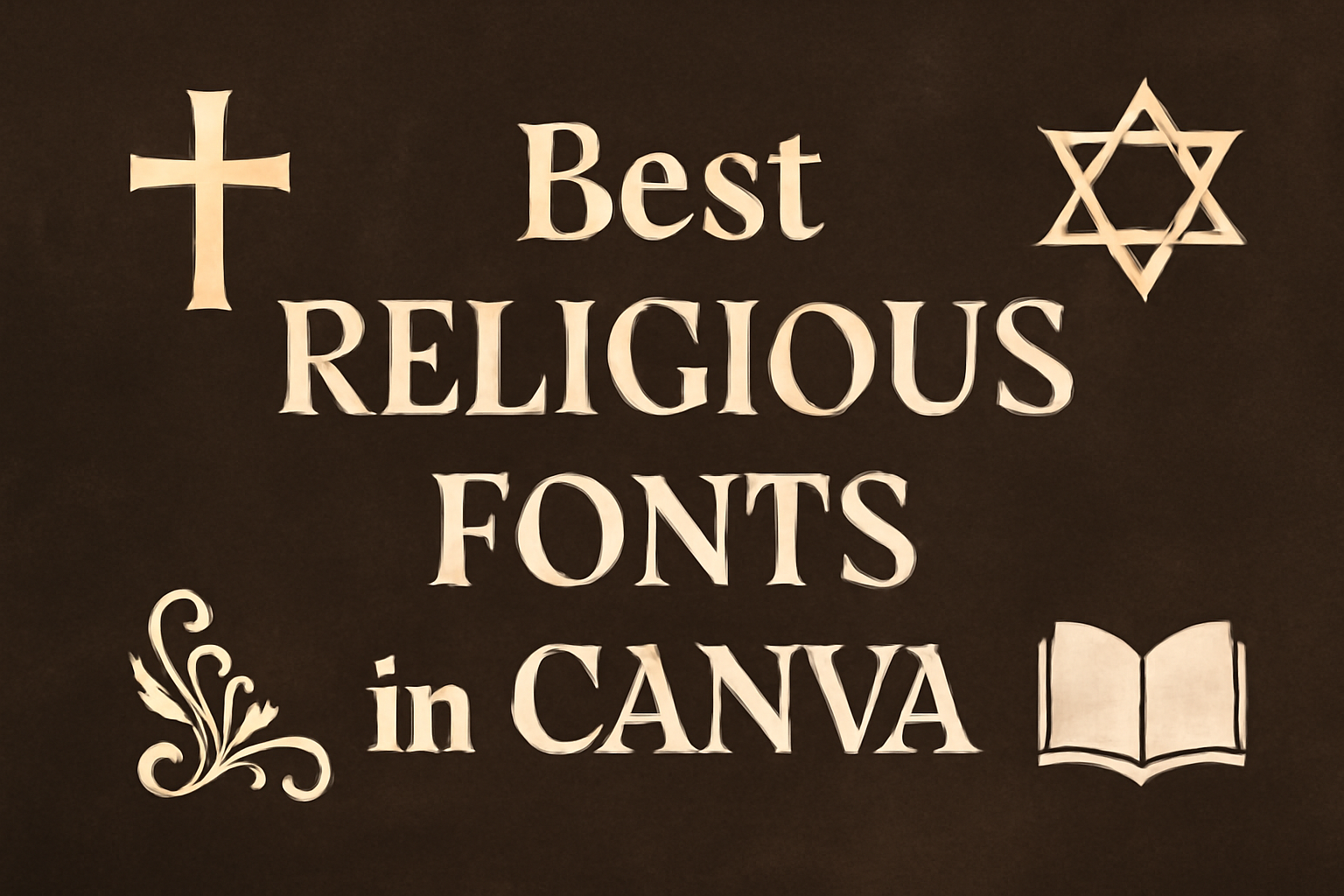
Choosing the right font can greatly impact the feel of a project, especially when it comes to religious or inspirational content.
Finding the perfect font on Canva might seem overwhelming with so many options available.
Selecting a religious font that aligns well with your message can enhance the spiritual ambiance and capture the essence of your text.
Fonts like Giaza Serif and Saint James are popular choices for their elegance and spiritual resonance.
For those who want a blend of modern and traditional, options like Lora and Ovo provide a great balance, making them suitable for both print and digital projects.
Whether it’s for a church bulletin, an inspirational poster, or sharing a heartfelt Bible verse, the right font sets the tone beautifully.
By exploring the best religious fonts available in Canva, creators can find just what they need to amplify their message.
Exploring the Significance of Fonts in Religious Design
Fonts play a crucial role in religious design, conveying both historical symbolism and emotional resonance.
They help bridge the connection between spirituality and visual communication.
Symbolism and Typography
Fonts in religious design often draw from historical and traditional elements.
Serif fonts are popular due to their classic and timeless design, which evokes a sense of history and tradition. Such fonts can reflect the solemnity and reverence seen in many religious texts and materials.
In religious settings, typography isn’t just about readability; it’s about reinforcing the spiritual message.
For example, using a font with script-like qualities might recall the calligraphy used in ancient religious manuscripts. The choice of color, along with traditional font styles, can enhance the spiritual ambiance.
Emotional Impact of Font Choices
Fonts greatly influence the emotional tone of religious materials. A font can make the viewer feel calm, inspired, or reflective.
Choosing the right font ensures that the text resonates with its audience on a deeper level.
For spiritual projects, the emotional impact can be profound. Fonts can transform messages, making them feel more sacred or uplifting.
A carefully selected font will help bridge the gap between traditional beliefs and modern design. The visual harmony created by thoughtful font choice can help align the message with the intended emotions, enriching the viewer’s experience.
Top Fonts for Religious Projects on Canva
Selecting the right font is essential for religious projects as it sets the tone and enhances the message.
The right combination of serif, sans serif, and script fonts can convey a sense of tradition, modernity, or elegance, respectively.
Serif Fonts for a Traditional Feel
Serif fonts are often preferred for religious projects due to their timeless and classic appearance. They carry a sense of history and tradition, making them suitable for formal religious texts or scriptures.
One popular choice is Giaza Serif, which is known for its elegant and high-contrast design. It’s a great option for use as a display font, as it brings a refined aesthetic to the text.
Lora is another versatile serif font that balances modern and traditional styles. It works well in both print and digital formats, providing a seamless reading experience.
These serif fonts are ideal for official church publications or religious invitations. Consider using a mix of serif fonts to highlight important messages while maintaining an inviting and respectful tone.
Sans Serif Fonts for Modern Appeal
For a more contemporary look, sans serif fonts offer simplicity and clarity. These fonts can bring a modern touch to religious projects, making them accessible and easy to read on screens.
Helvetica and Arial are popular choices due to their clean lines and neutral appearance. These fonts are excellent for PowerPoint presentations and digital displays, like worship lyrics projection.
Sans serif fonts like Open Sans provide clear legibility and a warm feel, making them suitable for religious newsletters or websites.
Using sans serif fonts in headings and subheadings can give a project a structured and organized look. They work well alongside serif or script fonts to create a balanced design.
Script Fonts for Elegance and Flow
Script fonts can add a touch of elegance and fluidity to religious projects. They mimic the beauty of handwritten text, making them ideal for special religious events or invitations.
Mustopha is a font that combines tradition and beauty, perfect for religious texts in Arabic scripts, enhancing both readability and style.
For Western scripts, consider using fonts like Dancing Script or Great Vibes, which offer a graceful flow. These fonts can draw attention to important passages or titles.
They work best when used sparingly, ensuring that the text remains legible and impactful. A well-chosen script font can evoke an emotional response, enhancing the overall message of the religious piece.
How to Choose the Right Religious Font
Choosing a religious font involves balancing style with the message, ensuring clarity, and creating a harmonious layout. Here are some key considerations to keep in mind when selecting the right font.
Understanding the Theme and Message
When selecting a religious font, it’s crucial to consider the theme and message you wish to convey. Fonts often carry emotional and cultural connotations.
For example, Gothic fonts might evoke a sense of history and tradition, perfect for formal religious texts. On the other hand, more modern and minimalist fonts can complement contemporary religious events or outreach materials.
The context of the content is also important. Are you designing a church brochure or a wedding invitation with a religious passage? Use fonts to support the purpose and tone.
For instance, a font with elegant scripts might present a sense of solemnity and reverence for a scripture reading. Make sure the font aligns with the intended audience and setting.
Considering Readability and Legibility
Readability is key to ensuring the audience can easily engage with the content. Selecting a clear and legible font helps deliver the message effectively.
While decorative fonts can add visual interest, it’s vital to check that they don’t compromise text clarity, especially on smaller screens or prints.
To enhance legibility, consider the font’s size and weight. Bold fonts can emphasize important words without overwhelming the reader.
Additionally, maintain enough spacing between letters and lines to prevent crowding. Opt for a font that is versatile, suitable for both large headings and smaller body text.
Finally, take advantage of tools that allow you to preview how a font looks in different settings. This helps ensure that the chosen font maintains readability in any format.
Font Pairing for Harmony
Achieving visual harmony involves pairing the right fonts together. Font pairing can bring balance by mixing styles that complement each other while highlighting various elements of the design.
For instance, a serif font paired with a sans-serif font can add both tradition and modernity to a piece.
Start with a primary font that fits your theme, then choose a secondary font that enhances it. For example, an ornate script for headings can pair with a simple sans-serif for body text. This contrast not only adds depth but also maintains a cohesive look.
Keep the number of fonts limited to avoid a cluttered appearance. Generally, using two to three different fonts is enough. Consistent usage helps maintain clarity and a unified theme throughout the document.
Incorporating Iconography with Fonts
Adding iconography to font designs can elevate the aesthetic appeal and enhance the message. Carefully selecting icon styles that complement the fonts can create harmony, while thoughtful placement can ensure an attractive and cohesive design.
Matching Icons to Font Styles
When combining icons with fonts, it’s essential to consider the style of each element.
Bold fonts pair well with strong, simple icons that don’t overpower the text. In contrast, elegant serifs like the Giaza Serif work beautifully with detailed or intricate icons that reflect the font’s sophistication.
Icons with pointed edges or geometric shapes can enhance the clean lines of a modern font. On the other hand, handwritten fonts can be complemented by casual or playful icon styles.
It’s important to ensure that the icons enhance, rather than clash with, the mood of the text.
Creating Visual Balance
Visual balance is crucial when integrating icons with text. The size of the icon relative to the text should be proportionate; a large icon shouldn’t dwarf the text, nor should it be too small to notice.
Consider placing icons either beside or above the text to create symmetry.
Use spacing effectively to avoid clutter and keep the design readable. Color matching of icons and text can unify the design, but contrast can also be used to draw attention to key elements.
Testing various placements and sizes ensures that the final design feels harmonious and visually consistent.
Canva Features for Enhancing Religious Text
Canva offers a range of features that make it easier to create beautiful and meaningful religious texts. By using text effects, thoughtful color schemes, and well-planned layouts, users can greatly enhance the impact of their religious content on Canva.
Text Effects and Customizations
Text effects in Canva are crucial for adding a special touch to religious text.
Users can apply shadows, glows, or even curved text to make important messages stand out. Customization options allow for font size adjustments, letter spacing, and line height, ensuring text is easy to read.
Using a combination of these effects can highlight key parts of religious scripts or passages, making them more engaging.
Additionally, Canva provides a wide selection of fonts, including some specifically suited for religious content, such as those with a traditional or spiritual feel.
Color Schemes and Background Choices
Selecting an appropriate color scheme is important for conveying the right mood in religious designs.
Canva provides palette suggestions that make it easy to find colors that work well together, such as calm blues or warm earth tones, which often suit religious themes.
Background choices further enhance the look. Users might choose solid colors, gradients, or even images that reflect the theme or message of the piece.
By combining the right text colors and backgrounds, religious texts can achieve a harmonious and inviting appearance.
Layout Considerations for Religious Content
The layout plays a major role in making religious text clear and accessible.
Canva offers numerous layout templates and tools to help create a visually pleasing arrangement.
It’s important to maintain a balance of text and space to prevent clutter.
Users can utilize grids and guides to align elements neatly.
Grouping related text with visuals can create meaningful connections, while ample spacing around key passages helps them stand out.
These layout options ensure that the religious message is presented in a way that is both respectful and appealing.