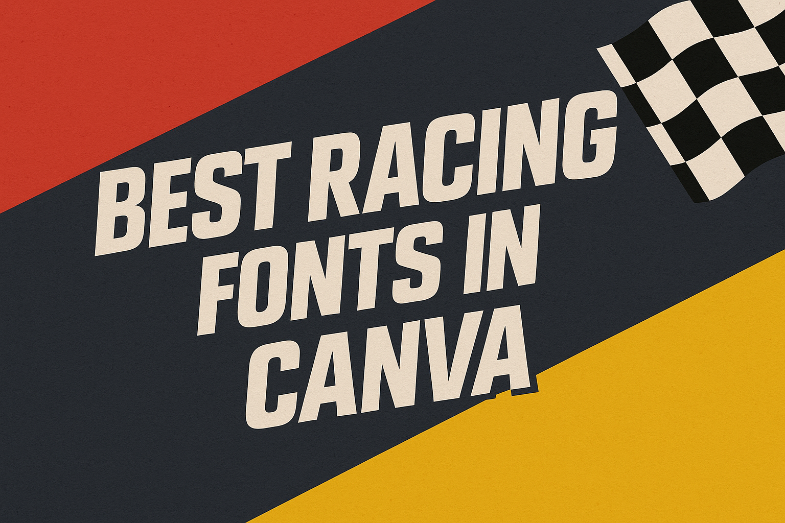
Racing fonts are perfect for adding energy and excitement to your design projects. Whether it’s for a poster, logo, or any other creative work, the right racing font can make all the difference.
It’s important to know which fonts can provide that dynamic feel you’re looking for.
Racing Sans One is one of the top choices in Canva for a bold and distinctive style. This font features thick and thin lines that create a sense of speed and movement, making it ideal for attention-grabbing headlines.
It blends well with other graphic elements to complete a racing-themed design.
For those wanting a versatile option, Racing Sans One is not the only choice; Canva offers a variety of fonts suited for racing themes. Exploring these options opens up possibilities for creating impactful designs that capture the thrill and excitement of racing.
The Essentials of Racing Fonts
Racing fonts bring a sense of speed and dynamism to any design. They often feature bold and streamlined elements, making them perfect for projects aiming to capture the thrill of motorsports.
Defining Racing Fonts
Racing fonts are all about impact and excitement. These fonts are designed with features that suggest movement and speed. They often incorporate sharp angles and bold lines that mimic the thrilling nature of racing.
These fonts are commonly used in sports logo designs, advertisements, and automotive branding.
Another important aspect is versatility. Many racing fonts can work well for a range of uses, from digital platforms to print media. Designers favor these fonts for their ability to grab attention instantly.
Some popular examples include geometric designs or those inspired by racing car numbers.
Characteristics of Racing Fonts
Key features of racing fonts are boldness and readability. Bold fonts ensure that the text stands out, even from a distance. This is crucial for applications like banners and sponsorship labels on racing cars.
Streamlined and geometric shapes also play a part, providing aesthetics that echo the sleek design of racing vehicles.
Colors often used with these fonts include reds, blacks, and metallic shades, enhancing the speed effect.
Racing fonts may display uppercase letters prominently, giving a sense of solidity and urgency. This element, combined with thick lines, ensures legibility.
Fonts such as Racing Sans One are well-regarded examples due to their engaging look and ease of reading.
How to Choose the Right Racing Font
Selecting the right racing font is crucial for designs that convey speed and excitement. When choosing a font, it is important to focus on factors such as legibility, brand consistency, and licensing requirements.
Font Legibility and Readability
Legibility is vital. A font must be easy to read at a glance, especially in high-speed contexts. Fonts like Racing Sans One are popular because they balance style with clarity.
Bold, high-contrast fonts are usually the best choices. Designers should also consider the environment where the text will be displayed. For example, if used on a banner during a race, the font must be readable from a distance.
Spacing and size also play roles in readability. Ensuring proper spacing between letters helps avoid a cluttered look.
Additionally, testing the font in different sizes helps ensure it remains legible whether the text is small or large.
By focusing on these details, designers will ensure the final design communicates its message effectively.
Matching Fonts with Your Brand
Aligning a font with a brand’s identity is essential. The font should mirror the brand’s personality and communicate the right message.
For instance, a brand associated with modern racing might favor sleek, contemporary fonts, while a classic car club might choose a more traditional font style.
Colors and design elements should also complement the font choice. The overall design should harmonize with the brand’s visual elements, creating a consistent and professional look.
Many brands select fonts that reinforce values like speed, innovation, or tradition, depending on their image and target audience. This careful alignment strengthens brand recognition and appeal.
Considering Font Licensing
Font licensing is an often overlooked, yet critical, aspect of font selection. Not all fonts are free for commercial use, so it is important to check licensing agreements before incorporating a font into any designs.
Some fonts require a purchase or subscription, while others may have restrictions on how they can be utilized.
Designers should always verify the terms of use for each font to avoid legal issues. Reading the licensing details for each font ensures that there are no unexpected limitations or costs. This step protects the designer and ensures that all font usage respects the creator’s rights.
Popular Racing Fonts in Canva
Racing fonts in Canva capture the excitement and speed of motorsports. These fonts range from bold and impactful to sleek and modern, and some even offer a vintage touch. Each style provides a different vibe to any design related to racing.
Bold Impact Fonts
Bold impact fonts are all about making a strong statement. Racing Sans One is a standout choice with its squared shapes and thick-to-thin contrast, giving off a dynamic energy reminiscent of speed and movement.
Its design is perfectly suited for headlines or titles that demand attention.
Another option is the Alfa Slab One, offering a solid and commanding presence. This type of font ensures that the text doesn’t just sit on the page; it jumps out with energy that matches the speed of the racetrack.
Whether it’s for event posters or merchandise, bold fonts make sure the message isn’t lost.
Sleek Modern Fonts
Sleek modern fonts bring a contemporary feel to racing themes. Their streamlined design reflects the aerodynamic shapes associated with fast cars. Streamlined fonts often feature wide letter spacing, enhancing readability and contributing to a polished look.
These fonts are great for use in digital designs where clarity and style go hand-in-hand.
Their unique letter designs can add a futuristic touch, making them ideal for tech-focused racing setups or any project that wants to emphasize modernity and speed. They ensure that the text is not only clear but also visually striking.
Vintage-Inspired Fonts
Vintage-inspired fonts bring a nostalgic element to racing designs. They evoke memories of classic cars and old-school racing events, lending a timeless quality to any project.
Fonts like Princetown reflect this style perfectly, echoing the spirit of collegiate sports with their classic feel.
These fonts work well for projects looking to capture a sense of tradition or history. Whether used in memorabilia, signage, or retro-themed event promotions, vintage fonts connect viewers to a heritage of racing glory, celebrating past eras while still resonating with today’s audience.
Customizing Fonts for Your Design
Enhancing your design with the right font can transform it into something truly engaging. By adjusting font size and spacing, using vibrant colors, and layering different fonts, designers can create dynamic and eye-catching visuals.
Adjusting Font Size and Spacing
Adjusting the size of your fonts can dramatically affect how your design is perceived. Large fonts can grab attention, while smaller fonts work well for details.
Spacing plays a crucial role too. Increasing the space between letters and lines can make text more readable.
It’s important for headings to have tight spacing to keep them bold and impactful. For body text, a little more space might be beneficial to enhance readability.
Using design tools, like Canva, allows easy manipulation of these aspects. Designers can slide controls to test various sizes and spacing until they find the perfect balance.
Using Font Color to Enhance Visibility
Color choice can either make a font pop or drown it out. Selecting the right color ensures readability and adds visual interest.
It’s important to choose colors that contrast well with the background.
Warm colors, like red and orange, can attract attention, whereas cool colors, like blue and green, offer a more calming vibe. When using racing fonts, bold colors can evoke excitement and energy.
Utilizing font colors in Canva is simple, allowing designers to experiment and preview how different hues affect visibility and mood.
Layering Fonts for Effect
Layering different fonts can create depth and visual hierarchy in a design. By combining fonts with different styles, such as a bold font with a script font, designers can add interest and structure to their text.
Using a primary font for headlines and a secondary one for subheadings or body text can guide the viewer’s eye through the content.
It’s crucial to maintain balance; too many fonts can make a design feel cluttered.
Design tools help by layering fonts easily, allowing for quick adjustments. Selecting contrasting styles that complement each other can make the layering effect more pronounced and engaging.
Using Racing Fonts Across Different Mediums
Racing fonts are popular for their bold and dynamic style, making them a versatile choice for various applications. They adapt well from digital platforms to print media and even onto merchandise like apparel.
Digital Media Considerations
In digital media, using racing fonts can help grab attention and convey energy. On websites, they should be used for headers or special callouts to create impact without overwhelming the page.
Racing Sans One, known for its high-contrast style, is a great example of a font that stands out on the screen.
The key is ensuring that the font remains legible across different devices, which may require testing on various screen sizes and resolutions. Considerations like color contrast are essential, as bold fonts can appear overwhelming if not well-balanced with the background.
Print Media Specifics
When applied to print media like posters, brochures, or flyers, racing fonts can effectively convey speed and excitement.
It is crucial to choose a font that maintains clarity at different sizes, ensuring it stands out while still complementing the rest of the design. The thickness and style of a font should match the message and tone of the print piece.
Using fonts like Racing Sans One ensures a stylish yet readable print look.
Designers should also be cautious about the quality of the print material, as certain paper stocks can affect how the font appears in physical form.
Merchandise and Apparel Use
Racing fonts are also popular on merchandise and apparel, bringing a sense of sportiness and motion to items like t-shirts, caps, or jackets.
The readability of the font is crucial, especially when applied to fabric. Smaller designs or text should prioritize clear fonts that retain their style without looking cramped.
Fonts like Saira Stencil One, noted for its boldness, can make graphic prints pop on clothing.
When choosing racing fonts for apparel, it’s imperative to consider the printing method, ensuring the font retains its characteristics after printing or embroidery.
Best Practices for Racing Font Combinations
Choosing the right racing font combination can make a design more engaging and dynamic. Balancing elegance and avoiding clashing are key to a successful design.
Pairing Fonts Elegantly
Combining fonts elegantly requires a balance of contrasting styles that complement each other. A popular choice is pairing a bold display font like Racing Sans One with a simpler, cleaner typeface.
This combination draws attention to key elements while keeping the overall look professional.
Experimenting with size and weight can also enhance a design. For instance, using a thicker font for headers and a thinner one for body text creates a visual hierarchy.
Designers often find that using fonts from the same family ensures consistency and harmony.
Avoiding Clashing Fonts
Avoiding font clashes involves careful consideration of style differences.
Mixing fonts with too many stylistic features can make a design look busy and unprofessional. A common mistake is pairing two highly decorative fonts, which tends to create visual noise.
Instead, designers should stick to a maximum of two or three different fonts.
This approach helps maintain focus and clarity. It’s also important to ensure that the fonts used share a similar context or mood, such as both evoking a sense of speed and movement commonly needed in racing themes.