Choosing the right font can make a big difference in design projects. The best narrow fonts in Canva help users create striking visuals while saving valuable space.
These fonts are perfect for everything from posters to social media graphics, allowing for clarity and style.
Narrow fonts have unique characteristics that make them stand out. They bring a modern and sleek look to designs, ensuring that text remains readable without taking up too much room.
Many creators find that using these types of fonts enhances their overall design aesthetic.
By exploring the variety of narrow fonts available in Canva, users can elevate their work significantly. With the right font choice, designs can convey messages more effectively and catch the viewer’s eye instantly.
This blog post will guide readers through the top options and how to use them effectively.
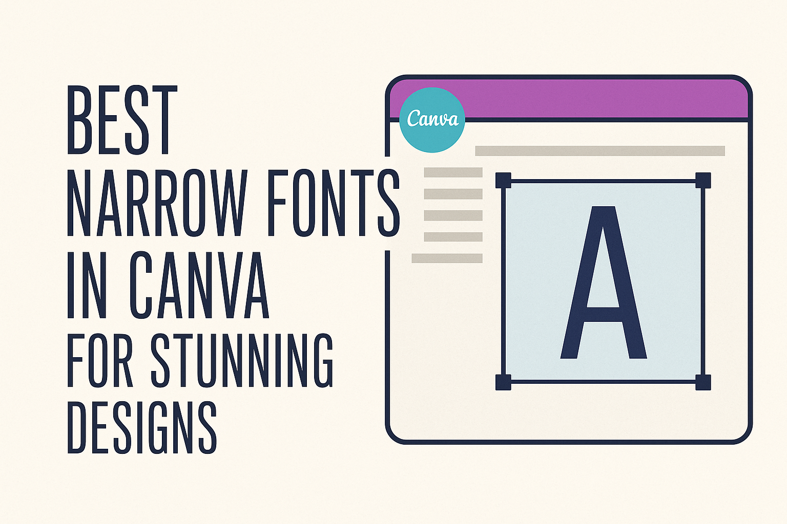
Exploring Canva’s Font Selection
Canva offers a wide range of fonts that cater to different design needs. Among these, narrow fonts stand out for their unique style and versatility.
Understanding their benefits can help designers make smarter choices.
Why Narrow Fonts?
Narrow fonts have a compact design that can effectively save space while making a strong visual statement. They are ideal for headers and titles when there is limited room.
Additionally, narrow fonts can convey elegance and sophistication.
Some examples of narrow fonts available in Canva include:
- Oswald
- Raleway
- Bebas Neue
These fonts are perfect for websites, posters, and social media graphics, allowing text to stand out without taking too much space. Designers often choose them for their readability and modern look.
The Role of Fonts in Design
Fonts play a crucial role in setting the tone of any design project. They can evoke emotions and influence how viewers perceive the message.
Different font styles, such as serif, sans-serif, or script, create distinct vibes.
Narrow fonts serve specific purposes in design:
- Focus: They draw attention to important information.
- Balance: They provide harmony in layouts with limited space.
- Style: They enhance overall aesthetics with a sleek appearance.
Using the right font can transform a simple design into an eye-catching piece. In Canva, designers can experiment with various fonts to find the perfect match for their project.
Top Narrow Fonts in Canva
Canva offers a variety of narrow fonts that can enhance any design. These fonts can be categorized into three main styles: elegant, modern, and classic. Each type serves a unique purpose and adds a different flair to projects.
Elegant Narrow Fonts
Elegant narrow fonts tend to have a delicate and refined appearance. These are perfect for invitations, promotional materials, or any project needing a touch of sophistication.
-
Paalalabras Condensed: This font features a geometric and modern style. Its tall letters and high x-height make it ideal for headlines.
-
Didot: Known for its thin and thick contrasts, Didot adds a classy vibe. It looks great in fashion or luxury-oriented designs.
-
Playfair Display: This serif font has an elegant style perfect for print media. Its thin, narrow lines create a regal effect.
Modern Narrow Fonts
Modern narrow fonts embrace minimalist and contemporary styles. These are great for tech or corporate designs where readability is key.
-
Sansterdam Condensed: It brings a clean and modern look with a sans-serif design. This font works well for sleek web designs or business presentations.
-
Montse Condensed: This rounded sans-serif font has a friendly yet professional vibe. It’s versatile for both digital and print applications.
-
Bebas Neue: Popular in signage and advertising, this bold typeface stands out while remaining narrow. It projects a strong and modern message.
Classic Narrow Fonts
Classic narrow fonts are timeless and versatile. They work across various design projects, offering a nostalgic touch.
-
Garamond: This serif font has a rich history and is known for its readability. Its narrow style makes it perfect for books and academic papers.
-
Bodoni FLF: Recognized for its contrast between thick and thin strokes. This font is elegant and classic, making it suitable for high-end branding.
-
Times New Roman: A staple in print and online, this narrow serif font is familiar and trusted. It works well in both formal and casual contexts.
Using Narrow Fonts Effectively
Narrow fonts can enhance a design by saving space and creating a sleek look. It’s important to know how to pair them and ensure they are easy to read.
Pairing Narrow Fonts
When it comes to pairing narrow fonts, choose complementary styles. For example, combining a narrow font with a bolder, wider font can create a nice contrast. This makes headlines stand out while keeping body text clear.
Here are some effective pairings:
- Narrow Font: Open Sans Condensed
- Bold Font: Roboto Bold
Another approach is to pair narrow fonts with scripts or serif fonts for a unique touch. Just remember to keep the contrast balanced. This adds interest without making the design too busy.
Readability and Legibility Tips
To maintain readability with narrow fonts, it’s crucial to consider size and spacing.
Always test different sizes to find what works best for the design. A font that is too small may become hard to read, especially in longer paragraphs.
Spacing is also key. Use enough letter and line spacing to help the text breathe. This avoids a cramped look that can frustrate readers.
Finally, ensure that the narrow font doesn’t compromise legibility against the background. A simple drop shadow can make narrow text stand out more clearly.
Making intentional design choices will enhance the effectiveness of narrow fonts.