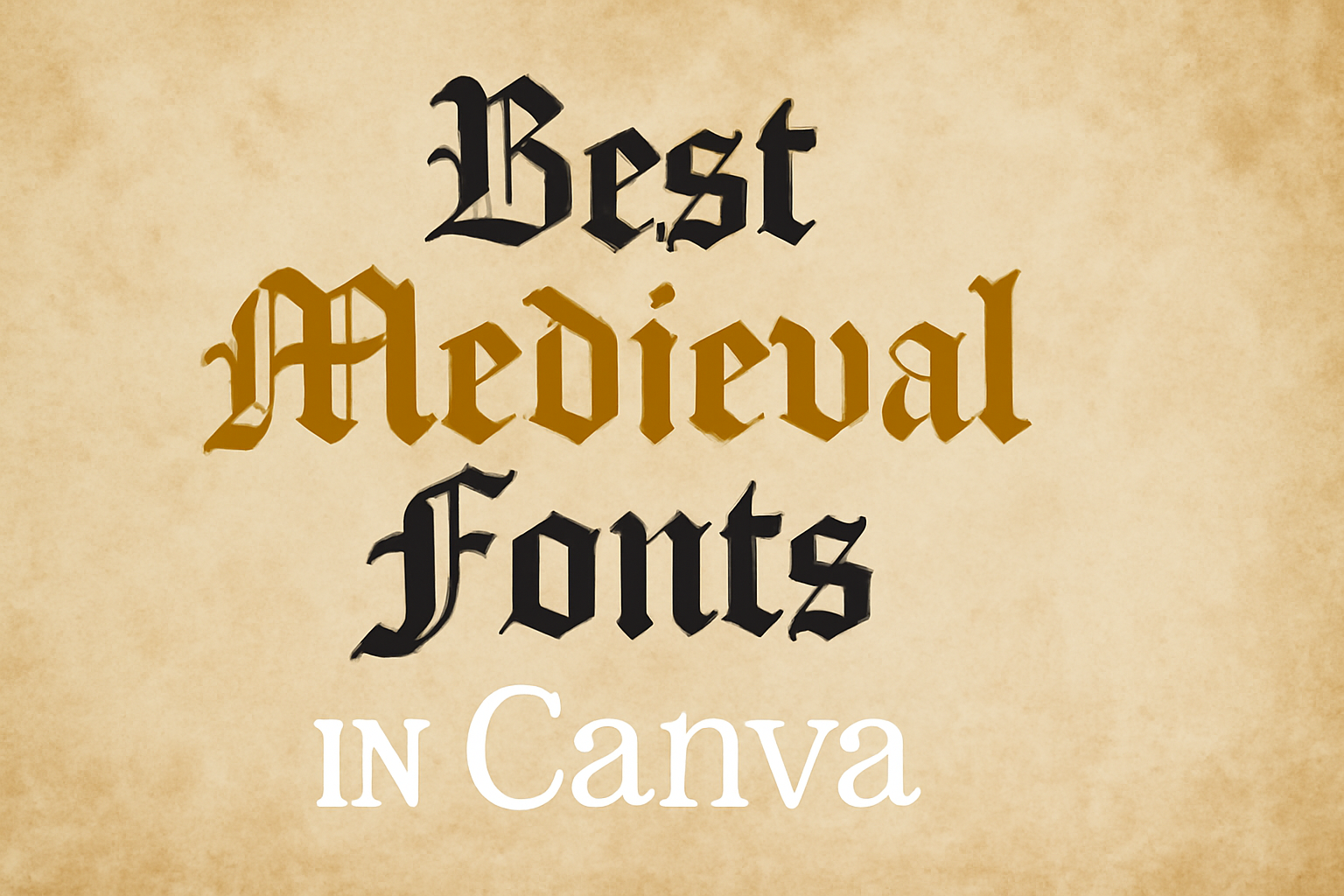
Exploring design projects on Canva can be exciting, especially when you’re looking to add a medieval flair to your creations.
One of the best ways to achieve this is by using medieval fonts that capture the essence of history and timelessness.
Whether working on a fantasy book cover or a themed party invitation, the right font can bring your project to life.
Fonts like Blaka and Armstrong stand out for their bold and distinctive style. Blaka’s heavy calligraphy-inspired lines make it perfect for headlines where a medieval presence is needed, adding a historical narrative to any design.
On the other hand, Armstrong offers a modern twist with its rounded edges and simple strokes, making it ideal for projects that need subtle medieval touches.
Designers can find many options on Canva, from premium to free selections. Wednesday and Engravers’ Old English are popular choices offering both elegance and readability. With these fonts, anyone can transform their creative vision into a stunning medieval-themed masterpiece.
Understanding Medieval Fonts
Medieval fonts provide a glimpse into the rich history of writing styles. They convey elegance and mystery, drawing on designs from centuries ago.
These fonts are known for their historical roots and unique features that make them stand out in modern design.
Historical Significance
Medieval fonts originate from the Middle Ages, a period with a wealth of artistic and cultural development. This era saw the creation of many manuscript styles, including Gothic and Carolingian scripts. These scripts were commonly used in religious texts and official documents.
Gothic script, for example, became popular due to its dense and intricate letterforms, which allowed scribes to fit more text on a page.
The importance of these fonts extends beyond their aesthetic value. They reflect the technological advancements of their time, such as the invention of the printing press, which made books more accessible. As a result, medieval fonts carry a sense of tradition and craftsmanship, appealing to those who appreciate history and classic design.
Characteristics of Medieval Typography
Medieval fonts are characterized by their ornate and elaborate design. They often feature thick, dramatic strokes and decorative elements like flourishes and serifs.
Gothic fonts, for instance, are known for their bold and angular appearance, with pointed arches and tight spacing.
Another common feature is their heavy use of blackletter, which gives them a dense and textured look. This style is ideal for creating a dramatic and authoritative tone. The detailed curves and lines add a sense of complexity and depth, making these fonts perfect for creating eye-catching titles and impressive logos. Medieval fonts’ unique attributes make them valuable in both historical reenactments and modern graphic design projects seeking a touch of authenticity and elegance.
Choosing the Right Medieval Font in Canva
Selecting the perfect medieval font in Canva involves considering its readability, its relevance to your project, and ensuring the licensing aligns with your usage needs. It’s essential to choose a font that enhances your design without compromising on clarity or appropriateness.
Font Legibility
Legibility is crucial when selecting a medieval font. Some medieval fonts can have intricate designs that look beautiful but can be hard to read, especially at smaller sizes.
It’s important to try different sizes and styles to ensure that your text remains clear and easy to read. Testing the font by viewing it on different screens and at different distances can also help ensure that it remains legible.
When considering legibility, think about where and how the text will be used. For example, a font for a large poster might allow for more elaborate designs, while a smaller text area might require something simpler.
Wednesday and Armstrong are examples of fonts that balance medieval style with readability. Think about how much text you need to use and adjust accordingly to keep everything clear.
Project Relevance
Aligning your font choice with the theme of your project is important. The font should match the tone and purpose of what you’re creating.
For instance, if you’re designing an invitation to a medieval-themed event, choosing a more ornate font might suit the theme well. On the other hand, if your project demands a modern touch with a nod to history, a font like Obra Letra might be a great option.
Consider what message you want to convey with your text. A strong medieval presence can be achieved with fonts like Blaka, known for their bold, calligraphy-like strokes. Each typeface brings its own distinct character, so pick one that enhances your design’s intent without overshadowing it.
License and Usage
When using fonts on Canva, it’s critical to check the license agreements to ensure your usage complies with the terms. Many fonts come with limitations on commercial use or may require a Canva Pro account.
Make sure to review the font’s license details so that you can use it legally in your project.
Users should verify whether the font is included in the free version of Canva or requires a subscription. Fonts such as Engravers’ Old English offer different availability depending on your Canva plan. Understanding these details can prevent potential issues with usage rights later on.
Top Medieval Fonts in Canva
Medieval fonts bring a unique flair to design projects, drawing on historical styles that evoke a sense of time and tradition. In Canva, users can explore various styles such as Blackletter, Gothic, Celtic, and Renaissance to find the perfect fit for their creative needs.
Blackletter Inspired
Blackletter fonts are known for their ornate and dramatic appearance. These fonts were heavily used during the Middle Ages in manuscripts.
In Canva, designers can find options like UnifrakturMaguntia, a celebrated Gothic typeface. This font is perfect for projects that aim to mimic the look of ancient texts or convey an old-world charm. Its intricate style makes it ideal for posters and logos where the font needs to stand out.
Another popular option is Blaka, which features bold lines and detailed curves. It mimics traditional calligraphy, adding an authentic medieval touch. This font works great for headlines or titles that need a strong historical presence. Though it may not be suitable for large amounts of text due to its complexity, it shines in shorter text settings.
Gothic Style
Gothic fonts are appreciated for their bold, dramatic look. They have heavy strokes and sharp angles, creating a powerful visual impact.
A standout choice on Canva is UnifrakturMaguntia, known for its impressive, stylish design by J. “mach” Wust. It’s perfect for crafting eye-catching banners or invitations where the font plays a central role.
Designers might also consider Rumbe Brave Script for a slightly softer yet equally dramatic option. This font combines the Gothic style with a script-like flow, allowing for a more fluid design. It’s great for projects that blend tradition with a modern twist, making it versatile and appealing.
Celtic Influenced
Fonts influenced by Celtic styles offer knot-like designs and a sense of mystery.
On Canva, fonts like Cormorant Unicase reflect these intricate patterns and curves. This font is excellent for adding a mystical or fairytale vibe to designs, ideal for book covers or fantasy-themed projects.
Another interesting choice is Aniyah, a font blending Celtic influences with a medieval enchanted look. It offers a magical quality, making it perfect for creating enchanting headers or decorative text elements. Because of their unique style, these fonts work best when used sparingly to maintain clarity and impact.
Renaissance Engraving Fonts
Renaissance engraving fonts draw inspiration from the detailed and artistic engravings of the Renaissance era. They often have elegant serifs and a structured appearance.
An example on Canva is Garamond, a timeless font that embodies the grace and sophistication of the Renaissance. It’s fantastic for formal invitations or documents where a classic look is desired.
Baskerville, another Renaissance-inspired font, is noted for its balance and clarity. It combines traditional elements with readability, making it suitable for longer text on websites or printed material. These fonts add a touch of elegance and refinement to any project, capturing the essence of the Renaissance era.
Customizing Fonts in Your Designs
Designers can make their projects stand out by choosing the right fonts and enhancing them with creative touches. They can experiment with pairing different fonts, adjusting color and contrast, and adding textures and effects to give their work a unique edge.
Pairing Fonts
Pairing fonts can truly elevate a design by adding visual interest and impact. Designers often mix serif and sans-serif fonts to create a balanced look.
For instance, a serif font like Blaka for headings can be combined with a sans-serif font such as Armstrong for body text. This combination maintains readability while adding a medieval flair.
Another approach is using contrasting font weights. A bold font like Obra Letra can pair nicely with a lighter, minimalist option like Wednesday. This contrast highlights important information and guides the reader’s eye. Consistency is key; it’s important to ensure that paired fonts align with the overall theme of the design.
Color and Contrast
Color plays a powerful role in making fonts stand out. Designers can use color to evoke certain moods or themes.
For example, deep reds or regal blues are often used to give a medieval feel. Adjusting the contrast between the text and background ensures readability. Light text on a dark background or vice versa makes the text pop.
For medieval designs, earthy tones paired with gold accents can create an authentic and rich look. Designers should ensure that color choices do not overpower the content. Experimenting with different color combinations helps to find the perfect match for the design’s purpose and audience.
Adding Textures and Effects
Textures and effects breathe life into flat text, adding dimension to any design. Applying a subtle texture can give fonts a rustic, aged look, suitable for a historical theme. Effects like shadow and embossing can make text appear more dynamic.
Designers can also use layering to add depth. For example, placing a parchment texture behind text enhances the medieval ambiance. Tools within design programs allow designers to experiment with these effects easily. The key is moderation—too many effects can overwhelm the viewer. Finding balance is crucial for achieving the desired aesthetic.
Best Practices for Using Medieval Fonts
When using medieval fonts in a design, it is important to consider how they align with the overall aesthetic and goals of your project. Key considerations include establishing a clear hierarchy for readability and mixing elements to balance old-world charm with modern design.
Hierarchy and Readability
Hierarchical design helps readers navigate text easily. In a design with medieval fonts, establishing a clear text hierarchy is crucial.
Larger fonts like Blaka are often used for headlines, where they can add dramatic flair and draw attention.
Subheadings can use slightly simpler yet complementary fonts to maintain balance. It’s important to choose font sizes that maintain readability, especially for body text. Complex medieval fonts with intricate designs can make the text hard to read, especially in smaller sizes.
Selecting the right color contrast between text and background can further enhance readability. Darker colors for text on a lighter background, or vice versa, ensures the text stands out without straining the eyes. Bold styles can add emphasis, while italics can introduce subtle emphasis or differentiate text sections.
Balancing Modern and Medieval Elements
Mixing medieval fonts with modern design elements can create striking visual appeal.
Pairing medieval fonts like those found in Old English fonts on Canva with sleek, minimalist elements can result in a harmonious blend that feels both historic and fresh.
Using decorative medieval fonts sparingly can prevent designs from feeling overwhelming.
Restricting intricate fonts to key areas, like headlines or logos, ensures they enhance rather than dominate the design.
Combining different styles, such as serif and sans-serif, can also enhance the design’s modernity. This approach maintains the visual appeal of medieval fonts while grounding the design in contemporary aesthetics.
Contrast and balance between elements are crucial to achieve a cohesive look.