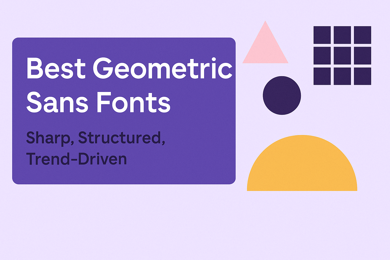
Geometric sans fonts stand out for their clean lines and sharp angles, making them perfect for projects that need a modern, structured look. The best geometric sans fonts combine simple shapes like circles and squares with balanced proportions to create a bold yet minimal style that fits today’s design trends. These fonts are popular in branding, tech, and digital media because they offer clarity and a professional feel.
Designers often choose geometric sans fonts when they want their work to feel fresh and precise without being too busy. Fonts like Futura and Montserrat have become favorites because they keep things simple but still look strong and stylish. Exploring sharp and trend-driven geometric sans fonts helps anyone find the right typeface that adds a modern edge to their design work.
Knowing which geometric font matches a project’s tone can make a big difference in how the message comes across. Whether for logos, websites, or posters, these fonts bring a neat, futuristic vibe without losing readability.
What Is a Geometric Sans Font?
A geometric sans font is a style of typeface based on simple shapes like circles, squares, and triangles. It uses clean, precise lines and a clear structure to create a modern and minimal look. This design approach shapes every letter in the alphabet with an emphasis on balance and consistency.
Key Characteristics
Geometric sans fonts focus on simple, basic forms. Each letter often features round shapes or straight lines, built from circles or rectangles. This gives the font a neat and even appearance.
The spacing between characters is usually very consistent. This makes text easy to read and visually pleasing, whether in headlines or body text.
Colors and weights can vary, but the core geometric shapes stay clear. Fonts like Sharp Sans show this with clean, balanced strokes and a modern feel.
How Geometric Sans Fonts Differ From Other Types
Unlike serif fonts, geometric sans fonts don’t have small decorative lines or “feet” at the ends of letters. This absence creates a cleaner and more straightforward look.
Compared to other sans-serif fonts, geometric ones have a stronger focus on basic shapes rather than organic or hand-drawn styles. Their uniform strokes and symmetrical letters make them stand out.
This design choice makes geometric sans fonts popular in branding, web design, and user interfaces where clarity and precision matter most.
The Role of Structure and Precision
Structure is key in geometric sans fonts. Each letter follows a mathematical design based on geometry. This precision ensures every character fits perfectly with others.
Because of this, geometric fonts feel balanced and harmonious. Designers often choose them when they want a tidy and professional look.
Precision affects not just letter shapes but also spacing and weight. The consistent rhythm throughout the font helps maintain legibility at different sizes and in various uses.
Learn more about these fonts at Sharp Sans font details.
Why Choose Sharp, Structured Geometric Sans Fonts?
Sharp, structured geometric sans fonts offer a clear, modern look that makes designs stand out. They balance clean shapes with solid construction, making typography both eye-catching and easy to read. These fonts fit well in many settings, enhancing brand identity while keeping messages sharp and simple.
Design Appeal
Geometric sans fonts use basic shapes like circles and squares to form letters, creating a balanced and orderly style. This structure gives typefaces a neat and professional appearance. Designers often choose these fonts for their minimalist and polished look.
Their clean lines remove unnecessary details, focusing on simplicity. This helps designs feel fresh without distracting from the message. Fonts like Futura and Circular are good examples, combining precision with subtle style.
Because of their geometric nature, these fonts work well for both print and digital projects. They bring cohesion and sophistication to typography, making text feel consistent throughout a design.
Modern Branding Applications
Brands aiming for a modern and sleek identity often pick geometric sans fonts. These typefaces communicate clarity and professionalism while maintaining a friendly vibe. They work well for tech companies, startups, and creative agencies.
The wide range of weights and styles in many geometric fonts allows designers to build hierarchy and emphasis easily. Brands can create different tones using bold for headlines and lighter styles for body text. This flexibility helps keep brand messaging clear and adaptable.
Structured shapes give these fonts a timeless quality, making them suitable for logos, packaging, websites, and apps. Their wide use by companies like Airbnb and Spotify shows their effectiveness in modern branding.
Readability Factors
Sharp, structured geometric sans fonts are built for legibility. Uniform stroke weights and open letterforms make individual characters easy to distinguish. This clarity helps readers process information quickly, which is important in fast-paced environments.
Because of their clean design, these fonts perform well across different screen sizes and resolutions. They reduce eye strain on digital devices, improving user experience.
When used thoughtfully, they support the visual hierarchy by clearly separating headings and body text. This clear structure guides readers through content, making text easier to scan and understand. For more on these fonts’ characteristics, see the in-depth Best Geometric Sans Fonts For Modern Design.
Top Trend-Driven Geometric Sans Fonts
Many designers seek fonts that balance modern style with sharp structure. The latest trends show a mix of bold weights, playful shapes, and versatile styles. Some fonts stand out for their popularity, while others bring fresh ideas or are great free options for any project.
Popular Picks in 2025
Fonts like Franie, Steelfish, and Metara are favorites this year. Franie offers a wide range of weights and italics, making it highly adaptable. Its mix of serious and playful elements fits many design needs, from branding to posters.
Steelfish is a tall, condensed font known for strong industrial vibes. It works well in bold headlines and modern layouts. Metara brings clean lines with unique alternate shapes, perfect for logos and social media graphics.
These fonts are popular among designers because they combine geometric precision with style, making layouts eye-catching yet easy to read.
Emerging Font Trends
Designers now favor geometric fonts with subtle quirks. Features like off-axis letters or softened corners add personality without losing a clean look. Fonts such as Thatura and Oblik reflect this trend, offering playful yet structured shapes.
There’s also a movement toward variable fonts, which let users adjust weight and slant smoothly. This flexibility helps keep designs fresh and precise. Another shift is using fonts that support multilingual text and special characters, broadening usability in global projects.
This trend shows how geometric fonts are evolving beyond rigid shapes, embracing both function and creativity.
Free Fonts Worth Trying
Several free geometric sans fonts provide excellent quality without cost. Hurtmold and New Garden are good examples, offering clean, professional looks ideal for digital projects and print.
Hurtmold features square shapes with rounded angles, great for tech content and promotions. New Garden is simple and precise, fitting well into modern branding needs.
Using free fonts like these lets designers experiment without budget limits, keeping designs trendy and sharp while saving money.
For more options, check out collections of free geometric sans-serif fonts that can suit various project styles and demands.
Featured Geometric Sans Fonts and Their Unique Features
These fonts stand out because they each offer something different for designers. From space-saving shapes to stylish versatility and futuristic looks, these fonts cover a range of needs without losing clarity or style.
Dense: Compact and Impactful
Dense is known for its tight spacing and bold presence. It packs letters close together, making it ideal for headlines where space is limited but impact is essential. The font’s compact design helps save room while keeping text easy to read.
Its strong, straight lines give Dense a sharp and modern feel. This makes it great for brands or projects that want a serious, professional look without extra decoration. Dense works well in digital formats as well as print because of its clear structure.
Because of its tight arrangement, this font is especially useful for posters, web headings, and branding materials where every inch counts. It balances boldness with simplicity to create a memorable impression.
Marta: Stylish and Versatile
Marta brings a smooth, friendly vibe to geometric sans fonts. Its rounded edges and balanced shapes make it feel approachable yet elegant. This versatility allows it to fit both creative projects and formal branding.
The font supports many weights, from thin to bold, giving designers options to create hierarchy and contrast in text. Marta’s open letterforms improve legibility, making it suitable for everything from body text to large titles.
Its style mixes modern geometry with a touch of warmth. This makes Marta a solid choice for websites, apps, and print where the goal is to appear clean but inviting. Its adaptability ensures it appeals to a wide audience.
Exo: Futuristic Structure
Exo stands out with a more technical, futuristic look. It features sharp angles and geometric precision that feels very modern. This font often fits projects related to technology, science, or innovation.
Exo uses varied stroke weights and distinctive shapes to give text a sense of motion and depth. This makes it not just readable but visually interesting, especially in digital contexts. The font balances style and function well.
With its sleek, structured feel, Exo suits branding and editorial designs that want a cutting-edge, forward-thinking image. Its design works well for tech startups, games, and sci-fi themes.
How to Use Geometric Sans Fonts in Design
Geometric sans fonts work best when clear structure and modern style are needed. Their clean lines and balanced shapes help create focused and easy-to-read designs. Using them right depends on the project and audience.
Web and App User Interfaces
Geometric sans fonts are a great match for web and app interfaces because of their clarity. Their simple shapes make text easy to read on screens of all sizes. Designers often choose these fonts for buttons, menus, and headings.
They help keep interfaces looking fresh and modern. Using fonts with uniform stroke widths improves legibility in digital environments. Pairing these fonts with generous spacing and clear hierarchy guides users smoothly through navigation.
For long paragraphs, choosing a geometric sans font with slightly taller x-heights can improve reading comfort. Bold weights highlight important actions without overwhelming the clean layout.
Logo and Branding Projects
In logo design, geometric sans fonts provide a strong, memorable presence. Their simple shapes create logos that look sharp and balanced. This helps brands appear professional and trustworthy.
Designers select these fonts because they work well with minimalist and bold aesthetics. Fonts like Pantra or Averta offer a range of weights for flexibility in branding. Mixing geometric sans with rounder serif fonts can add contrast and personality.
Using a consistent geometric sans font across all branding materials ensures a unified and clear look. This avoids clutter and keeps the brand message direct. Carefully choosing spacing and weight variations makes the logo adaptable to different sizes.
Editorial and Print Uses
For editorial layouts, geometric sans fonts bring a modern tone that suits magazines and brochures. Their clean forms help organize text clearly, especially in headlines and subheads.
They are easiest to read in short bursts. Designers often combine geometric sans with serif fonts in body text to balance style and readability.
Print projects benefit from geometric fonts that have good x-height and clear letterforms. These features keep pages from looking crowded. Using weights strategically differentiates sections without losing a neat flow.
In print, pairing geometric sans fonts with color and white space enhances focus on key messages. This creates an inviting and easy-to-follow reading experience.
For more examples of geometric sans fonts perfect for logos, visit 20 great fonts for logo design.
Tips for Choosing the Right Geometric Sans Font
Choosing the right geometric sans font requires attention to how it works with other typefaces, how easy it is to read, and whether its style fits the project’s goals. These factors help create clear, attractive typography that supports the message without distractions.
Pairing With Other Typefaces
Pairing geometric sans fonts with other typefaces can boost the design’s impact. They often pair well with other sans-serifs for a clean, modern look. Using fonts with different weights or widths can add contrast without clashing.
To add more interest, pairing geometric sans fonts with serif fonts is a good option. This creates a balance between the sharp, simple shapes of geometric letters and the classic, decorative features of serifs. Designers should pick serifs with moderate stroke contrast to avoid overpowering the geometric alphabet.
A simple way to test pairings is to check how the fonts look together at different sizes.
Optimizing for Readability
Legibility is key when using geometric sans fonts. Because these fonts rely on simple shapes, some can look too uniform or tight, especially at small sizes. Choosing fonts with open letterforms and enough space between characters helps readers process text easily.
It’s important to avoid overly condensed geometric styles for long paragraphs. Fonts with consistent stroke weight and clear distinction between letters like “O” and “Q” improve clarity. Adjusting line height and letter spacing also supports better reading.
Testing the typeface on different screens and printed materials can reveal potential readability issues early.
Balancing Personality With Purpose
While geometric sans fonts tend to feel modern and neutral, each typeface has its own character. Some may feel cold and technical, while others bring a warmer, friendlier vibe. Designers must match the font’s personality with the brand or message.
For formal projects, fonts with strict shapes and uniform strokes often work best. Casual or creative work can benefit from more playful forms or rounded edges within the geometric style.