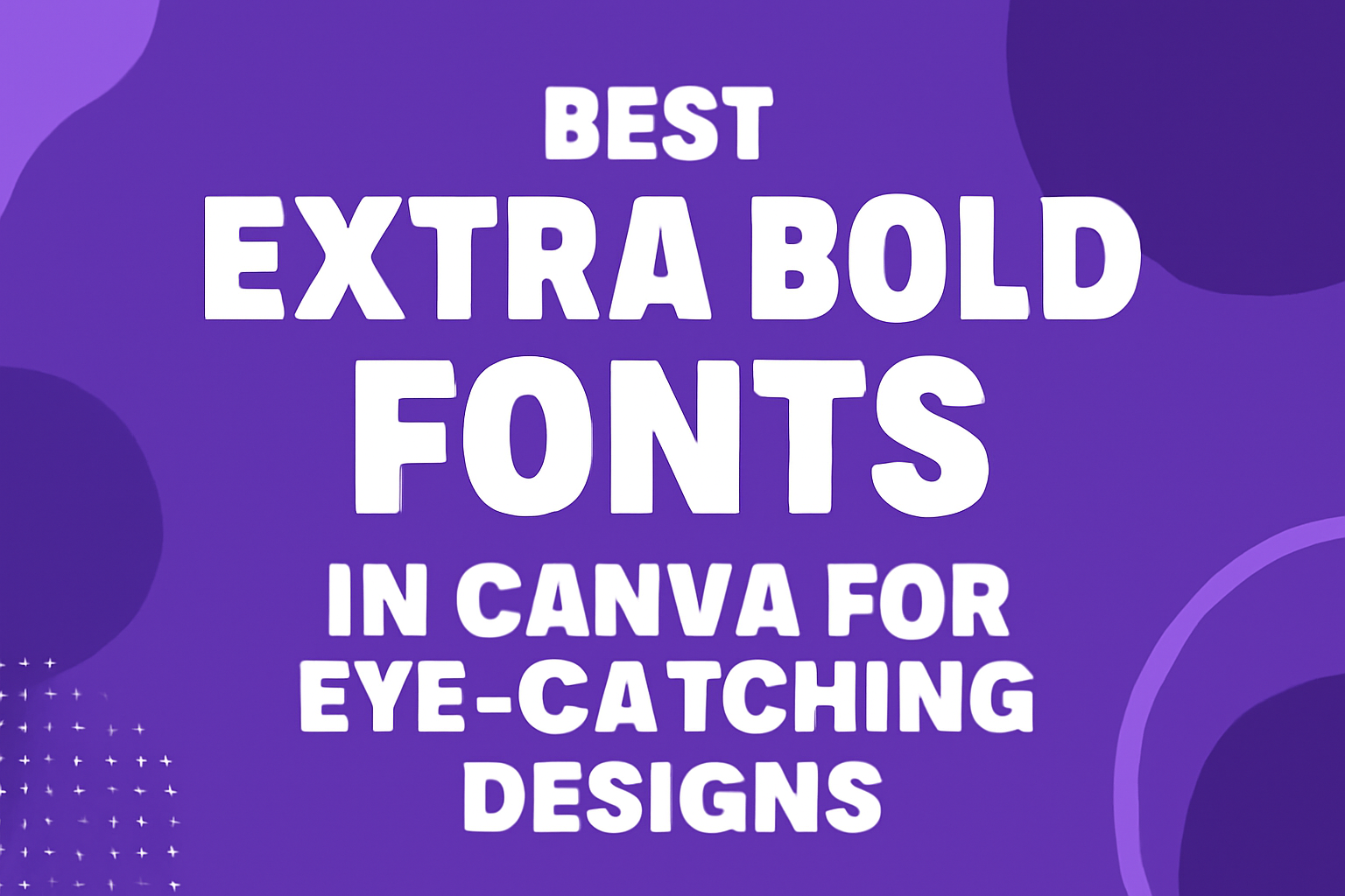
Choosing the right font can make a big difference in design projects, especially when aiming for an eye-catching look.
Extra bold fonts offer strong visual impact and can help messages stand out effectively. Canva provides an excellent selection of extra bold fonts that cater to various styles and needs, allowing designers to enhance their work.
From modern serifs to playful sans-serifs, each font brings its own personality to a design.
Whether one is creating a striking poster, an engaging social media graphic, or a standout logo, the perfect extra bold font can elevate any creative project. By exploring the best extra bold fonts in Canva, they can find the ideal choice for their design goals.
Exploring Extra Bold Fonts
Extra bold fonts stand out with thick strokes and a strong presence. They catch the eye and add emphasis to any design. These fonts are popular for various uses, including branding and headlines.
What Are Extra Bold Fonts?
Extra bold fonts have a weight that is heavier than regular bold fonts. They feature thick letterforms that create a sense of strength and urgency. This makes them ideal for grabbing attention.
These fonts can vary in style, from geometric sans-serifs like Muller Bold to more playful options like Seymour One. The choice of an extra bold font can impact the mood of a design, making it feel more vibrant and engaging.
In visual design, the weight of the typeface plays a key role. Designers choose extra bold fonts for titles, slogans, and calls to action. Their thickness helps words stand out on both digital and print platforms.
Popularity and Use Cases
Extra bold fonts have gained popularity in various industries. They are widely used in advertising, where strong messages need to be communicated quickly. Businesses use these fonts for logos, promotional materials, and social media posts.
Common use cases include:
- Headlines: They capture readers’ attention in articles or blogs.
- Posters: Extra bold fonts make events and announcements easy to notice.
- Branding: Many companies rely on these fonts to create a memorable identity.
These fonts can convey different feelings, from playful to serious. For example, a bold sans-serif might suggest modernity, while a blocky font could seem more playful. This versatility makes extra bold fonts a favorite among designers seeking impactful designs.
The Impact of Typography
Typography plays a vital role in design by influencing how information is perceived. The choice of fonts can shape a viewer’s experience, making text more inviting and easier to understand. Two key aspects that greatly influence this effect are visual hierarchy and reader engagement.
Visual Hierarchy
Visual hierarchy refers to the arrangement of text in a way that guides the reader’s attention. Different font styles and weights can create levels of importance. For example, an extra bold font can draw attention to a headline, while lighter fonts can be used for body text.
Using a mix of sizes and weights helps to create a clear path for the reader’s eye. A well-structured hierarchy makes it easier for them to grasp the main points quickly. This can be especially effective in digital formats, where users often scan rather than read word for word.
Reader Engagement
Engaging the reader is crucial in any design. Typography can influence emotions and create a connection. A bold, modern font can convey energy and excitement, while a simple, classic font can evoke reliability and tradition.
When designers choose fonts like Muller Bold or Panton Bold, they tap into the emotional weight of type. Font choice impacts readability, as well. Readers are more likely to stay engaged with text that is easy to read. Balancing eye-catching designs with legibility keeps the audience interested and ensures that the message is clear.
Top Extra Bold Fonts in Canva
Extra bold fonts are perfect for grabbing attention in designs. They stand out in headlines and posters, making messages clear and impactful. This section explores Canva’s font philosophy and highlights some user favorites.
Canva’s Font Philosophy
Canva believes that font choice can transform a design. They offer a variety of extra bold fonts that suit different styles. These fonts range from modern to playful, helping users convey their unique brand voice.
The design platform focuses on accessibility. Users can easily find and apply these fonts. Every extra bold font is carefully curated to ensure versatility and ease of use. Canva’s philosophy emphasizes the importance of clear communication, making bold fonts an essential tool for engaging designs.
User Favorites
Many users have their favorite extra bold fonts in Canva. Some popular choices include:
- Borsok: This rounded font gives a friendly feel. It’s great for casual events or projects.
- Boldesqo: A heavy serif font that stands out in formal designs. Its classic style catches the eye.
- Lato: This font combines readability with a modern touch. It’s perfect for various design types.
Users appreciate these fonts for their clarity and style. Whether for a poster or a social media graphic, these extra bold choices help create impactful designs.
Choosing the Right Font
Selecting the right font is crucial for effective design. It can help convey a brand’s message and improve readability. The choice of font should align with the brand’s identity and the content being presented.
Brand Identity and Fonts
Fonts can significantly impact how a brand is perceived. A strong brand identity often requires consistent font choices that reflect its values and personality.
- Modern brands might opt for sleek sans-serif fonts, such as Muller Bold, to show innovation.
- Traditional brands may choose serif fonts, providing a sense of reliability and tradition.
When deciding on fonts, consider the target audience. For example, playful fonts like Seymour One can attract a younger crowd. In contrast, more formal fonts serve a professional audience. Matching the font to the brand’s message creates a strong visual connection and reinforces recognition.
Matching Fonts to Content
Different types of content require different typographic approaches. The font chosen should enhance the reading experience and fit the content’s tone.
- Headlines should be bold and attention-grabbing. Extra bold fonts like Panton Bold can add impact.
- Body text needs clarity. It should be easy to read and not overly stylized. Simple sans-serif options work well here.
Also, consider font pairing. A bold headline font paired with a simpler body font ensures visual interest without overwhelming the viewer. This combination keeps the design organized and enhances the communication of the message.
Design Tips for Extra Bold Fonts
When using extra bold fonts, attention to detail is essential for creating eye-catching designs. Key aspects include proper spacing and sizing along with effective color contrasts. These elements can enhance readability and overall appeal.
Spacing and Sizing
Choosing the right spacing and sizing is crucial for bold fonts. They tend to take up more visual space, so adequate letter spacing is important. Too tight spacing can make the text appear crowded, while too much spacing can disrupt flow.
When sizing, bold fonts can dominate the design. It’s best to use them for headings or key messages rather than body text.
For example, headings may use a size of 36-48 points, while body text should stay around 14-18 points depending on the design’s overall style.
Additionally, adjusting line height can improve readability. A line height of 1.2 to 1.5 times the font size can make a big difference. The right combination helps to create a balanced appearance.
Color Contrasts
Color contrasts play a vital role in making bold fonts stand out. A strong contrast between text and background helps ensure legibility. For instance, white text on a dark background or black text on a light background works well.
Using complementary colors can also enhance impact. For example, pairing warm colors like red or orange with cool colors like blue or green creates visual interest.
He should select colors that reflect the message of the design.
Avoid overly busy backgrounds that may distract from the text. Instead, keep backgrounds simple and let the bold font shine. Using shapes or soft gradients behind the text can help it stand out while maintaining focus.
Font Pairing Strategies
Choosing the right fonts can greatly enhance a design. It is vital to know how to pair fonts effectively to create an appealing look. Two main strategies to explore include complementary font choices and balancing bold with subtle styles.
Complementary Font Choices
Selecting complementary fonts is essential for a cohesive design. This involves choosing fonts that match in style and tone. For example, pairing a bold sans-serif with a more delicate serif can provide contrast while maintaining harmony.
Here are a few practical combinations:
- Muller Bold with Tex Gyre Pagella: The boldness of Muller contrasts nicely with the elegance of Tex Gyre Pagella.
- Panton Bold with Playfair Display: A modern twist with a classic touch can be effective.
These pairs can make headings stand out while keeping body text readable. It’s important to ensure that both fonts share a similar feel to create visual balance.
Balancing Bold with Subtle
Balancing bold fonts with subtle ones helps create hierarchy in a design. While bold fonts attract attention, subtle fonts guide the reader’s eye through the information. A well-balanced approach ensures the design is easy to read and visually pleasant.
For example, using Margin as a bold header can grab attention when paired with a lighter script font like Marline. The contrast between strong and soft makes the content engaging.
- Consider using larger sizes for bold fonts and smaller for subtle ones.
- Use color variations to further distinguish between bold headings and soft body text.
This strategy ensures clarity while maximizing visual appeal.
Incorporating Bold Fonts in Layouts
Using bold fonts effectively can transform layouts and make important information stand out. This includes their role in header and banner designs as well as in posters and advertisements, where visual impact is key.
Header and Banner Design
In header and banner design, bold fonts drive attention. They work well for titles or main headings, ensuring viewers immediately grasp the layout’s focus.
For instance, fonts like Muller Bold and Panton Bold are great choices. These fonts offer a clean, modern look that enhances visibility.
When designing, consider the font size and spacing. A larger size combined with ample spacing can elevate the header’s prominence. Using contrasting colors for text and background also highlights bold fonts, making the message clear.
Additionally, pairing bold fonts with lighter, more neutral fonts for subheadings can create a visually appealing hierarchy. This method helps readers navigate the design while emphasizing important content.
Poster and Advertising
In posters and advertising, bold fonts capture attention quickly. They are essential for conveying messages in crowded spaces.
For example, incorporating the Seymour One font in advertising can create a playful yet robust feel. Its blocky nature ensures that the headline pops out.
In this context, contrast is key. Using bold fonts in different colors against a muted background can draw the eye. Designers should choose legible sizes and make sure they fit the overall aesthetic.
Additionally, using bullet points or short phrases in bold helps highlight main features or calls to action. This technique makes the information easier to digest while retaining visual impact.
Overall, incorporating bold fonts strategically enhances any layout, making the content more engaging and effective.
Canva Tools for Font Customization
Canva offers various tools to help users customize fonts creatively and effectively. These features enable people to enhance their designs and make their text stand out. Below are two key aspects of font customization in Canva.
Font Effects and Features
Canva provides several font effects that bring text to life. Users can apply shadows, glows, and outlines to create depth and emphasis. This can make a text more prominent in designs.
Key Features Include:
- Text Shadows: This effect adds a shadow behind the letters, giving them a lifted appearance.
- Text Color Changes: Users can choose from a wide palette to change text colors for better visibility.
- Opacity Adjustments: This allows designers to change how see-through the text appears.
These features allow for unique style creation and can help set the tone of a project. Knowing how to use them can greatly improve any design.
Creative Text Widgets
Creative text widgets in Canva allow for more dynamic text layouts. These widgets include text boxes, headings, and quotes, which users can drag and drop into their designs.
Notable Widgets:
- Text Boxes: Perfect for containing longer texts neatly.
- Headings: Bold sections draw attention to important information.
- Quote Templates: These can showcase quotes attractively.
By using these widgets, designers can organize their content better. This makes it easier for audiences to engage with the message. Canva’s tools foster creativity in text arrangement and style.