Creating the perfect business card can leave a lasting impression, and choosing the right font plays a significant role in that.
For a modern and sleek look, Roboto and Poppins are excellent choices due to their clean and contemporary style. These fonts are known for their versatility and can suit a wide range of industries.
For those craving a more playful look, Oregano offers a whimsical style that works well for creative professionals. This font adds a quirky touch while maintaining readability.
Additionally, Aileron Regular, with its classic design inspired by Helvetica, is ideal for businesses wanting a traditional yet stylish approach.
The Importance of Font Choice in Business Cards
Choosing the right font for a business card is like picking the perfect outfit for an important event. It helps set the first impression and communicates the brand’s personality.
Different fonts can convey different feelings. Sans serif fonts like Helvetica are clean and modern, often used by tech companies. They give a sense of simplicity and clarity.
Serif fonts, such as Times New Roman, bring a classic and formal touch. These are perfect for law firms or traditional businesses looking to convey stability and trust.
For a bit of flair, script fonts can be eye-catching. Better Saturday, for instance, is a modern script that adds a luxurious feel. This makes it suitable for upscale businesses, like boutiques or high-end salons.
Bold fonts can make a design stand out. They ensure that important details like the name or contact info don’t get missed. Using a bold font adds emphasis and draws the eye.
A simple list of considerations when choosing a font:
- Audience: Is the target audience young or mature?
- Readability: Is the font easy to read at a small size?
- Tone: Does it match the business’s message and industry?
Understanding Canva’s Font Library
Canva’s font library offers an extensive range of styles suitable for various design needs. It is organized into different categories, making it easier for users to find the perfect font for their projects.
Choosing the right font is crucial for conveying the desired mood and message effectively.
Font Categories
Canva’s font library is divided into several categories, each designed to suit different purposes. The main categories include serif, sans-serif, script, and decorative fonts.
-
Serif fonts are traditional and convey formality. They are commonly used in professional and business documents.
-
Sans-serif fonts are modern and clean, ideal for minimalist designs. They offer a more casual look compared to serif fonts.
-
Script fonts mimic handwriting and bring elegance or playfulness, perfect for invitations or personal touches.
-
Decorative fonts feature unique and bold designs, often used for headlines or standout elements.
Having these categories helps users quickly find fonts that match their design goals, ensuring a harmonious and visually appealing outcome.
Selecting the Right Font Style
Choosing the right font style in Canva requires considering the design’s purpose and audience. For business cards, a balance between readability and aesthetic appeal is essential.
-
Readability: Prioritize fonts that are easy to read at small sizes. Sans-serif fonts like Montserrat are popular for their clarity.
-
Tone: Align the font style with the brand’s message. For a chic and feminine touch, script fonts like Brittany can be effective.
-
Harmony: Ensure the font pairs well with other design elements. Canva allows experimenting by providing a feature to preview combinations in real-time.
Top Canva Fonts for Professional Appeal
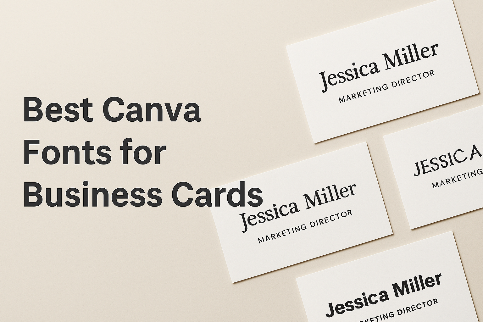
When designing business cards, choosing the right fonts can elevate a brand’s image. Serif fonts offer a timeless, classic look that is ideal for traditional businesses. On the other hand, sans-serif fonts provide a clean, modern touch perfect for contemporary brands.
Serif Fonts for a Classic Look
Serif fonts are perfect for businesses that want to convey trust and tradition. These fonts have a certain elegance due to their small, decorative lines at the end of each letter.
Times New Roman and Merriweather are examples that offer a dependable and professional appearance. They are often used by law firms and financial institutions looking to project authority and reliability. Serif fonts are great in print, making them ideal for business cards.
For those using Canva, a font like Libre Baskerville combines readability with classic styling. It’s perfect for businesses wanting to blend old-world charm with modern functionality. The nostalgic look of serif fonts can enhance the branding of companies with a historical or sophisticated angle.
Sans-Serif Fonts for a Modern Touch
Sans-serif fonts are favored for their clean and minimalist design. They lack the additional strokes of serif fonts, making them appear straightforward and modern.
Examples like Helvetica and Lato embody a contemporary style that suits tech startups and creative agencies. These fonts have a simple structure that works well on digital and print platforms, making them versatile for various branding materials.
On Canva, the font Montserrat offers a sleek option that’s both professional and eye-catching. Its geometric shape provides a fresh look, helping brands stand out with a bold statement. This approach is ideal for businesses aiming for a modern and approachable identity.
Pairing Fonts in Canva
When designing business cards, choosing the right font combinations can make a big difference. Effective font pairing helps enhance readability and creates a professional look. It can also add emphasis and interest to key details.
Combining Fonts for Readability
For business cards, readability is key. The card must be easy to read at a glance. Choosing fonts with distinct styles that complement each other is essential.
One effective combination is a serif font for the name and a sans-serif font for the contact details. Serif fonts like Cinzel add a touch of formality, which pairs well with the clear and modern look of sans-serif fonts like Public Sans. This mix ensures that names stand out, and contact information remains readable.
Another approach is using Boulder with More Sugar, which both offer a balance of boldness and softness, respectively, making them ideal for headers and subtext.
Contrasting Fonts for Emphasis
Contrasting fonts can highlight important information on a business card. This technique draws attention to areas that need emphasis. For instance, consider Yellowtail and Open Sans.
Yellowtail adds a playful touch with its script style, perfect for creative roles or industries. Paired with the straightforward Open Sans, this creates a dynamic look that grabs attention without being overwhelming.
Similarly, pairing Margin with Marline incorporates a modern sans-serif with an elegant script, providing a professional yet stylish flair. Such contrasts make key sections pop, ensuring that viewers notice them right away.
These font pairs allow different aspects of the card to shine, enhancing the overall design and helping to communicate the desired message effectively.
Font Size and Color Considerations
Font size and color in business card design can significantly affect readability and impact. It’s essential to balance these elements carefully to ensure the card is both stylish and functional.
Balancing Font Sizes
Choosing the right font size is crucial for readability and aesthetics. Main text, such as a person’s name, should be prominent, typically around 10-12 pt. Smaller details, like phone numbers or addresses, can be in an 8-9 pt range.
Varying the size of fonts can create a hierarchy of information. This helps to guide the reader’s eye through the important details. Emphasizing certain parts of the text, like company names, with bold or larger fonts can make them stand out more, drawing attention effectively.
Avoid using too many font sizes on one card, as this can create visual clutter. Stick to 2-3 sizes for a more organized look. Consistent spacing and alignment are also key in making sure the text looks neat and professionally designed.
Choosing Font Colors for Visibility
Color plays a vital role in how text is perceived, especially on small surfaces like business cards. Contrast is the most important factor for readability. Using dark text on a light background or vice versa makes the text stand out, improving visibility.
Stick to a limited color palette for uniformity. Using two or three colors can maintain a clean look while still allowing certain elements to pop. Complementary colors are often a good choice for highlights without overwhelming the overall design.
Think about the context and feel of your brand when selecting colors. Bright and vibrant colors might suit creative industries, while subdued tones may be better for more traditional businesses. Always ensure that the chosen colors align with the brand’s identity and message.
Implementing Brand Identity Through Fonts
Selecting the right fonts is essential for expressing a brand’s personality and ensuring consistency across all marketing materials. This involves matching fonts with the brand’s character and maintaining uniformity in their use.
Matching Fonts with Brand Personality
Choosing fonts that reflect a brand’s identity helps connect with its target audience. For a brand that exudes luxury and elegance, modern and sophisticated script fonts like Better Saturday can be a great fit. On the other hand, a brand aiming for a youthful and energetic vibe might prefer fonts like Bellaboo, which adds a playful touch.
Fonts come in various types, such as serif, sans-serif, and script. Each style conveys a distinct feeling. Serif fonts often evoke tradition and reliability, while sans-serif fonts appear modern and clean. Script fonts, featuring decorative elements, add a creative flair. The choice of font should align with the emotions and messages the brand wants to communicate.
Consistency Across Marketing Materials
Once the perfect fonts are chosen, using them consistently across all marketing channels is crucial. This includes everything from business cards to advertisements and social media posts. Consistency ensures that the brand is easily recognizable, which helps build trust with the audience.
Canva offers tools to help maintain this uniformity. Users can save and apply their brand fonts in various designs, simplifying the process of sticking to brand standards. Ensuring fonts align with other brand elements, such as colors and logos, further supports a cohesive brand image.
Brands that use consistent fonts give their audience a seamless experience, making it easier for consumers to associate specific fonts with their unique identity. Consistency in font usage strengthens brand recognition and loyalty over time.
Canva Pro Fonts vs. Free Fonts
Choosing fonts on Canva can feel exciting, especially when deciding between Canva Pro and free fonts.
Canva offers a vast font library, but understanding the differences between Pro and free options is essential for any project.
Free Fonts:
Free fonts are available to all Canva users. They offer a wide range of options, suitable for personal projects or basic business needs.
Some popular free fonts include classic styles like Arial and fun, modern options like Pacifico.
Canva Pro Fonts:
Users with a Canva Pro subscription get access to an expanded selection of fonts. These exclusive fonts often include more unique and bold choices, giving users the ability to create standout designs.
The Pro version also allows for commercial use, which is critical for business card designs.
Comparison Table:
| Feature | Free Fonts | Canva Pro Fonts |
|---|---|---|
| Access | All users | Pro subscribers only |
| Variety | Limited selection | Extensive library |
| Commercial Use | Limited | Full rights |
When designing business cards, having the right font can make all the difference.
While free fonts are great for getting started, Canva Pro fonts provide more creative options and flexibility, especially for business-related projects. Each type serves a purpose, yet Pro fonts offer a broader scope for professional design.
Best Practices for Font Licensing and Usage
When designing with Canva fonts, following certain best practices ensures that one adheres to licensing agreements and maintains both professional and legal standards.
Check Licensing Details
Before using any font, check the font’s licensing requirements. Each font may have different permissions settings, especially when used for commercial purposes.
Some may have restrictions or require a paid license.
Use Commercially Approved Fonts
Stick to fonts explicitly marked for commercial use. Canva offers a range of free and premium fonts.
Free fonts can often be used without restrictions, while premium fonts might require a subscription.
Read the Terms Carefully
Taking the time to read the terms associated with font use is important. This helps in understanding any potential restrictions on usage, modifications, or distribution.
Consider Upgrading to Pro
Canva Pro might offer additional font options with fewer limitations. Business owners might find it beneficial for broader design needs.
Keep Documentation
Keep records of all licenses, especially if using premium fonts. This helps in case of any legal inquiries or audits regarding the usage of specific fonts.
Creating Custom Fonts in Canva
Creating custom fonts in Canva can add a unique touch to any design. While Canva doesn’t allow users to create entirely new fonts from scratch, users can customize existing ones significantly.
Using Canva Pro, users have more options for personalization by uploading their own fonts. Go to the Brand Kit section and simply upload your chosen font files to use them in your projects.
To customize fonts within Canva, users can adjust size, color, spacing, and alignment. The text toolbar offers various tools for making these adjustments.
Users can create a distinct look by playing with these options creatively.
Combining different fonts is another way to achieve a custom feel. Pairing a bold font with a clean, simple one can add character. Look at Canva’s suggestions for font combinations.
Using effects can also enhance the font’s appearance. Shadow, lift, or hollow effects add depth and dimension.
Users can access these from the effects menu above the canvas.
For more design freedom, use letter and line spacing. Adjusting these can make text appear more open or condensed, helping to fit the aesthetic of the design.
Tips for Testing and Finalizing Your Font Choice
When choosing fonts for business cards, testing is key to finding the perfect match.
Print Samples: Print a few samples before making a final decision. This helps to see how the font looks on paper and whether it stays legible at smaller sizes.
Get Feedback: Share the printed samples with friends or colleagues. Their opinions can provide valuable insights on how the font conveys the business’s brand and message.
Check Compatibility: Ensure the chosen font works well across various devices and formats. This prevents issues when sharing the design digitally or printing in different locations.
Test Font Sizes: Experiment with different font sizes. Ensure that names, titles, and contact details remain clear and easy to read even when printed in small sizes.
Pairing Fonts: Consider using two complementary fonts. A quick guide can help pair a distinctive script font with a clean sans-serif for a balanced and professional look.
Alignment and Spacing: Adjust alignment and spacing to improve readability. Proper alignment makes the information easier to follow, while consistent spacing avoids clutter.
Consider Readability: Choose fonts that maintain clarity. Avoid extremely decorative fonts that can be difficult to read. Focus on clean lines and shapes that offer readability at a glance.