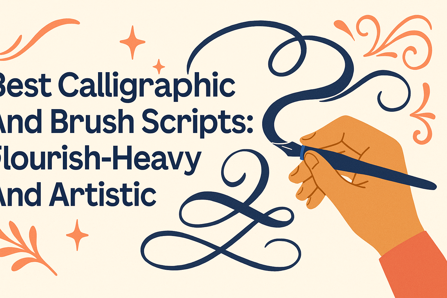
For those looking to add a touch of elegance and personality to their projects, choosing the right calligraphic or brush script is key. The best scripts combine artistic flourishes with smooth brush strokes to create a stylish, eye-catching look that enhances any design. These fonts often feature dramatic loops and swoops that give words a lively, handcrafted feel.
Many artists and designers love flourish-heavy scripts because they allow for creative expression and add a sense of sophistication. Whether it’s for wedding invitations, logos, or decorative art, these scripts bring a unique flair that simple fonts can’t match.
What Defines Flourish-Heavy Calligraphic and Brush Scripts
Flourish-heavy scripts focus on adding elegant curves and decorative strokes to letters. These scripts balance beauty with legibility, using flourishes to enhance the text without overwhelming it. They combine artistic detail with the basic structure of calligraphy or brush lettering.
Characteristics of Flourishes
Flourishes are smooth, curved lines that extend from letters. They often follow oval shapes to keep the design graceful and balanced. The best flourishes cross at about 90 degrees and avoid overlapping thick lines, which helps maintain clarity.
Flourishing usually appears in specific spots like upper and lower loops, t-crossbars, and at the ends or under words. These areas allow flourishes to add style while keeping the text readable. Flourishes can vary from simple loops to complex swirls.
Ornamental and Decorative Elements
Flourish-heavy scripts use decoration to add personality and style. These elements include loops, spirals, swashes, and sometimes small inner loops inside flourishes. The decoration helps fill space and makes the writing feel more lively.
Balance is important. Too many decorations can make letters hard to read. The flourishes should look intentional and fill space evenly around the word to keep the design pleasing to the eye.
Difference Between Calligraphy and Brush Scripts
Calligraphy scripts typically use nibs or pointed pens. They focus on thin and thick strokes controlled by pressure and angle. Flourish detail in calligraphy often has sharp starts and ends with elegant, oval-based curves.
Brush scripts use brushes or brush pens. Their strokes are softer and more fluid, creating bold lines with natural variation. Flourishes in brush scripts tend to be looser and more organic, showing the motion of the brush while still following flourish rules.
Both styles can be flourish-heavy but have different tools and stroke characteristics that affect the overall look. They often share the same flourish spots and principles for balance and legibility.
Learn more about flourish rules and examples at Lettering Daily’s calligraphy flourishing guide.
Popular Flourish-Heavy Script Styles
Flourish-heavy scripts are popular for adding grace and personality to lettering. These styles often use sweeping loops, elegant curves, and decorative tails. Each style offers unique flair that fits different design needs, from casual modern looks to formal vintage charm.
Modern Calligraphy Scripts
Modern calligraphy scripts blend traditional calligraphy with fresh, artistic touches. They often feature smooth, flowing lines with dramatic flourishes that highlight movement. These fonts usually have varied stroke widths, creating a lively and relaxed feel.
Artists and designers like modern scripts for invitations, branding, and social media because of their stylish yet approachable look. They often include playful loops and swirls, giving each letter an organic dance. This style works well with monoline pens or brush tools.
Vintage and Ornate Styles
Vintage and ornate scripts focus on detailed, intricate flourishes. These styles mimic hand-lettering found in the 18th and 19th centuries, often with heavy decoration on both uppercase and lowercase letters. They use loops, curls, and sometimes floral elements that add a regal or classic vibe.
These fonts suit projects that want to express tradition, luxury, or history. They can transform simple words into complex works of art. Often found in signage, packaging, and logos, vintage scripts bring a sense of craftsmanship and elegance.
Wedding and Invitation Fonts
Wedding and invitation scripts celebrate romance and formality with delicate and graceful flourishes. These fonts typically balance decorative curves with readability, ensuring names and event details stand out beautifully. They include connectors and loops that link letters smoothly.
Many wedding fonts combine both modern and vintage elements to create an inviting look. They pair well with soft color palettes and textured paper. These scripts are often designed for pointed pen calligraphy, highlighting fine line variation and detailed strokes.
For examples and free download options, exploring 268 Free Flourish Fonts is helpful.
Top Flourish-Heavy Calligraphic and Brush Script Fonts
These fonts stand out for their elaborate details and elegant strokes. Each brings a unique personality through decorative flourishes that enhance design projects. The fonts work well for invitations, branding, and anywhere a graceful, artistic touch is needed.
Monsieur La Doulaise
Monsieur La Doulaise is a beautifully crafted calligraphy font with bold, sweeping flourishes. It has a classic style that feels both vintage and fresh. The thick and thin contrasts in the strokes make letters pop while preserving readability.
Its elaborate swirls are perfect for logos or wedding invitations where a formal yet artistic feel is desired. The font comes with stylistic alternates and ligatures, adding extra design flexibility. It also supports multiple languages, making it a versatile choice for global projects.
Feathergraphy Decoration
Feathergraphy Decoration is known for its delicate, flowing flourishes that look like fine penmanship. The ornamented style adds personality without overwhelming the text. It pairs well with simple fonts, offering a charming contrast.
This font shines in creative branding and decorative headlines. It includes a wide range of swashes and stylistic sets, allowing users to customize the look with ease. Feathergraphy Decoration suits projects aiming for a personal, handcrafted vibe.
Weather Sunday
Weather Sunday uses expressive brush strokes combined with intricate flourishes. Its artistic style carries a lively and spontaneous energy, making it ideal for modern, creative designs. The font’s natural flow mimics real brush lettering.
It is excellent for casual invitations, posters, and logo designs that want a bold yet refined statement. Weather Sunday supports ligatures and alternate characters, which helps create unique letter combinations that stand out. Its versatility makes it great for projects where creativity is key.
Artistic Applications for Flourished Scripts
Flourished scripts add a unique, decorative touch to many creative projects. They combine style with elegance, helping designs stand out while keeping text readable. These scripts work well in areas where beauty and clarity are both important.
Graphic Design Projects
In graphic design, flourished scripts bring visual interest and sophistication. Designers often use them for invitations, greeting cards, and event promotions. The flourishes help fill empty spaces, creating a balanced and elegant look.
It’s important to choose flourished scripts that complement other design elements. Using too many flourishes or overly complex styles can make text hard to read. Designers usually focus on piece harmony, making sure the script enhances the overall message without overwhelming it.
Logo and Branding
Flourished scripts can give logos and branding a personal, artistic feel. Many brands use these scripts to suggest luxury, creativity, or tradition. For instance, a bakery or boutique might pick a flourished script to show craftsmanship and elegance.
When applying flourished scripts in logos, legibility is key. The flourishes should add style without confusing the brand name. Simple, clean flourishes used strategically help create memorable and classy branding that appeals to the target audience.
Posters and Decorative Artwork
Posters and decorative art benefit from flourished scripts by gaining a hand-crafted look. Artists use flourishes to make titles and quotes pop, adding flair and personality. This style suits vintage, romantic, or whimsical themes very well.
Using flourished scripts on posters requires balance. Too much embellishment can distract from the main message. A good approach is to combine flourishes with clear fonts or design elements, giving the artwork an artistic yet readable quality.
For more on adding style and practice to lettering, check out this detailed calligraphy flourishing guide for practical tips and examples.
Tips for Using Flourish-Heavy Fonts Effectively
Using flourish-heavy fonts can add a touch of elegance and personality, but they need care to keep designs clear and balanced. Paying attention to how these fonts work with other text and how they look on the page helps keep your message easy to read and attractive.
Best Practices for Readability
Flourish-heavy fonts often have elaborate curves and swirls that can make letters hard to read. To avoid this, limit their use to short words or headings rather than long paragraphs. Using larger font sizes can also help make the details more visible without crowding.
Spacing is important. Increasing letter spacing and line height prevents the flourishes from overlapping or blending into each other. If the font feels too busy, pairing it with simpler, clean fonts can improve clarity. Always test your text by viewing it from a distance to check if it remains legible.
Combining with Other Typefaces
Pairing flourish-heavy fonts with other typefaces creates visual interest without overwhelming the reader. It works best to combine them with simple, sans-serif or clean serif fonts. These offer contrast and help highlight the decorative font without competing.
Use flourish fonts for emphasis like titles or names, and reserve the simpler fonts for body text or smaller details. Avoid mixing multiple decorative fonts in one design; too many flourishes can confuse readers. Choosing fonts that complement each other’s style and weight keeps the overall look balanced and professional.
Maintaining Visual Balance
Visual balance ensures that flourish-heavy fonts don’t overpower other elements on the page. Position flourished text carefully, often at the top or center of a design, where it can stand alone. Surround it with enough white space to avoid clutter.
Balance the flourishes with plain backgrounds and minimal additional graphics. If the flourishes are dense or large, reduce other design elements nearby. Checking the composition by stepping back or using tracing paper to sketch your layout can help adjust where flourishes sit for the best flow and harmony.
For more on flourishing techniques and practice, explore calligraphy flourishing tips.
Free versus Commercial Flourished Fonts
Choosing between free and commercial flourished fonts depends on factors like design needs, budget, and usage rights. Many free fonts offer beautiful styles but may have limits on commercial use. Paid fonts usually provide more features, variations, and clearer licensing.
Where to Find Free Flourish Scripts
Free flourished fonts are available on sites like 1001 Fonts and FontSpace. These sites offer a wide variety of styles, from elegant calligraphic scripts to bold brush designs.
Most free fonts come in popular formats such as TTF and OTF, making them easy to use in most design software. However, designers should check the font details carefully to ensure the style matches their project and supports needed languages and special characters.
Licensing and Usage Considerations
Licensing is a crucial factor with flourished fonts. Free fonts are often labeled for personal use only, meaning they cannot be used in projects intended to make money without buying a license.
Commercial fonts usually include a license covering logos, branding, and product packaging. They often come with extra features like alternates, ligatures, and extended character sets.
Before downloading, users should read the license terms carefully. Ignoring license restrictions can lead to legal issues.