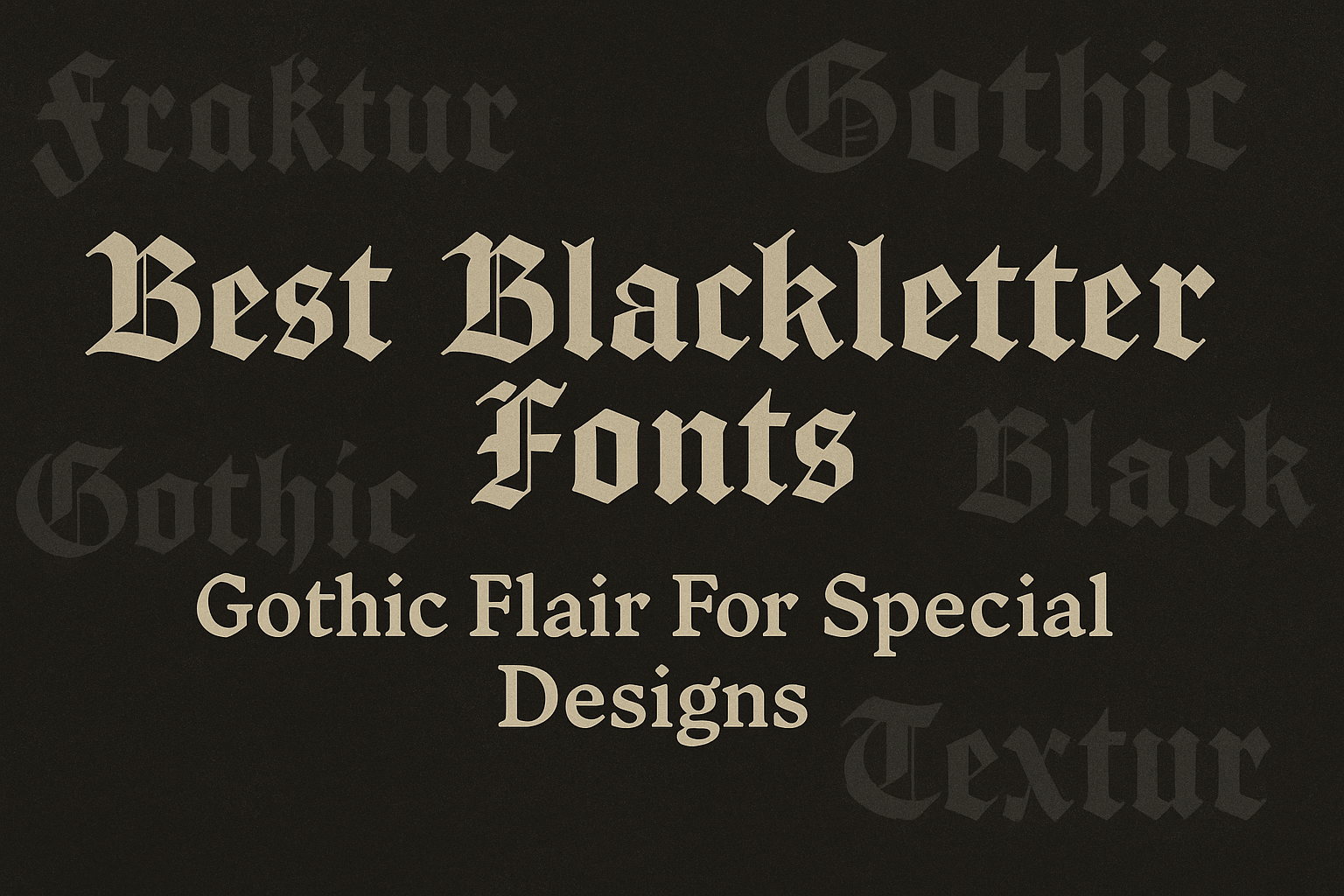
Blackletter fonts bring a striking gothic flair that can make any design stand out with a vintage, medieval touch. They work well for logos, posters, invitations, and branding, adding a sense of drama and style that simpler fonts can’t offer.
Designers often choose fonts like Cambridge, Darkgone, and Cattedrale for their mix of traditional and modern gothic styles. These fonts offer versatility, fitting everything from elegant book covers to edgy event posters with ease. With so many great options, finding the right blackletter font can elevate a project’s mood and message.
Whether the goal is a mysterious vibe or a strong, decorative statement, blackletter fonts bring history and character to modern design. They work especially well when a project needs something both classic and eye-catching.
Best Blackletter Fonts for Creative Projects
What Are Blackletter Fonts?
Blackletter fonts are known for their strong and dramatic style. They have a unique look that combines dense, sharp shapes with elegant curves. This style gives designs a medieval or Gothic feel, perfect for special projects that want to stand out.
Defining Blackletter and Gothic Script
Blackletter fonts, sometimes called Gothic fonts or old English fonts, are based on writing styles used in Western Europe during the Middle Ages. These fonts are often intricate, with thick vertical lines and thin connecting strokes.
The term “Gothic script” refers to the handwritten version of blackletter used before printing. Blackletter typefaces recreate this look for use on computers and in print. They give a design a historic and artistic touch that is both bold and decorative.
Origins and Evolution Through History
Blackletter originated in the 12th century and became the main script for books and documents across Europe. It was especially popular in Germany, England, and France. This style was used until the 15th century when more modern typefaces started to replace it.
Despite falling out of everyday use, blackletter fonts never disappeared. In the 20th and 21st centuries, they experienced a comeback, embraced by tattoo artists, heavy metal bands, and fashion designers wanting that Gothic vibe. Today, blackletter typefaces mix tradition with modern design.
Key Characteristics of Blackletter Typefaces
Blackletter fonts have several distinct features:
- Thick vertical strokes that create a strong visual weight
- Thin horizontal lines and connecting strokes for sharp contrast
- Decorative serifs often ending in sharp points or curves
- Condensed letter shapes that make words look compact and dense
These features make blackletter fonts read as bold and historic. They work well for titles, logos, and designs that want to evoke a dramatic or old-world style without losing readability. Using one can give a design an edgy, artistic twist.
For more on blackletter and gothic fonts, see this detailed list of best blackletter fonts.
Top Picks: Best Blackletter Fonts for Design
Blackletter fonts come in various styles that suit different design needs. Some fonts keep the classic Gothic look, while others add modern twists or rich ornamental details. Choosing the right style depends on the mood and message a designer wants to convey.
Classic Blackletter Fonts
Classic blackletter fonts capture the traditional medieval and Gothic spirit. They often feature sharp angles and strong vertical lines, giving designs a bold, timeless feel. These fonts work well for projects needing a historic or luxurious vibe, such as luxury branding or vintage labels.
Examples like Osgard Pro and Aimerva stand out for their elegant design, including swashes and ligatures that add finesse. They are perfect for high-end product promotions where an old English look with clear readability is needed. Classic blackletter fonts also support multilingual characters, making them versatile for international use.
Modern Blackletter Fonts
Modern blackletter fonts update traditional styles with cleaner shapes or creative cuts, making them suitable for contemporary designs. They often improve readability without losing their Gothic charm.
Fonts like Mighty Empire use diagonal slices on letters to add strength and sophistication. Others such as Graphorn blend sharp edges with smooth curves, making them ideal for logos, editorial layouts, and branding. Modern blackletter fonts are great when designers want a blend of old and new for posters, websites, or fashion labels.
Decorative and Ornamental Blackletter Fonts
Decorative blackletter fonts bring artistic flair through detailed swashes, flourishes, or unusual elements. These fonts add personality and work best as display fonts for titles or special occasions.
Fonts like Silhouetta and Roadsley include ornamental details that catch the eye and give a custom feel. They are perfect for invitations, packaging, or merchandise that needs an elegant and handcrafted touch. These types often offer multiple styles or glyphs for creative freedom and can elevate a design with their rich Gothic flair.
For more examples and details on top blackletter fonts, visit this best blackletter font collection.
Using Blackletter Fonts in Creative Projects
Blackletter fonts add a strong sense of style and history that can transform designs. They work best when used thoughtfully to highlight key areas without overwhelming the entire project.
Logo Design and Branding Materials
Blackletter fonts bring a bold, historic feel to logos and branding. They are great for businesses wanting to stand out with a unique look, like breweries, tattoo shops, or alternative fashion brands.
When used in logos, it’s important to keep readability in mind. Pairing blackletter with simpler fonts for additional text can balance the design. For branding materials like business cards or packaging, blackletter fonts can create a lasting impression if the style matches the brand’s personality and audience.
Album Covers and Posters
Album covers and posters benefit from the dramatic flair of blackletter fonts. These fonts work well for rock bands, metal music, or any genre wanting to convey edge and strength. The historic and gothic appearance grabs attention quickly.
Designers often use blackletter fonts for headlines or main titles while keeping the rest of the text clean and easy to read. This keeps the focus on the artwork and key messages. Using blackletter in concert flyers or promotional posters adds an energetic and memorable vibe.
Invitations and Event Stationery
For invitations and event stationery, blackletter fonts create an elegant and formal tone. They are common choices for weddings, gothic-themed parties, or high-fashion events. The font style suggests tradition and sophistication.
Mixing blackletter with serif or sans-serif fonts on invitations helps maintain clarity. It is ideal for headers or names, while the details like dates and locations stay simple. This combination keeps the invitation readable but visually striking.
Styling Tips for Effective Blackletter Typography
Using blackletter fonts well means balancing their bold, detailed look with clear, readable design. Choosing the right partner font and focusing on how to keep text easy to read can help anyone create striking and functional designs.
Pairing Blackletter with Other Fonts
Blackletter fonts are dense and ornate, so pairing them with simpler fonts creates contrast and balance. They work best with clean sans-serif fonts or classic serif fonts. Sans-serifs bring a modern, minimal feel that cuts through blackletter’s complexity. Serif fonts, on the other hand, complement the gothic style with elegance while keeping text legible.
When mixing fonts, choosing ones with different weights helps prevent clutter. For example, a heavy, intricate blackletter pairs well with a light sans-serif like Montserrat or a refined serif like Lora. Avoid pairing blackletter with other decorative fonts as it makes designs too busy.
Improving Readability in Designs
Blackletter letters can be tricky to read because of their detailed shapes. To improve readability, designers should keep the blackletter font size large enough, especially for headlines or titles. Using generous spacing between letters and lines also helps reduce visual confusion.
Limiting blackletter text to short phrases or single words prevents overwhelming readers. For body text or longer content, using simpler fonts is key. Clear fonts with distinct letterforms make the overall design easier on the eyes. Adjusting contrast and avoiding decorative backgrounds can further make blackletter text stand out without strain.
For more tips on balancing gothic lettering styles, visit 15 Stunning Blackletter Font Pairing Ideas to Refine Designs.
Blackletter Fonts in Modern Culture
Blackletter fonts continue to make a strong impact beyond their historic roots. They are widely used to create bold, eye-catching visuals that convey power and style. This makes them popular in music, fashion, and branding where a unique edge is needed.
Heavy Metal Bands and Music Branding
Heavy metal bands often adopt blackletter fonts to emphasize their intense and rebellious image. The sharp, dramatic style fits perfectly with metal music’s dark and powerful themes. Bands use these fonts on album covers, logos, and merchandise to create a recognizable, bold identity.
Metal bands also benefit from blackletter fonts in alternative branding. The gothic look helps them stand out in a crowded market, grabbing the attention of fans who identify with the genre’s raw energy. This style gives a nod to tradition while fitting modern music culture’s appetite for striking visuals.
Pop Culture and Fashion Influence
Blackletter fonts have crossed over into pop culture, especially in fashion. High-end brands use these fonts in logos and ads to add a sense of history and sophistication. The ornate style brings an old-world charm that contrasts well with modern trends.
In streetwear and casual apparel, blackletter fonts add a distinct, edgy vibe. This makes them popular for T-shirts, hats, and accessories that appeal to younger audiences who want to mix vintage style with contemporary design. The font’s strong visual presence makes it ideal for brands looking to create impact without relying on flashy graphics.
For more on how blackletter fonts blend old and new styles, visit modern blackletter fonts.
Historical Inspirations for Blackletter Fonts
Blackletter fonts draw from a rich past filled with unique writing styles and design influences. Their shapes and details grew from medieval writing, German printing traditions, and even architecture. These elements shaped how Blackletter looks and why it remains special today.
Medieval Manuscripts and Textura
Blackletter’s roots lie deep in medieval manuscripts. During the 12th century, scribes used a style called Textura, known for its tight, angular strokes. This style made the most of limited space on expensive parchment.
Textura is recognized by its tall, narrow letters packed closely together. It looks sharp and formal, often with decorative “hats” or serifs on letters. Because of its ornate design, Textura was mostly used in religious and official documents.
This font style was not just about beauty—it was practical. Its compact form allowed more text on each page, helping books spread knowledge faster in medieval Europe.
Fraktur and German Typography
Fraktur is a Blackletter style that became a symbol of German culture from the 16th century until the early 20th century. It evolved from earlier forms like Textura but introduced curves alongside sharp angles.
Fraktur carries both elegance and readability. Its mixed use of angular and rounded features made it popular for printed books, newspapers, and official papers in Germany.
This style became so tied to German identity that it was widely used in German print well after other countries moved on to simpler fonts. Fraktur’s influence still appears in designs that want to capture a German historic feel.
Gothic Architecture’s Influence
The dramatic look of Blackletter fonts connects closely to Gothic architecture, a style known for pointed arches and elaborate details. This architectural style flourished in Europe from the 12th to the 16th centuries.
Just like Gothic buildings, Blackletter’s design features sharp lines and intricate ornamentation. The font’s pointed shapes mimic the arches and windows seen in cathedrals and castles.
For more about Blackletter’s style and history, see 30+ Best Blackletter Fonts with Modern Medieval Style.