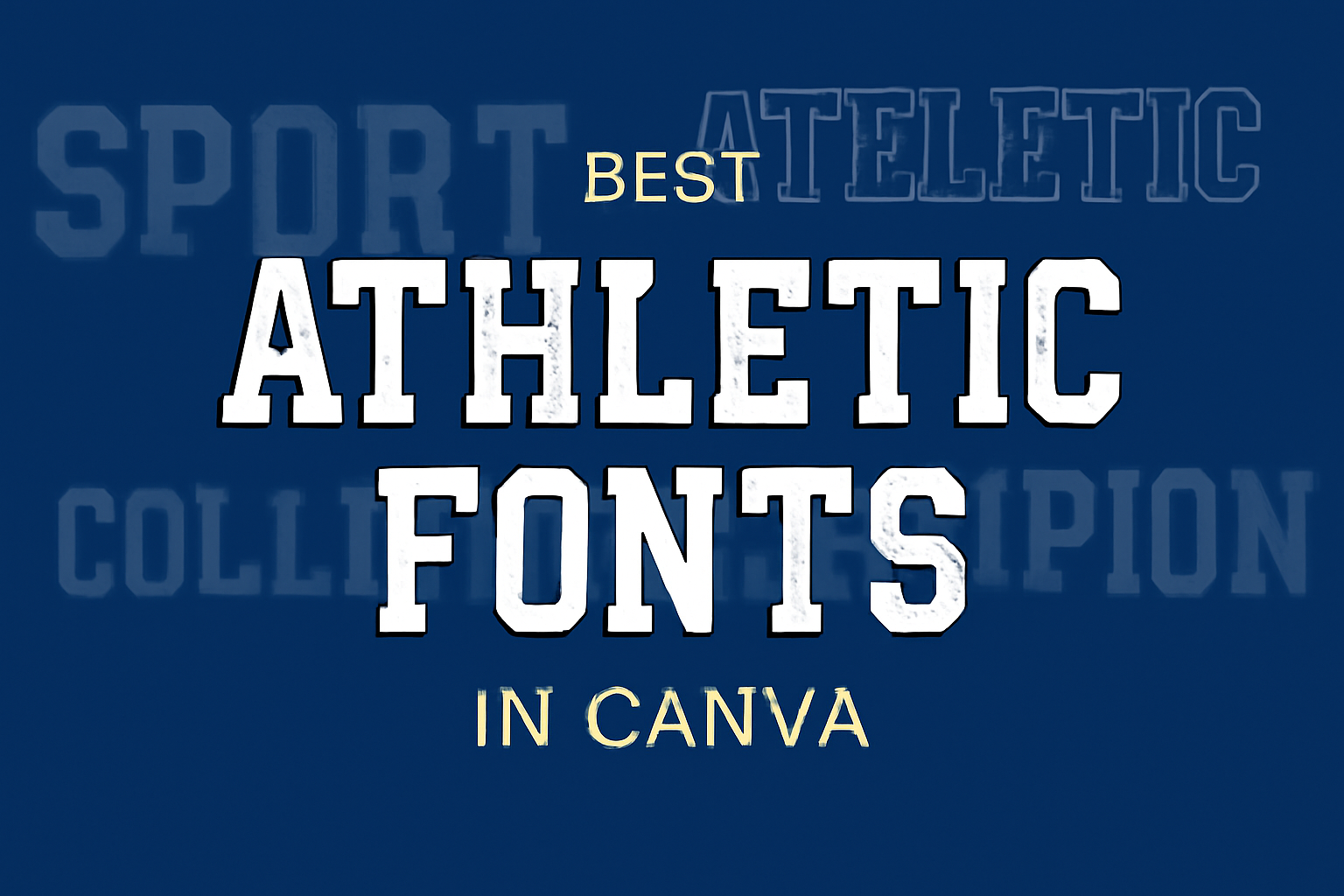
Choosing the right font can make a big difference in sports design projects. In Canva, there are many athletic fonts that not only capture the spirit of sports but also enhance the overall look of any design.
The best athletic fonts in Canva are bold, dynamic, and perfect for making headlines or team logos stand out.
For anyone looking to create eye-catching designs for events, team promotions, or merchandise, selecting the right font is key. The right font sets the tone and conveys energy, making it easier to connect with the audience.
From sleek and modern to bold and impactful, there is a wide variety of options available.
In this blog post, readers will discover some of the top athletic fonts in Canva that suit various needs and styles. Whether designing for a sports team or a fitness event, these fonts will help achieve a professional and energetic look.
What Defines an Athletic Font
Athletic fonts are designed to convey energy, movement, and strength. They play a crucial role in branding for sports teams, events, and products by capturing attention and communicating a sense of excitement.
Characteristics of Athletic Fonts
Athletic fonts possess unique characteristics that make them stand out. They are often bold and impactful. This helps them grab attention quickly.
Many athletic fonts feature sans-serif designs, giving them a modern and clean look.
Common traits include thick lines and sharp angles. These features create a sense of dynamism. Fonts like Bebas Neue are tall and make for excellent headlines due to their stature and clarity.
Additionally, many athletic fonts also incorporate elements that reflect the sport they represent. This could mean looks reminiscent of a basketball or a football. Overall, the fonts must be easily readable from a distance, which is vital during games or events.
The Impact of Typography in Sports Design
Typography in sports design is important for branding. The right font can create a memorable identity for a team or event. It resonates with fans and helps build loyalty.
Good typography does more than just show the name—it creates an emotional connection. For example, playful fonts may suit youth sports, while bold fonts are more fitting for professional teams.
Using contrasting colors with athletic fonts can also enhance visibility. This ensures that the text stands out against different backgrounds. For example, using white text on a dark background creates sharp contrast that catches the eye.
When choosing an athletic font, designers focus on conveying the right emotions while maintaining clarity. This balance helps teams attract fans and create a lasting impression.
Navigating Canva’s Font Library
Canva offers a user-friendly way to find and select fonts for various design projects. Knowing how to access athletic fonts and use searching options can enhance the design process.
Accessing Athletic Fonts on Canva
To find athletic fonts in Canva, users should first log into their account. Once on the homepage, they can start a new project or open an existing one.
In the design editor, the text tool can be located on the left panel.
Users can click on the “Text” option, then click “Add a heading,” “Add a subheading,” or “Add a little bit of body text.” This action opens the font library.
To focus specifically on athletic fonts, users can scroll through the extensive list or start typing “athletic” or specific font names into the search bar for quicker access.
Searching and Filtering Options
Canva provides excellent searching and filtering tools to streamline font selection.
After accessing the font library, users can type specific keywords or categories directly into the search bar. For instance, typing “bold” can pull up strong athletic fonts that stand out.
Additionally, users can filter results by style. Options include sans-serif, serif, script, and more. This helps in narrowing down choices based on the project’s needs.
Each font also has a preview option, allowing users to see how their text looks before finalizing it.
Exploring these searching options ensures users can find the perfect athletic fonts quickly and easily.
Popular Athletic Fonts in Canva
Many designers choose specific fonts to enhance the sporty feel of their projects. In this section, some popular athletic fonts in Canva are highlighted, catering to different needs and styles.
Top Rated
-
Boxing
The Boxing font stands out for its bold and impactful design. It is ideal for headlines and makes a strong statement. -
Bebas Neue
This font features a tall and bold look. Its modern style allows it to work well for sports headlines and promotional materials. -
Sports World
A classic choice, Sports World has a traditional athletic vibe. It works effectively for team logos and apparel.
These fonts are often praised for their clarity and their ability to capture attention.
User Favorites
-
Play
Play is a popular choice due to its casual, youthful vibe. Its rounded shapes make it easy to read, perfect for engaging content. -
Saira Stencil One
This font brings a unique flair with its stencil style. It is great for eye-catching designs, especially in promotional items. -
Magz
Ideal for sports magazines, Magz has a modern style that appeals to many users. It is suitable for dynamic headings and layouts.
These user favorites offer versatility and character, making them great options for any athletic design.
Using Athletic Fonts Effectively
Choosing and using athletic fonts wisely can significantly enhance the look of sports materials. Key factors like font pairing and ensuring contrast and legibility play important roles in creating visually appealing designs.
Font Pairing Strategies
When selecting athletic fonts, pairing them can create strong visual interest. A good combination often includes a bold headline font paired with a simpler body font.
For example, a font like Bebas Neue works well for headings due to its tall and impactful style.
To complement it, a clean sans-serif font like Arial can serve as the body text, ensuring clarity.
When pairing, it’s essential to maintain a consistent theme based on the sport or event. Designers may also try using different weights of the same font family. This creates harmony while providing variation in size and importance.
Contrast and Legibility
Contrast is crucial in making text stand out. Using a dark font on a light background, or vice versa, ensures that the text is easy to read.
For instance, a white font over a dark blue background enhances visibility and grabs attention.
The size of the font also affects legibility. Headlines should be larger than body text to guide the viewer’s eye naturally.
In addition, incorporating different colors can add excitement to the design. Using bright colors for headlines against a neutral background can draw more attention.
It is important to test designs in various sizes to ensure they remain legible even from a distance.
Incorporating Branding
Branding is essential for any sports team or athletic organization, and choosing the right fonts can play a big role in that. By selecting fonts that align with brand values and customizing them, teams can create a strong identity.
Matching Fonts with Brand Identity
When considering fonts for branding, it’s important to reflect the team’s personality. For example, a bold, strong font like Bebas Neue conveys power and confidence, making it suitable for competitive sports.
On the other hand, a more casual font like Play suggests friendliness and approachability, which might be great for youth sports teams.
The key is to choose fonts that resonate with the team’s mission and audience. Creating a visual connection with fans can enhance loyalty and recognition.
Customizing Fonts for Unique Branding
Customization can elevate a brand’s identity. Teams can modify existing fonts by adjusting size, weight, or color to fit their specific needs.
Using distinct colors that match team uniforms can make text more eye-catching. For instance, Sports World fonts can be adapted with the team’s color scheme, enhancing visibility.
Another option is to combine two different fonts. Using a bold font for headlines and a more legible font for smaller text can create hierarchy, guiding viewers’ attention effectively.
Ultimately, tailored fonts ensure a unique look that stands out in a crowded marketplace.
Tips and Tricks
Choosing the right athletic fonts in Canva can take designs to the next level. Below are some creative ways to use these fonts effectively, along with techniques to enhance visual hierarchy.
Creative Use of Athletic Fonts
Athletic fonts are bold and eye-catching, making them perfect for catching attention. They can be used in various designs, from sports posters to social media graphics.
To make the most of these fonts, consider pairing them with complementary styles. A bold athletic font can work well alongside a simpler, sans-serif font for a clean look. This combination allows the main message to stand out without overwhelming the audience.
Another tip is to play with color. Bright, contrasting colors can draw attention to specific elements, such as team names or event dates. Using gradients or shadows can also give text an added depth, enhancing the overall design.
Enhancing Visual Hierarchy
Creating a strong visual hierarchy is essential in any design. It helps guide the viewer’s eye to what matters most. When using athletic fonts, size and weight can greatly influence this hierarchy.
Using larger sizes for headlines or key information makes them instantly noticeable. Subheadings can be slightly smaller but should retain enough weight to stand out. This separation ensures that important details are easy to find.
Additionally, spacing plays a critical role. Adequate space between text lines and around elements helps keep things organized. Using bullet points or lists can also break up information and make it more digestible.
Learning from Professional Designers
Professional designers often have unique approaches to sports design. They use specific fonts to evoke emotions and connect with the audience.
For example, a bold font like Sports World provides a classic sports feel, perfect for team jerseys.
Tips from Experts:
- Experiment with Fonts: Mixing different styles can produce intriguing results.
- Stay Current: Following design trends ensures relevance in marketing materials.
- Feedback: Consulting others can provide new perspectives on designs.
By adopting these strategies, designers can create compelling visuals. Studying the works of experienced professionals inspires creativity and innovation in athletic designs.