Selecting the right font is crucial when designing 3D printed objects in Canva. Fonts impact the legibility and appearance of 3D printed text, making the choice a significant part of the creative process. Canva users have access to a variety of fonts that cater to both aesthetic appeal and functional considerations for 3D printing.
Among the fonts available in Canva, certain styles stand out for their 3D printing friendliness. Fonts like Helvetica and Arial are renowned for their clarity and ease of printing, which are qualities that make them popular choices. Additionally, stylized fonts such as Intro Rust and Vattican Brush provide creative flair without compromising printability, allowing users to add a unique touch to their designs.
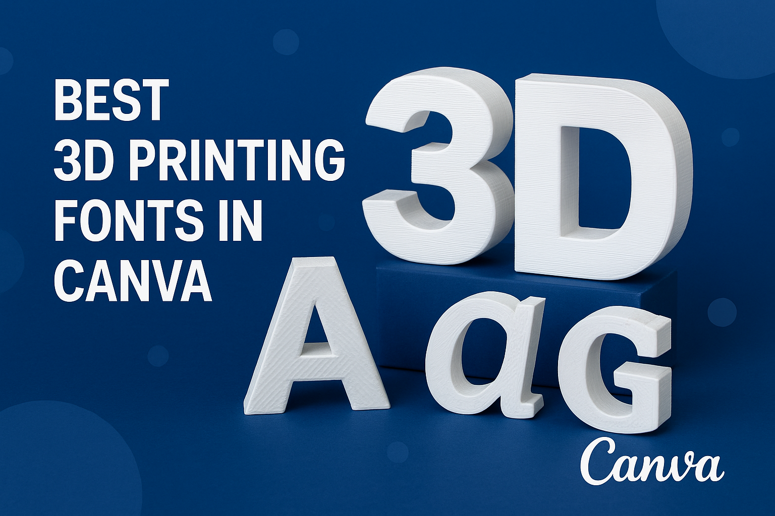
Basics of 3D Printing Fonts
Selecting the right font for 3D printing is critical to a project’s success. The reader should appreciate that fonts must be both aesthetically pleasing and structurally sound to be suitable for 3D printing.
Understanding Font Types
In the realm of 3D printing, fonts can broadly be classified into two types: serif and sans-serif. Serif fonts include small lines or decorative strokes at the ends of characters, but in 3D printing, sans-serif fonts are often preferred. They tend to have cleaner and simpler lines that are easier to print and less prone to errors.
Importance of Readability in 3D Printing
Readability is of paramount importance for 3D printed text. Letters should be distinct and legible to ensure that text is understandable at various sizes and dimensions. This clarity prevents confusion and maintains the integrity of the message or design intended in the printed object.
Font Weight and 3D Printing Compatibility
When considering font weight, it’s generally advisable to choose fonts with medium to bold weight for 3D printing. Thicker letterforms provide better structure and stability, reducing the risk of breakage during and after printing. Lighter font weights may not translate well into physical form, compromising the durability of the print.
Top 3D Printable Fonts in Canva
When choosing fonts for 3D printing in Canva, one must consider clarity, simplicity, and whether the font can stand out when printed. Here are the top three fonts that excel in these areas.
Font 1: Pragmatica Shadow: Characteristics and Applications
Pragmatica Shadow is appreciated for its clean, modern sans-serif look paired with a shadow effect. This shadow grants each letter a distinct 3D appearance, making it suitable for projects where a sense of depth is desired. It’s often used for professional presentations and marketing materials that require a contemporary touch.
Font 2: Londrina Shadow: Characteristics and Applications
Londrina Shadow offers a playful and fun approach to 3D typography. Its sans-serif style, combined with a shadow effect, gives letters added depth which catches the eye. The font is optimal for informal designs or creative projects that aim to project a friendly and engaging vibe.
Font 3: Bebas Neue: Characteristics and Applications
Bebas Neue is known for its strong, clean lines and excellent legibility. When turned into a 3D text in Canva, it makes each character stand out, which is essential for readability in 3D printing. This font is a go-to for designers looking to create impactful, clear text that translates well into a printed format.
How to Choose the Right Font
When selecting fonts for 3D printing in Canva, designers should focus on the legibility of the typeface, the aesthetics aligning with the project’s theme, and the scalability of fonts relative to the print size.
Font Legibility
The legibility of a font is crucial, especially when it comes to 3D printing where every detail matters. Fonts like Pragmatica Shadow and Helvetica Rounded are often recommended for their clean and modern sans-serif appearance that remains readable even when printed in three dimensions. It’s advisable to avoid thin fonts, but if one must use them, they should be bolded for enhanced legibility.
Font Aesthetics
A font’s style should complement the theme of the printed design. Londrina Sketch has a playful character which might be perfect for casual and creative projects, whereas Univers offers a more formal aesthetic suitable for professional applications. The choice of font aesthetics should resonate with the message the design intends to convey to its audience.
Print Size and Font Scalability
The scalability of a font in relation to the print size is important. Some fonts may lose clarity or readability when scaled down due to the limitations of 3D printing resolution. Designers need to consider the nozzle diameter of the 3D printer and choose fonts like Montserrat or VAG Rounded, which maintain their integrity when printed at various sizes. They should keep a balance between the font size and the level of detail the printer can accurately reproduce.
Designing with 3D Fonts in Canva
When designing in Canva with 3D fonts, one has the flexibility to adjust settings for a unique look, incorporate the font creatively into designs, and even combine different fonts to prepare for 3D printing.
Adjusting Font Settings
In Canva, users can easily manipulate font settings to enhance the 3D effect. Size, color, and spacing can be adjusted under the text menu to help lettering stand out. Experimentation with drop shadows and opacity can further give fonts a more pronounced 3D appearance.
Incorporating Font into Design
Strategically incorporating 3D fonts into a design involves more than just placing text on a page. Designers should consider the background color and image elements to ensure the font pops. Layering text over contrasting elements can add depth, making the 3D effect more convincing.
Combining Fonts for 3D Printing
When preparing a design for 3D printing, combining different fonts can bring a dynamic range to the final print. One should use a bold, thick font for the main elements to ensure readability and durability during printing. Complementary secondary fonts can be used for details or to provide a visual hierarchy.
Optimizing 3D Font Printability
When selecting fonts for 3D printing within Canva, one should account for how well a font translates from the screen to the physical print. The aspect of printability is crucial, considering the technical constraints of 3D printers.
Testing Fonts Before Printing
Before committing to a particular font, it is beneficial to run several tests to assess printability. Users should examine fonts for clarity and legibility at different scales, as well as their structural integrity when translated into a 3D model.
Adjusting for Font Overhangs
Overhangs in fonts, especially in more stylized or intricate text, can pose challenges during printing. Adjustments may include adding supports or altering the angle of the print to avoid these issues. Additionally, selecting fonts with fewer overhangs can mitigate these concerns from the outset.
Common 3D Printing Font Issues
Users may encounter several common issues when printing 3D fonts:
- Bridging: This occurs when the printer must create a span or bridge between two points without support from below. Sans-serif fonts typically handle this better.
- Stringing: Fine threads that appear between parts of the print often manifest with script or complex fonts.
Selecting fonts with fewer intricate details and more solid structures can help avoid these problems.
Advanced Tips for 3D Printing Fonts
When selecting fonts for 3D printing in Canva, designers must consider how font characteristics will translate into printed form. This includes factors like font weight, legibility at various sizes, and the relationship between the font and printer resolution.
Using Variable Fonts
Variable fonts offer flexibility that can be crucial for 3D printing, allowing one to adjust weight, width, and slant easily. For example, a designer may choose a bolder weight for a smaller object to ensure that the text remains legible once printed. Additionally, they should test different variations to find the optimal setting that matches their printer’s capabilities.
Custom Font Design for 3D Printing
Creating a custom font for 3D printing opens up the possibility for fully optimized typography. Here, designers should focus on creating characters with uniform thickness, avoiding fine details that may not print well. It’s critical for them to account for overhangs and unsupported features that could complicate the printing process or compromise the structural integrity of the printed text.