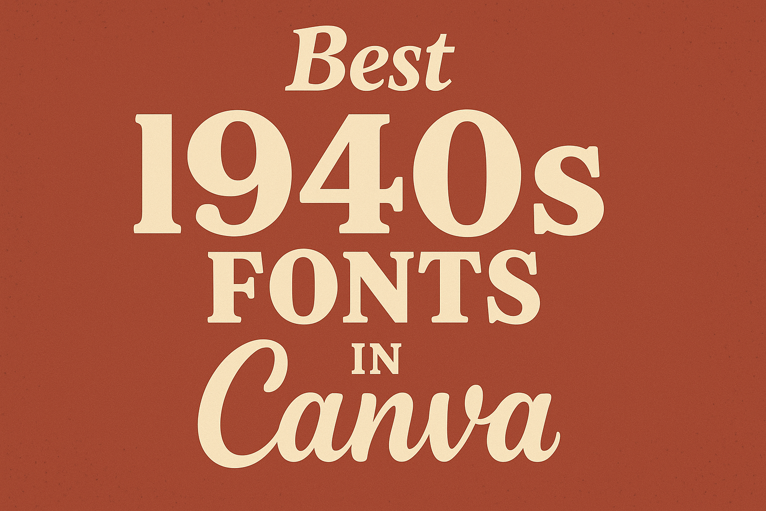
The 1940s were a unique time for design, blending modernity with classic styles. Many fonts from this era still resonate today, making them perfect for various projects in Canva.
Choosing the right 1940s font can add character and authenticity to any design, setting the tone and mood that modern fonts sometimes lack.
Canva offers a range of 1940s fonts that capture the essence of this distinctive decade. From bold military styles to elegant serif typefaces, each font tells a story and evokes a sense of nostalgia.
These fonts are not only visually appealing but also versatile for use in vintage-themed graphics or modern projects seeking a retro touch.
Exploring the best 1940s fonts in Canva can inspire creativity and elevate design work. Readers will find options that suit their projects, whether they aim to create invitations, posters, or branding materials.
With the right font choices, designs can truly stand out while honoring a remarkable era in design history.
The Charm of 1940s Typography
The typography of the 1940s carries a unique charm shaped by historical events and design trends. This period showcased a range of font styles that reflect a blend of elegance and practicality.
Historical Influence on 1940s Font Styles
The 1940s were marked by significant historical events, including World War II. Typography during this time was influenced by the need for clear communication in both military and industrial contexts.
Fonts had to be legible from a distance, which led to the popularity of bold and sturdy typefaces like Stencil. This font was widely used in military applications and carried a strong visual weight.
Additionally, the post-war era saw a return to more decorative styles. Fonts like Garamond emerged, celebrating elegance in print for books and magazines. This variety mirrored a society ready to express creativity after years of conflict.
Characteristics of 1940s Typefaces
The typefaces of the 1940s exhibit distinct characteristics that set them apart. Many fonts feature serif styles, providing a classic and formal look.
Their clean lines and strong structures made them ideal for impactful communication.
Boldness is a key trait, as seen in fonts designed for headlines and titles. Styles like Mr. Dafoe showcase a strong presence, while script fonts such as Niconne add a touch of elegance.
Readability was crucial, leading to smoother curves and well-defined letterforms. These features enhanced the visual appeal and ensured that text was easy to read.
The combination of practicality and artistic flair in 1940s typography left a lasting impact on design that continues to inspire today’s creators.
Sourcing 1940s Fonts in Canva
Finding the right 1940s fonts in Canva is an exciting journey. Users can explore various tools and options to discover vintage typefaces that fit their creative projects.
Searching for Vintage Fonts in Canva
To search for vintage fonts in Canva, users can start by opening the font selection menu. Typing keywords like “vintage” or “1940s” will yield relevant options. Canva offers a diverse library of fonts, including free and premium choices.
Using the filters, users can narrow down the search by selecting categories such as “Serif” or “Display.” This helps in finding fonts that match the aesthetic of the 1940s.
Canva also provides a visual preview of how each font looks with typed text. This feature allows users to see how different fonts work with their designs before making a decision.
Canva’s Best 1940s Font Selections
Canva has a selection of standout fonts ideal for capturing the 1940s vibe. Here are some of the best choices:
- Garamond: A classic serif font known for its readability. It suits books and magazines from that era.
- Stencil: This bold font reflects military and industrial style, common in the 1940s.
- Harlow: With its elegant curves, this font adds a touch of sophistication.
For more unique styles, ITC Bottleneck offers an art deco feel, while Vintage Rotter provides a charming script style perfect for branding and quotes. Users are encouraged to experiment with combinations to achieve the desired vintage look.
Designing with Nostalgic Fonts
Using nostalgic fonts can evoke memories and feelings from the 1940s. By focusing on specific design elements, anyone can create an authentic vintage look that resonates with audiences.
Creating Authentic 1940s Designs
When designing with 1940s fonts, it’s crucial to capture the style of the era. Fonts like Bickham Script and Bodoni reflect the elegance and charm of that time.
Opt for flowing cursive or bold serifs that were popular in signage and advertising.
Each font choice should be intentional. For example, Gotham can give a modern twist while still feeling retro.
Layering these fonts over textured backgrounds can enhance the vintage appeal, giving a sense of depth.
Pairing Fonts for Harmony
Effective font pairing is essential for balanced design. It’s best to mix a more decorative font with a simple, sans-serif option.
For instance, pairing Caslon with Helvetica can create visual interest while ensuring readability.
Consider using contrasting weights to emphasize important text. Bold headlines paired with lighter body text work well in layouts. Keeping the number of fonts to two or three helps maintain clarity.
Color Schemes and Typography
Color schemes play a major role in evoking a nostalgic feel.
Popular 1940s colors include muted tones like olive green, soft browns, and dusky yellows. These shades can bring warmth and authenticity to the design.
It’s also helpful to pair colors with the chosen fonts.
Light colors can complement dark typefaces, while darker colors work best with light fonts. This contrast helps in making text pop, ensuring it grabs attention without overwhelming the design.

