Using AI to find the best font pairings in Canva makes design simpler and more effective. AI tools analyze your choices and suggest font combinations that look balanced and professional without the guesswork. This helps users create appealing visuals quickly, whether for social media, presentations, or branding.
With Canva’s AI-powered font pairing feature, anyone can mix fonts that match style and purpose. These smart suggestions save time and improve the overall look of a project by choosing fonts that work well together. It’s a helpful way to bring out the right tone, from playful to formal, with ease.
Exploring AI-generated font pairings in Canva opens up fresh design possibilities. People can try new combinations confidently, knowing they are supported by smart technology tailored to their project’s needs. This makes crafting clear and stylish designs much easier for beginners and pros alike. For more ideas, see AI-Generated Font Pairing in Canva.
Understanding AI-Generated Font Pairing in Canva
AI-generated font pairings simplify finding fonts that look good together, making designs more polished. This technology helps users match fonts quickly by analyzing style, contrast, and readability. It changes how designers create by automating font choices while still allowing personal tweaks.
How AI-Anchored Pairing Works in Canva
Canva’s AI uses algorithms to analyze font characteristics like size, weight, and style. It then suggests pairs that balance contrast and harmony, such as combining a bold serif with a light sans-serif.
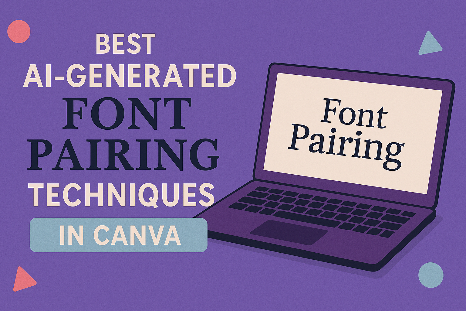
The AI also looks at common design rules and user preferences. It picks fonts that work well for headings, body text, or accents. Users can access this from the “Font Pairing” feature in Canva’s Typography section.
The system adapts as users make changes, refining suggestions based on the design context. This dynamic approach saves time and reduces font clash risks.
Advantages of AI Font Pairing for Designers
AI font pairing helps designers avoid guesswork. It speeds up the creative process by instantly presenting balanced font combinations. This is especially helpful for beginners unsure where to start.
Using AI tools ensures consistency across projects. Designers can maintain a professional look by picking fonts that match the brand style automatically. It also supports experimentation with different font weights and styles without extra hassle.
This technology reduces time spent on trial-and-error and lets designers focus more on layout and content. Canva’s AI-powered font tools are perfect for quick, reliable font matching.
The Role of AI in the Font Selection Process
AI narrows down hundreds of fonts to a curated set of options. It evaluates fonts on legibility, style, and pairing history from popular designs. This makes the font selection process less overwhelming.
Designers receive tailored recommendations based on the type of project, whether it’s a presentation, social post, or flyer. AI also factors in readability on different devices and sizes.
While AI suggests combinations, designers can still adjust colors, sizes, and spacing. This mix of automation and manual control creates unique, effective font pairings without sacrificing creativity. More details on using Canva’s AI font features can be found at AI-powered font pairing tools in Canva.
Fundamentals of Typography and Font Pairing
Good typography helps make designs clear and easy to read. Choosing the right fonts and combining them properly is key to creating visual balance and style. It involves understanding font types, their roles, and how to mix them without losing legibility or harmony.
Typography Basics for Canva Users
Typography is the art of arranging text. In Canva, users can control font size, weight, spacing, and alignment to shape how text looks.
Legibility is the most important goal. Text must be easy to read on any screen size. Canva offers many font options, so users should test styles to find clear combinations for their project.
Good typography uses contrast between fonts for hierarchy. Headlines are often bold or larger, while body text stays simple. Clear spacing between lines and letters improves reading flow.
Types of Fonts and Their Roles
Fonts are generally divided into serif and sans serif types. Serif fonts have small lines at the ends of letters and often feel classic and formal. They work well for body text in print or digital reading, improving legibility.
Sans serif fonts have clean lines without extra strokes. They look modern and are used for headings or brief text that needs attention. Canva users can try pairing a serif font for body text with a sans serif font for titles to create contrast.
Display fonts are decorative and meant for short, eye-catching text. Script fonts mimic handwriting but should be used sparingly because they can reduce legibility.
| Font Type | Best Use | Example |
|---|---|---|
| Serif | Body text, formal content | Libre Baskerville |
| Sans Serif | Headlines, interfaces | Montserrat, Roboto |
| Script | Short headings, logos | Yellowtail |
| Display | Emphasis, art projects | Bebas Neue |
Principles of Effective Font Combinations
Effective font pairings create balance and guide readers through content. The main rules include:
-
Contrast: Combine fonts with different weights, styles, or sizes to make each one stand out. For example, pair a bold sans serif heading with a light serif body font.
-
Limit fonts: Use no more than two or three fonts. Too many fonts create noise and confuse readers.
-
Consistency: Stick to a small palette of font styles and sizes for similar text types throughout the design.
-
Hierarchy: Create clear differences between headings, subheadings, and body text to organize information visually.
Trying AI tools in Canva can help users apply these principles by suggesting pairs that are proven to work well together. This saves time and improves the professionalism of the design.
For more details on pairing fonts effectively in Canva, see their font pairing guide.
Key Techniques for Achieving Harmony and Contrast
Achieving a strong balance between harmony and contrast is essential in font pairing. This involves managing the way fonts look together so the design is clear and inviting. Proper control of size, weight, and style helps guide the viewer’s eye and keep the text easy to read.
Balancing Contrast and Visual Hierarchy
Contrast is about choosing fonts that stand out from each other without clashing. This means pairing different styles—like a bold sans serif with a light serif—to catch attention and keep the text organized. Visual hierarchy uses contrast to show what’s most important first through size, weight, or color.
Too little contrast makes text blend and confuse the reader. Too much contrast can feel chaotic. The goal is to create clear sections where headings and body text work well together. Using contrast helps the reader quickly figure out the flow of information.
Optimizing Font Size and Weight
Font size and weight play a big role in making text readable and attractive. Larger or bolder fonts typically serve well as headings because they draw focus. Smaller or lighter weights are better suited for body text since they reduce visual noise and make long reading easier.
Adjusting font size should keep proportions balanced so that no text feels out of place. Weight differences, like pairing bold titles with regular body fonts, create natural emphasis. It’s important to test how these sizes and weights look side-by-side, especially on different screens or print formats.
Creating Consistency and Harmony
Consistency in font pairing means sticking to a limited set of styles that complement each other. Harmony is achieved when fonts share a similar tone or mood even if they contrast in style. Using fonts from the same family with different weights or Italics can keep designs neat without feeling boring.
Harmony also involves aligning spacing and letter shapes to avoid awkward gaps or clashes. Consistent use of hierarchy, color, and placement adds structure. Applying these principles ensures the design feels intentional and polished rather than random or messy.
For more detailed guidance on applying these techniques in Canva, see the Ultimate Guide to Font Pairing.
Best Practices for AI-Generated Font Pairing in Canva
Choosing the right fonts with AI tools in Canva involves more than just picking styles that look good together. It requires careful attention to how easy the text is to read, how well the fonts match the brand’s personality, and how the combination affects the feelings of the audience.
Ensuring Legibility and Readability
Legibility is the most important factor when pairing fonts. The text should be clear and simple to read, even at smaller sizes. Using AI to combine a clean sans serif font for headings with a readable serif font for body text often improves clarity.
Avoid pairing fonts that are too similar or overly decorative. This can cause confusion and make the design feel cluttered. It’s best to use contrast in weight, size, or style to help guide the reader’s eye smoothly through the content.
Spacing matters too. Proper line height and letter spacing prevent the text from feeling cramped. AI tools in Canva can suggest size and spacing adjustments to keep text comfortable for reading on screen or print.
Aligning Font Pairings With Brand Identity
Every font carries its own personality. When AI suggests pairings, it’s key to choose ones that reflect the brand’s spirit. For example, elegant serif fonts might suit a luxury brand, while bold geometric fonts fit tech companies better.
Brand consistency is essential. The fonts should match existing logos, colors, and overall visual style to create a unified look. AI can help test combinations quickly, making sure the fonts support the brand’s message without clashing.
Fonts also need flexibility. Using families with multiple weights or styles allows brands to maintain hierarchy while keeping the identity consistent. Canva’s AI tools can highlight these versatile font families for practical pairing.
Emphasizing the Emotional Impact of Typography
Typography influences how people feel about a design. AI font pairing should aim to evoke the right emotions that support the content’s purpose. Warm rounded fonts can feel friendly, while sharp and condensed fonts feel more serious or dynamic.
Combining fonts that create the right mood helps connect with the audience. For example, pairing a playful script font with a simple sans serif can add charm to invitations or creative projects.
Colors and background also affect this emotional impact. AI can help suggest font colors that complement images or design themes, enhancing the feelings the typography conveys in a design.
Top AI Tools and Resources for Canva Font Pairings
Choosing the right fonts in Canva can be easier with smart tools and helpful resources. These include both built-in Canva features and outside AI-driven generators. Users can explore vast font libraries and customize pairings to fit their design style.
Overview of Built-In Canva Tools
Canva offers a built-in Font Pairing tool that suggests font combinations based on style harmony. It helps users match headings with body text for balanced readability. This tool integrates seamlessly into the design workspace, making font pairing quick and simple.
Another feature, Magic Morph, uses AI to create smooth text designs by blending different font styles. Both tools support easy font selection from Canva’s extensive font library. This library includes popular options like Google Fonts, ensuring a wide range of choices for designers.
Using External AI Font Pairing Tools
For more advanced font pairing needs, designers turn to external AI tools. These tools often provide deeper customization and expert-curated pairings. For example, Fontjoy uses deep learning to generate real-time font combinations based on contrast or similarity preferences.
These external tools usually allow exporting font pairings in formats like CSS, which helps when moving designs between platforms. Designers can experiment with many font styles not always available in Canva, expanding their creative options.
Popular Pairing Generators and Libraries
Some of the top AI font pairing tools include Monotype Font Pairing Generator, known for expert-approved combinations trained on thousands of typefaces. It offers advanced filters to fine-tune pairings for specific design needs.
Google Fonts remains a popular library because of its free, open-source fonts and large selection. Designers can use Google Fonts with AI-powered tools or directly in Canva, combining accessibility with AI’s creative guidance.
For more information on AI font pairing tools, see Best AI Font Pairing Tools.
Examples and Trends in AI-Generated Font Pairing
AI tools now help create font combinations that balance style and readability. Designers use specific pairings to fit different design needs, such as headlines or logos. Canva’s AI features make experimenting with fonts smoother, helping match fonts based on characteristics like x-height and kerning.
Trending Font Pairings in 2025
In 2025, clean and modern fonts like Montserrat paired with classic serifs like Garamond stand out. This mix creates contrast that feels fresh but grounded. Sans-serifs with high legibility, such as Lato, often pair with elegant serif fonts like Merriweather for digital projects.
Handwritten styles like Great Vibes add personality when paired sparingly with simple fonts like Helvetica. Bold display fonts like Bebas Neue are popular for headlines paired with neutral body fonts like Georgia. Designers often focus on kerning adjustments for tight spacing in trendy pairings.
Pairings by Use Case: Headlines, Logos, and More
Headlines benefit from bold fonts with strong x-heights like Bebas Neue or Montserrat. Pairing these with softer serifs such as Lora enhances hierarchy and readability.
Logos often use unique pairings like Sketch with Garamond, combining creativity with tradition. Body text relies on highly readable fonts like Merriweather or Georgia. These serif fonts hold up well across devices, especially when kerning is optimized.
For web design, pairing geometric sans-serifs and classic serifs provides balance. AI tools in Canva suggest combinations based on the project type, making it easier to pick the right fonts for each use.
Real-World Examples Using Canva
Designers use Canva’s AI to combine fonts like Lato and Garamond for blog headers and body text. This pairing works well because Lato’s clean letter shapes contrast with Garamond’s traditional style.
For event invitations, Great Vibes pairs beautifully with Montserrat, mixing a flowing script with a modern sans-serif. The AI helps balance the kerning and weight to keep the text readable.
Bold headline fonts like Bebas Neue are paired with Merriweather in Canva to give brand websites a strong yet approachable look. The tool adjusts spacing so the fonts look well matched, even at different sizes.