Choosing the right fonts for font pair management systems can make managing brand identity easier and more effective. The best Canva fonts for these systems combine clear readability with versatile pairing options to keep designs consistent and professional. This balance helps users create sharp, attractive visuals without confusion or clutter.
Many font pairings mix bold headers with simple body text to guide the viewer’s eye smoothly through information. Popular combinations like Montserrat with Open Sans or Poppins with Lora offer both style and functionality, working well across digital and print formats.
Using strong font pairs can save time while reinforcing brand personality. For anyone managing multiple projects, knowing which Canva fonts pair well simplifies the design process and keeps communication clear.
Understanding Font Pair Management Systems
Font pair management systems help organize and control how different fonts work together. They ensure font combinations follow good design rules like contrast and readability. This aids in creating clear visual hierarchy and strong brand identity.
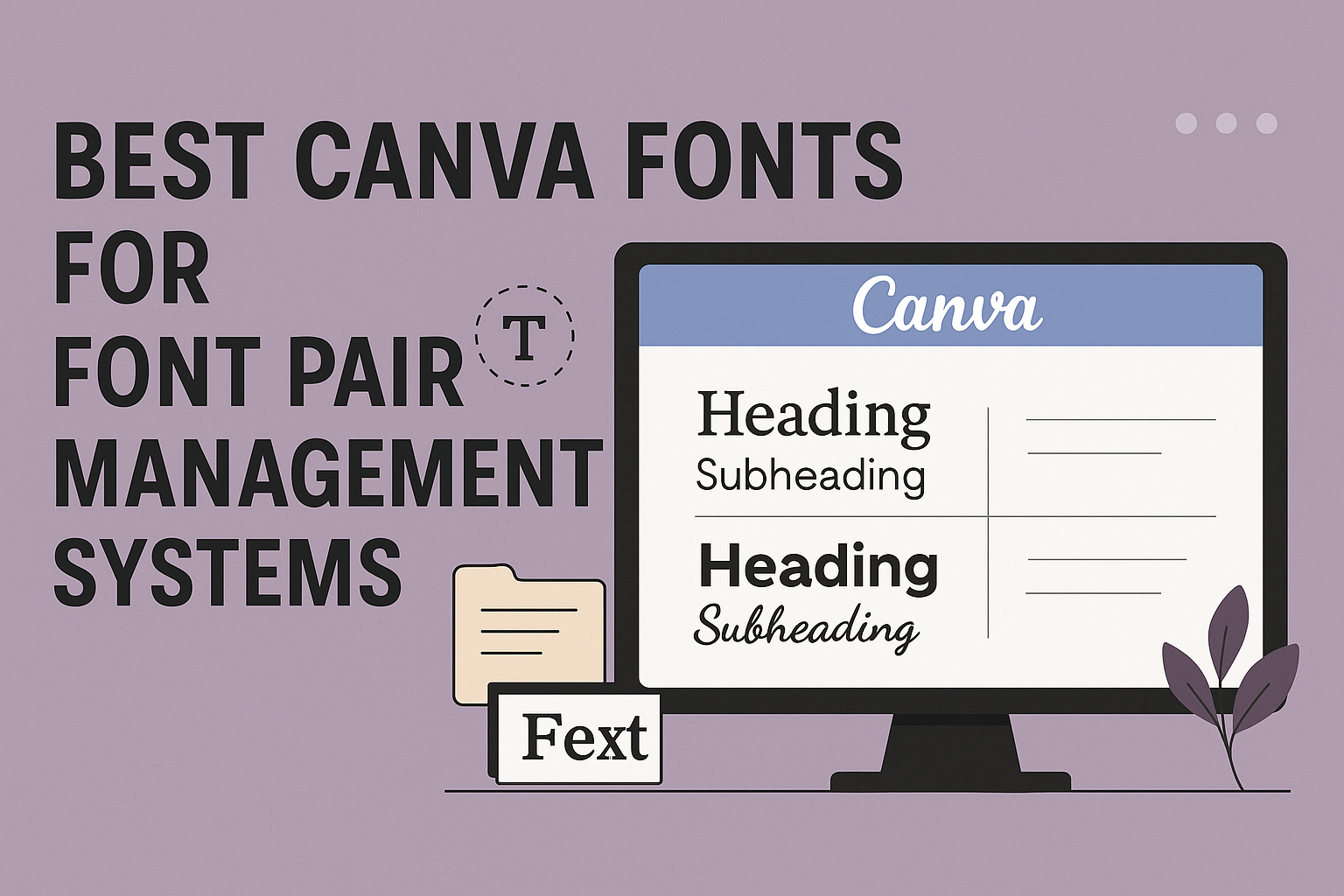
What Is a Font Pair Management System?
A font pair management system is a tool or software that helps users select and manage font combinations. It simplifies the process of choosing fonts that work well together, based on design principles.
These systems often include features like font libraries, pairing suggestions, and style guides. They help maintain consistency across projects by storing approved font pairs. This keeps designs professional and easy to read.
Most systems support balancing contrast between fonts, such as pairing a serif with a sans serif. This creates clear visual hierarchy and improves how the text flows on a page.
Benefits of Using Font Pair Management Solutions
Font pair management solutions save time by suggesting effective font combinations based on proven principles. This reduces guesswork and avoids font clashes that confuse readers.
They improve brand consistency by enforcing the use of specific font pairs across all materials. This helps customers instantly recognize a brand in different designs.
These tools often assist with visual hierarchy, guiding users to pick fonts that highlight headings, subheadings, and body text properly. Clear hierarchy makes content easier to scan and understand.
By simplifying complexity, these systems make good typography accessible even to those without design experience.
Challenges and Solutions in Font Pairing
One challenge is avoiding font clashes that confuse the reader or damage brand identity. So many fonts look similar or poorly contrast, making pairing tricky.
Another issue is maintaining readability across multiple platforms. Some fonts that look good on screen may not print well or vice versa.
Effective font pair management systems include tools to preview pairs in real time and check for accessibility. They encourage combining fonts with enough contrast in style, weight, and size.
Good systems also limit font choices to two or three per project to prevent clutter. They help users follow pairing principles so designs are clear, consistent, and easy to read.
Users who follow these guidelines are less likely to face common font pairing problems.
Key Principles of Font Pairing in Canva
Good font pairing starts with clear goals for how the text will look and feel. It involves finding the right balance between style and function to guide readers through the design smoothly. Effective font pairings help create a strong brand identity while making the content easy to read.
Establishing Effective Hierarchy
Visual hierarchy tells the reader which parts of the text matter most. This usually means making headings larger or bolder than body text. In Canva font pairings, using contrasting font sizes and weights helps separate titles, subtitles, and paragraphs clearly.
For example, a bold sans serif for headings can stand out when paired with a simple serif or a clean, narrow font for body copy. This makes scanning easier and helps readers focus on the key points first. Hierarchy also helps organize information logically, which improves user experience.
Balancing Contrast and Harmony
Good font combinations create contrast without clashing. Typically, this means pairing a bold or heavy font with a lighter or more subtle one. Contrast emphasizes important text but should not overwhelm the overall design.
Harmony comes from choosing fonts that share similar traits, like letter shapes or spacing. This keeps the design cohesive. For instance, mixing a geometric font with a rounded script can look balanced if their stroke widths or moods match. Effective Canva font pairings follow these principles to create designs that feel both dynamic and unified.
Choosing Fonts for Readability
Readability is key when selecting fonts in any design system. Fonts should be clear in size, shape, and spacing. Simple serifs or sans serifs often work best for body text because they reduce eye strain.
Fonts with high x-heights (the height of lowercase letters) improve legibility on screens and printed materials. Avoid overly decorative or script fonts for long text blocks. Using different font styles or weights for headings versus paragraphs also helps readers quickly identify sections.
Limiting Font Choices for Consistency
Sticking to just 2 or 3 fonts keeps a design clean and professional. Too many fonts can confuse the eye and hurt a brand’s identity. Canva font pairings often recommend limiting fonts on a project to create visual consistency.
This means picking one font for headings, one for body text, and sometimes a third for accents or highlights. Consistency helps tie all parts of a design together, making it easier for audiences to recognize and remember the brand. Designers often use font families with multiple weights or styles to keep choices limited but flexible.
Types of Canva Fonts and Their Roles
Fonts shape the voice of any design. Each type serves a clear purpose, whether it’s to build trust, catch attention, or add personality. Understanding their roles helps users pick the right fonts to match their brand or project needs.
Serif Fonts
Serif fonts have small lines or “feet” at the edges of letters. They give a classic, trustworthy feel. This makes them great for brands wanting to show stability and tradition.
In Canva, serif fonts like Libre Baskerville or Cormorant Garamond work well for long texts and formal designs. They pair nicely with cleaner fonts, adding elegance without losing readability.
These fonts suggest qualities like respect, elegance, and authority. They suit businesses that value a refined and mature look, like law firms or luxury brands.
Sans-Serif Fonts
Sans-serif fonts have clean strokes without extra lines. They look modern, simple, and easy to read on screens. This makes them perfect for websites, apps, and body text.
Fonts like Montserrat and Open Sans in Canva deliver clarity and a fresh, straightforward vibe. They are often paired with serif or script fonts to balance style and readability.
Sans-serifs express efficiency, honesty, and minimalism. They appeal to tech companies or any brand wanting a clean, no-nonsense image. Their versatility makes them a staple in many designs.
Display and Decorative Fonts
Display and decorative fonts are bold and eye-catching. They are used mostly for titles, logos, or social media where grabbing attention quickly matters.
These fonts can be playful or dramatic, with unusual shapes or styles that set a fun or unique tone. For example, Canva’s Lobster or Roxborough add personality but are not suited for body text because they can be hard to read.
This font type shines when brands want to stand out or express creativity. They work well in marketing, event posters, or artistic projects where style is key.
Script and Handwriting Fonts
Script and handwriting fonts mimic natural writing, often linking letters in a flowing way. They feel personal, elegant, and sometimes playful.
Canva offers popular script fonts like Pacifico or Dancing Script, which are widely used for invitations, logos, or feminine brands. However, these fonts should be limited to headlines or accents because they can be hard to read in large blocks.
These fonts express creativity and warmth. They are perfect for brands wanting a touch of personality or a casual, handmade vibe. They add softness and charm without overwhelming the design.
Best Canva Font Pairings for Management Systems
Choosing the right fonts for management systems helps create clear, organized, and professional designs. Fonts should balance readability with style to make information easy to follow while keeping the design engaging. Combining different font styles can highlight key sections without confusing the viewer.
Modern and Versatile Pairings
For management systems that need a clean, modern look, Montserrat paired with Open Sans is a strong choice. Montserrat’s bold geometric shapes work well for headings, while Open Sans offers a simple and readable style for body text.
Another versatile pairing is Poppins with Source Sans Pro. Poppins brings a fresh and stylish feel, good for titles or buttons, while Source Sans Pro supports clear readability for longer sections.
These combinations focus on clear hierarchy, helping users quickly find important details. They keep interfaces uncluttered and professional, which is crucial in management settings.
Elegant and Sophisticated Combinations
When a management system requires a more refined look, Libre Baskerville and Cardo offer classic serif styles that bring elegance to documents and reports.
Pairing Bodoni FLF with Montserrat Light creates a mix of bold sophistication and modern clarity. Bodoni FLF’s decorative serif fonts work well for headings, while Montserrat Light maintains easy readability in text blocks.
Font pairs like Tan Mon Cheri with Poppins add a subtle vintage charm mixed with clean lines, making the interface inviting but still professional.
These elegant choices help elevate the design without sacrificing function or legibility.
Playful and Eye-Catching Duos
Sometimes management systems benefit from fonts that add energy and creativity without losing clarity. Shrikhand paired with Tenor Sans combines a bold, rounded font for headings with a crisp sans-serif for content, adding fun but staying easy to read.
League Spartan with Moontime creates a bold yet artistic look. League Spartan’s strong geometric style contrasts nicely with Moontime’s handwritten charm, ideal for systems needing personality.
For softer designs, The Artist Script paired with Julius Sans One offers a graceful script balanced by a simple sans-serif. This combo is great for user-friendly platforms that want a warm, personal touch.
These duos keep management systems lively without overwhelming users.
For more detailed font pair ideas in Canva, exploring best Canva font pairings can help find combinations that fit different project moods and needs.
Popular Canva Fonts for Professional Font Pairing
Choosing the right fonts helps make documents and projects clear and easy to read. Some fonts work great for headlines because they grab attention, while others are better for body text due to their readability. It’s also important to avoid fonts that can cause confusion or look unprofessional in font pair management systems.
Recommended Canva Fonts for Headlines
Fonts like League Spartan and Montserrat are popular for headlines in Canva. League Spartan has bold, clean lines that stand out and give a modern feel. Montserrat is versatile, balancing strong presence with good readability, making it great for titles and headers.
Other good headline options include Poppins, which is geometric and sharp. These fonts help create a clear visual hierarchy by making headlines distinct from body text. They keep the design professional and neat, which is key for management systems handling multiple fonts together.
Top Canva Fonts for Body Text
For body text, fonts such as Open Sans and Poppins work well in Canva projects. Open Sans is highly readable, with simple shapes that don’t tire the eyes. It balances modern style with clarity, making it a favorite for longer texts and user interfaces.
Poppins also fits well in body text due to its clean but friendly look. Playfair Display can be used for special sections needing a touch of elegance but is best kept for headlines or short blocks because of its decorative style.
Fonts to Avoid in Management Systems
Fonts with very stylized or decorative features should be avoided in font pair management systems. These include overly scripted or handwritten fonts that reduce legibility. Too many flourishes or uneven spacing can cause issues in systems that need clear, consistent typesetting.
Fonts that are too similar to each other, like two heavy sans-serifs with little contrast, also cause confusion. It is best to use fonts like Montserrat and Open Sans that offer clear differences and good readability.
For more on pairing professional fonts in Canva, see popular font lists and tips at goofydesigner.com.
Ensuring Brand Identity and Visual Hierarchy
Choosing the right fonts is key to shaping a clear and strong brand image. Fonts help guide viewers through content while reflecting the brand’s unique style.
Maintaining Consistency Across Designs
Consistency in font use strengthens brand identity. Using the same font pairings—such as a serif for headings and a sans serif for body text—keeps designs uniform. This helps audiences recognize the brand quickly.
Strong typography rules make it easier for teams to follow a style guide. These include:
- Fonts to use for headlines, subheadings, and body text
- Font sizes and spacing for each typography level
- Color choices paired with fonts
Following these rules across all marketing materials avoids confusion and supports visual hierarchy, making content easy to scan and understand.
Aligning Fonts With Brand Personality
Fonts speak the brand’s personality without words. Serif fonts suggest tradition and trust, while sans serifs look modern and clean. Script fonts can add elegance and creativity, but they work best in accents, not for large text blocks due to readability.
Brand values and target audience shape font choices. A luxury brand might pick classic, sophisticated fonts, while a fun, casual brand may lean toward playful or handwritten styles.
Good font pairings balance harmony and contrast. For example:
| Brand Style | Heading Font Type | Body Font Type |
|---|---|---|
| Elegant | Serif (e.g., Libre Baskerville) | Sans Serif (e.g., Montserrat) |
| Modern | Sans Serif (e.g., Futura) | Sans Serif (e.g., Open Sans) |
| Creative | Script (e.g., Sacramento) | Serif or Sans Serif |
Learn more about the best font pairings for strong brand identity at Best Canva Font Pairings For Brands And Small Businesses.