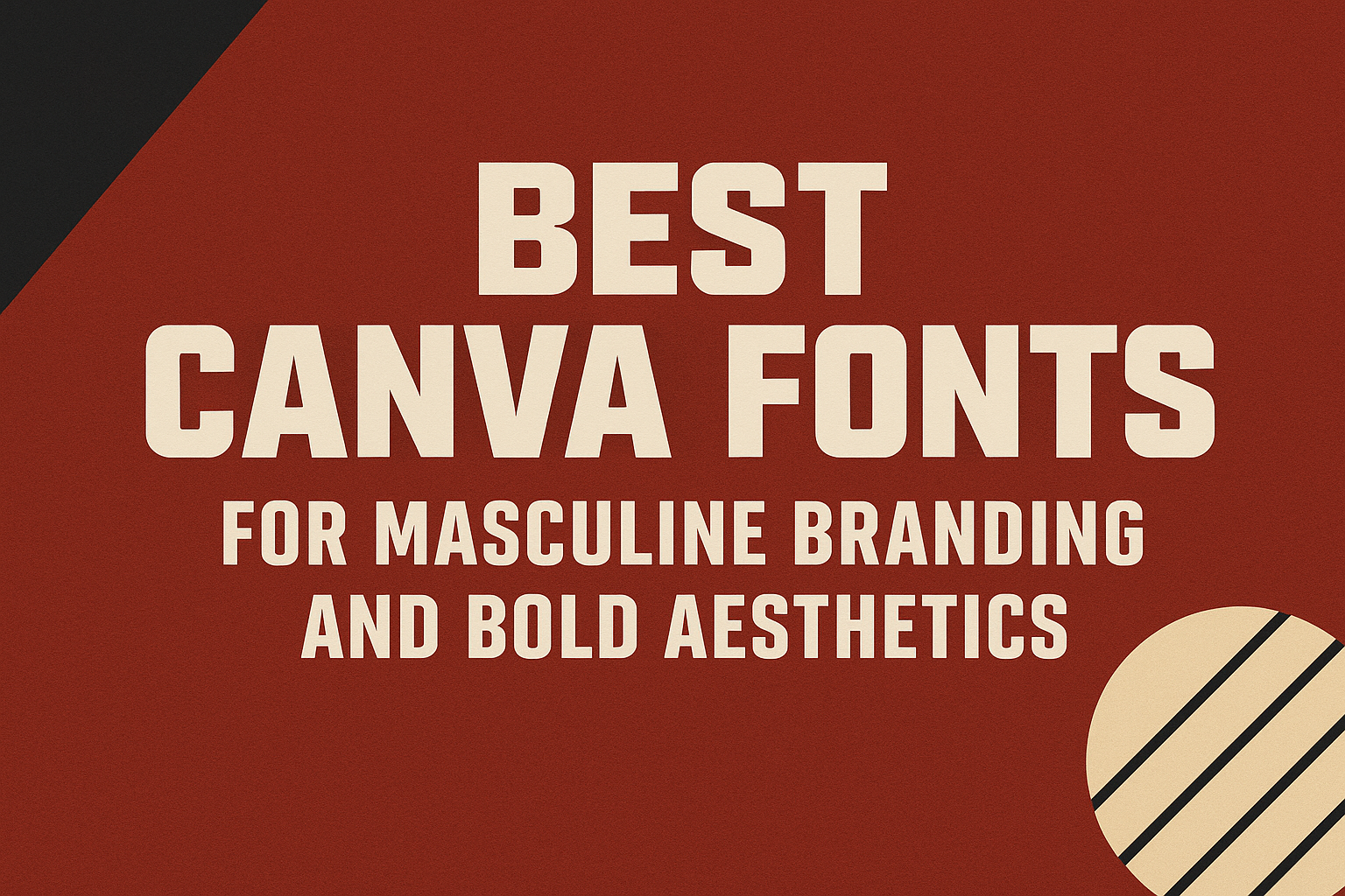
When creating a strong, masculine brand, choosing the right font plays a huge role. The best Canva fonts for masculine branding combine boldness, clarity, and style to give designs a confident and powerful look. These fonts stand out without overwhelming the message, making them perfect for logos, headlines, and marketing materials.
Masculine fonts often feature thick lines, sharp edges, and clean shapes that communicate strength and authority. Designers can use these to create a look that feels both modern and timeless, fitting many types of brands from sports to tech.
Finding fonts that balance bold aesthetics with good readability can be tricky, but Canva offers many options that hit the mark. This article highlights some of the best masculine fonts on Canva, helping anyone build a brand with impact and clarity. For more details, visit 10 Best Masculine Fonts on Canva.
What Makes a Font Masculine on Canva?
Masculine fonts often show traits like strength and boldness. They stand out with clear shapes and confident designs. These fonts are made to grab attention and give a strong impression.
Defining Masculine Font Characteristics
Masculine fonts usually have thick, bold lines that feel powerful. They often use straight or geometric shapes rather than delicate or ornate ones. This creates a strong, solid look.
Many masculine fonts avoid rounded or script styles, which are seen as softer. Instead, they lean toward sharp edges and clean lines. These traits make the fonts look confident and impactful.
They also tend to have a balanced, stable feel. This means their letters don’t sway or look fragile. The font feels steady and firm, which builds a sense of masculinity.
Typical Use Cases for Masculine Fonts
Masculine fonts work well for projects needing a strong presence. They fit well in branding for tech companies, sports teams, or industries like metalwork or construction.
These fonts are also popular for posters, logos, and webpage headings where boldness is key. For example, a sports team’s jersey or a movie poster with action themes might use masculine fonts.
They are less common in casual or feminine-oriented projects but shine when a design must communicate power, professionalism, or toughness clearly.
Psychology of Bold and Powerful Font Choices
Bold fonts send a message of confidence and authority. When a font looks strong, it can make the viewer trust the brand or product more.
Powerful fonts grab attention fast and make information feel more important. This helps brands get noticed and remembered.
Choosing a masculine font can also evoke feelings of stability and seriousness. This influence helps brands appear reliable and ready for challenges, which is why many masculine fonts are chosen for business and sports designs.
Learn more about masculine Canva fonts to see these traits in action.
Top Canva Fonts for Masculine Branding
Choosing the right font can make a brand look strong and confident. Masculine fonts often use bold shapes and clear lines to create that effect. The fonts below stand out in Canva for their unique ways of showing strength and style.
Alfa Slab One for Impactful Statements
Alfa Slab One uses thick, blocky letters to create a powerful presence. It’s perfect for headlines that need to grab attention quickly. The slab serifs add a touch of toughness without making the font hard to read.
This font works well for brands that want to feel both modern and solid. It fits designs that need to look trustworthy and bold. Alfa Slab One is common in logos and posters where impact is key.
Carter One’s Bold Modern Appeal
Carter One brings a friendly but strong vibe with its rounded edges and thick strokes. It combines a modern look with a casual feel, making it less intimidating but still commanding. This balance helps brands appear approachable yet confident.
Ideal for brands targeting a younger or more laid-back audience, Carter One stands out in Canva projects focused on personality and energy. It’s great for marketing materials and social media posts that aim to connect quickly.
League Spartan’s Geometric Strength
League Spartan offers sharp, clean lines and a geometric style that feels precise and professional. Its tall, narrow letters create a sense of strength and focus. This font is often chosen for its minimalist but commanding look.
Because of its versatility, League Spartan suits many masculine branding needs. It’s excellent for businesses wanting a sleek, modern style with strong visual impact. Canva users appreciate it for both headlines and bold text blocks.
More Canva Fonts That Embody Masculinity
Masculine fonts often combine strength and clarity, making them great for bold branding. They include serif and sans-serif styles that create authority and confidence. These fonts work well for logos, headlines, and branding materials that need to stand out.
Rundeck’s Authoritative Serif Design
Rundeck is a serif font that carries a sense of tradition and power. Its elegant serifs add formality, making it perfect for brands that want a classic, strong look.
The font uses thick strokes and sharp angles, which give it a commanding presence. This makes Rundeck ideal for headlines and logos where the design calls for confidence without losing readability.
It stands out among masculine fonts because it balances sophistication with boldness. Rundeck works well for projects that want to evoke authority and trustworthiness at the same time.
Other Popular Bold Typefaces
Several other bold fonts on Canva balance masculinity with clean design. Fonts like Horizon, League Spartan, and Alfa Slab One each bring different qualities to a masculine brand.
- Horizon features thick vertical strokes with minimal curves, projecting power and assertiveness.
- League Spartan offers sharp, geometric shapes with a modern, confident vibe.
- Alfa Slab One features bold slabs and good legibility, suitable for various sizes and platforms.
Each font delivers strong visuals but remains easy to read. These options work well for designers who want clear, bold messaging with a masculine edge. For more about masculine fonts, see this list of best masculine fonts on Canva.
Choosing Fonts for Bold Aesthetic Branding
Selecting fonts for bold aesthetic branding means focusing on strength and clarity. It’s about choosing typefaces that reflect confidence and make a lasting impression. The right fonts help build a clear voice and ensure the brand stands out.
Establishing Strong Brand Identity
A strong brand identity starts with fonts that express the brand’s core values. Masculine fonts with thick lines and sharp edges often convey power and reliability. Fonts like Archivo Black or Bebas Neue give a bold, commanding feel that fits masculine branding well.
Consistency is key. Using the same bold font across logos, headlines, and marketing materials makes the brand recognizable. It helps the audience quickly connect with the message.
Testing font sizes and weights also shapes how the brand is seen. Headlines should be heavy and eye-catching, while body text stays simple for easy reading.
Pairing Masculine Fonts for Consistency
Pairing fonts means combining a strong headline font with a simpler body font. This balance keeps designs clear and easy to follow. For masculine branding, a bold font like Gotham Black can pair well with a clean sans-serif font like Rubik.
Contrasting font styles create hierarchy. A thick, bold header grabs attention, while a lighter font underneath supports the message without competing for focus. This prevents clutter and improves readability.
Colors matter too. Dark tones like navy or charcoal combined with bright accents highlight the masculine font style. It strengthens the overall bold aesthetic while keeping designs inviting and easy to read.
For advice on font combinations, see the guide on best Canva font combinations.
Best Practices for Using Masculine Fonts in Canva
Choosing masculine fonts means balancing strength with clarity. It’s important to make sure the text stays easy to read while fitting well within the design space. Color and layout should highlight the font’s bold character without overpowering the message.
Enhancing Readability and Legibility
Masculine fonts often have thick strokes, which can make small text hard to read. Using fonts like Horizon or Alfa Slab One in larger sizes helps keep letters clear. Spacing between letters should be adjusted to avoid crowding, especially in headings or logos.
Avoid overly complex or decorative fonts for body text. Clean lines and simple shapes work better for readability. Bold fonts are best for short phrases or titles, so pairing them with simpler fonts for longer text can improve flow.
Color, Size, and Layout Considerations
Choosing the right color contrast is key. Dark masculine fonts look sharp on light backgrounds but may get lost against dark or busy images. Using solid background colors helps fonts stand out.
Font size must suit the medium. Large sizes work well for posters or banners, while medium sizes are better for social media posts. Canva’s layout tools let users easily resize and adjust spacing to keep the design balanced.
A strong grid or alignment system in Canva helps arrange masculine fonts neatly. This adds structure and avoids a cluttered look, ensuring the bold font shines without distraction.
Masculine Fonts in Posters and Visual Marketing
Masculine fonts in posters help create strong, clear messages that catch the eye. These fonts add boldness and confidence to visual marketing, making brands more memorable and effective.
Designing Standout Posters
Choosing the right masculine font can make a poster stand out instantly. Fonts with thick lines, sharp edges, or clean sans-serif styles give a bold and confident look. These fonts work well for headlines or key information.
Using contrast between fonts and background colors also boosts visibility. Pairing a masculine font with simple graphics keeps the message clear. For example, a rugged serif font can highlight strength, while a sleek sans-serif adds modern appeal.
Some popular masculine fonts in Canva include Baston, Horizon, and Lovelo. These fonts balance boldness with readability, making them perfect for posters aimed at grabbing attention fast.
Case Studies of Successful Branding
Many brands have used masculine fonts in posters to build strong identities. A sports brand might use bold, blocky fonts to emphasize power and movement.
One case involved a fashion magazine that chose Baston for its cover posters. The font’s precise curves gave a manly, stylish feel without losing elegance.
Another example is a tech company that used Horizon font in their marketing posters. The font’s clean, dynamic lines reflected innovation and confidence, which aligned perfectly with their brand goals.
More details on great masculine fonts for designs are available at 12 Best Masculine Fonts in Canva.